Gorgeous Wall Decor Design Ideas: 18 Brilliant Techniques
Want wall decor design ideas that explain the actual principle behind a great-looking wall, not just another object to buy? This guide covers 18 brilliant, practical techniques, from color drenching to the two-thirds wall coverage guide, that designers rely on to make a wall feel balanced and intentional. Good wall decor design usually comes down to a handful of repeatable rules around scale, spacing, and visual weight, applied consistently rather than guessed at room by room. This guide walks through eighteen specific techniques covering color, placement, and composition, each with practical notes for applying it at home. Readers will come away with tools they can reuse on every wall in the house.
Trend & Background
Wall decor design content has shifted toward explaining underlying technique rather than simply showcasing finished walls, giving people more transferable tools to apply across different rooms and layouts. This reflects growing interest in understanding why a wall works visually, rather than attempting to copy a specific styled photo that may not translate to a different space. This matters now because more design educators and stylists have begun publishing process-focused breakdowns of techniques like color drenching and eye-level hanging standards, both of which have grown significantly in search interest. This shift has made professional-level wall design principles far more accessible to people planning their own homes without hiring a designer.
Key Takeaways
- These 18 wall decor design ideas focus on repeatable technique and principle rather than a single specific object to purchase.
- An eye-level hanging table breaks down standard center height guidance for art in different room contexts.
- Several techniques apply across any room, from color balance to spacing rules for grouped art.
- Learning these underlying principles tends to produce more consistently successful results than copying a single reference photo.
1. Color Drenching Technique for Wall Decor Design
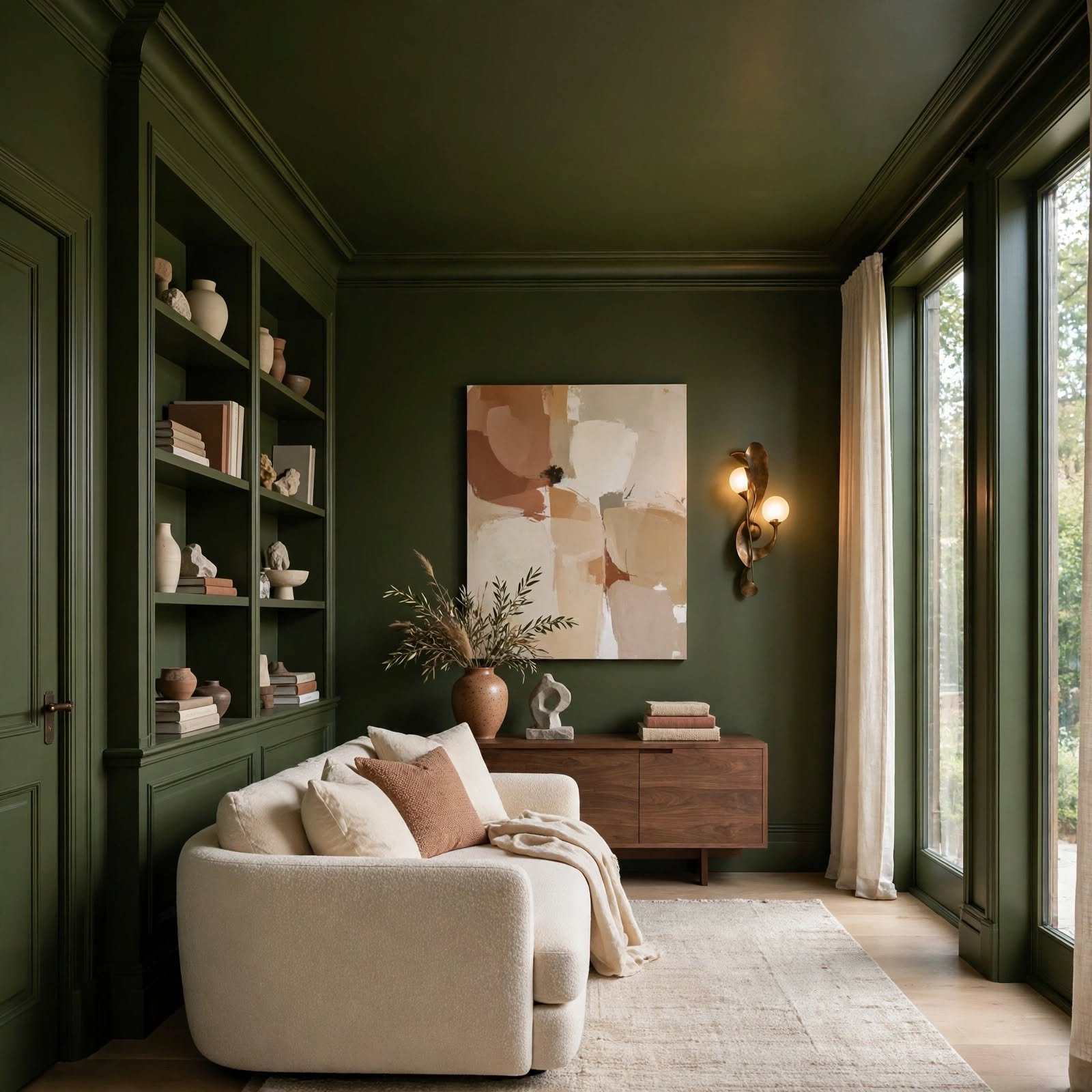
Color drenching, which involves painting the walls, trim, and ceiling of a room in the same or a very closely related shade, removes the visual breaks that separate these surfaces and makes a room feel more enveloping and cohesive. This technique works particularly well with deeper, more saturated colors, since the lack of contrast keeps the color from feeling overwhelming in smaller doses. Choosing a slightly different sheen for the ceiling versus the walls, even within the same color, adds subtle dimension without breaking the overall effect.
2. Focal Point Wall Anchoring for Wall Decor Design
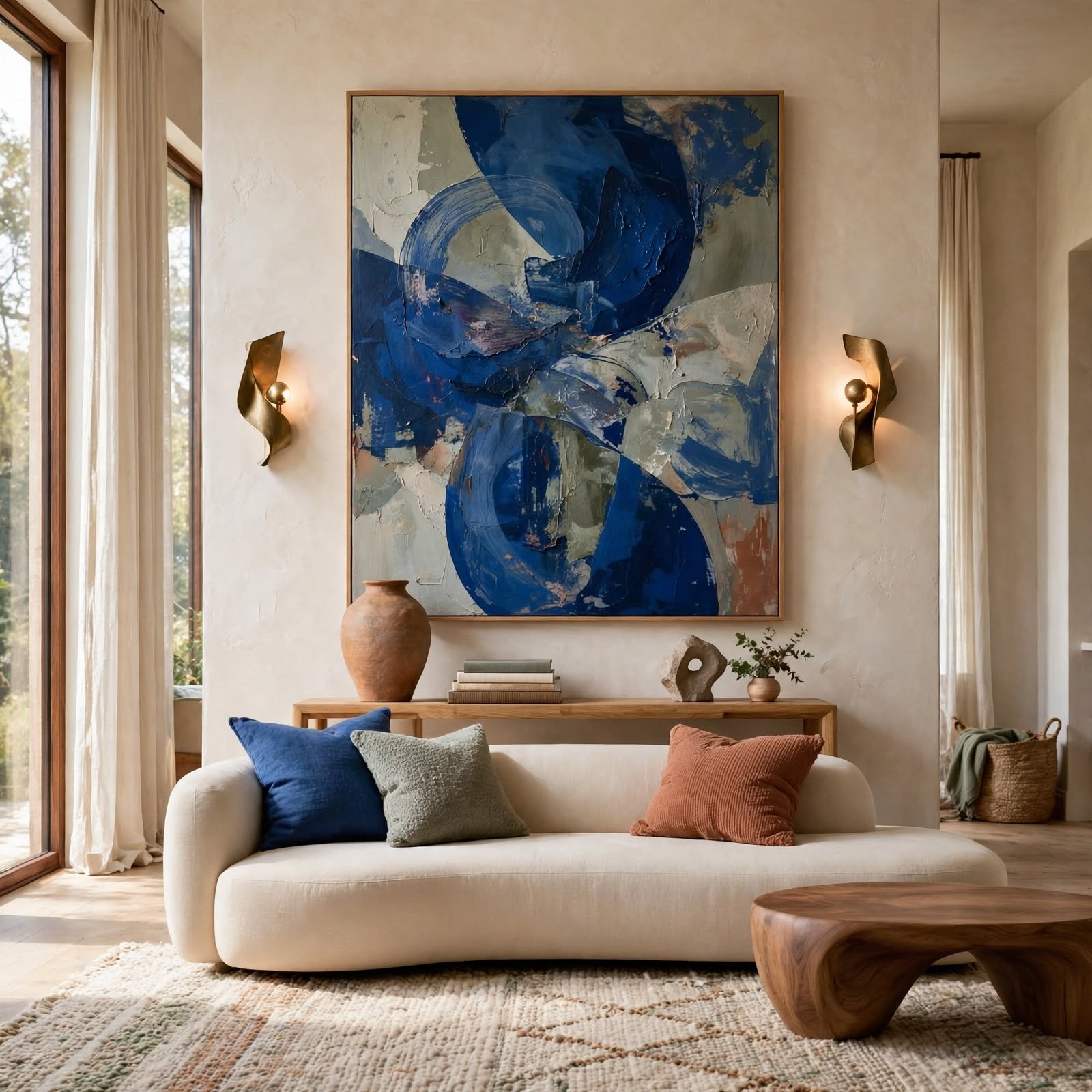
Identifying a single wall to serve as the room’s primary visual anchor, then directing the most significant decor investment toward that wall specifically, prevents a room’s decor budget and attention from being spread too thin across every surface. This technique typically targets the wall behind a bed, sofa, or dining table, since these are the walls most consistently in view from where people spend the most time. Keeping surrounding walls simpler by comparison reinforces the focal wall’s intended prominence rather than competing with it.
3. Scale-to-Wall Proportion Rule for Wall Decor Design
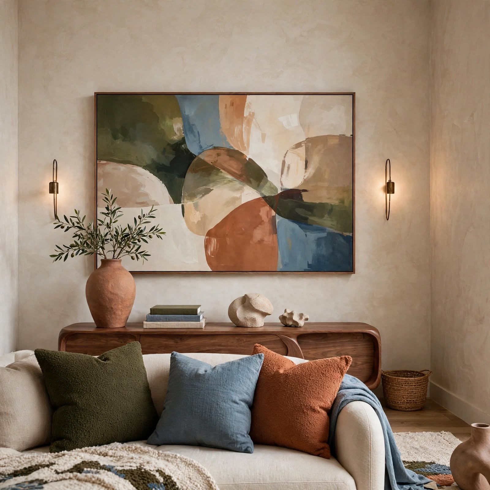
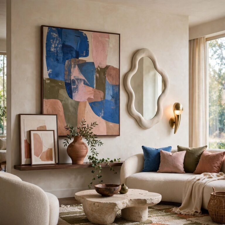
A widely used design guideline suggests that art or a decor grouping should cover roughly two-thirds of the available wall width above a piece of furniture, like a sofa or console table, for a proportionally balanced look. Going smaller than this ratio tends to make the art look undersized, while going significantly larger can overwhelm the furniture beneath it. Measuring the furniture’s width first, then multiplying by roughly point six five, gives a practical target width for the art above it.
4. Mixed Frame Finish Curation for Wall Decor Design
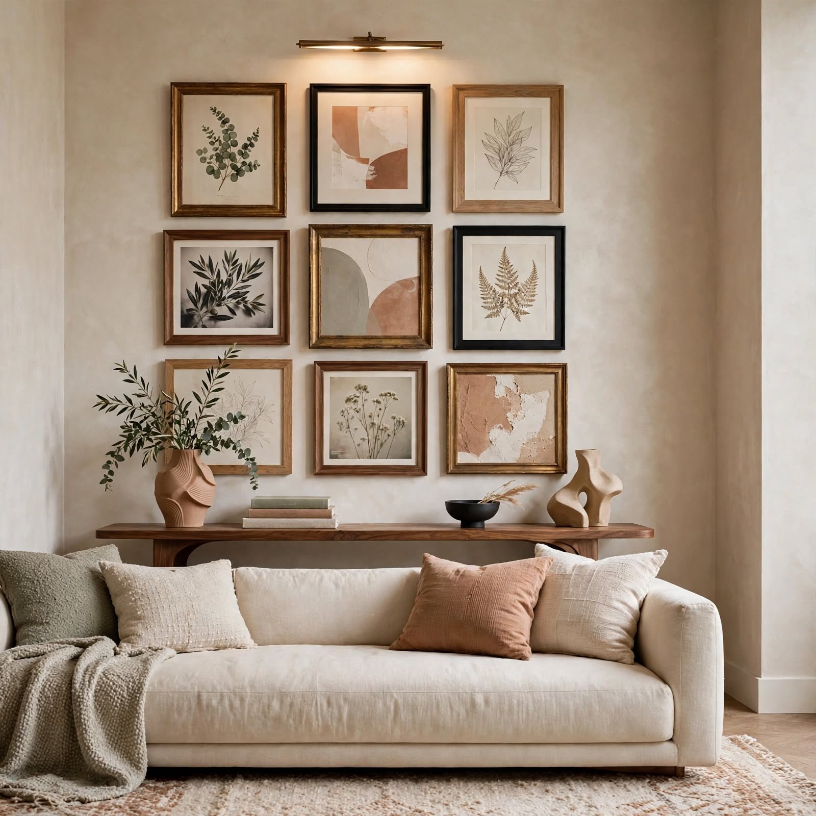
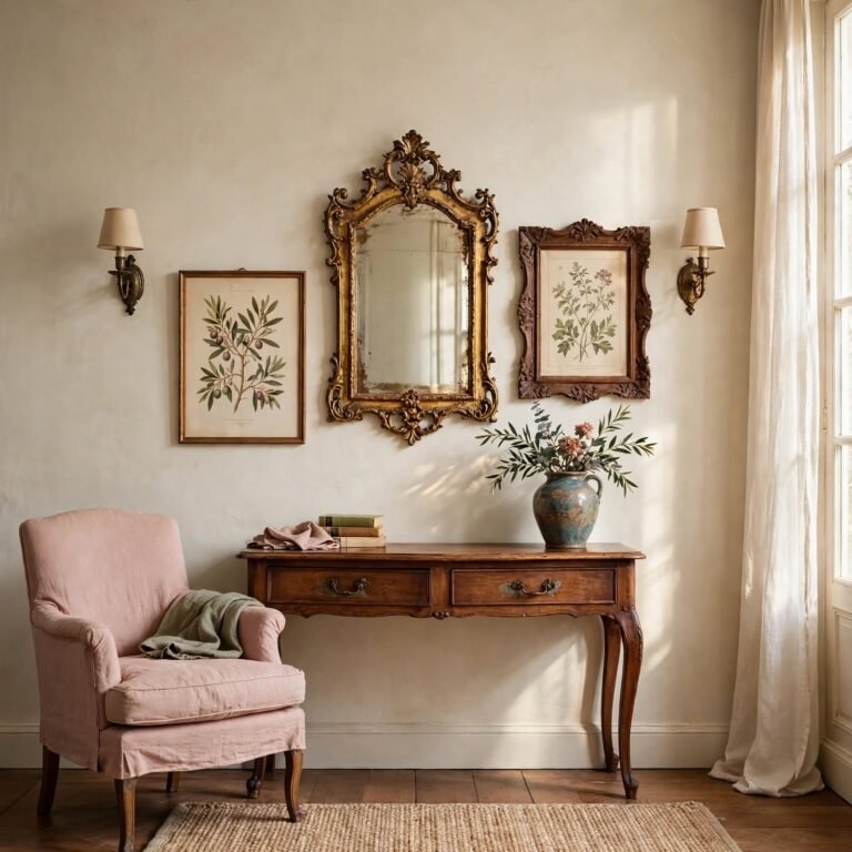
Deliberately combining two or three different frame finishes, such as wood, black metal, and brass, within a single gallery arrangement creates a curated, collected look rather than the more sterile appearance of an entirely matched set. Limiting the mix to two or three finishes, rather than an unlimited variety, keeps the combination feeling intentional instead of accidental. Repeating each chosen finish at least twice within the grouping helps establish a clear, readable pattern rather than one-off, random inclusions.
5. Repetition Pattern Wall Rhythm for Wall Decor Design
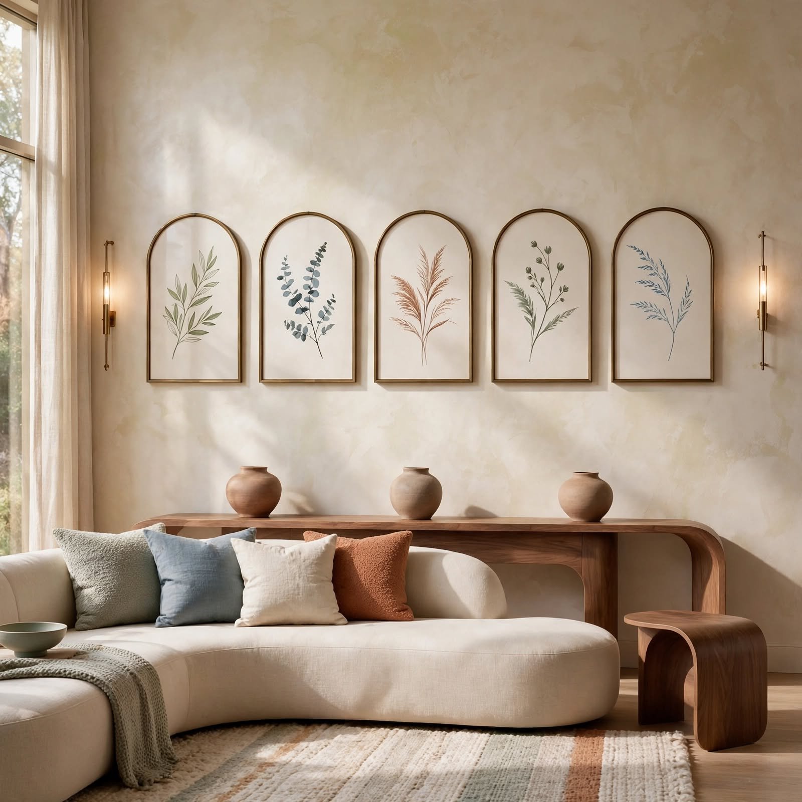
Repeating a single design element, like identical small frames, matching sconces, or a series of the same object, at consistent intervals along a wall creates a sense of rhythm that guides the eye smoothly across the space. This technique works particularly well in long hallways or above a large sofa, where a single object wouldn’t have enough presence to fill the space on its own. Maintaining exact, measured spacing between each repeated element is essential for the rhythm to read as intentional rather than uneven.
6. High-Low Design Mixing for Wall Decor Design
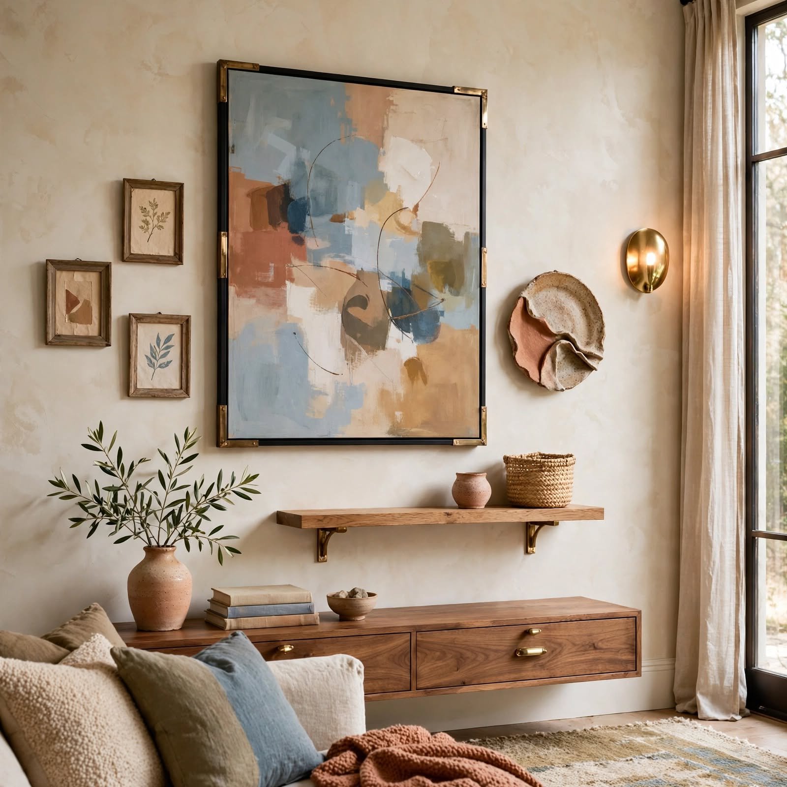
Pairing a higher-end, more expensive piece of wall decor with a more affordable, lower-cost item creates a room that feels curated over time rather than purchased all at once from a single budget tier. This technique mirrors how many professionally designed rooms are actually assembled, balancing a splurge item with more accessible surrounding pieces. Choosing the higher-end piece as the room’s clear focal point, with lower-cost items playing a supporting role, keeps the mix feeling deliberate rather than mismatched.
7. Vertical Line Emphasis Technique for Wall Decor Design
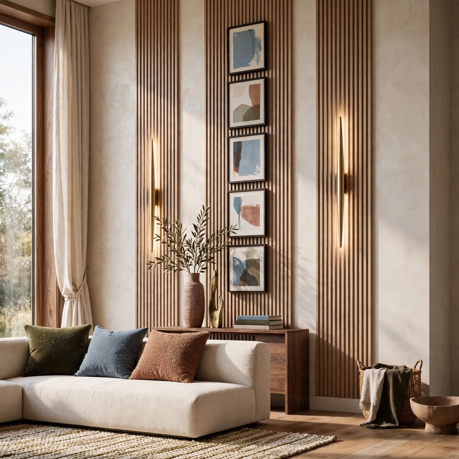
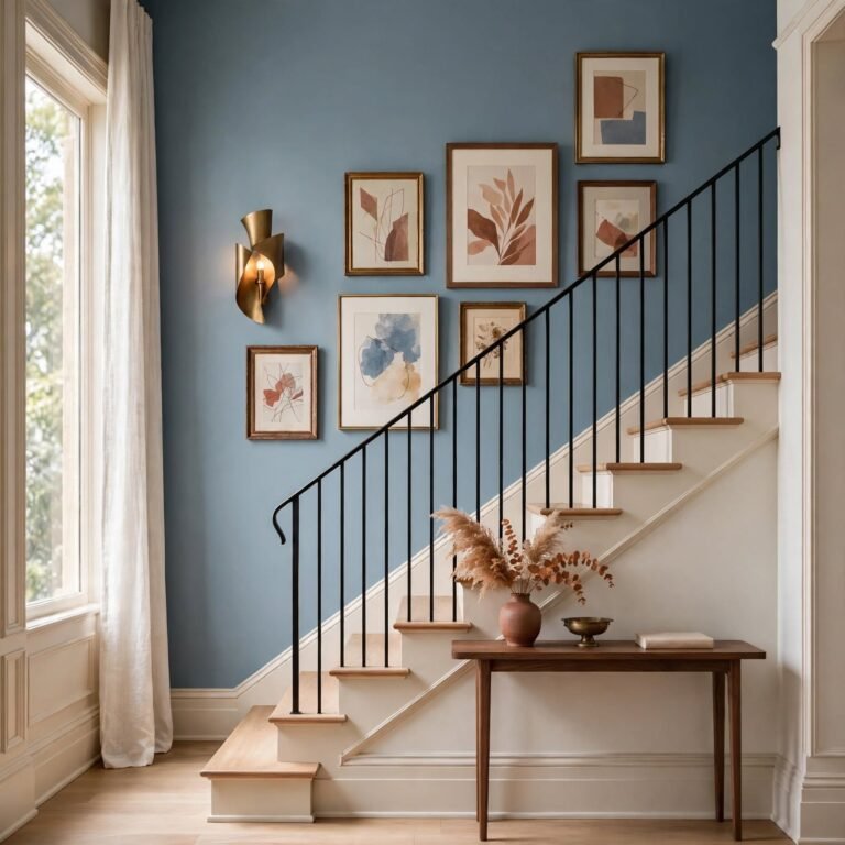
Arranging art, shelving, or a mirror in a tall, narrow vertical grouping draws the eye upward, a technique that makes a room with lower ceilings feel taller than its actual dimensions. This works particularly well in narrow hallway walls or beside a doorway, where a wide horizontal arrangement wouldn’t fit the available space anyway. Choosing frames with a portrait orientation, rather than landscape, reinforces this vertical emphasis further.
8. Warm-Cool Tone Balancing for Wall Decor Design
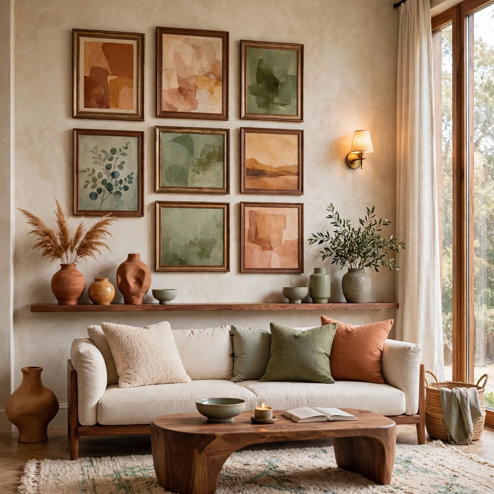
Deliberately balancing warm-toned wall decor, like wood or brass, against cool-toned elements, like a gray-based artwork or chrome frame, prevents a room from leaning too far in either temperature direction. This technique requires identifying the room’s dominant undertone first, then choosing an accent in the opposite temperature family to create balance rather than a jarring clash. A roughly seventy-thirty ratio, favoring the room’s dominant tone with a smaller opposing accent, tends to produce a more successful result than an even split.
To get inspired from hallway wall decor ideas, CLICK HERE.
9. Layered Depth Wall Trick for Wall Decor Design

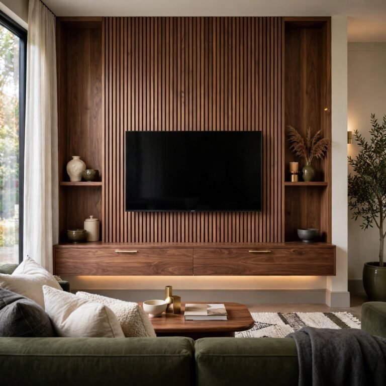
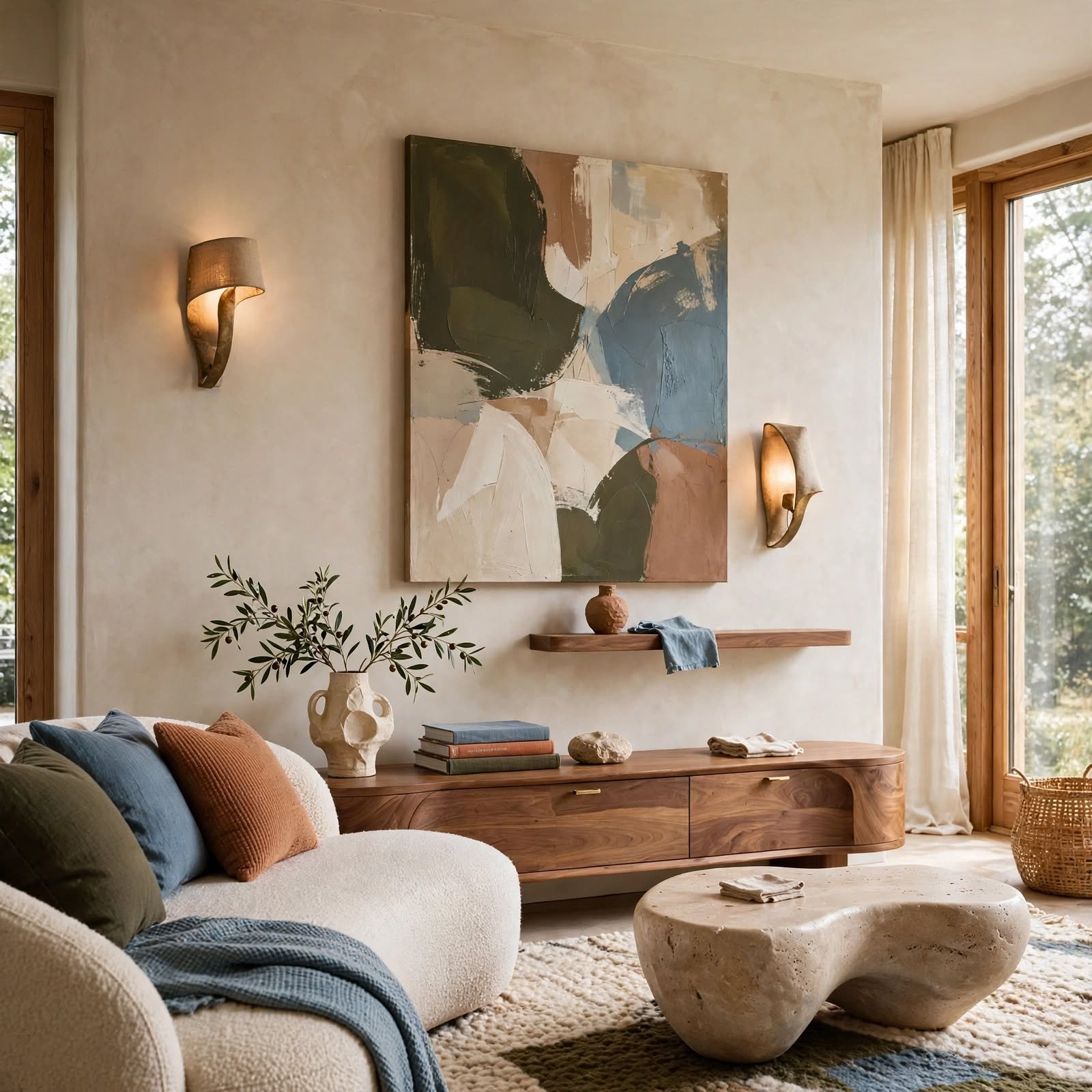
Combining flat wall art with at least one three-dimensional element, like a floating shelf, a sconce, or a piece of sculptural decor, adds physical depth that a wall covered only in flat frames can’t achieve. This technique works particularly well when the dimensional piece is positioned to cast a visible shadow, adding another layer of depth beyond the object itself. Placing the three-dimensional element off-center within a larger flat art arrangement tends to create the most dynamic composition.
10. Eye-Level Hanging Standard for Wall Decor Design
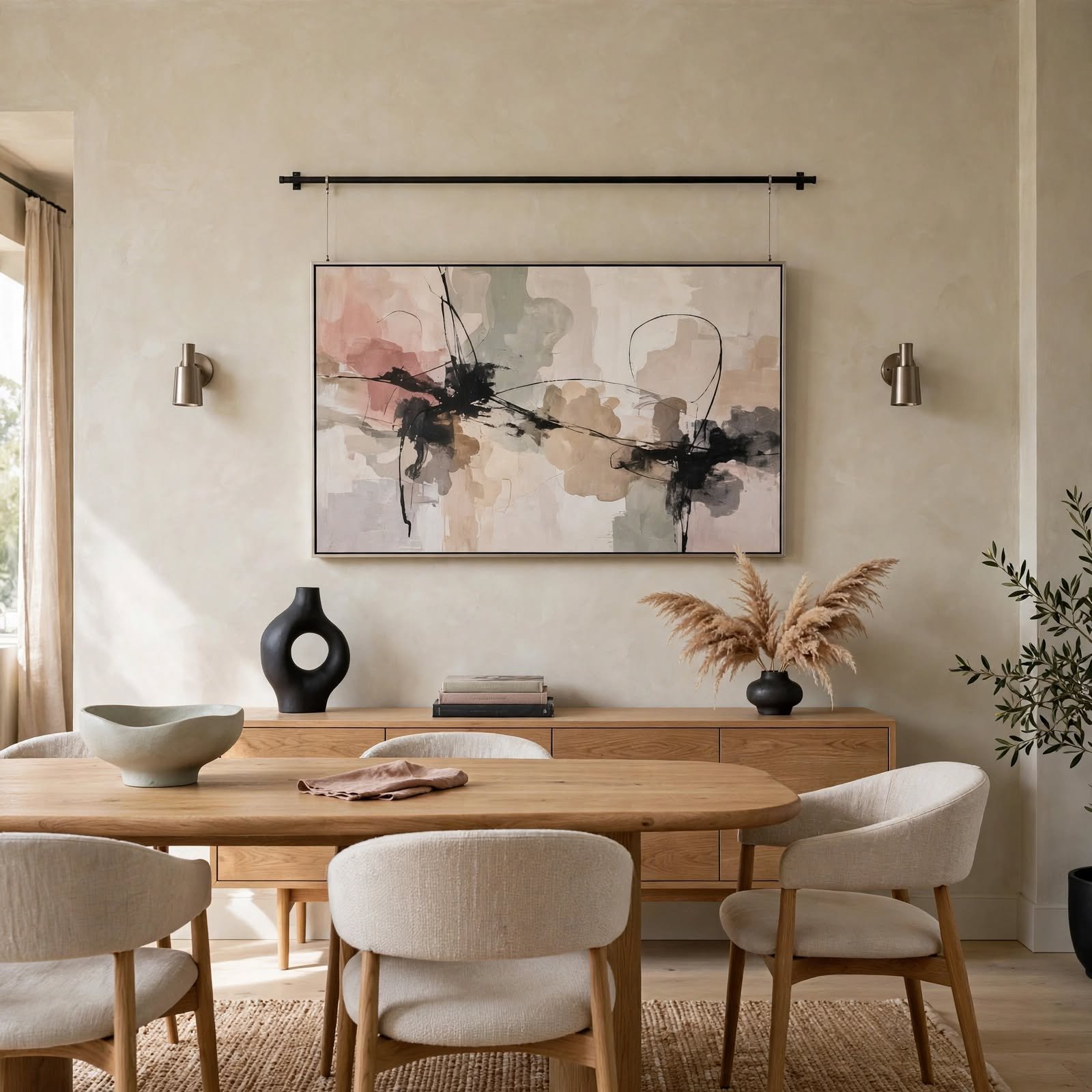
Hanging the center of a piece of art at a standard eye level, generally around fifty-seven inches from the floor, is the design industry’s most widely used guideline for individual pieces, though the specific number shifts slightly depending on context. The table below breaks down common adjustments to this standard.
| Context | Recommended Center Height | Reasoning |
| Standalone wall art | 57″ from floor | Standard adult eye level |
| Above a sofa or bed | 6″ to 8″ above furniture | Keeps art connected to furniture below |
| In a hallway | 60″ to 62″ from floor | Accounts for typical walking sightline |
11. Textural Contrast Pairing for Wall Decor Design
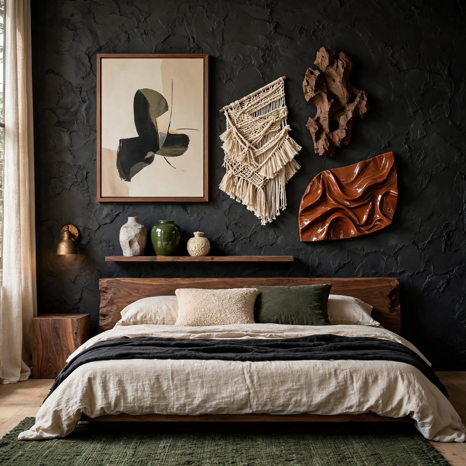
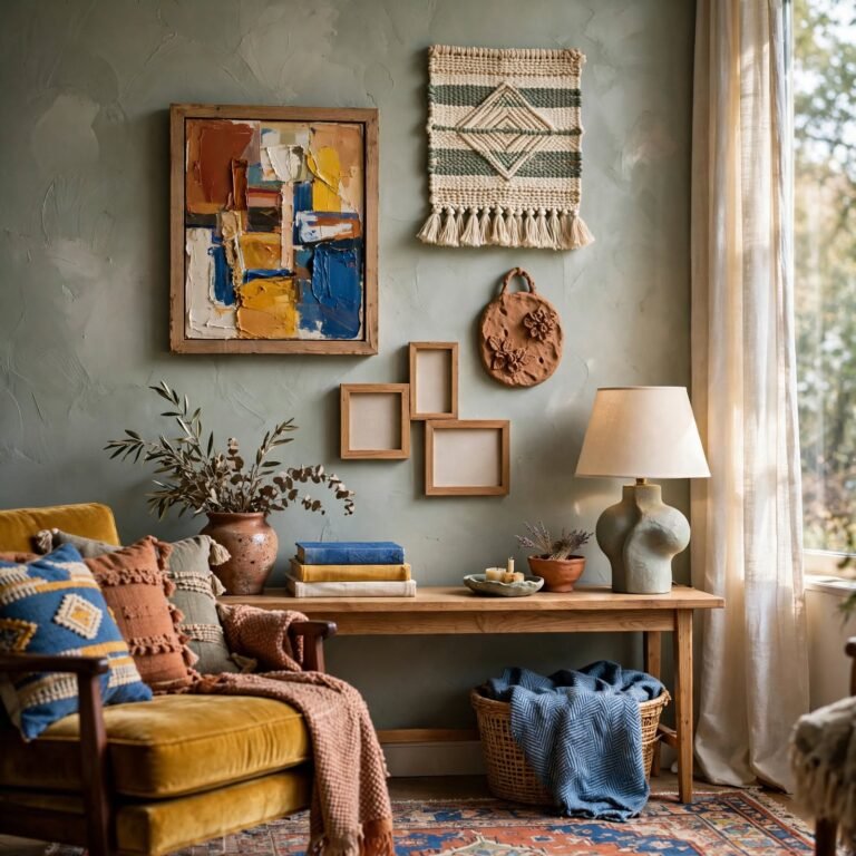
Placing a smooth, glossy surface, like a lacquered frame or a glass-front piece, next to a rougher, matte texture, like woven fiber or unfinished wood, creates visual interest through contrast rather than relying solely on color or pattern differences. This technique works well even within a otherwise monochromatic color scheme, since the textural variation alone provides enough visual interest to keep the wall from feeling flat. Limiting the contrast to two distinct textures, rather than several competing ones, keeps the pairing feeling intentional.
12. Monochromatic Wall Zone for Wall Decor Design
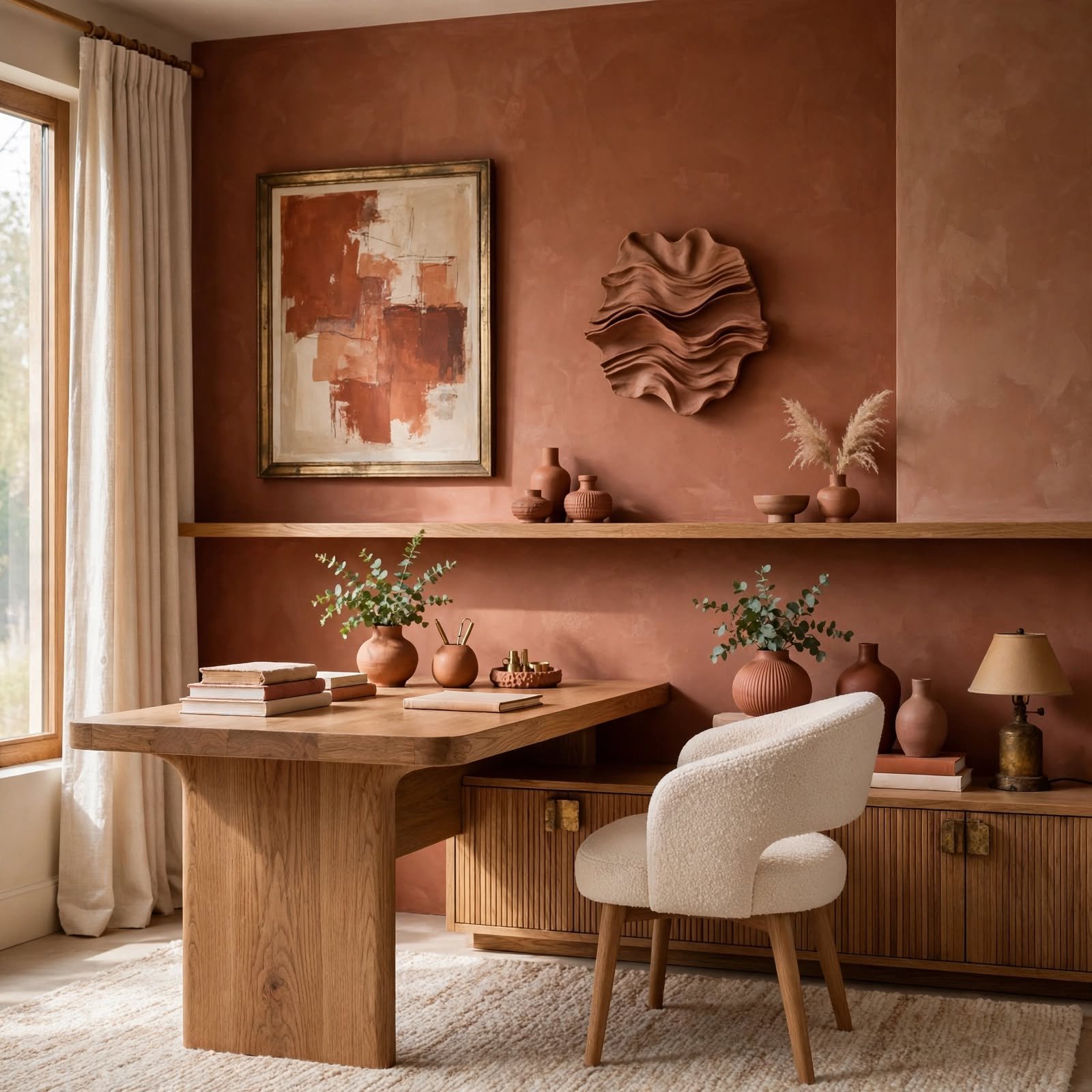
Dedicating a specific wall section to decor entirely within a single color family, varying only in shade and material, creates a cohesive zone that reads as a deliberate design statement rather than a random collection. This technique relies heavily on texture variation to prevent the limited color range from feeling flat, similar to techniques used in monochromatic room palettes more broadly. Choosing at least three distinct value levels within the chosen color, from light to dark, adds enough contrast to keep the zone visually engaging.
13. Framed Negative Space Trick for Wall Decor Design
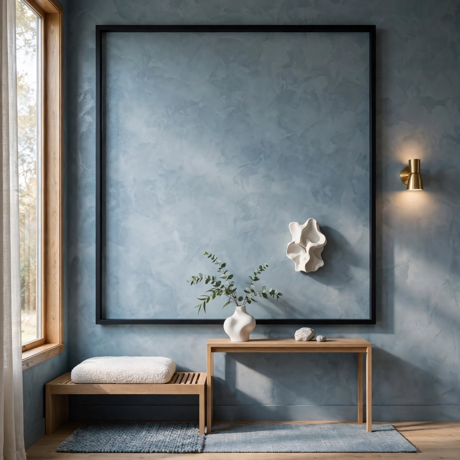
Deliberately leaving generous empty wall space around a single, smaller piece of art, rather than filling that space with additional decor, actually draws more attention to the piece by giving it visual breathing room. This technique runs counter to the instinct to fill every available inch of wall space, but it’s a common strategy in more minimalist or gallery-inspired design approaches. Choosing this technique works best when the single piece is genuinely a strong focal point capable of holding attention on its own.
14. Asymmetrical Balance Layout for Wall Decor Design
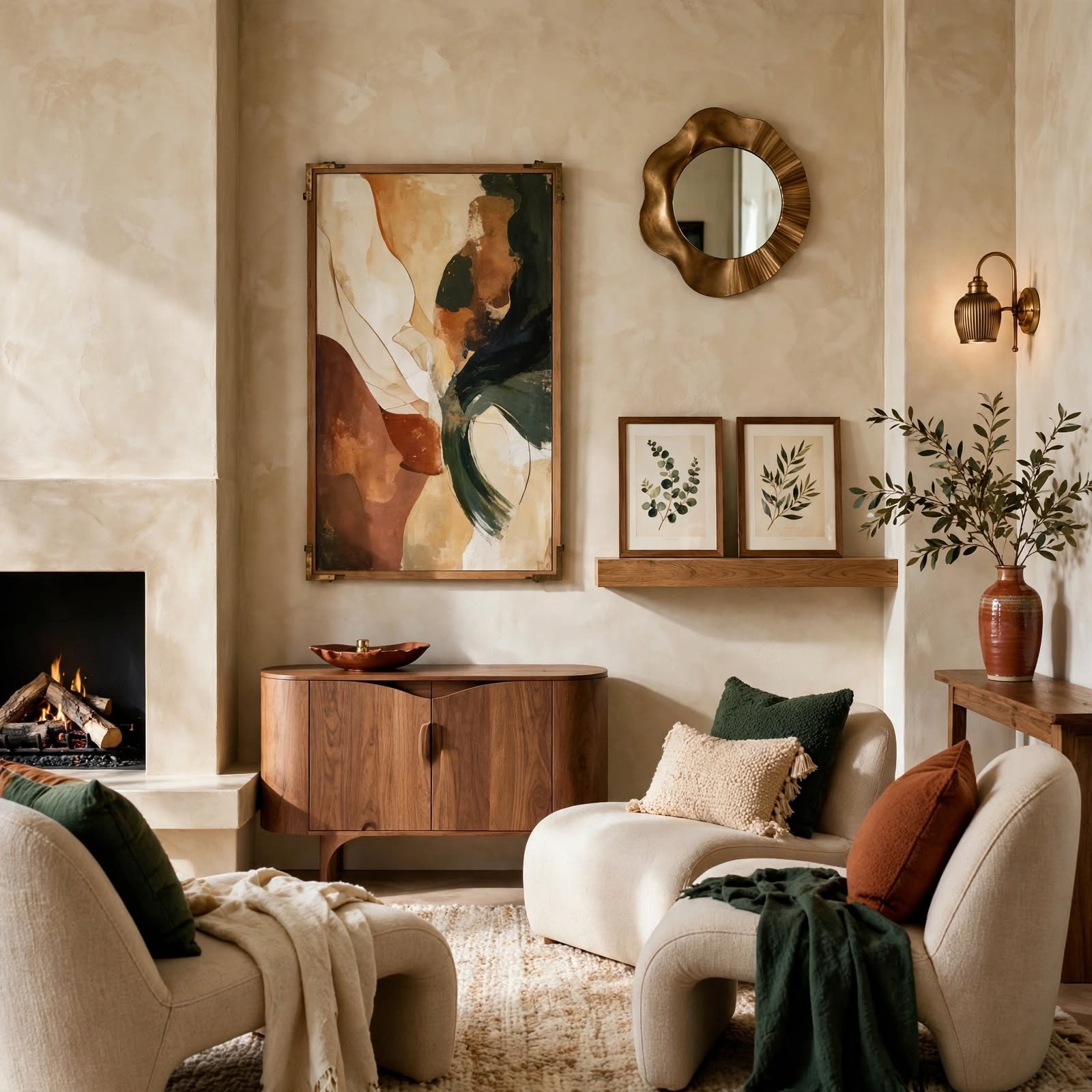
Arranging decor of varying sizes and shapes so that the overall visual weight feels balanced from side to side, without requiring identical or mirrored placement, achieves a more dynamic composition than strict symmetry. This technique often involves placing one larger, heavier-looking piece on one side, balanced by two or three smaller pieces grouped together on the other side. Stepping back frequently during the arrangement process helps gauge whether the overall visual weight actually feels balanced rather than lopsided.
15. Sightline Continuity Design for Wall Decor Design
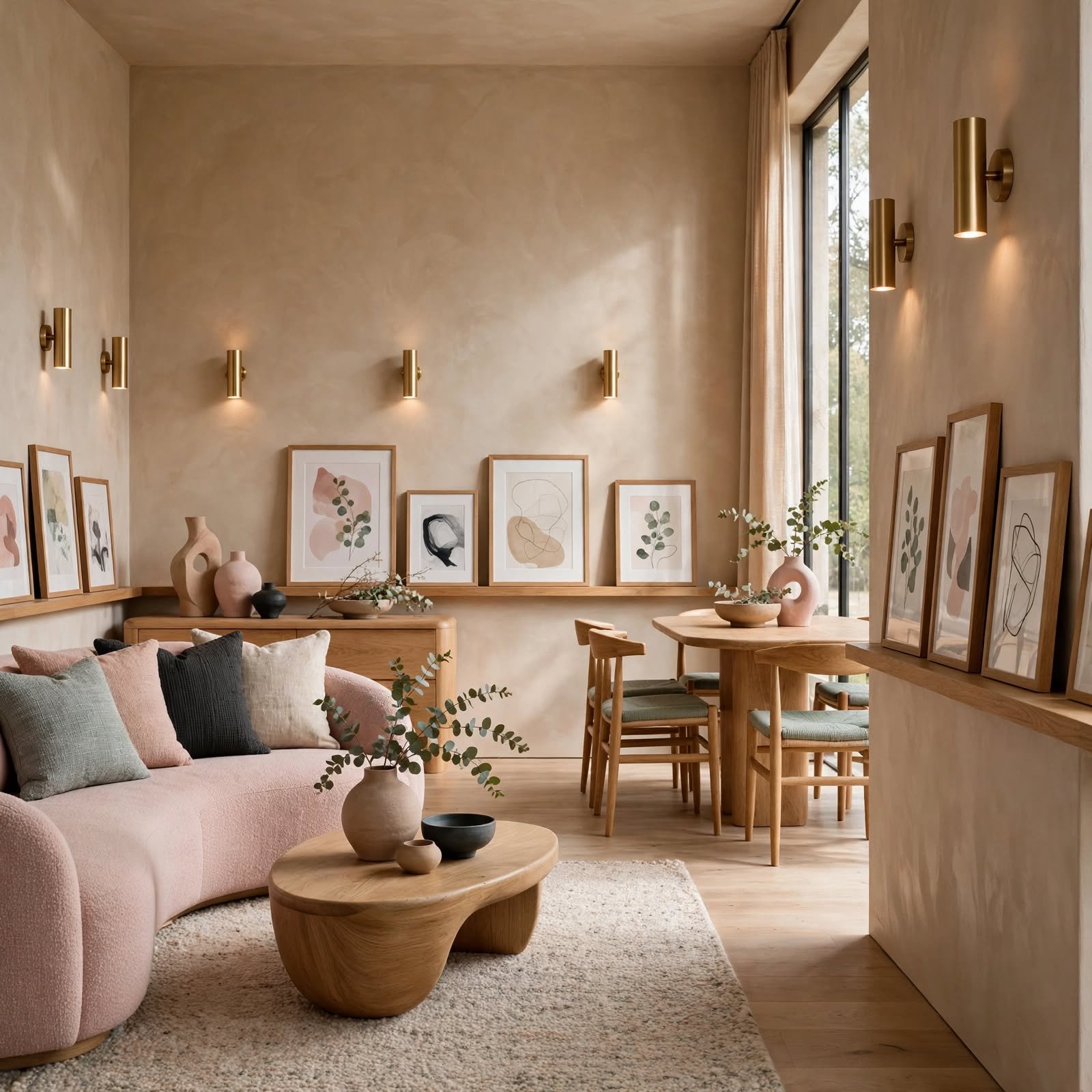
Considering what’s visible from adjacent rooms or hallways when planning wall decor in a specific room helps ensure the overall home feels cohesive as someone moves through it, rather than each room existing in visual isolation. This technique involves standing in doorways and hallways to assess which walls are actually seen from those vantage points before finalizing decor plans. Choosing complementary, though not necessarily identical, colors and styles across these connected sightlines produces a smoother overall flow through the home.
16. Accent Wall Placement Strategy for Wall Decor Design
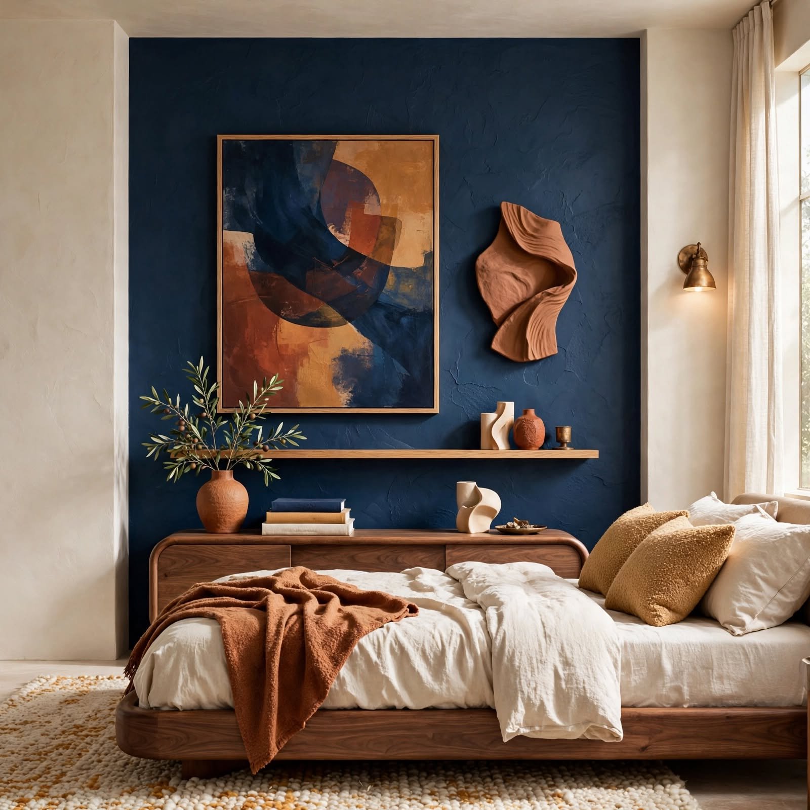
Choosing which wall in a room becomes the accent wall matters as much as the treatment itself, with the wall first seen upon entering the room or the wall behind the primary furniture piece generally serving as the strongest candidates. Avoiding an accent treatment on a wall interrupted by multiple doors or windows keeps the treatment from feeling fragmented. This strategic wall selection, more than any specific paint color or material choice, often determines whether an accent wall reads as successful.
17. Two-Thirds Wall Coverage Guide for Wall Decor Design
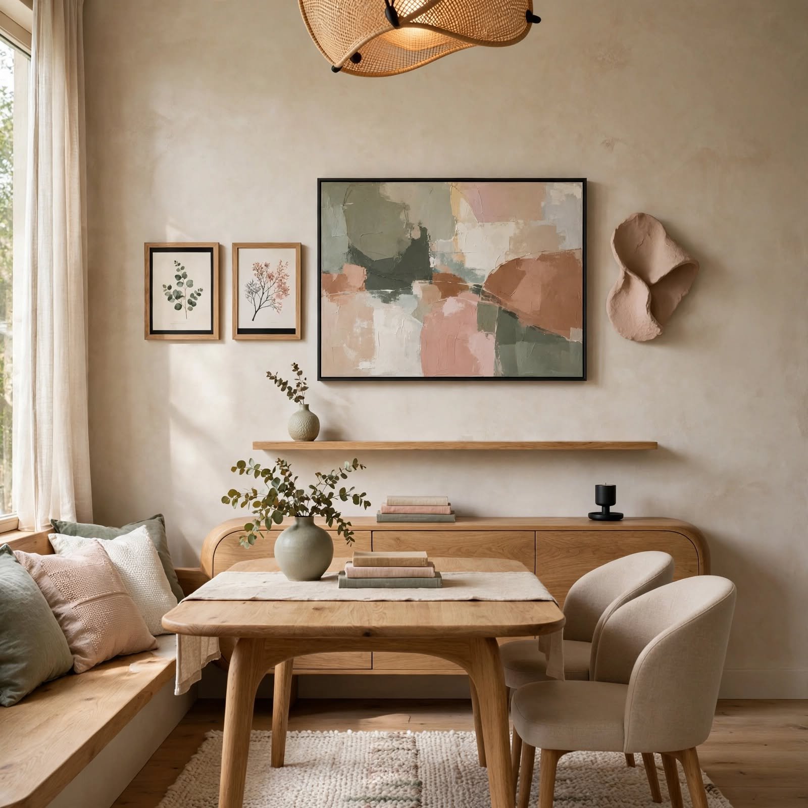
Beyond the furniture-relative sizing rule, a broader guideline suggests keeping decorated wall coverage to roughly two-thirds of a wall’s total height and width, leaving the remaining third as breathing room around the edges. This prevents a wall from feeling either sparse, when coverage falls well short of this ratio, or overcrowded, when decor extends too close to the ceiling, floor, or adjacent walls. Measuring the wall’s full dimensions before planning a larger decor arrangement helps keep this ratio in mind from the start.
18. Directional Lighting Wash for Wall Decor Design
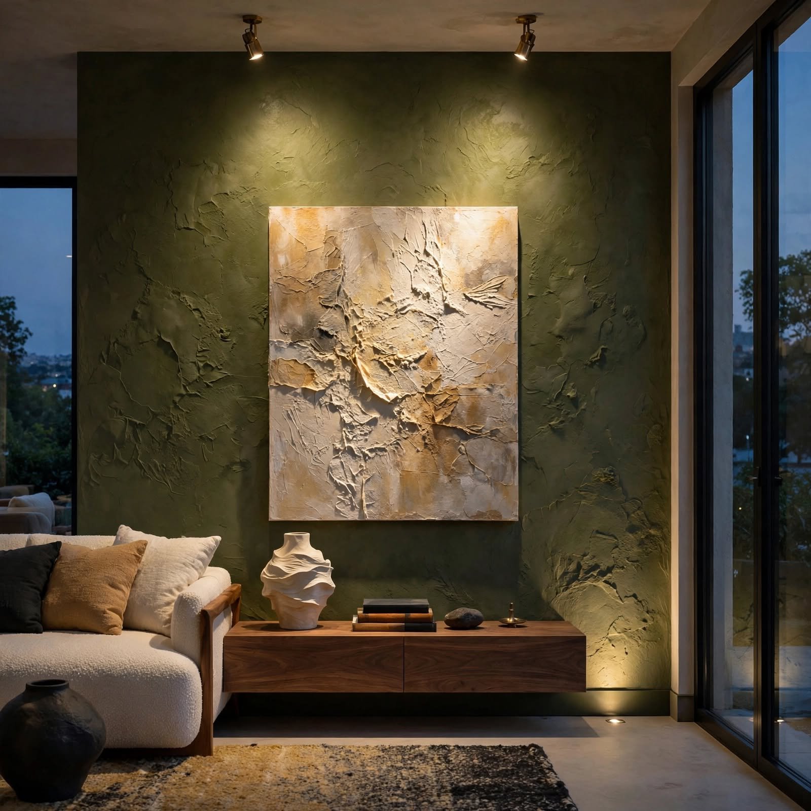
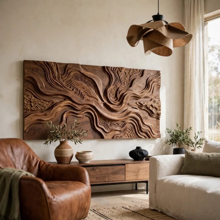
Positioning a light source, whether a picture light, a floor lamp, or track lighting, to wash light directly across a textured wall surface emphasizes shadow and depth that flat, even lighting would otherwise flatten out. This technique works particularly well for textured art, like plaster pieces or dimensional wall panels, where the play of light and shadow is a key part of the visual interest. Angling the light source slightly, rather than positioning it directly straight-on, tends to create more dramatic and visible shadow definition.
Shop the Look
A handful of tools support these wall decor design techniques and are worth having on hand when planning a room. A laser level helps maintain precise, consistent spacing for repetition-based arrangements, and a roll of painter’s tape allows for testing layouts before committing to nail holes. A picture light or small directional lamp supports the lighting wash technique for textured art, and a tape measure is essential for applying the scale-to-wall proportion rule accurately. A mix of frame finishes, such as wood, black metal, and brass, on hand ahead of time supports the mixed frame curation technique.
Common Mistake to Avoid
A common mistake when applying wall decor design principles is following a single rule in isolation without considering how it interacts with the others, such as achieving perfect eye-level height while ignoring whether the piece is proportionally sized for the wall. These techniques generally work best applied together, since a well-placed but undersized piece of art can still look off despite correct hanging height. Stepping back to evaluate the overall composition against several principles at once, rather than checking off a single rule, produces a more genuinely successful result.
Frequently Asked Questions
What is the most important wall decor design rule to learn first?
The scale-to-wall proportion rule, covering roughly two-thirds of the available wall or furniture width with art or a decor grouping, is generally the most useful wall decor design principle to learn first, since incorrect scale is one of the most common and most visually noticeable mistakes. Once this proportion feels intuitive, techniques like eye-level hanging and repetition rhythm become easier to layer on top of a properly scaled foundation. Measuring before purchasing or arranging any wall decor helps put this rule into practice immediately.
Is color drenching a passing trend or a lasting design technique?
Color drenching has shown more staying power than many single-season color trends, since the underlying principle, removing visual breaks between wall, trim, and ceiling, produces a cohesive effect regardless of which specific color gets used. This makes the technique itself more durable than any one particular shade currently in fashion. Choosing a color with more timeless appeal, rather than the most trend-driven shade of a given year, helps a color-drenched room stay relevant for longer.
How do I know if my gallery wall arrangement is properly balanced?
Photographing the arrangement and viewing it as a flattened image can help reveal whether the visual weight is properly balanced from side to side, since it’s sometimes easier to spot an imbalance in a photo than when standing directly in front of the actual wall. Squinting at the arrangement in person, which blurs out the specific details and leaves only the general shapes and darkness levels, is another practical trick for assessing balance. If one side consistently draws the eye more strongly than the other, adjusting the placement or size of a piece on the lighter side usually helps correct the imbalance.
Can these wall decor design principles work with an already-decorated room?
Yes, most of these techniques can be applied to an already-decorated room by rearranging or making small adjustments to existing pieces, rather than requiring an entirely new purchase. Evaluating an existing gallery wall against the scale and spacing rules, for example, might simply mean adding or removing a piece to bring the coverage back toward the recommended ratio. Applying these principles as an audit of the current setup, rather than starting from a blank wall, is often the more practical use case for most people.
Do these wall decor design techniques apply the same way in every room?
While the underlying principles remain consistent, their specific application shifts depending on the room’s function and existing architecture, such as a hallway benefiting more from vertical emphasis and repetition, while a living room might rely more heavily on focal point anchoring around a sofa. Adjusting a technique’s specific execution to fit a room’s actual purpose and layout tends to produce better results than applying it identically everywhere. Considering the room’s typical viewing distance and sightlines also affects which techniques will read most effectively in that particular space.
Conclusion
These eighteen wall decor design ideas focus on transferable technique and principle, from color drenching to proportion rules, that can be applied across nearly any room rather than relying on a single specific product purchase. Learning a handful of these core principles and applying them together tends to produce more consistently successful walls than following any single rule in isolation. Save this guide to Pinterest for later reference, and check out the related gallery wall and color palette posts for more ideas.