17 Modern Color Palette Design Ideas for Cohesive Interiors
A room rarely fails because someone chose an ugly color it fails because the colors weren’t planned to work together in the first place. This guide covers seventeen approaches to color palette design for living rooms, bedrooms, and full-home schemes, from ratio-based planning to undertone matching and lighting considerations. You’ll learn how professional designers structure a palette before buying paint or furniture, how to test colors accurately in your own space, and the one mistake that causes most DIY palettes to feel disjointed.
Trend & Background
Color palette design has shifted away from single-color trend chasing the all-white kitchen, the millennial-gray living room toward layered, personal palettes built around three or more colors working in ratio together. This matters now because paint and furniture options have expanded dramatically, and without a structural framework, more choice tends to produce more mismatched results rather than better ones. The renewed interest in maximalism and “collected” interiors has also made color confidence more mainstream, but it still requires an underlying system to avoid looking chaotic rather than intentional.
Key Takeaways
- Strong color palette design starts with an undertone strategy, not a list of favorite colors picked in isolation.
- The 60-30-10 ratio is the most reliable starting framework for balancing dominant, secondary, and accent colors in a room.
- Lighting direction and material finish change how the same color reads a table inside this guide breaks down warm versus cool light effects.
- Limiting a palette to three to five core colors keeps a room cohesive even as furniture and decor change over time.
1. The 60-30-10 Ratio
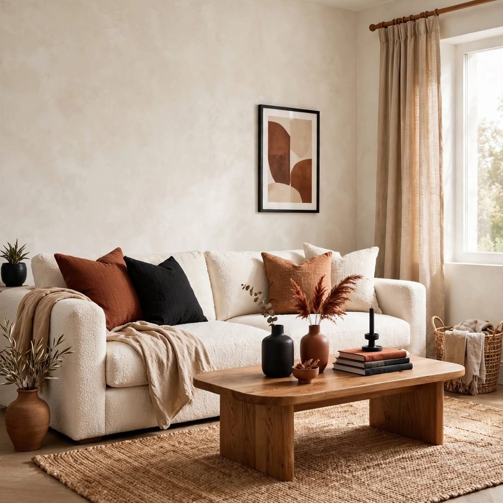
The 60-30-10 rule allocates 60 percent of a room to a dominant color, usually walls and large furniture, 30 percent to a secondary color for items like rugs or curtains, and 10 percent to an accent color used sparingly in pillows or art. This ratio prevents any single color from overwhelming the room while still giving the palette a clear hierarchy. Most rooms that feel unbalanced are missing this structure entirely, with all three color categories fighting for equal visual weight.
| Category | Percentage | Typical Elements |
| Dominant | 60% | Walls, large furniture |
| Secondary | 30% | Rugs, curtains, accent furniture |
| Accent | 10% | Pillows, art, small decor |
2. Warm Undertone Mapping
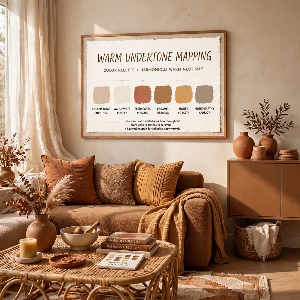
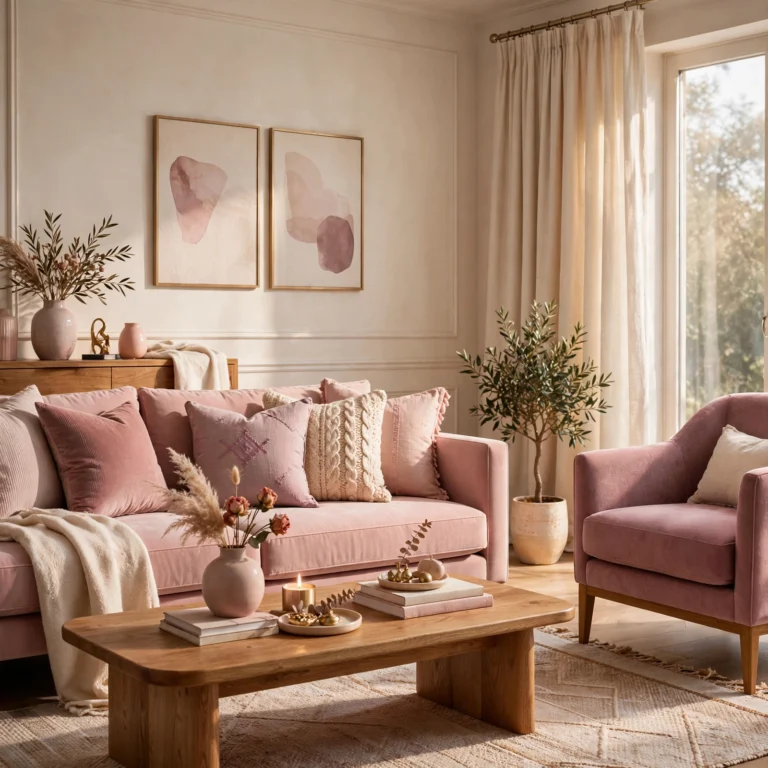
Warm undertone mapping means checking every color in a palette against a shared warm base yellow, orange, or red before combining them, since a warm red and a cool red will clash even though both are technically “red.” Lay paint chips or fabric swatches side by side in natural daylight to catch undertone mismatches early. This step matters most with neutrals, since a warm white and a cool white look nearly identical alone but visibly disagree once placed next to each other.
To see more summer color palette
3. Cool Undertone Mapping
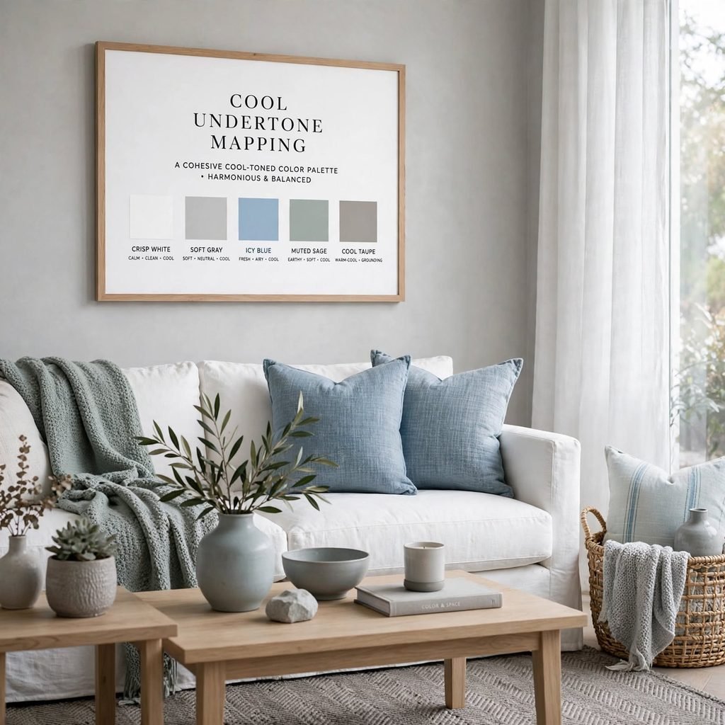
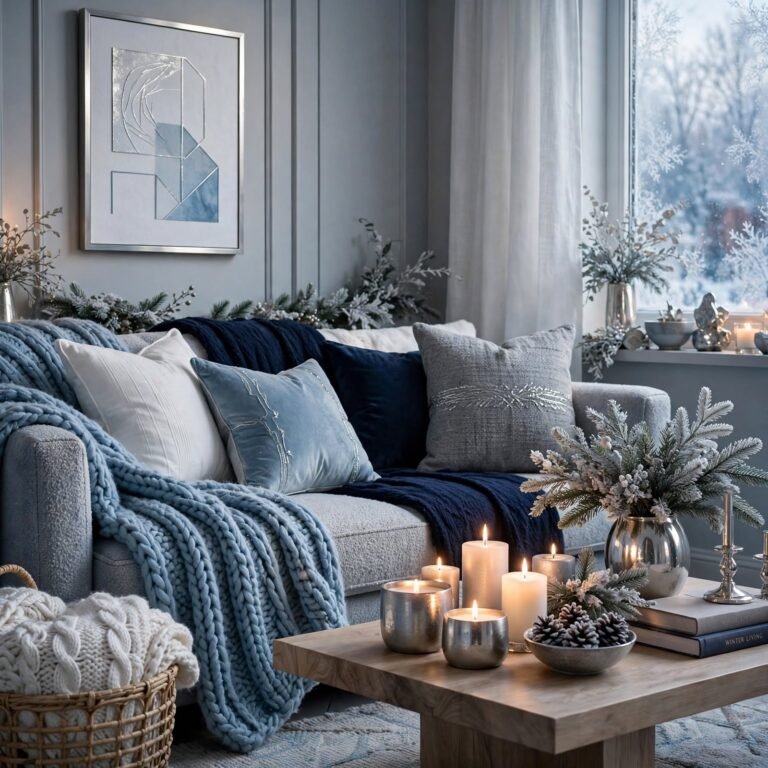
Cool undertone mapping follows the same logic as warm mapping but anchors the palette to blue, green, or purple undertones instead, which pairs naturally with materials like chrome, black metal, and marble. A palette built entirely on cool undertones tends to read as calm and modern, but it can feel sterile without at least one warm material, like a wood floor or a brass fixture, introduced as a grounding counterpoint.
4. Monochromatic Palette
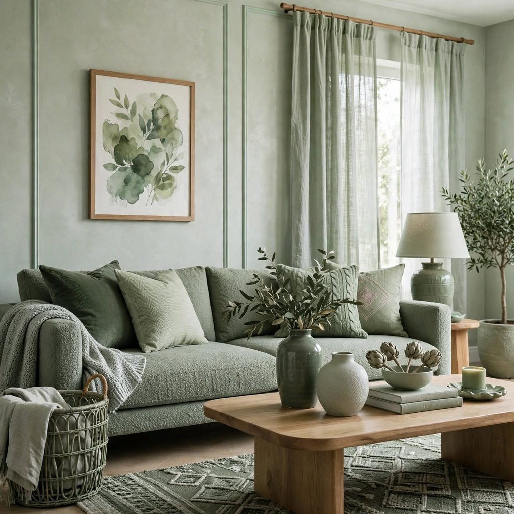
A monochromatic palette uses a single hue across multiple values, from a pale tint to a deep shade, relying entirely on texture and material contrast to keep the room visually interesting. This approach is lower-risk than mixing multiple hues since there’s no undertone clash to manage, but it requires more attention to texture variation matte versus glossy, smooth versus woven to avoid the room feeling flat.
5. Complementary Color Pairing
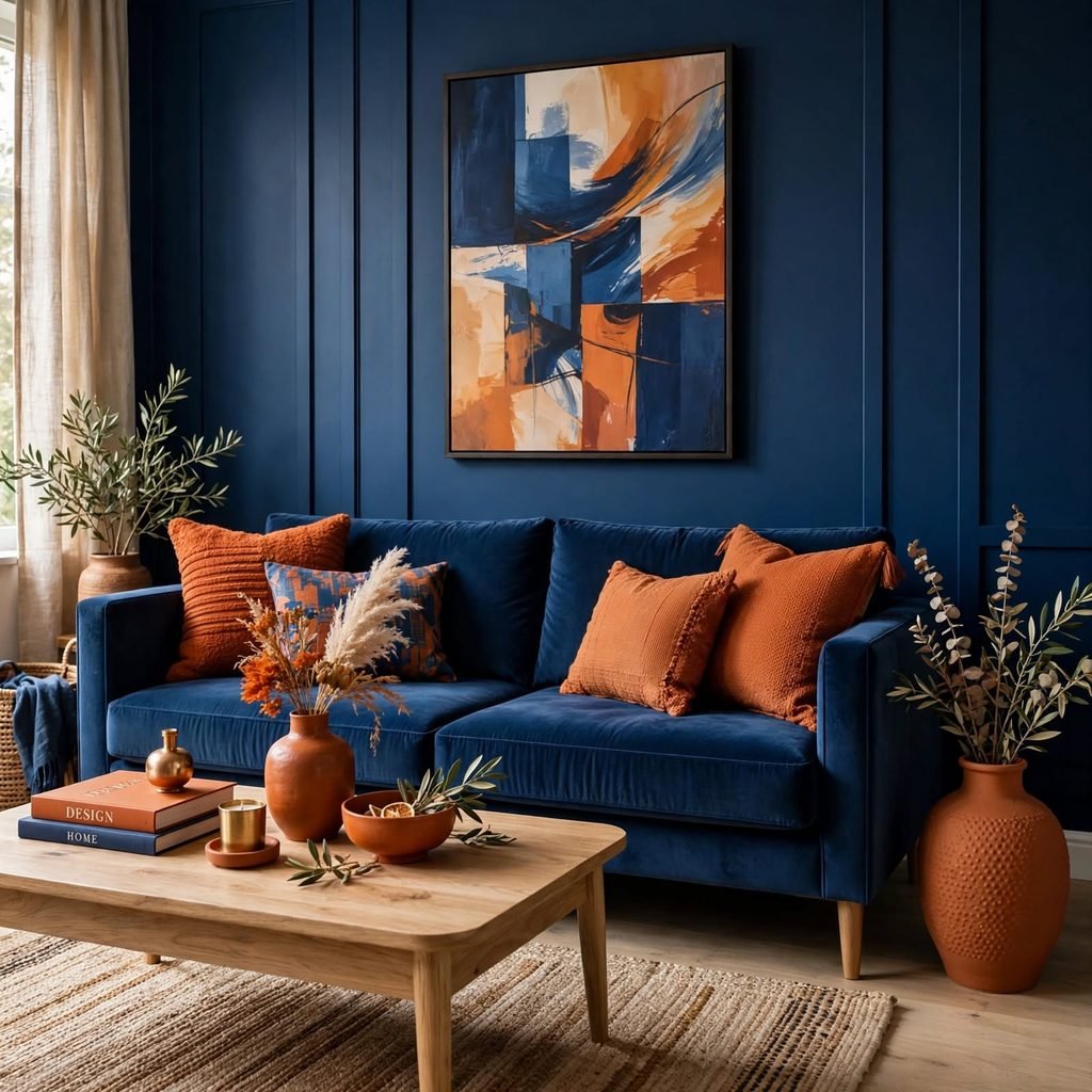
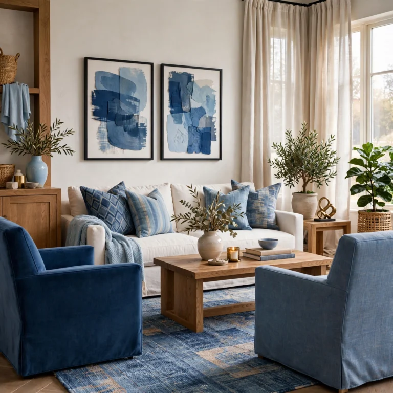
Complementary colors sit directly opposite each other on the color wheel, like blue and orange or green and red, and the contrast between them creates strong visual energy when used deliberately. This pairing works best when one complementary color dominates and the other is used only as an accent, since two complementary colors used in equal amounts tend to compete rather than balance each other.
6. Color Palette Design Moodboard
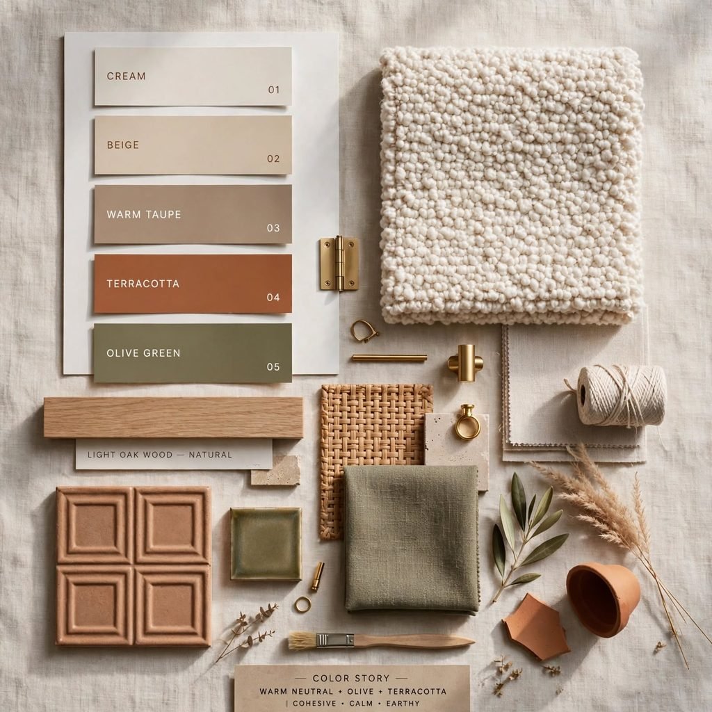
Building a full moodboard before finalizing a color palette design lets you test how every material, fabric, and paint color interacts before anything is purchased. Pull physical swatches rather than relying on screen colors, which shift depending on device calibration, and view the board in the actual room’s lighting at different times of day. This step catches undertone conflicts and value imbalances early, before a wall is painted or a large upholstered piece is ordered in the wrong tone.
7. Analogous Color Scheme
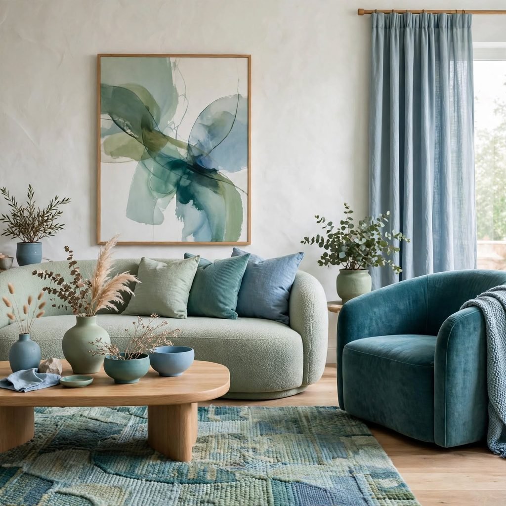
An analogous scheme pulls three colors that sit next to each other on the color wheel, like yellow, yellow-green, and green, which creates a naturally cohesive palette since the colors already share undertones. This approach works well for anyone nervous about mixing colors, since analogous combinations rarely clash, though the palette can read as flat without at least one higher-contrast accent color layered in.
8. Neutral Base With One Accent Color
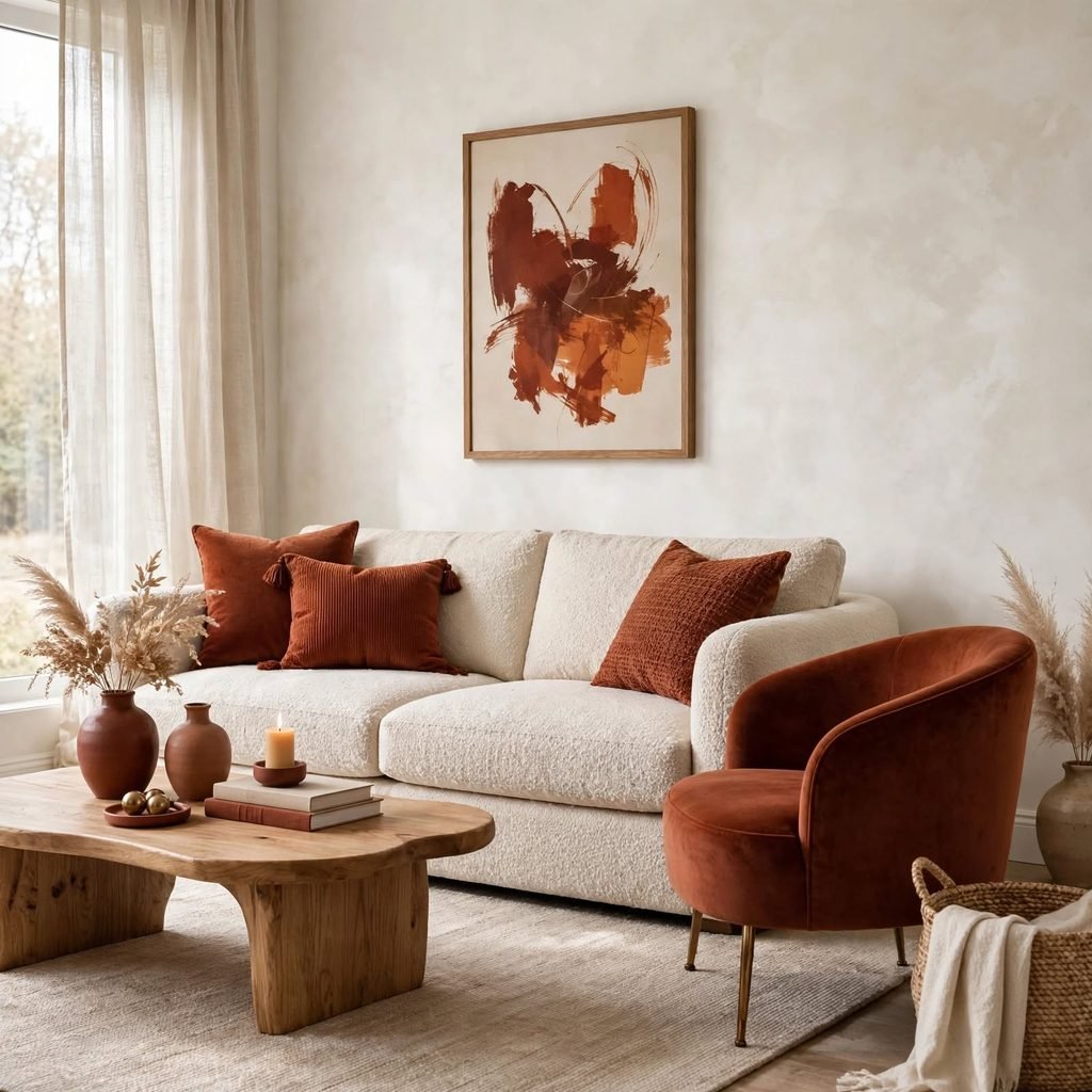
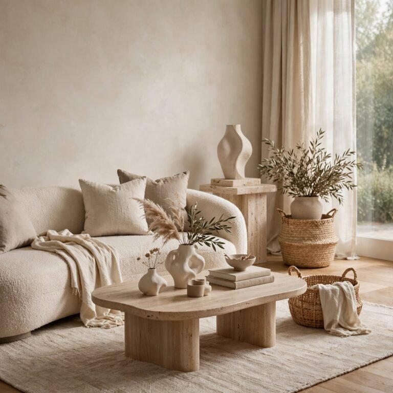
Building a palette from layered neutrals white, oatmeal, gray, black and introducing exactly one accent color keeps a room flexible and easy to update over time, since only the accent needs to change to refresh the space. This structure also makes larger investment pieces, like a sofa or rug, safer purchases, since they stay in the neutral base rather than the color likely to feel dated first.
9. 70/20/10 Alternate Ratio
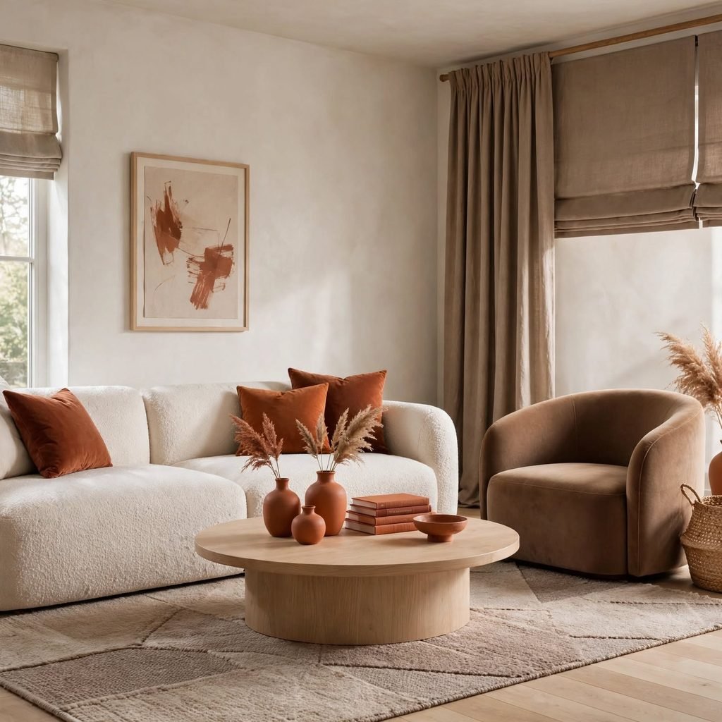
The 70/20/10 ratio shifts slightly from the standard 60-30-10 formula, giving the dominant color more visual weight and reducing the secondary color’s share, which works well in smaller rooms where too many competing colors can feel cluttered fast. This ratio is particularly useful in a small bedroom or home office where wall space dominates the room and there’s less square footage for a strong secondary color to show up meaningfully.
| Ratio Type | Best Room Type | Dominant Share |
| 60-30-10 | Living rooms, larger spaces | 60% |
| 70-20-10 | Small bedrooms, offices | 70% |
| 50-30-20 | Maximalist or eclectic rooms | 50% |
10. Split-Complementary Scheme
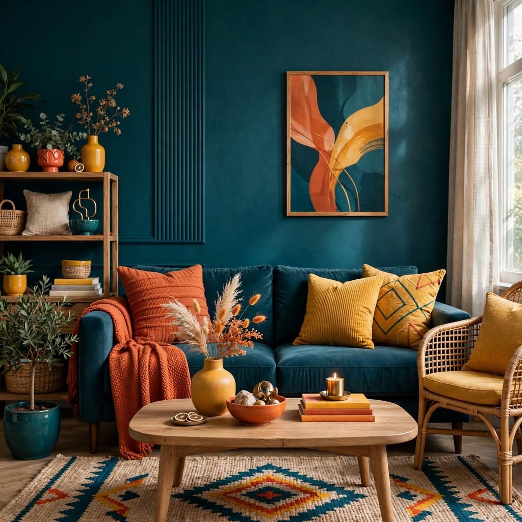
A split-complementary palette takes one base color and pairs it with the two colors adjacent to its direct complement, rather than the complement itself, which softens the contrast while still keeping visual energy in the room. This scheme gives more flexibility than a strict complementary pairing and tends to be easier to balance across furniture, walls, and textiles without one color overwhelming the others.
11. Triadic Color Scheme
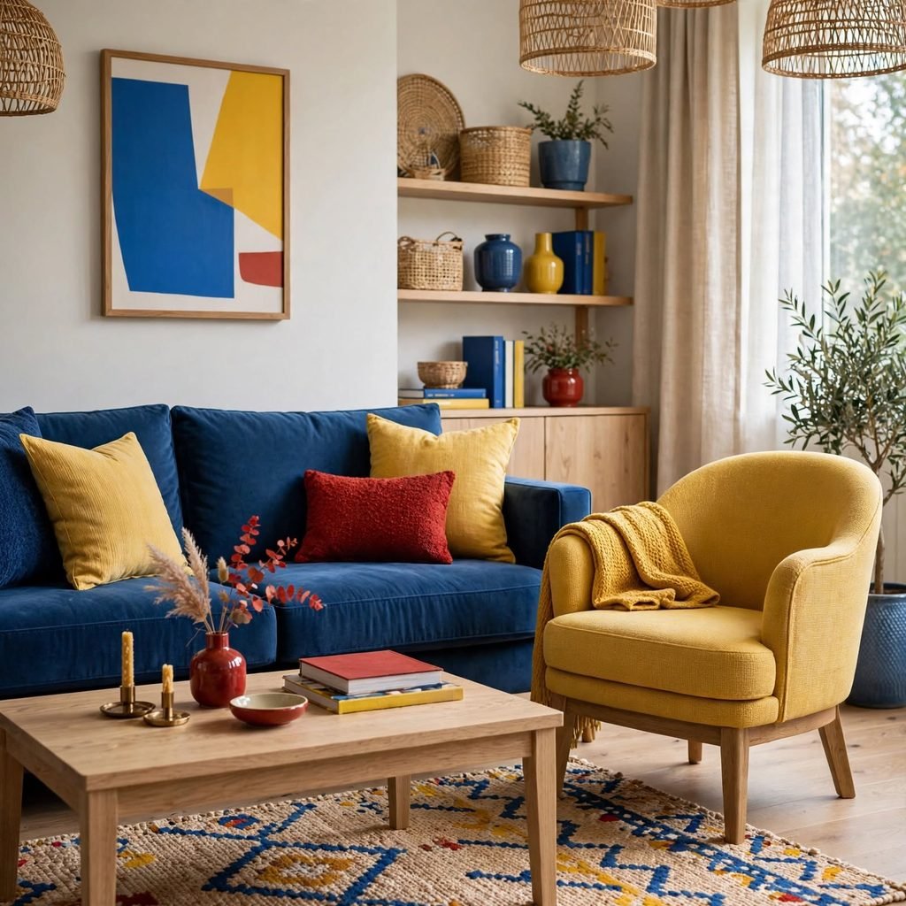
A triadic palette selects three colors evenly spaced on the color wheel, which creates a vibrant but still balanced combination when one color is allowed to dominate and the other two are used in smaller doses. This scheme works well for playful spaces like a kids’ room or a creative studio, but it requires more discipline in a living room or bedroom to avoid the palette feeling busy rather than considered.
12. Lighting-Adjusted Palette Testing
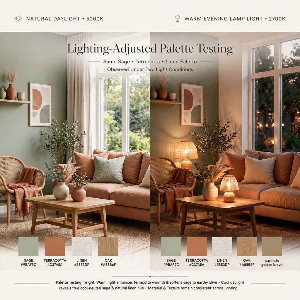
The same paint color can look distinctly different under morning daylight, afternoon sun, and warm evening lamp light, so testing large swatches on the actual wall across a full day is a necessary step before committing to any color palette design. Rooms with primarily north-facing light tend to read cooler and benefit from warmer paint choices to compensate, while south-facing rooms handle cooler tones better since they already receive warmer natural light.
| Light Direction | Natural Light Tone | Recommended Paint Adjustment |
| North-facing | Cool, blue-toned | Choose warmer paint shades |
| South-facing | Warm, golden | Cooler tones read well |
| East-facing | Warm morning, cool evening | Mid-tone, balanced undertones |
| West-facing | Cool morning, warm evening | Mid-tone, balanced undertones |
13. Material-Led Palette Building
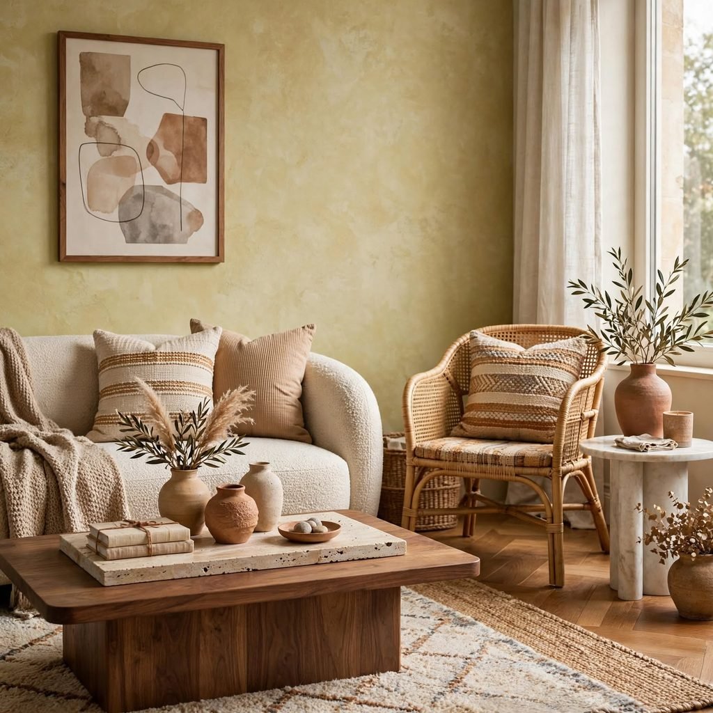
Instead of starting with paint, this approach starts with a fixed material already in the room a wood floor, a stone countertop, a tile backsplash and builds the color palette design around matching that material’s undertone. This method works especially well in kitchens and bathrooms, where expensive fixed materials can’t easily be changed, and it prevents the common mistake of choosing a paint color that clashes with an existing floor or counter.
14. Seasonal Rotation Palette
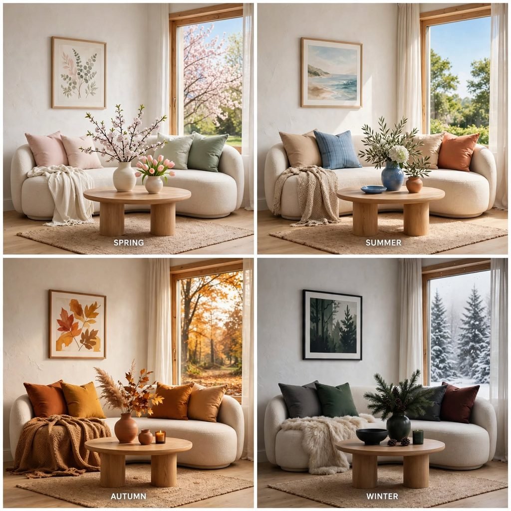
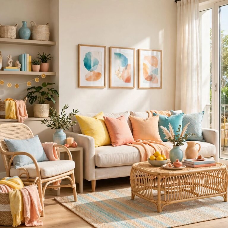
A seasonal rotation palette keeps the core wall and furniture colors neutral year-round and shifts only the accent layer pillows, throws, small decor with the seasons, which keeps redecorating costs low while still refreshing the room’s feel several times a year. This approach pairs naturally with the neutral-base-plus-accent method, since the accent slot is already designed to be the most replaceable part of the palette.
15. High-Contrast Two-Tone Scheme
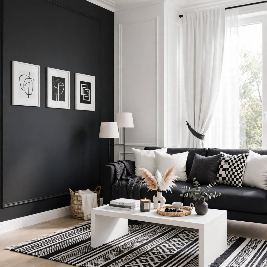
A high-contrast scheme pairs a very light color with a very dark one, like white and charcoal or cream and black, relying on value contrast rather than hue variety to create visual interest. This approach reads as modern and graphic, and it works particularly well in kitchens and bathrooms where cabinetry and tile create natural, defined color-blocking opportunities.
16. Earth-Tone Palette
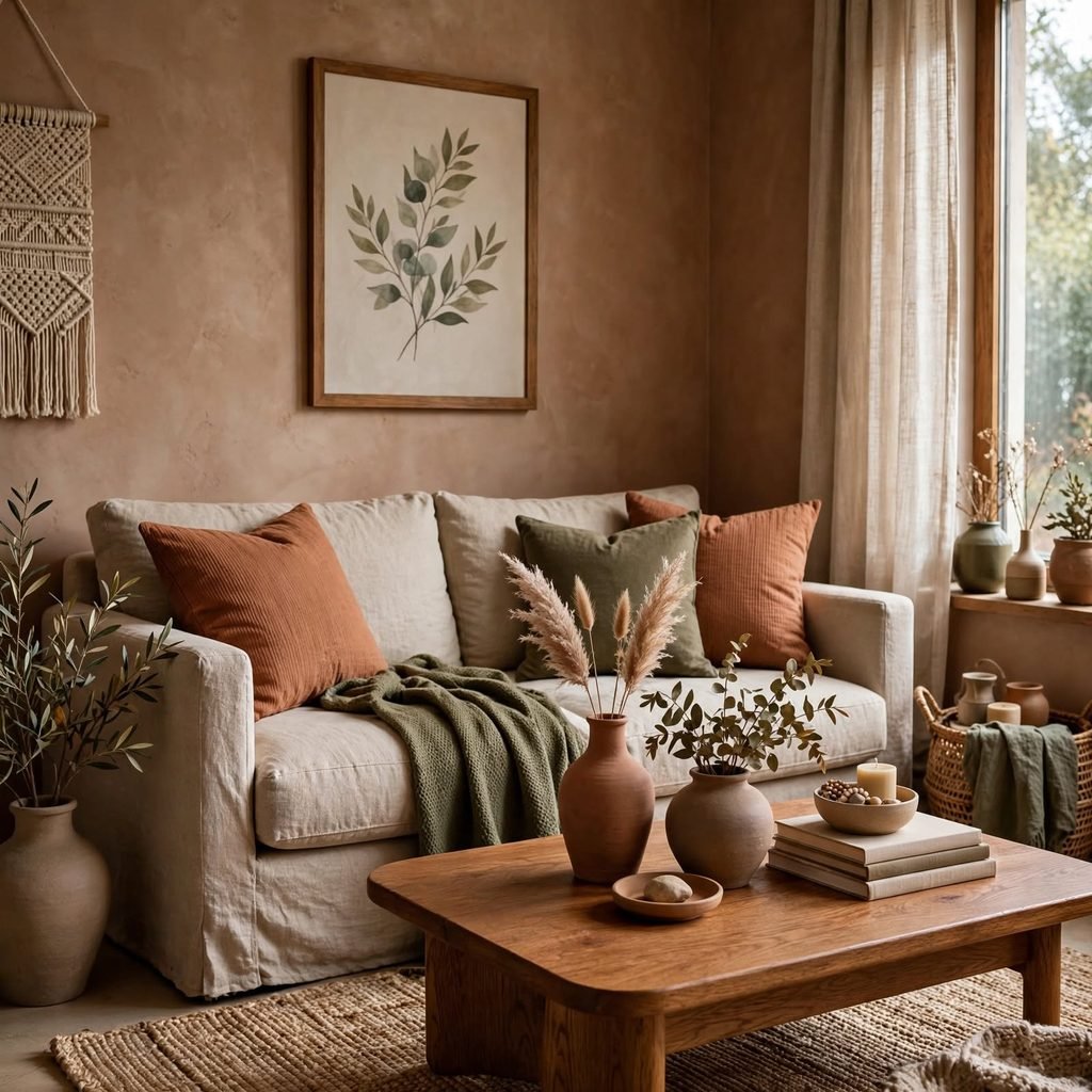
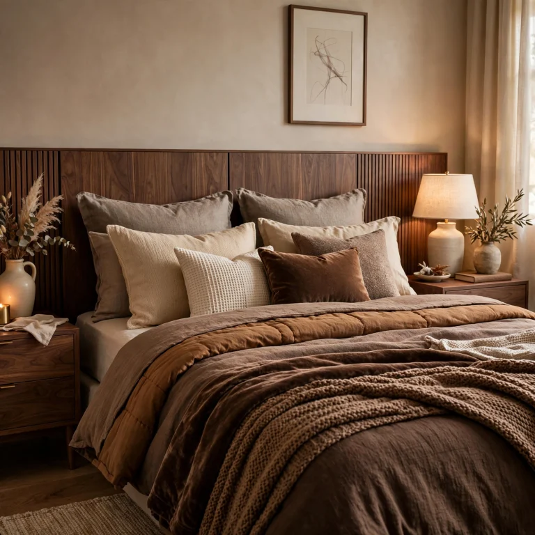
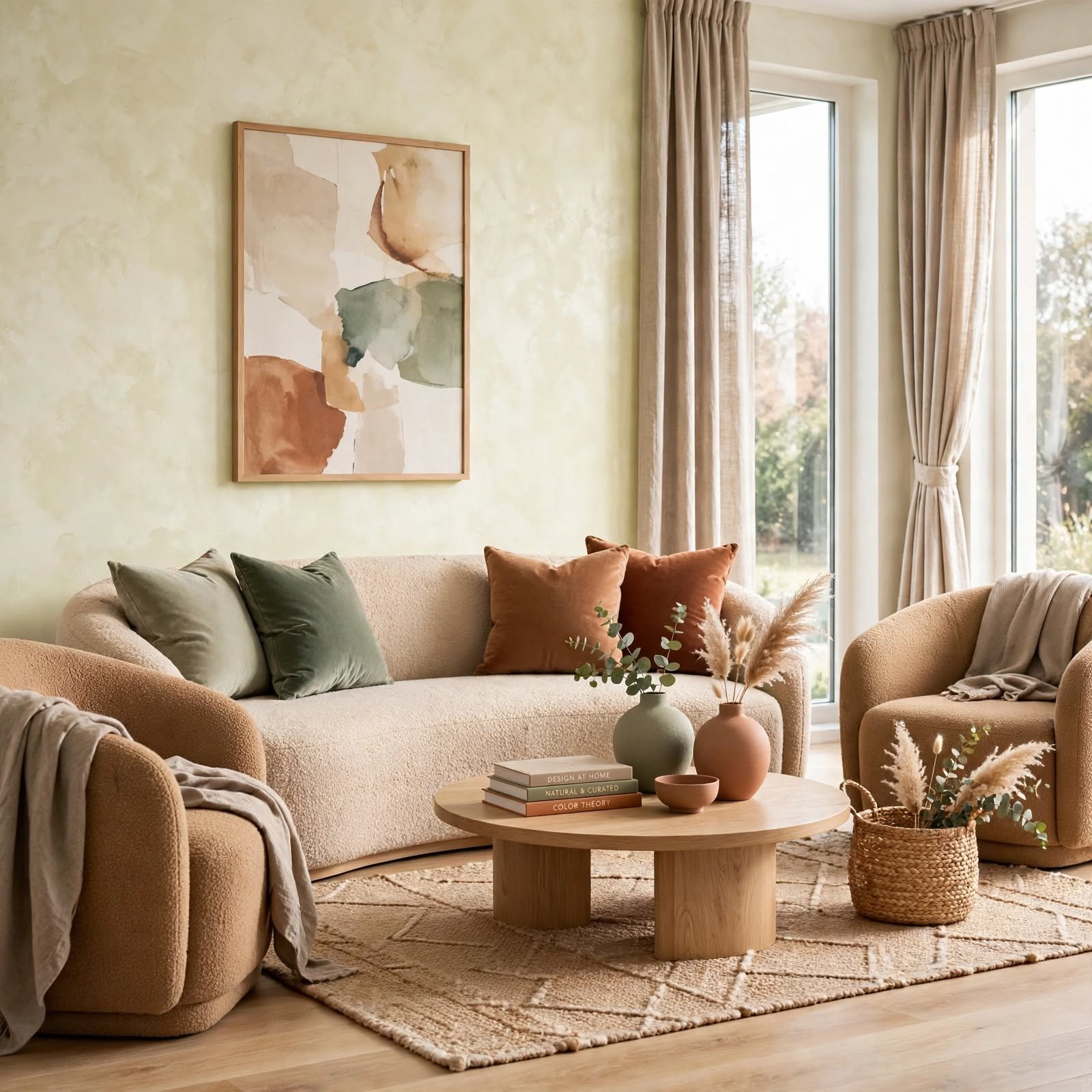
An earth-tone palette built from clay, olive, walnut, and sand draws its colors directly from natural materials, which makes it inherently easier to coordinate with wood furniture, stone, and woven textiles already common in a home. Earth tones also tend to age well compared to more trend-driven colors, since they’re rooted in materials rather than a specific design era.
17. Digital Color Matching Tools
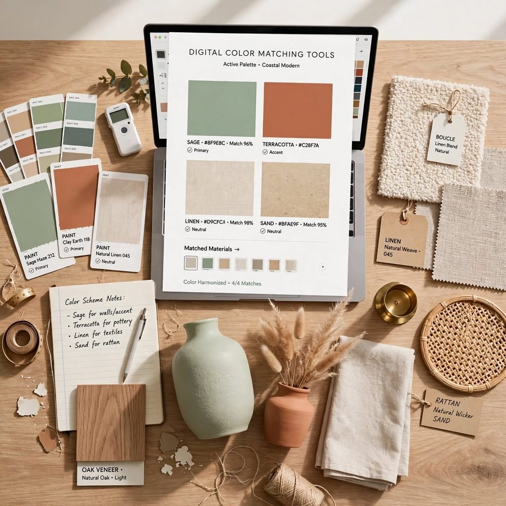
Paint and design apps that let you scan a fabric swatch or a photo to generate a matching color palette can speed up early-stage planning, though the results should always be checked against a physical paint chip before a final decision. These tools are most useful for narrowing a wide field of options down to a shortlist, rather than being treated as the final word on a color’s real-world undertone and value.
Shop the Look
A neutral base of warm white walls pairs well with a walnut console table and a set of clay-toned ceramic vases as the palette’s secondary layer. Add an olive or terracotta accent pillow set following the 60-30-10 ratio, a woven jute rug to ground the space, and a set of matte black picture frames for a high-contrast accent detail across the room’s art wall.
Common Mistake to Avoid
The most common mistake in color palette design is choosing every color independently rather than checking undertones against each other before committing, which is why a room full of individually attractive colors can still look mismatched once assembled. A warm beige sofa next to a cool gray rug is a common version of this error. Always test swatches side by side in the room’s actual lighting, and build the palette around a shared undertone before adding contrast through value or material instead of clashing hues.
FAQs
What is the 60-30-10 rule in color palette design?
The 60-30-10 rule is a ratio for distributing color across a room, with 60 percent going to a dominant color like wall paint, 30 percent to a secondary color such as furniture or rugs, and 10 percent to accent colors in smaller items like pillows or art. This structure prevents any one color from overwhelming the space and gives the palette a clear visual hierarchy, which is why it remains the most commonly taught framework for planning interior color schemes.
How many colors should be in a color palette?
Most successful interior palettes use three to five colors total, including neutrals, since more than that tends to create visual competition rather than cohesion. A typical structure includes one dominant neutral, one secondary color, and one or two accent colors used more sparingly. Sticking to this range also makes it easier to introduce new decor items later without disrupting the palette’s overall balance.
How do I know if colors match in a room?
The most reliable check is comparing undertones rather than the colors themselves, since two colors can appear similar in isolation but clash once placed side by side due to one leaning warm and the other cool. Testing physical swatches together in the room’s actual lighting, rather than relying on how colors look on a screen or in a store, is the most accurate way to confirm a real match before committing to paint or large furniture.
Does lighting really change how a color looks?
Yes, and it’s one of the most overlooked factors in color palette design the same paint color can look distinctly different under cool morning light, warm afternoon sun, and yellow-toned lamp light in the evening. This is why professional designers recommend testing large paint swatches directly on the wall and observing them across a full day before finalizing a color, rather than judging from a small chip under store lighting.
What’s the difference between a complementary and analogous color scheme?
A complementary scheme pairs colors from opposite sides of the color wheel, like blue and orange, creating high contrast and visual energy when one color is allowed to dominate. An analogous scheme instead pulls colors that sit next to each other on the wheel, like blue, blue-green, and green, which creates a naturally cohesive, lower-contrast palette since the colors already share similar undertones and require less balancing to look intentional.
Conclusion
Strong color palette design comes down to structure a clear ratio, a shared undertone, and a limited color count rather than simply picking favorite colors and hoping they work together. Start with one framework from this list, like the 60-30-10 ratio or a material-led approach, before finalizing paint or large furniture purchases. Save this guide to Pinterest for later, and check out our related post on choosing paint undertones for more in-depth color planning.
Author Expertise Note
This guide reflects several years of building color schemes for both full-home renovations and single-room refreshes, where getting the undertone strategy right upfront consistently saved clients from costly repaints and returns. The ratios and pairings here are based on what has held up across a wide range of lighting conditions and material combinations, not just theory.