15 Brilliant Blue Color Palette Ideas for Every Room in the House
Blue is one of the most flexible colors to build a room around, but a blue color palette can just as easily feel cold and flat if the undertone, pairing, and depth aren’t chosen carefully. This guide walks through sixteen ways to bring blue into a space, from a full monochromatic scheme to smaller touches like painted hardware or striped textiles. Each idea explains the specific shade, pairing, or application that makes it work, so you can build a palette that suits your room’s light, size, and existing furniture.
Trend & Background
Blue has held steady as one of the most requested paint and design colors for years, but the way it’s being used has shifted toward deeper, more saturated shades navy, indigo, and slate paired with warm metals and natural wood instead of the cooler, all-white pairings that were common a decade ago. This matters now because more people are choosing one statement color to build a room around rather than defaulting to neutral walls with color introduced only through accessories. A well-chosen blue color palette can carry an entire room’s mood without needing much else.
Key Takeaways
- A blue color palette works best when paired with a warm neutral or metal tone rather than used alone.
- Shade depth matters more than the color itself navy, powder, and slate blue each suit different rooms and lighting conditions.
- Small rooms benefit from lighter, cooler blues, while larger or north-facing rooms can carry deeper, warmer blues without feeling closed in.
- Pairing blue with brass, terracotta, or mustard keeps the palette from reading flat or cold.
1. Navy and Cream Combination
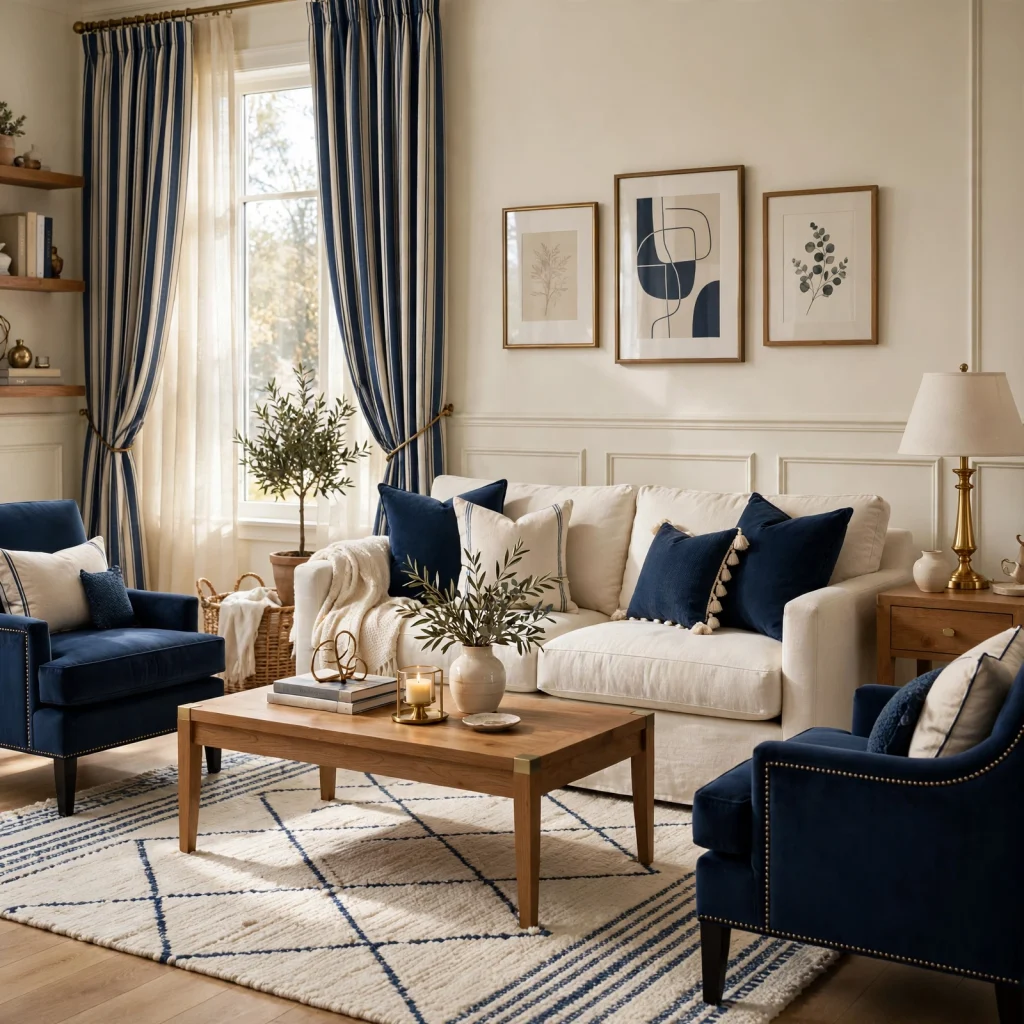
Navy and cream is one of the most dependable pairings in a blue color palette because the contrast is strong enough to feel intentional without tipping into stark or cold. Using navy on lower walls, cabinetry, or a large upholstered piece and reserving cream for trim, ceilings, and secondary furniture keeps the balance from feeling heavy. This combination works particularly well in dining rooms and studies, where a slightly formal, grounded feel is welcome and existing wood furniture already leans warm.
2. Coastal Blue Palette
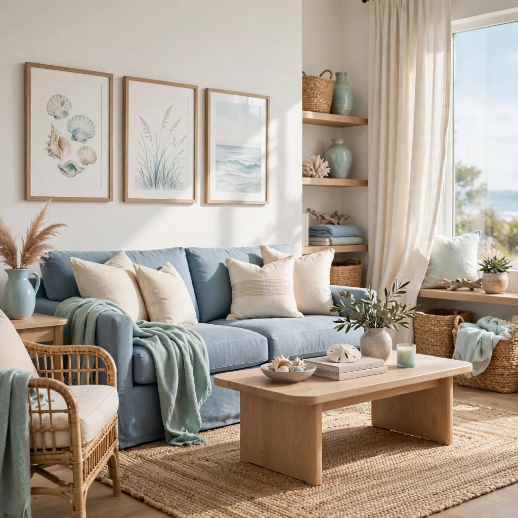
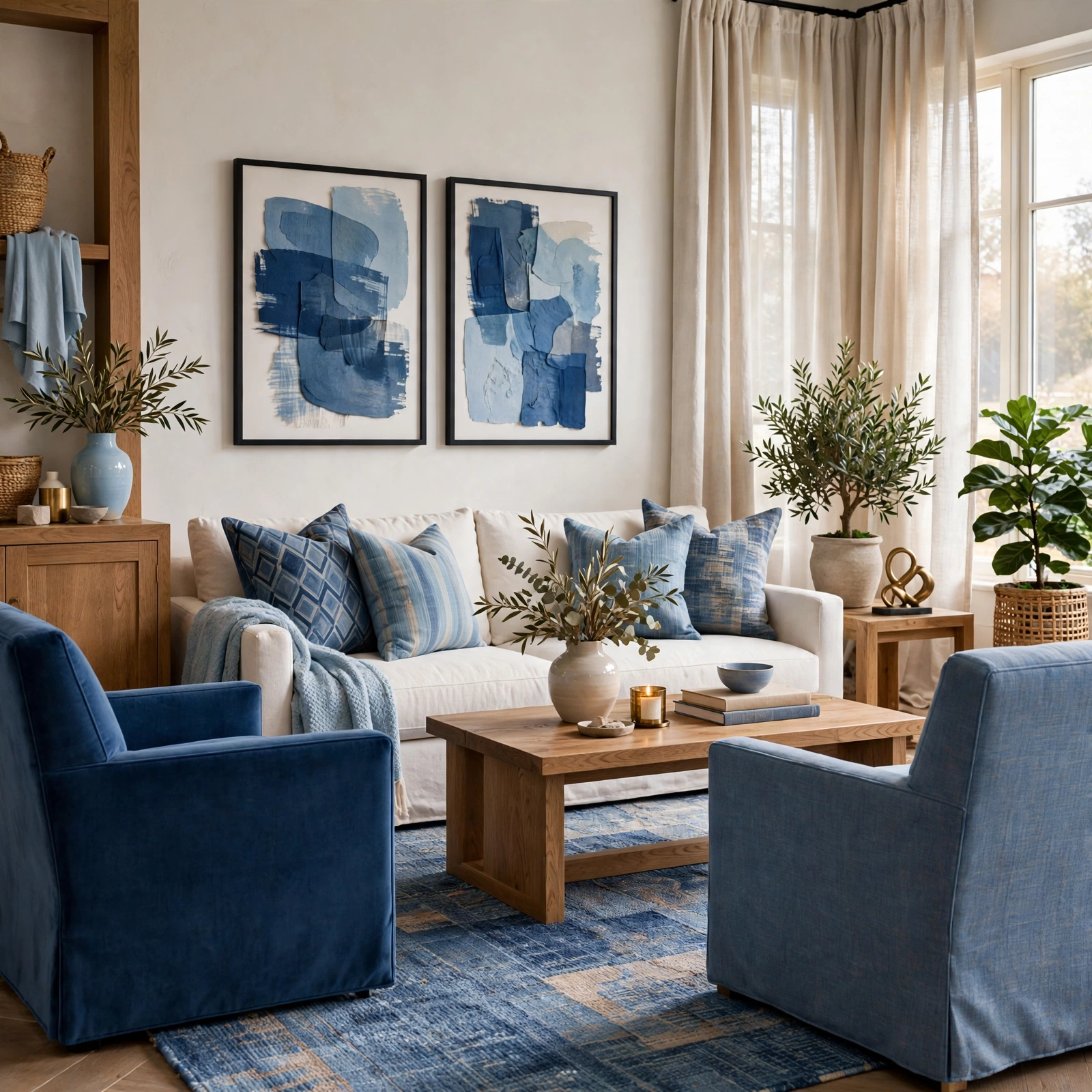
A coastal blue palette leans on lighter, more washed-out shades sea glass, pale aqua, driftwood gray rather than the deep navies associated with more formal rooms. Pairing these tones with natural materials like rattan, linen, and light oak keeps the look from feeling like a costume version of “beach house.” This palette reads best in rooms with strong natural light, since the pale shades can look muddy and gray under dim or yellow-toned lighting instead of soft and bright.
To see more options for color palette
3. Monochromatic Blue Scheme
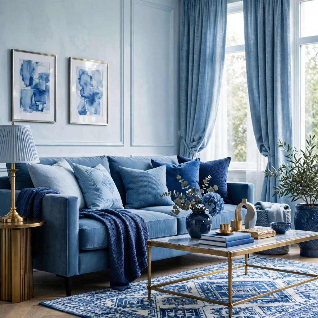
A monochromatic blue scheme uses several depths of the same blue family across walls, furniture, and textiles instead of introducing a second color at all. The key to making this work is varying the finish and texture at each depth a matte navy wall, a glossy cobalt ceramic lamp, a woven mid-blue throw so the room doesn’t read as flat despite the limited color range. This approach suits bedrooms and studies where a calm, enveloping feel is the goal.
| Shade Depth | Example Use | Finish Recommendation |
| Pale (powder, sky) | Ceiling, trim | Eggshell |
| Mid-tone (cornflower, slate) | Walls, upholstery | Matte or satin |
| Deep (navy, indigo) | Cabinetry, accent furniture | Semi-gloss |
4. Blue and Terracotta Pairing
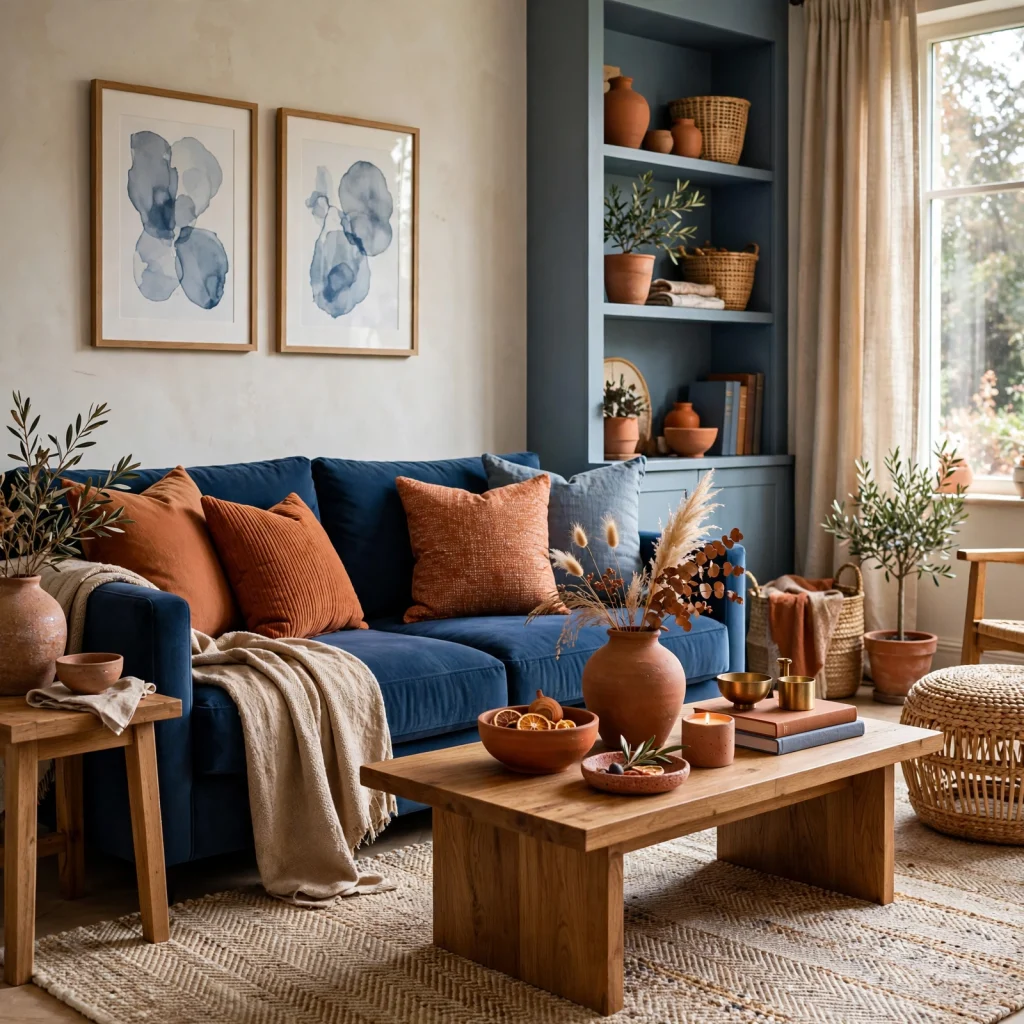
Blue and terracotta is a warmer, more unexpected pairing than the typical blue-and-white combination, since the orange-red undertone in terracotta directly offsets blue’s coolness. A terracotta throw pillow or ceramic vase against a slate blue sofa keeps the room from feeling one-note, and the pairing works especially well in living rooms with warm wood flooring already in place. Keep terracotta as the accent color rather than the dominant one, since too much can compete with the blue instead of supporting it.
5. Dusty Blue and Blush
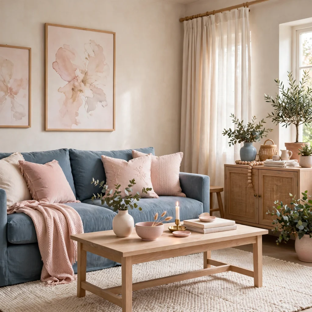
Dusty blue and blush is a softer, lower-contrast pairing that suits bedrooms and nurseries where a calmer palette is the goal rather than a bold statement. Both colors share a muted, grayed-down quality, which keeps the combination from reading as overly sweet once paired with natural wood furniture and simple linen bedding. This pairing works well as a wall-and-textile combination rather than two full walls of solid color competing for attention.
6. Deep Teal Accent Wall
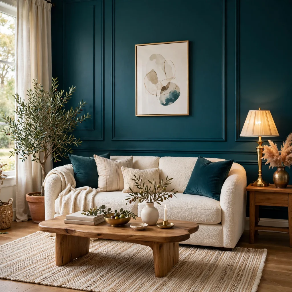
A deep teal accent wall sits at the edge of a blue color palette, closer to green than a true navy, and works as a single statement wall rather than an all-over color choice. Painting the wall behind a bed headboard or a media console gives the color room to breathe without overwhelming smaller spaces. Pairing it with brass fixtures and warm wood tones keeps the teal from reading too cool or clinical against the rest of the room’s furnishings.
7. Powder Blue Kitchen Cabinets
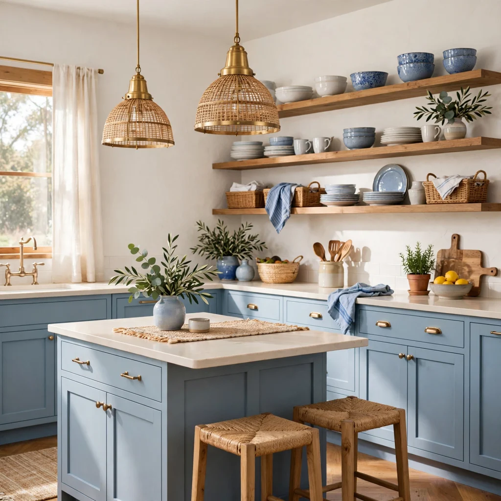
Powder blue kitchen cabinets bring color into one of the most-used rooms in the house without committing to a full wall of paint, since cabinetry can be repainted more easily than an entire kitchen later on. Pairing powder blue lower cabinets with white or cream uppers keeps the kitchen feeling bright rather than heavy, and brass or unlacquered hardware adds warmth against the cool undertone. A satin or semi-gloss finish holds up better to daily wiping than a flat one.
8. Blue Color Palette for Small Rooms
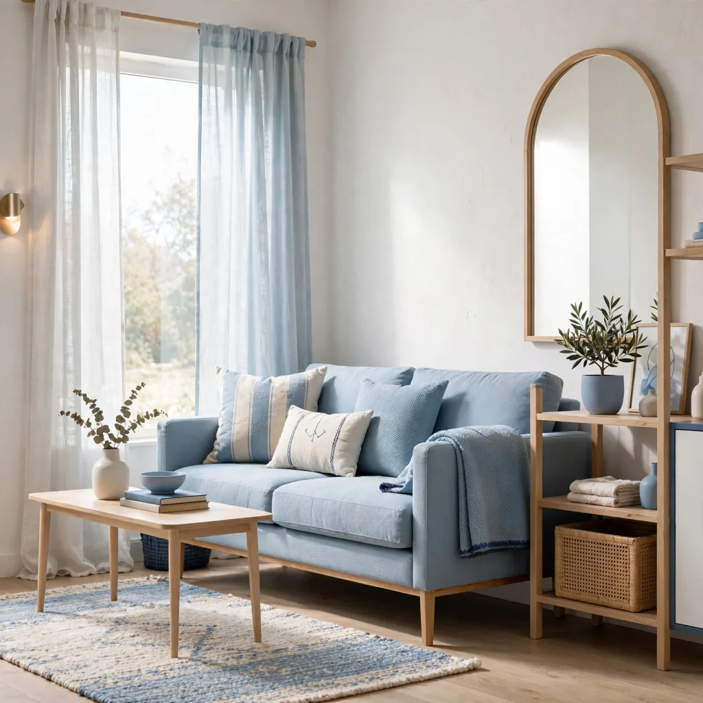
A blue color palette for small rooms works best with lighter, cooler shades like powder blue or pale slate, since deep navy or indigo can make a already-tight room feel smaller under low light. Reserving the darkest blue for a single accent a headboard, a door, a piece of furniture rather than the full wall keeps the room from closing in visually. Pairing the palette with a light ceiling color also helps the room read taller than it is.
| Budget Tier | Example Update | Approx. Cost |
| Under $50 | Painted hardware, throw pillows | $20–$50 |
| $50–$150 | Accent wall paint, ceramic accessories | $60–$150 |
| $150+ | Cabinet repaint, upholstered furniture | $200–$600 |
9. Indigo and Mustard Combination
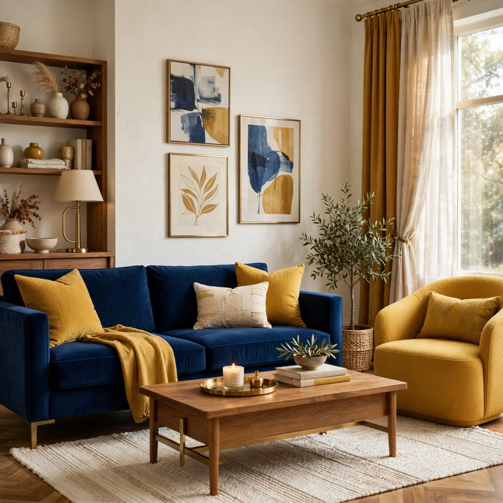
Indigo and mustard is a bolder, more saturated pairing than most blue combinations, using a warm golden-yellow to offset indigo’s deep coolness in a way that reads confident rather than cautious. This pairing works best in smaller doses a mustard throw pillow, a lampshade, or a piece of art against a larger indigo surface like a sofa or accent wall, rather than splitting the room evenly between the two colors.
10. Cornflower Blue Bedding
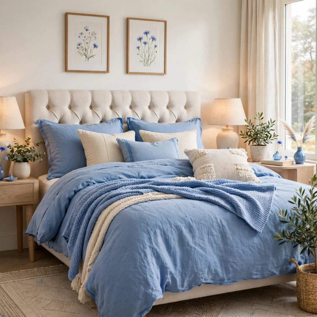
Cornflower blue bedding introduces a blue color palette into a bedroom without any wall or furniture commitment, which makes it one of the easiest starting points for testing whether a deeper blue scheme will suit the room. Pairing a solid cornflower duvet with white or cream sheets keeps the look from feeling too saturated, and a linen texture softens the color further compared to a flat cotton sateen finish.
11. Slate Blue Living Room
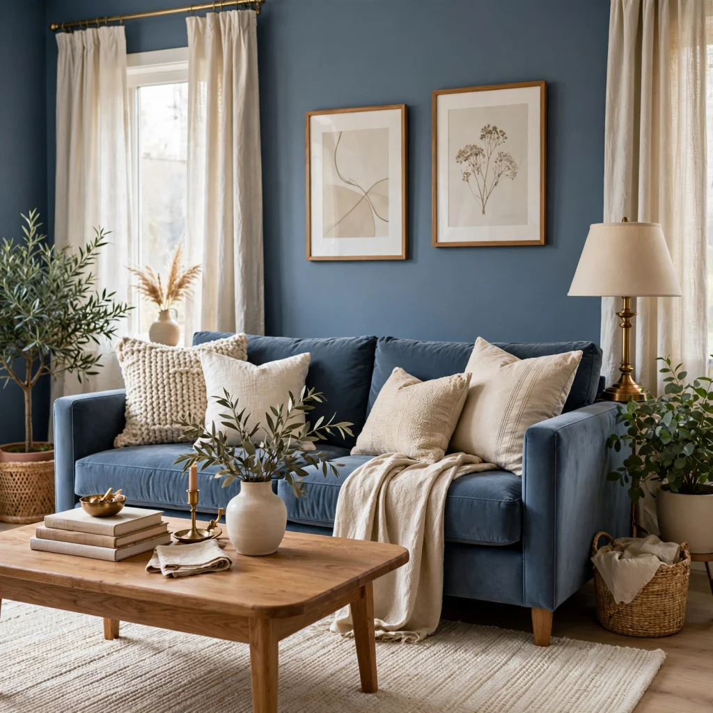
A slate blue living room uses a gray-leaning blue that reads more neutral and versatile than a true navy, which makes it easier to pair with existing furniture in a range of wood tones. Slate blue works well as a full wall color in rooms with good natural light, or as a large upholstered sofa in a room where the walls stay neutral. This shade tends to shift noticeably under artificial light, so testing a sample swatch at night is worth the extra step.
12. Blue and White Striped Textiles
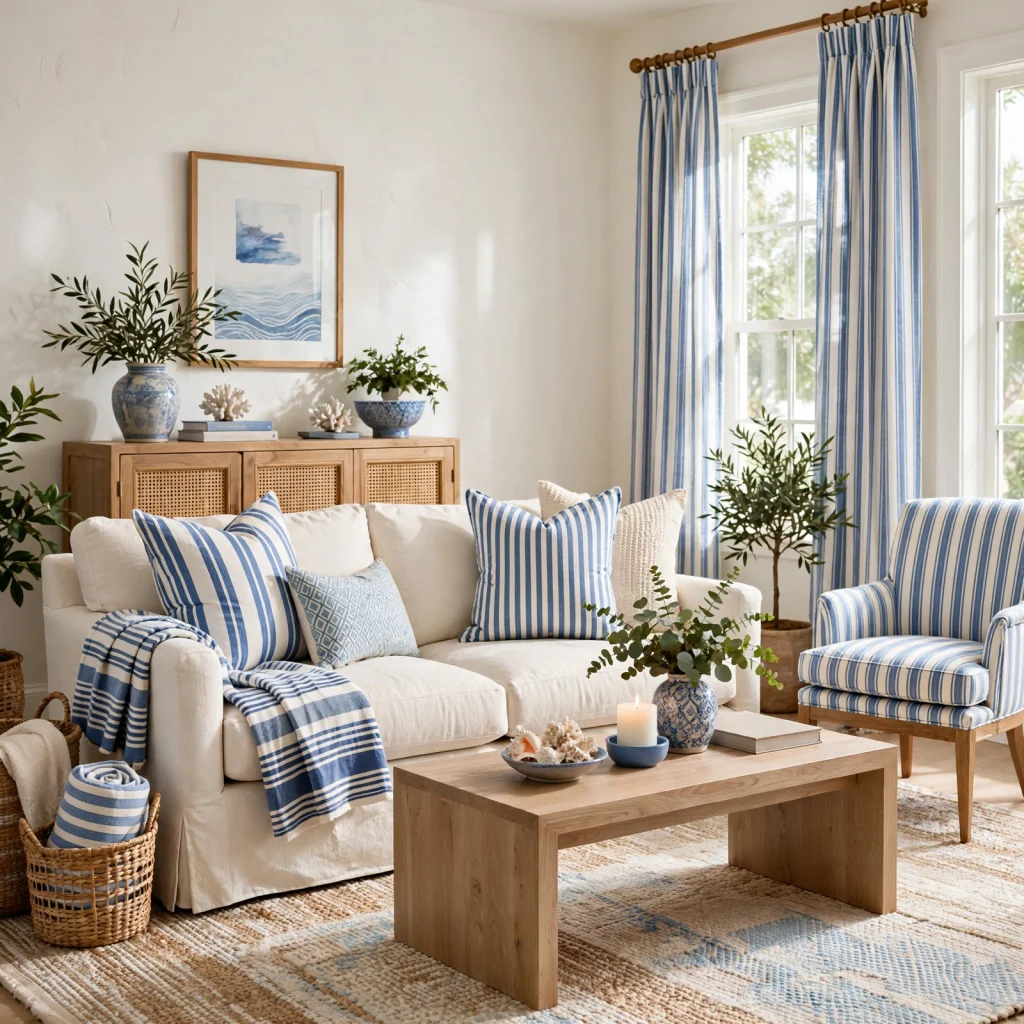
Blue and white striped textiles bring a classic, slightly nautical pattern into a room without needing to paint anything, using curtains, pillow covers, or a rug to carry the pattern. Keeping stripe width consistent across multiple textiles in the same room rather than mixing thick and thin stripes keeps the pattern from feeling busy. This works especially well in sunrooms, kitchens, and bathrooms where a crisp, clean look is the goal.
13. French Blue Front Door
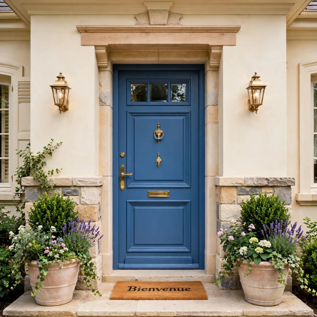
A French blue front door is one of the highest-impact, lowest-effort ways to introduce a blue color palette to a home’s exterior, since a single door repaint changes the entire first impression of a house. This mid-tone, slightly grayed blue reads as classic rather than trendy, and it pairs well with black or brass hardware depending on the rest of the home’s exterior finishes. A satin or semi-gloss exterior paint holds up best against weather and daily handling.
14. Steel Blue Accent Furniture
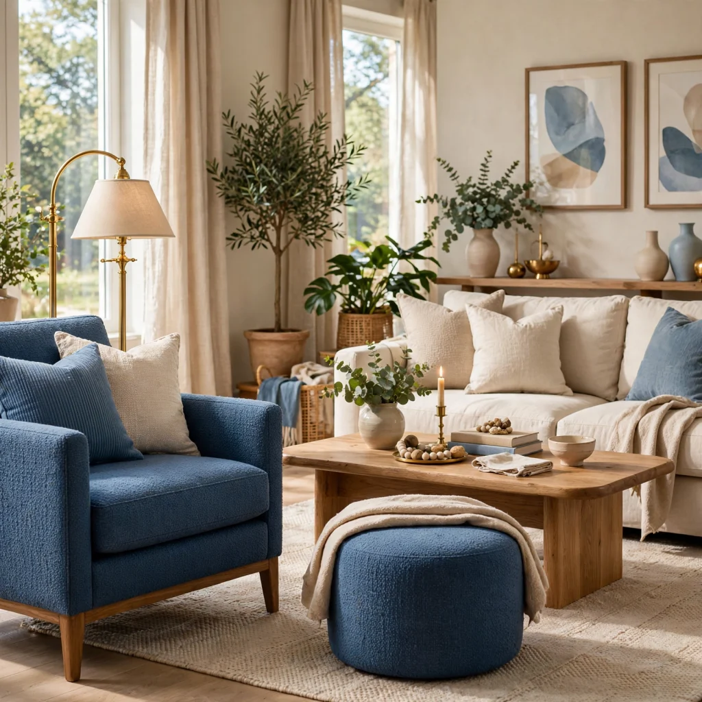
Steel blue accent furniture a sofa, an armchair, a media console introduces a blue color palette into a room without requiring any paint or wall commitment at all, which makes it a lower-risk starting point for renters or anyone hesitant to commit to a full color scheme. Steel blue’s gray undertone makes it easier to match with existing neutral furniture than a purer, more saturated blue would be.
15. Blue Ombre Wall Treatment
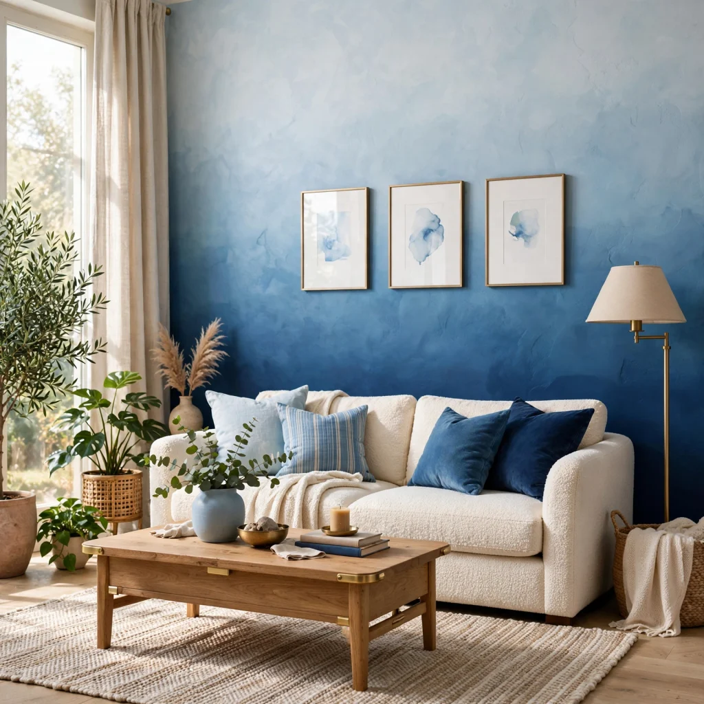
A blue ombre wall treatment blends several shades of blue from dark to light across a single wall, typically moving from a deep navy at the base to a pale sky blue near the ceiling. This technique adds visual depth and a sense of height to a room without needing wallpaper or a pattern, and it works especially well in a nursery or a bedroom where a soft, gradual color shift suits the mood better than a flat, single-tone wall.
Shop the Look
A few pieces make it easy to build several of these ideas into one cohesive room. A slate blue sofa paired with terracotta throw pillows and a brass floor lamp covers the blue-and-warm-accent approach in one seating area. For a bedroom, cornflower blue linen bedding alongside a dusty blue upholstered headboard and cream curtains builds a softer, monochromatic version of the same idea without much added cost.
Common Mistake to Avoid
The most common mistake with a blue color palette is choosing a shade based on a paint chip alone without testing it against the room’s actual lighting, since blue shifts more dramatically under artificial and natural light than most other colors. A blue that looks soft and gray in a store can read cold and flat, or shift purple, once it’s on a north-facing wall at night. Always paint a large test swatch and view it at different times of day before committing to a full room.
FAQs
What colors go best with a blue color palette?
Warm neutrals and metals tend to work best against blue, since blue’s coolness needs a counterbalance to avoid feeling flat or sterile. Cream, terracotta, mustard, and unlacquered brass are the most common and dependable pairings, each offsetting blue’s temperature in a slightly different way. Wood tones, particularly warmer oak or walnut, also work well as a grounding element in a room built primarily around a blue color scheme.
Does a blue color palette make a room look smaller?
Deep, saturated blues like navy or indigo can make a small room feel more enclosed, especially under limited natural light, while lighter shades like powder blue or pale slate tend to open a room up instead. Using the darkest blue as a single accent rather than an all-over wall color is the easiest way to get the depth of the color without the smaller-feeling effect. A light ceiling color also helps counter any closed-in feeling.
What’s the difference between navy and slate blue?
Navy is a deep, highly saturated blue with very little gray mixed in, which makes it read bold and formal, while slate blue carries a noticeable gray undertone that makes it read softer and more neutral. Slate blue tends to be easier to pair with a wider range of existing furniture and wood tones, since its grayed-down quality behaves more like a neutral than navy’s more assertive, saturated presence in a room.
How do I test a blue paint color before committing to a full room?
Paint a swatch at least two feet wide directly on the wall rather than relying on a small paint chip, and view it at multiple points during the day morning light, midday, and after dark under artificial lighting since blue shifts more than most colors depending on the light source. Testing on more than one wall is also worth doing, since walls facing different directions in the same room can make the same paint color look noticeably different.
Is a blue color palette a passing trend or a safe long-term choice?
Blue has remained one of the most consistently popular paint and design colors for decades, unlike more trend-driven colors that cycle in and out quickly, which makes it a relatively safe long-term choice. Sticking to a classic, mid-saturation shade like navy or slate blue rather than a very bright or unusual tone helps the palette age well, since those shades pair easily with whatever furniture or trends come next.
Conclusion
A blue color palette can carry an entire room on its own, but it works best when the shade, pairing, and depth are chosen with the room’s light and size in mind rather than picked from a paint chip alone. Start with a smaller commitment, like painted hardware or a set of throw pillows, before moving to a full wall or piece of furniture. Save this list to Pinterest for later, or check the related interior color pairing post for more combinations beyond blue.