15 Creative Green Color Palette Ideas for a Grounded, Natural Home
Green has become one of the most versatile colors in home design, capable of reading as calming and neutral or bold and dramatic depending on the specific shade and how it’s paired. This post covers fifteen green color palette ideas addressing specific shades, room applications, and pairing choices, with practical notes on undertone and lighting for each option. Each idea explains the shade or combination involved and where it works best, so the list is useful whether the goal is a single accent wall or a full-room color scheme.
Trend & Background
Green has moved from an occasional accent color to a primary palette choice across many rooms, driven by a broader interior design shift toward natural, grounded tones that echo materials like wood, stone, and greenery itself. Deep, saturated greens forest, emerald, hunter have grown particularly popular in more formal spaces like dining rooms and home offices, while softer, muted sage and eucalyptus tones dominate bedrooms and nurseries. Pairing green with warm metallics like brass and unlacquered brass, rather than cooler silver tones, has also become the standard recommendation, reflecting the same warmer material shift seen across other current design trends.
Key Takeaways
- A green color palette works across nearly every room in the house, from deep jewel tones in a formal dining room to soft sage in a nursery.
- Pairing green with the right neutral or metallic keeps the palette from feeling either too cold or too saturated.
- Different green undertones blue-based, yellow-based, or gray-based read very differently depending on a room’s natural light.
- Layering multiple shades of green within the same room, rather than a single flat tone, adds depth without introducing another color.
1. Sage Green Bedroom Palette
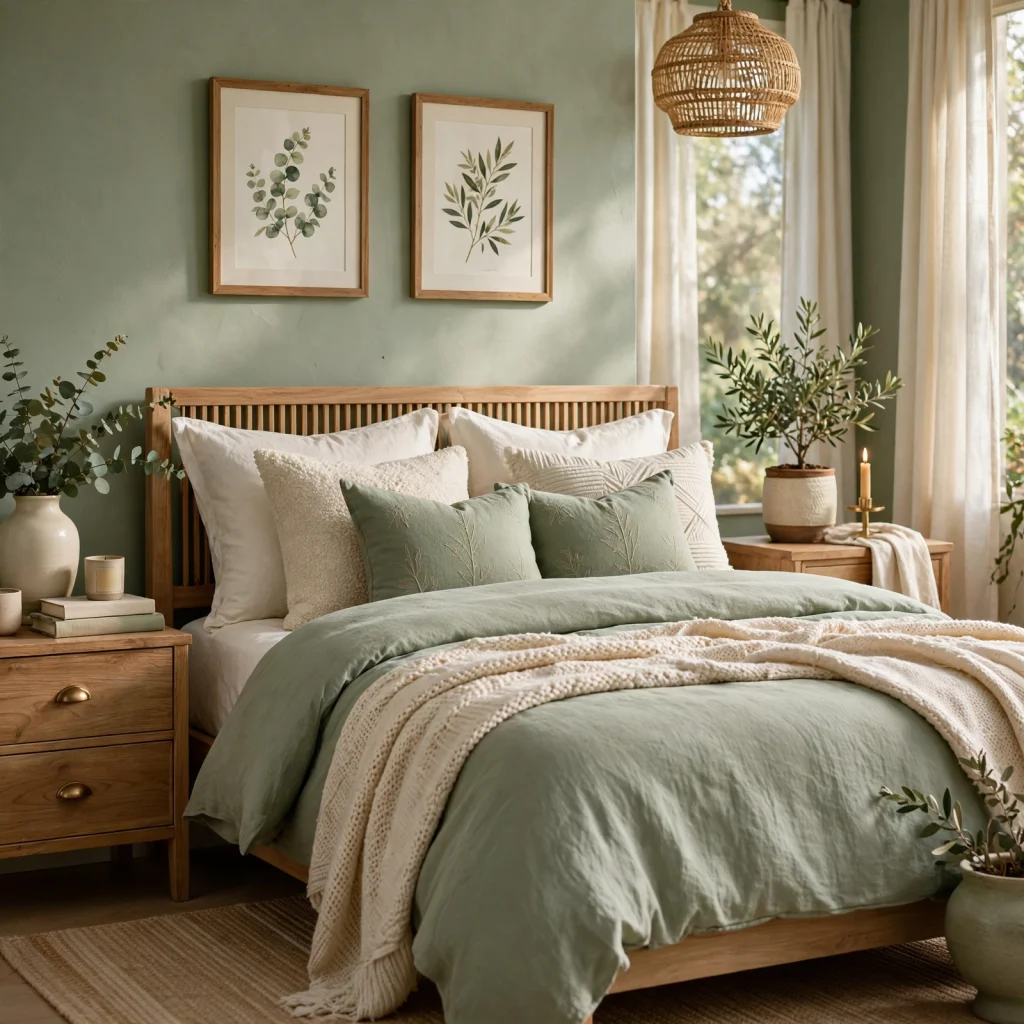
Sage green, a muted, grayish-toned green, has become one of the most popular bedroom color choices because it reads as calming without being cold, unlike a brighter or more saturated green would in a space meant for rest. This shade pairs particularly well with warm wood tones and cream textiles, avoiding the sterile feeling a cooler gray-green can sometimes create. Testing a sample swatch in the bedroom’s actual lighting, both day and evening, helps confirm the shade reads as intended before committing to a full wall.
| Green Shade | Undertone | Best Room Application |
| Sage | Gray-green | Bedrooms, nurseries |
| Forest | Blue-green | Dining rooms, studies |
| Olive | Yellow-green | Kitchens, living rooms |
2. Forest Green Dining Room Walls
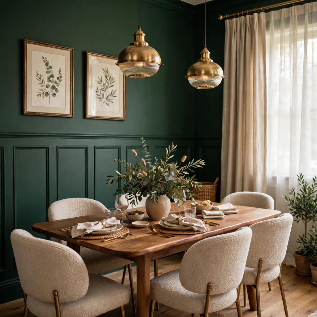
Forest green, a deep, blue-leaning shade, creates a dramatic, formal atmosphere particularly well suited to a dining room used primarily for evening meals under warm, dim lighting. This shade absorbs light rather than reflecting it, which can make a smaller dining room feel more intimate and enclosed in a positive, cocoon-like way rather than cramped. Pairing forest green walls with a lighter ceiling color prevents the room from feeling entirely closed in from floor to ceiling.
3. Olive Green Kitchen Cabinets
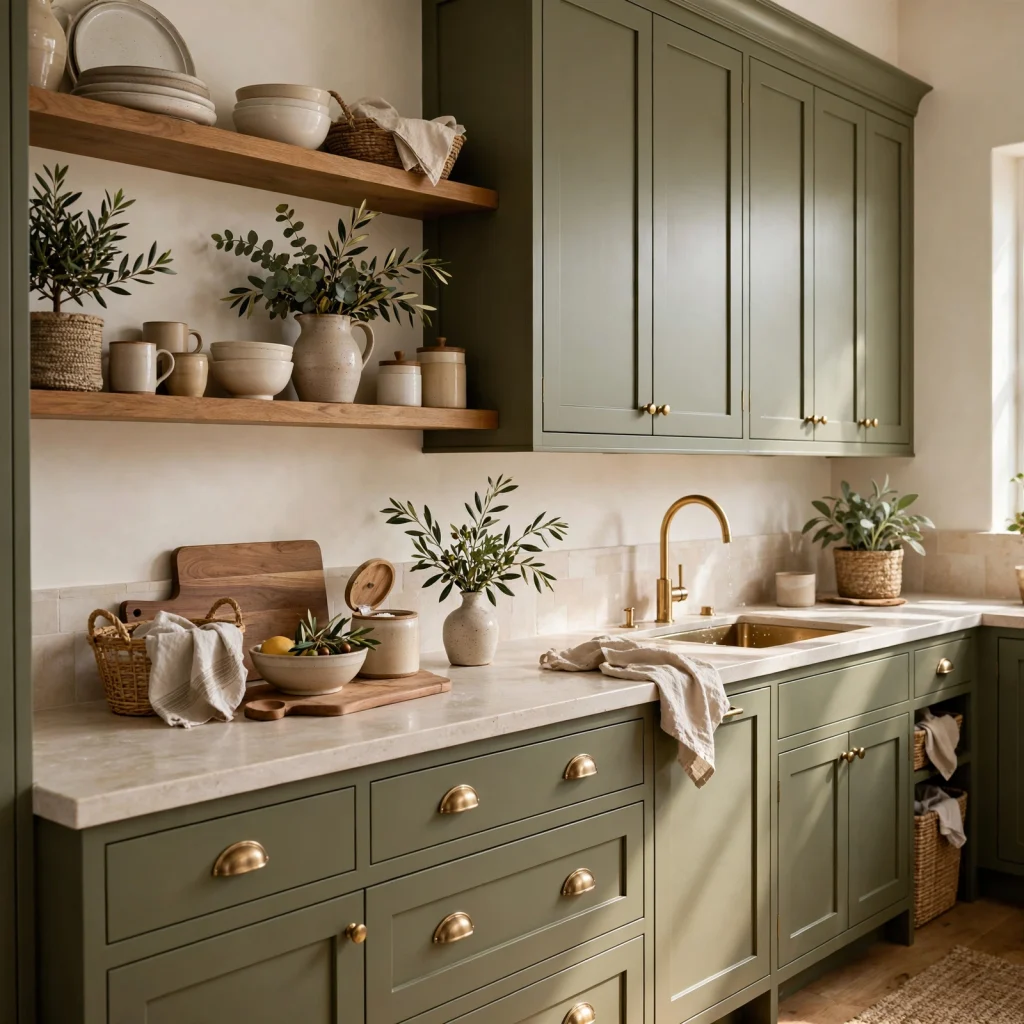
Olive, a warmer, yellow-leaning green, has grown in popularity for kitchen cabinetry as an alternative to the more common sage or forest green choices, offering a slightly earthier, more grounded feel. This shade pairs particularly well with brass hardware and warm wood open shelving, echoing the same warm undertone throughout the room’s other materials. Olive tends to photograph and read differently under warm versus cool lighting, so testing a sample under the kitchen’s actual bulbs is worthwhile before committing.
To see more blue color palette CLICK HERE
4. Emerald Green Accent Wall
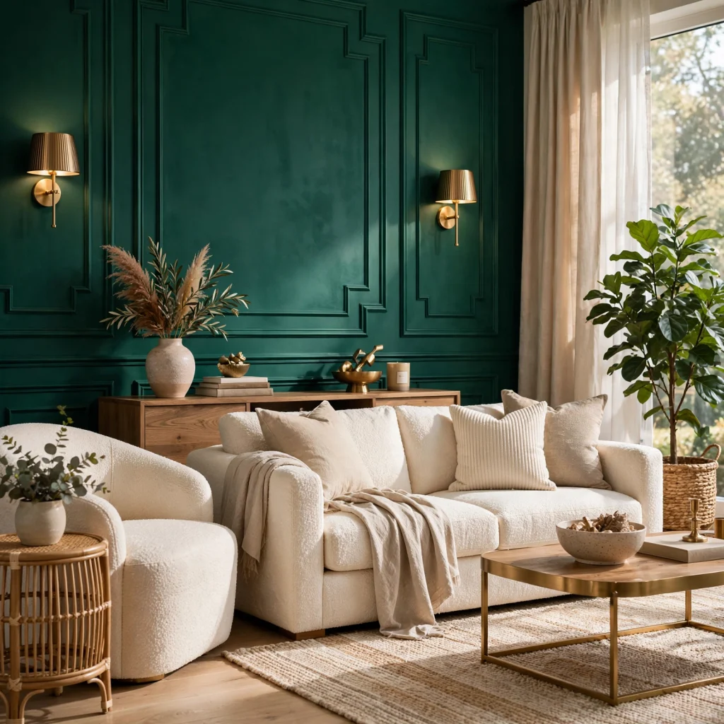
Emerald, a brighter and more saturated jewel-toned green, works well as a single accent wall rather than a full-room color commitment, given its intensity. This shade pairs particularly well with brass or gold accents and works especially well in a room with strong architectural detail, like a fireplace surround or built-in shelving, that the color can help highlight. Choosing a matte or eggshell finish, rather than high gloss, keeps the saturated color from reading as overly intense under bright lighting.
5. Green and Cream Color Pairing
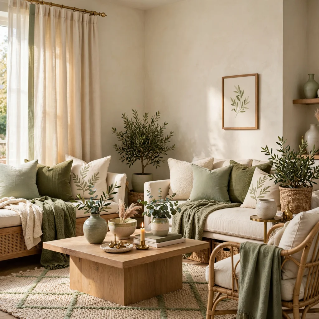
Pairing any shade of green with cream, rather than a starker white, softens the overall palette and avoids the higher-contrast look that a pure white pairing creates. This combination works particularly well with warmer green undertones, like olive or sage, since cream shares a similar warm base rather than competing with a cooler undertone. Using cream for trim, ceilings, or a secondary wall keeps the green from feeling like the only color decision in the room.
6. Green and Terracotta Palette
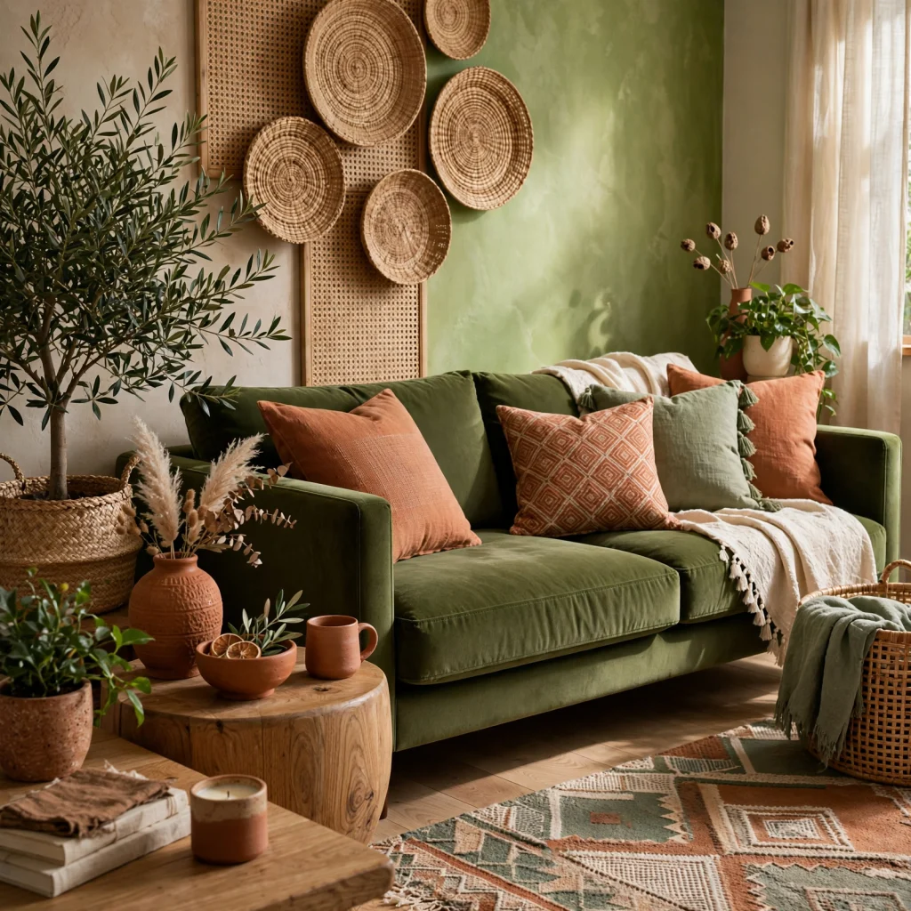
Combining green with terracotta or burnt orange creates a warm, earthy palette that draws on complementary color relationships without feeling as bold as a true red-green pairing would. This combination works especially well in a room leaning toward a Mediterranean or bohemian design direction. Keeping the terracotta as an accent, through textiles or a single furniture piece, rather than a dominant wall color, keeps the green as the palette’s primary anchor.
7. Deep Hunter Green Home Office
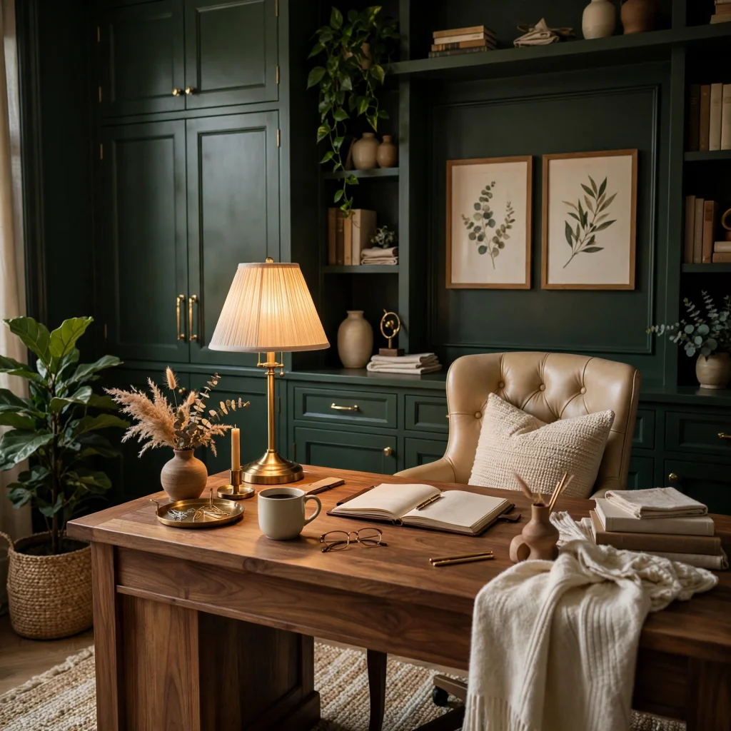
Hunter green, slightly darker and more muted than forest green, creates a focused, library-like atmosphere well suited to a home office or study. This shade pairs particularly well with dark wood furniture and brass desk accessories, reinforcing a more traditional, scholarly aesthetic. Adding adequate task lighting is especially important with this shade, since the deep color absorbs significant light and can make a room feel dim without sufficient additional light sources.
8. Sage and Blush Nursery Palette
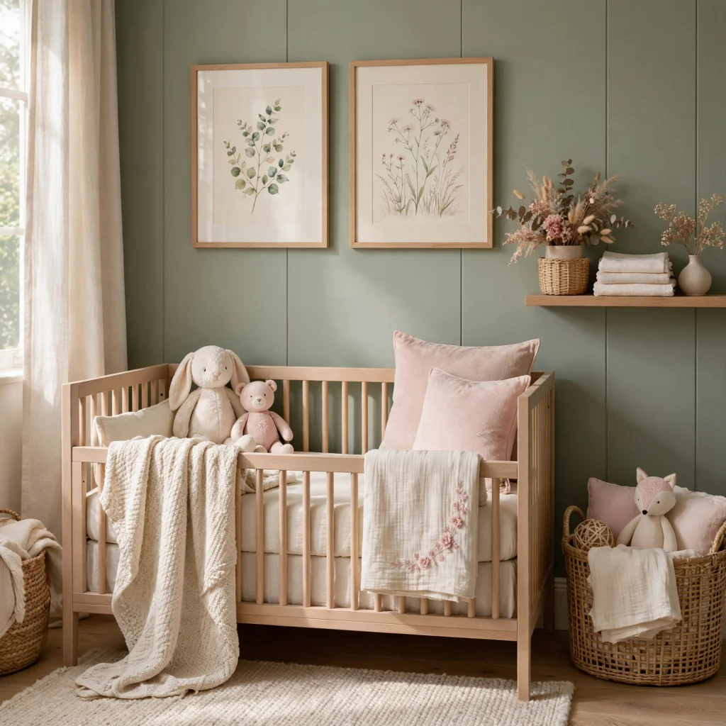
Pairing sage green with a soft blush pink creates a gentle, gender-neutral nursery palette that works well regardless of the child’s gender, avoiding the more traditional blue-or-pink binary. This combination reads as calm and soothing without leaning too sweet or too muted on its own. Using sage as the dominant wall color and blush as an accent through textiles or a single furniture piece keeps the palette balanced rather than competing.
9. Green Color Palette Botanical Wallpaper
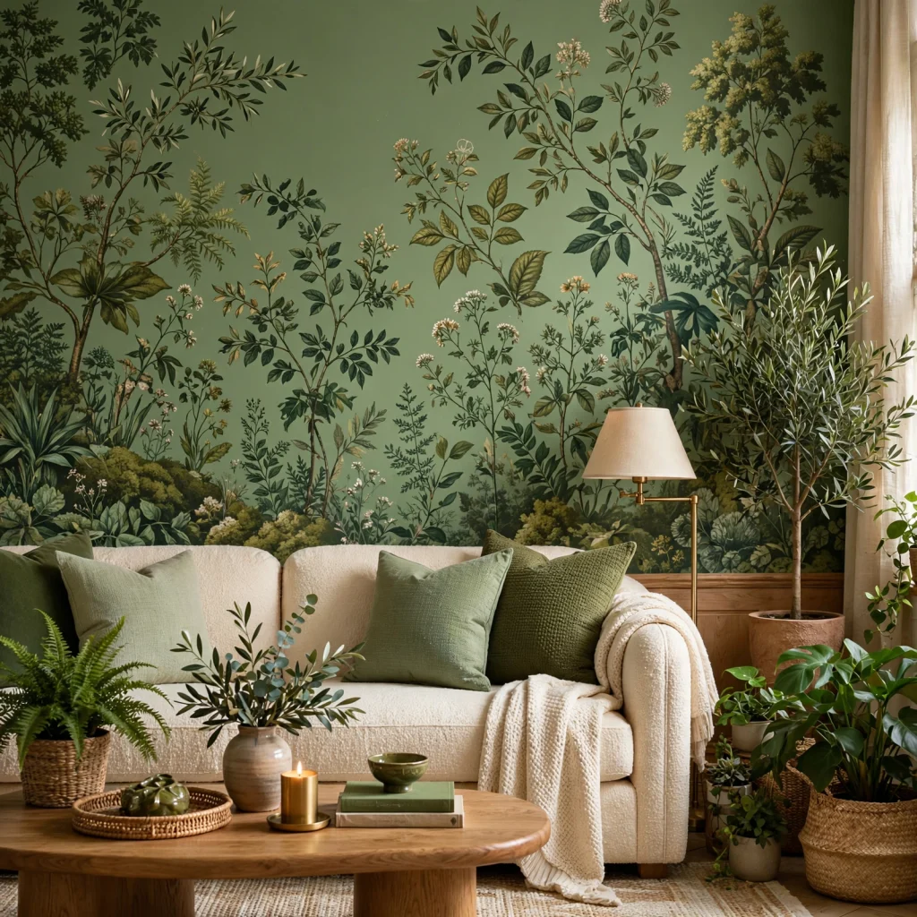
A botanical print wallpaper, featuring layered leaf or fern patterns in varying shades of green, brings a full tonal palette into a single wall covering rather than requiring separate paint decisions for each shade. This works particularly well in a powder room or entryway, where a bold pattern has less overall wall space to cover and therefore feels less overwhelming. Among green color palette choices that add depth without extra planning, botanical wallpaper does the layering work in a single product.
| Wallpaper Scale | Best Room Size | Pattern Density |
| Small-scale print | Small powder rooms | Dense, repeating |
| Medium-scale print | Entryways, hallways | Balanced |
| Large-scale print | Larger accent walls | Open, spaced |
10. Green and Navy Two-Tone Palette
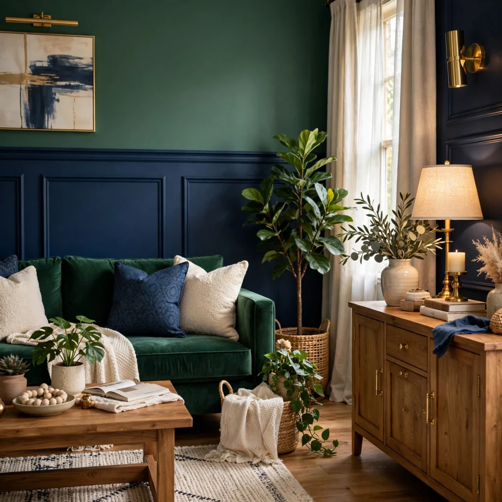
Combining a deep green with navy, rather than pairing either color with a neutral alone, creates a richer, more layered dark palette that reads as more intentional than a single deep color used throughout. This combination works particularly well in a formal living room or dining room, where the two deep tones sit close enough on the color wheel to feel cohesive rather than clashing. Adding warm metallic accents, like brass light fixtures, keeps this darker two-tone palette from feeling too heavy or cold.
11. Muted Eucalyptus Green Living Room
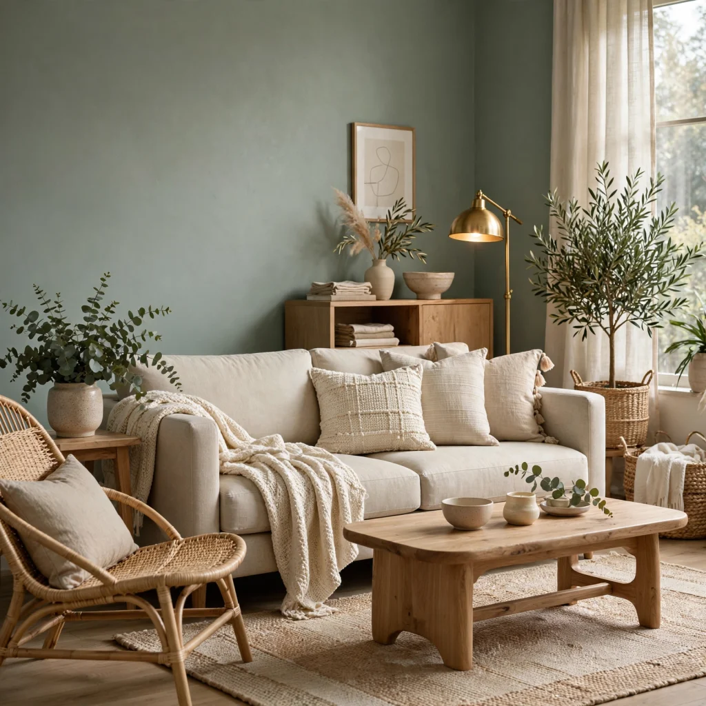
Eucalyptus, a soft, slightly blue-gray green, offers a calming living room palette that reads as more contemporary than a warmer sage or olive tone. This shade pairs particularly well with white oak furniture and linen textiles, keeping the overall palette light and airy rather than heavy. Eucalyptus works especially well in living rooms with ample natural light, where the cooler undertone won’t read as flat or dim.
12. Green Kitchen Island With Neutral Perimeter
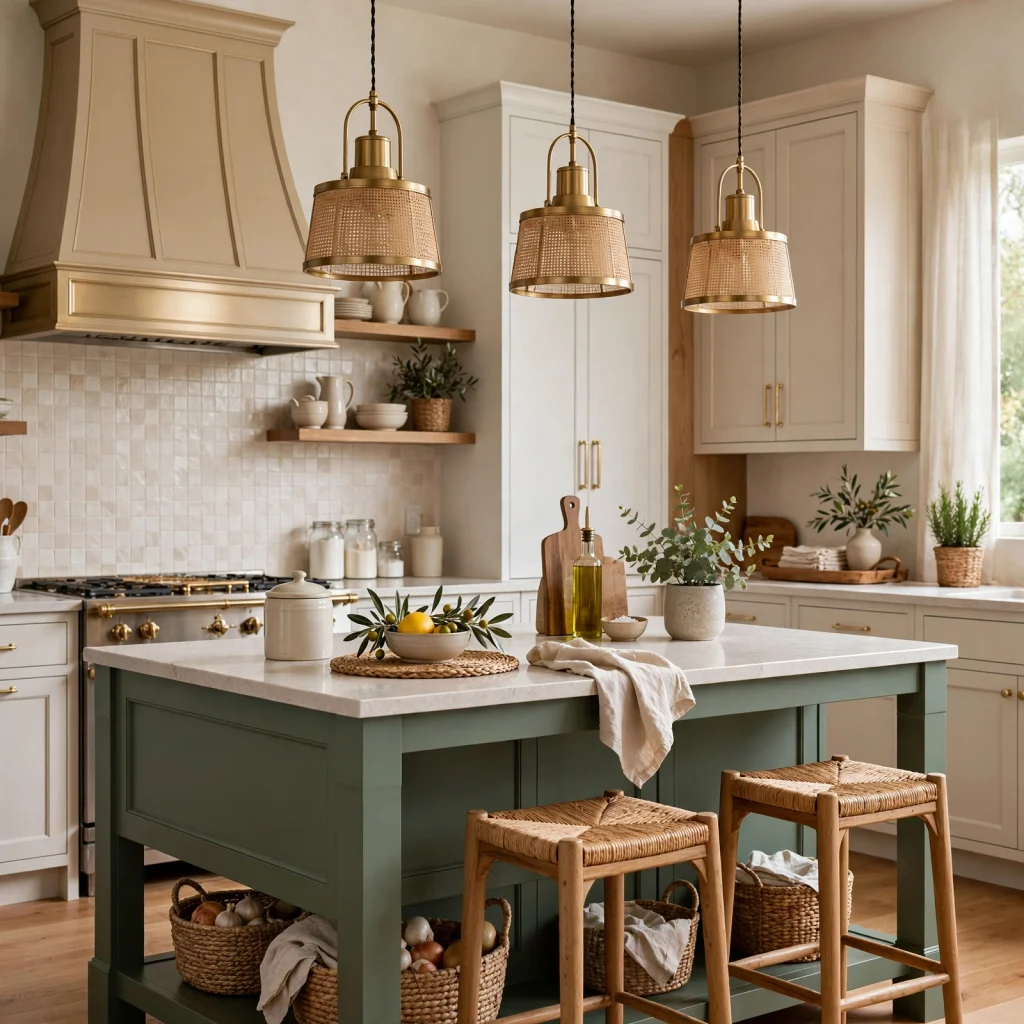
Painting only the kitchen island a bold shade of green, while keeping the surrounding perimeter cabinets in a neutral white or cream, makes the island the room’s focal point without committing the entire kitchen to a saturated color. This approach works well for homeowners drawn to a bold green but hesitant about a full-room commitment. Choosing a countertop material that complements rather than competes with the green, like a simple white quartz, keeps the focus clearly on the cabinetry color itself.
13. Green and Brass Metallic Pairing
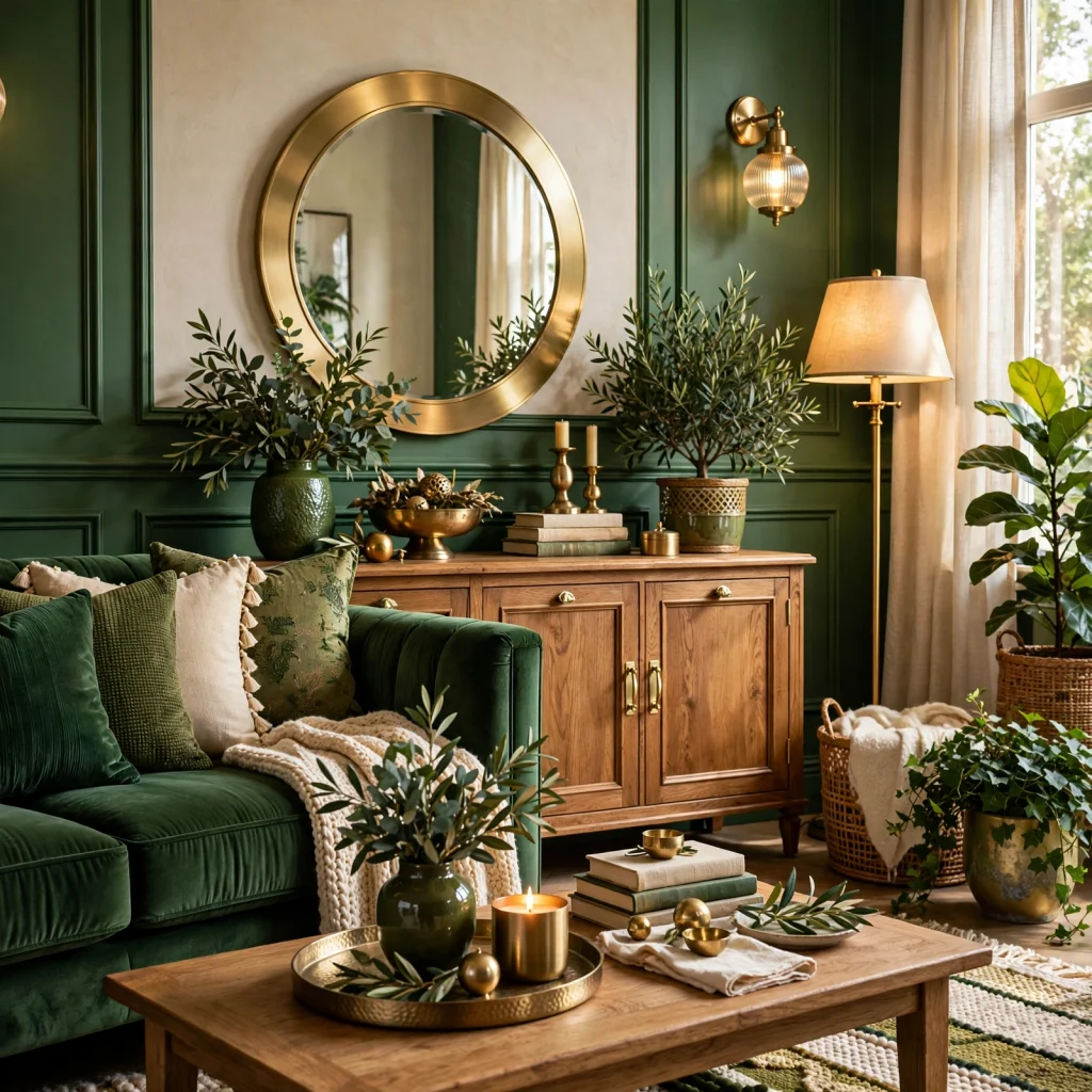
Pairing green, in nearly any shade, with brass or warm gold hardware and fixtures has become one of the most consistently recommended metallic pairings in current interior design. The warm metal tone complements green’s natural, organic association better than a cooler silver or chrome finish typically does. Extending the brass finish across hardware, lighting, and faucet fixtures within a green room ties the palette together more cohesively than mixing metal finishes would.
14. Sage Green Bathroom Vanity
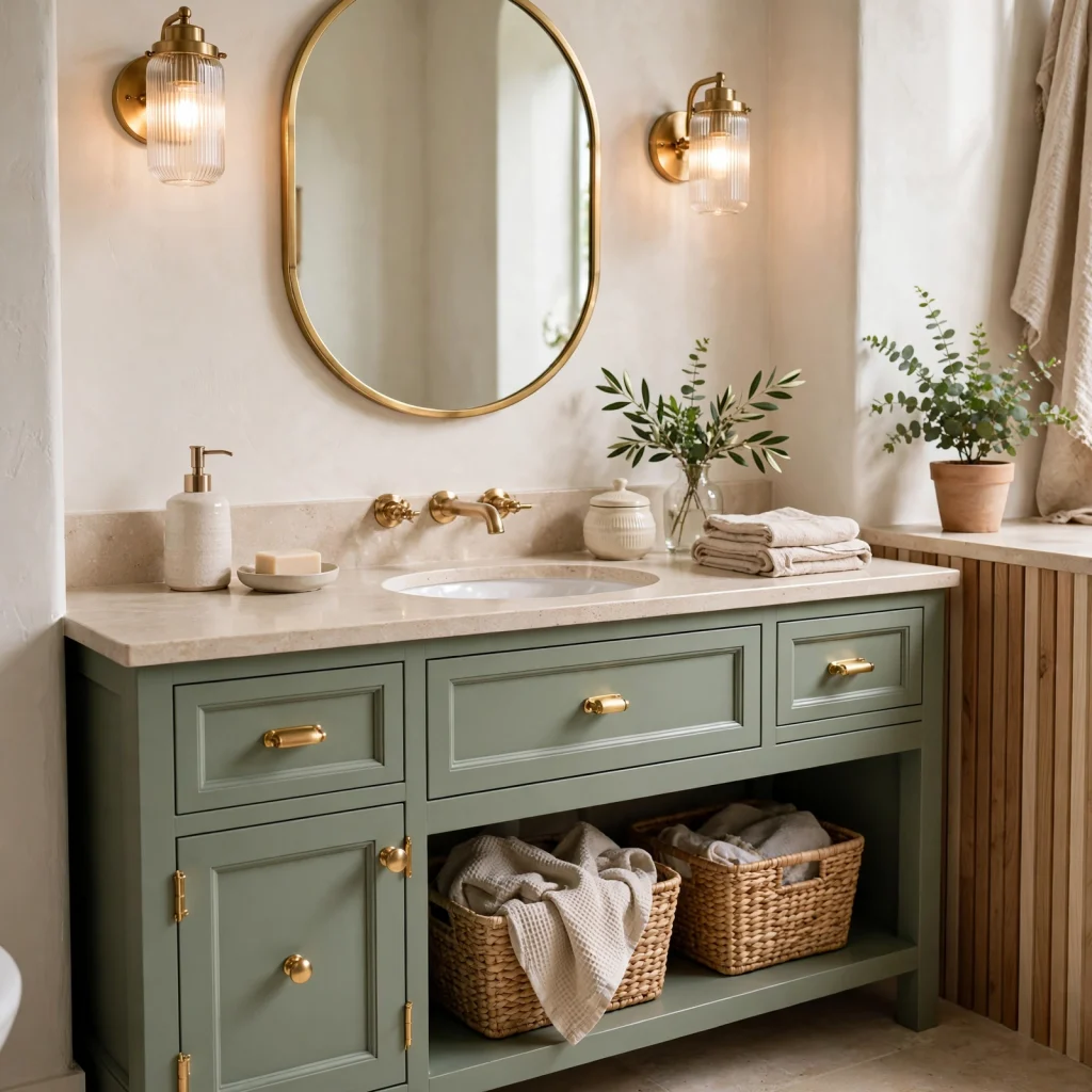
A sage green vanity, paired with white or marble-look countertops and brass fixtures, brings the popularity of green cabinetry into the bathroom, an application that’s grown significantly alongside the broader trend of green kitchen cabinetry. This shade works particularly well in a bathroom with ample natural light, where the muted, gray-green undertone reads as calming rather than dim. Choosing a matte cabinet finish, rather than high gloss, keeps the color feeling soft and spa-like rather than overly saturated.
15. Layered Green Tonal Palette
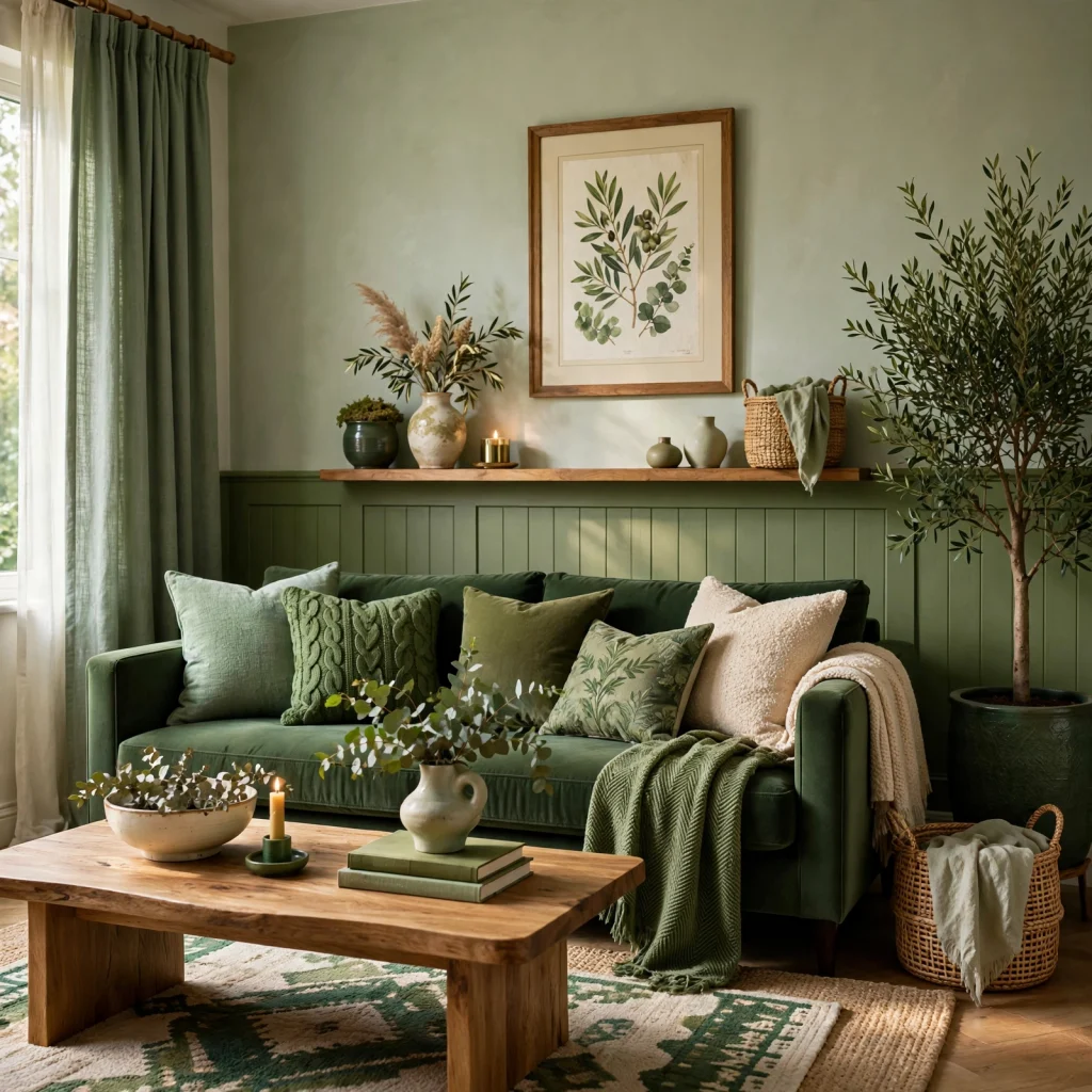
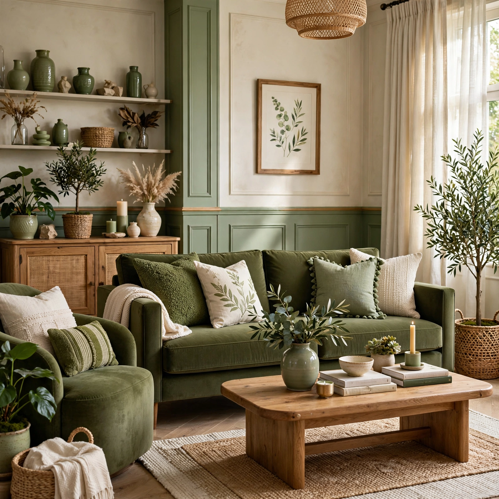
Rather than choosing a single shade of green for an entire room, layering two or three different greens a sage wall, an olive textile, and a forest green accent piece creates depth and visual interest within a cohesive, single-color family. This approach avoids the flatness that can come from a single green used across every surface in a room. Varying the greens’ undertones slightly, from warmer to cooler, while keeping the overall saturation level similar, prevents any one element from clashing within the layered scheme.
Shop the Look
Sage green walls paired with cream trim and warm wood furniture create a calming, layered base for a bedroom or living room. Add brass hardware and light fixtures throughout, along with a botanical wallpaper accent in a powder room or entryway for a bolder tonal moment. Finish with a terracotta textile accent, like a throw pillow or table runner, to introduce warmth alongside the green’s cooler undertones where needed.
Common Mistake to Avoid
The most common mistake with a green color palette is choosing a shade based on a paint chip or online image alone, without testing it in the room’s actual natural and artificial lighting, which often results in a green that reads far more yellow, blue, or gray in person than expected. Painting a large sample swatch directly on the wall and observing it across different times of day prevents most of these mismatches. Skipping this step is one of the most common reasons homeowners end up repainting a green room shortly after the initial installation.
FAQs
What green shade works best for a small room?
Lighter, cooler-toned greens like sage or eucalyptus tend to work best in a small room since they reflect more light than a deep, saturated shade like forest or hunter green. Using the same green tone on the ceiling as the walls, rather than a contrasting white, can also help a small room feel more enveloping and cohesive rather than choppy. Reserving deeper green shades for a single accent wall, rather than the full room, is a practical alternative if a bolder tone is still desired.
What colors pair well with a green color palette?
Cream, warm wood tones, and brass or gold metallics are among the most reliable pairings across nearly any shade of green, since they share or complement green’s naturally warm, organic associations. Terracotta and navy also pair well as bolder accent colors, depending on whether the overall palette is leaning warm or cool. Avoiding cooler grays or stark whites as the primary pairing color tends to keep a green palette from feeling too clinical or flat.
Is green a good color for a kitchen?
Green has become one of the most popular kitchen cabinet colors, particularly in sage, olive, and forest green shades, offering a warmer, more grounded alternative to the white and gray kitchens that dominated previous design trends. Olive and sage tend to suit kitchens with more natural, organic material choices, while a deeper forest or hunter green works well in a more formal or traditional kitchen design. Pairing any green kitchen cabinet color with a lighter countertop helps balance the overall visual weight of the room.
How do I choose the right green undertone for my space?
The right undertone depends largely on the room’s natural light and the other materials already present, such as flooring and existing furniture. Warmer, yellow-leaning greens like olive tend to work well in rooms with limited natural light or warm wood tones, while cooler, blue-leaning greens like eucalyptus suit brighter rooms with white or light gray elements already in place. Testing a sample swatch directly in the room, rather than relying on a paint chip alone, is the most reliable way to determine which undertone reads correctly in that specific space.
Can I use multiple shades of green in the same room?
Yes, layering two or three shades of green within the same tonal family, such as a sage wall paired with an olive textile and a forest green accent piece, adds depth and visual interest without introducing another color into the room. Keeping the layered greens at a similar overall saturation level, while allowing some variation in undertone, helps the different shades feel cohesive rather than mismatched. This approach tends to read as more intentional and designed than relying on a single flat green tone throughout the entire space.
Conclusion
A green color palette offers genuine versatility, capable of reading as calming and neutral or bold and dramatic depending on the specific shade, pairing, and lighting involved. Whether the starting point is a single sage green accent wall or a full layered tonal scheme across a living room, the goal is a palette that feels intentional and grounded rather than accidental. Save this list to Pinterest for later, and check out our related post on gray kitchen cabinets for another versatile, neutral color direction.