16 Stunning Pastel Color Palette Ideas for a Softer Room
Pastels can be difficult to get right, since the same soft pink or blue that looks calm in one room can read flat or overly sweet in another. This guide covers sixteen pastel color palette ideas, from muted single-family combinations to bolder pastel-and-anchor pairings, with notes on undertone and where each one tends to work best. Whether you’re decorating a nursery, a bedroom, or just want to soften a space without going fully neutral, there’s a direction here to build from.
Trend & Background
Pastels have moved beyond nurseries and spring-only decorating into year-round use across full rooms, driven partly by a broader shift toward warmer, more personal color choices after years of stark white and gray interiors. Paint and textile brands have responded with more muted, dusty versions of pastel tones rather than the brighter, candy-colored pastels popular in earlier decades, making them easier to use across an entire room instead of just small accents. This shift has made a well-planned pastel color palette a more realistic option for adult living spaces, not just children’s rooms.
Key Takeaways
- Pastel palettes work best when paired with at least one deeper anchor tone, keeping the room from feeling washed out.
- Undertone consistency across pastels matters more than matching exact shades from a single color family.
- Natural light exposure changes how saturated a pastel reads, so testing in your actual room is essential.
- Mixing in warm metals, wood, or a single bold accent keeps a pastel color palette from feeling overly sweet.
1. Dusty Pink and Cream
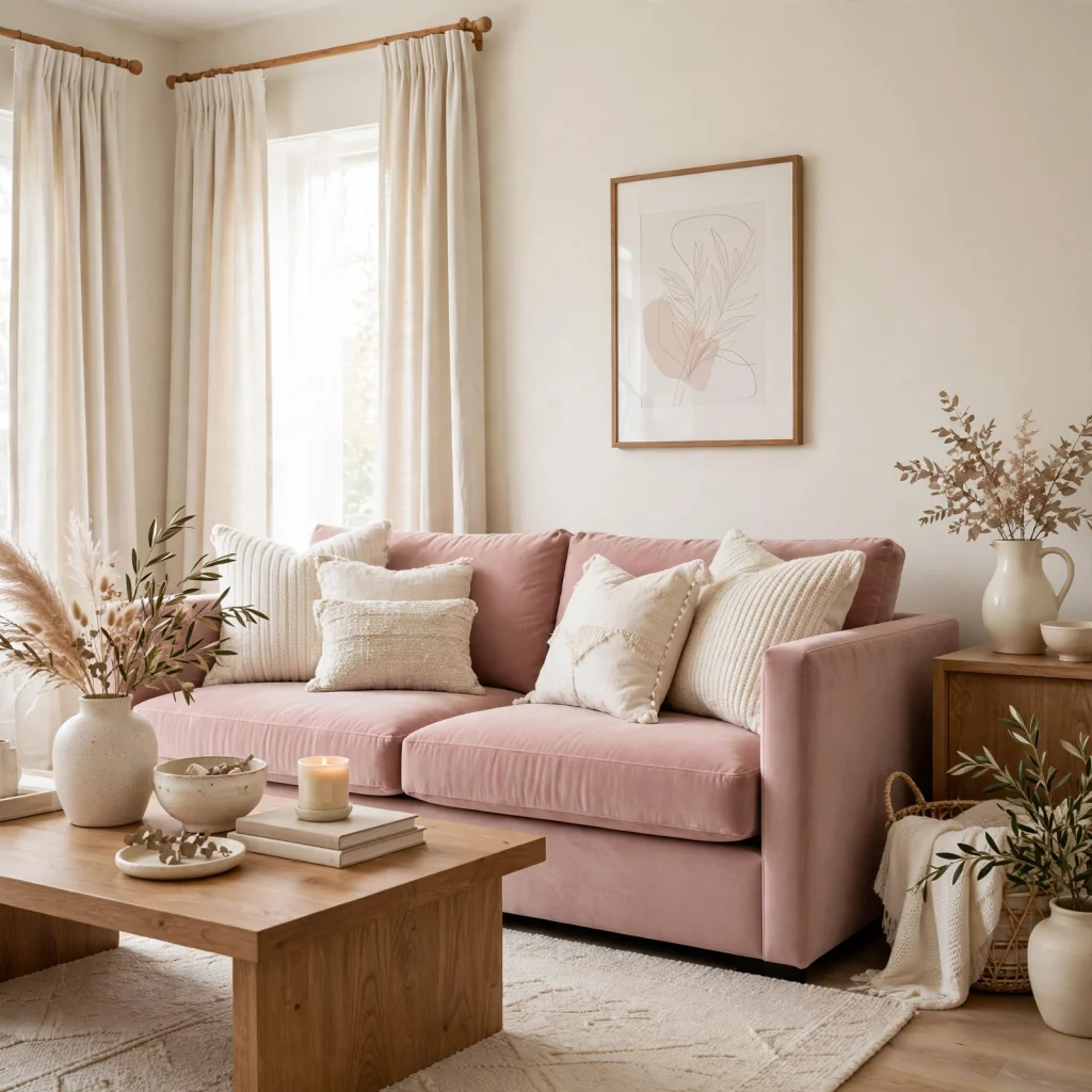
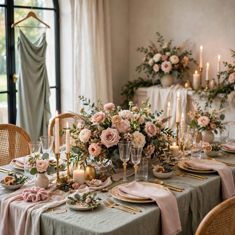
Dusty pink and cream pairs a muted, grayed-out pink with a soft off-white, creating a palette that reads calm rather than overly sweet or juvenile. Dusty pink works well on an accent wall, upholstery, or bedding, while cream carries the majority of the room to keep the pink from feeling overwhelming. This combination pairs naturally with warm wood tones and brass hardware, which help ground the softness of the palette.
2. Sage and Blush
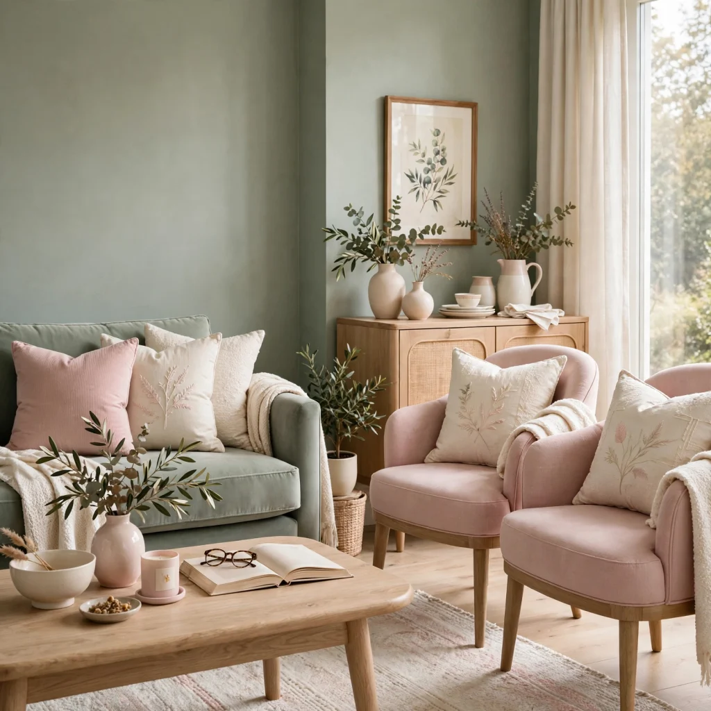
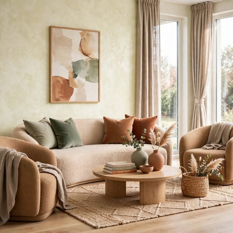
Sage and blush combines a muted green with a soft pink, two pastel tones from opposite sides of the color wheel that still read as gentle rather than contrasting sharply. Sage typically carries larger surfaces like walls or cabinetry, while blush appears through textiles or smaller accents to keep the balance from tipping too pink. This palette suits nurseries, bedrooms, or reading nooks where a soft, slightly botanical feel is the goal.
3. Pastel Color Palette Undertone Match
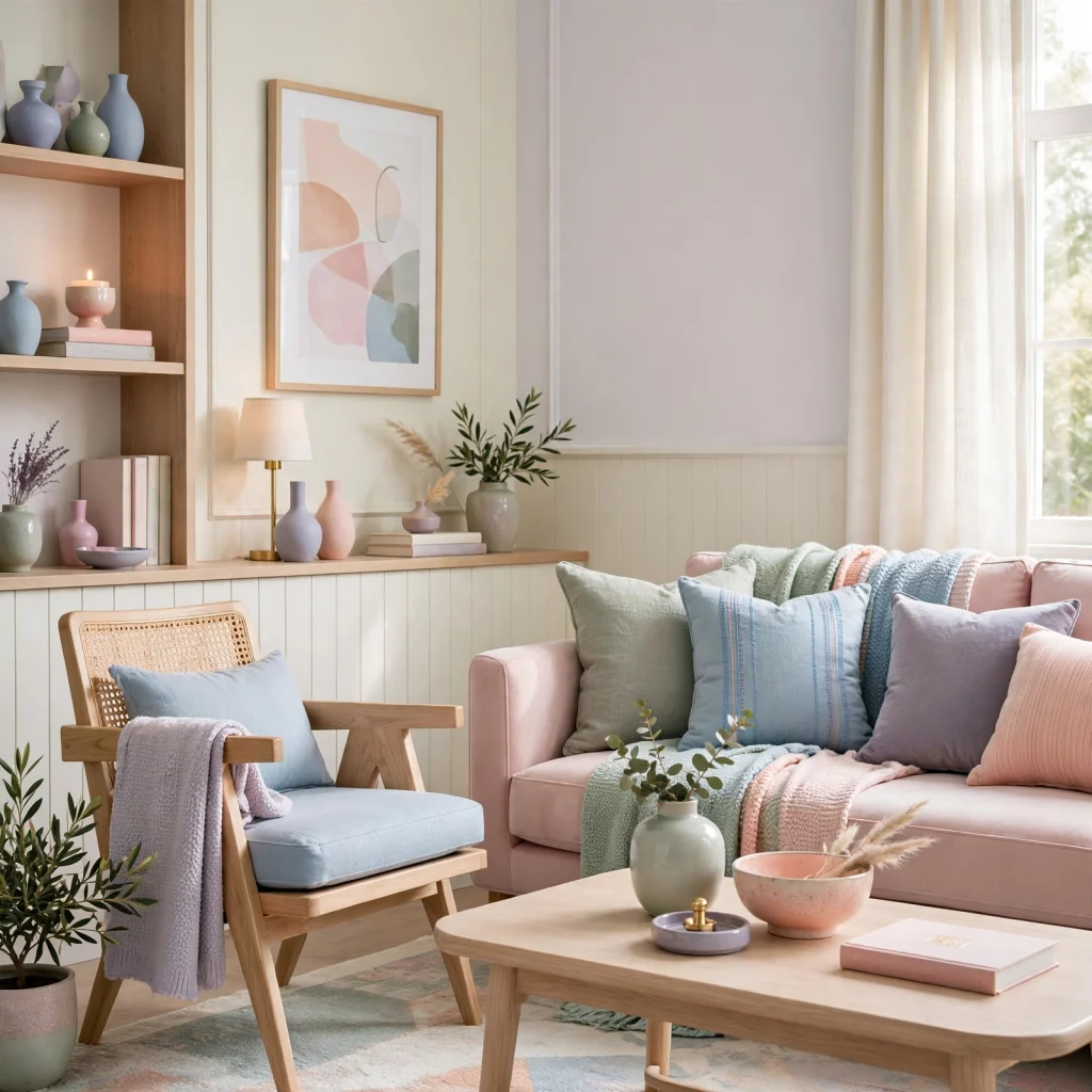
Building a cohesive pastel color palette depends more on matching undertone across colors than on choosing pastels from the same shade family, since a warm pastel yellow paired with a cool pastel blue can clash even though both are technically soft, muted tones. Holding paint chips or fabric swatches together in the room’s actual lighting reveals whether the undertones align before committing to a full combination. This step matters especially with pastel pinks and blues, which shift the most noticeably between warm and cool versions.
In order to see more options for brown color palette CLICK HERE
4. Lavender and Warm Gray
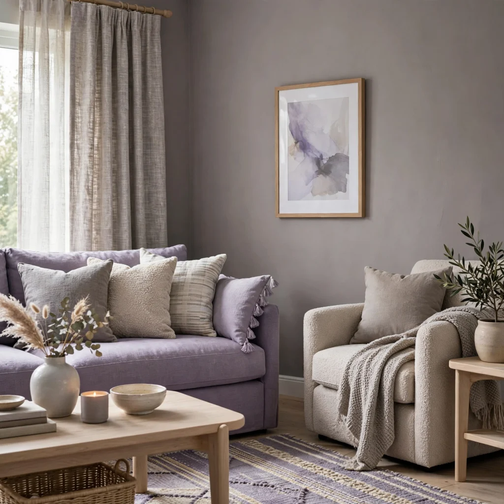
Lavender and warm gray pairs a soft, muted purple with a gray that leans slightly warm rather than cool, preventing the combination from reading too cold or sterile. Lavender works well on an accent wall, bedding, or upholstery, while warm gray carries trim, larger furniture, or secondary walls. This palette tends to suit bedrooms over shared living spaces, since it reads as restful rather than energizing.
5. Mint and Ivory
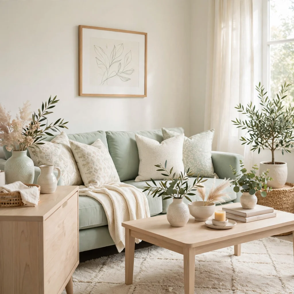
Mint and ivory combines a pale, slightly blue-green with a warm off-white, creating a fresh but understated palette that avoids the more saturated, candy-like mint tones popular in earlier decades. Mint typically appears on cabinetry, tile, or a single accent wall, while ivory carries the majority of surrounding surfaces. This combination pairs well with brass fixtures and light wood, which keep the palette from feeling too cool overall.
6. Peach and Terracotta

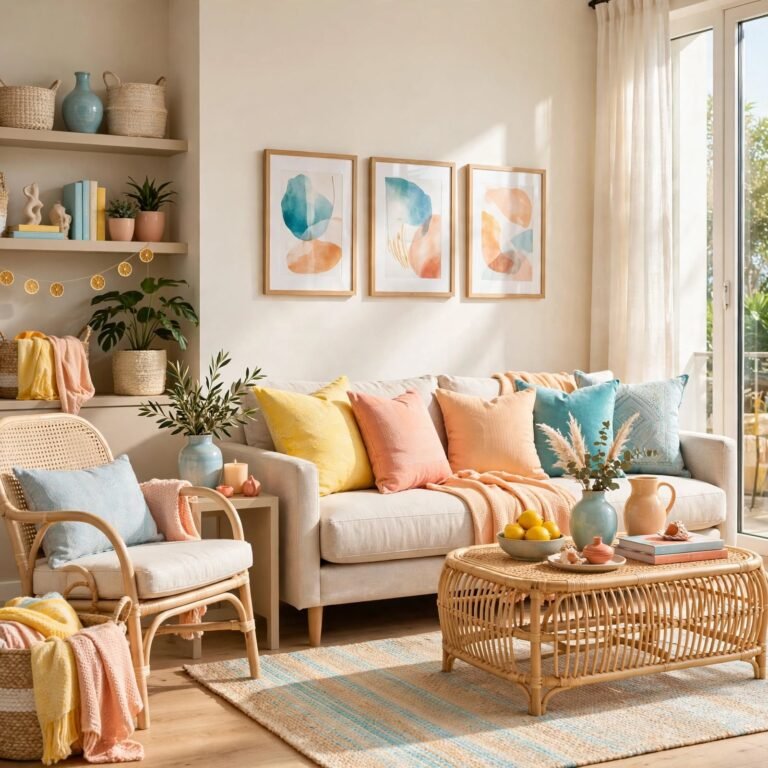
Peach and terracotta pairs a soft pastel peach with a deeper, more saturated terracotta, giving the palette an anchor tone that keeps it from feeling flat. Peach typically carries walls or bedding, while terracotta appears through ceramics, textiles, or a single furniture piece to add depth and warmth. This combination works particularly well in rooms with warm natural light, since both tones intensify nicely under golden-hour lighting.
7. Baby Blue and Warm White
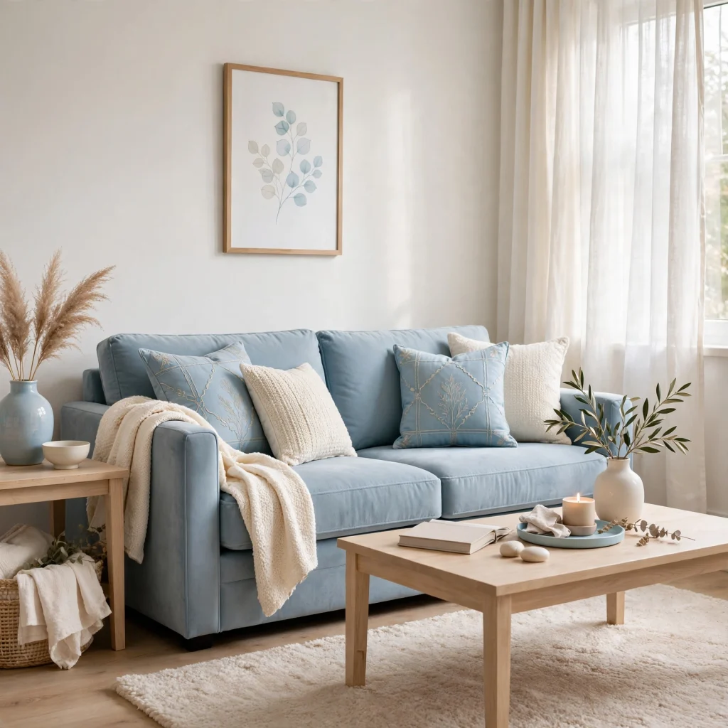
Baby blue and warm white combines a soft pastel blue with a slightly creamy white rather than a stark, cool white, keeping the overall palette from reading too clinical. Baby blue typically works on walls, cabinetry, or bedding, while warm white carries trim and secondary surfaces. This palette suits nurseries, bathrooms, or coastal-adjacent rooms, and pairs naturally with light wood tones and woven natural textures.
8. Butter Yellow and Soft Gray
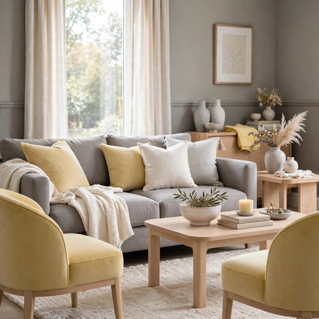
Butter yellow and soft gray pairs a warm, muted pastel yellow with a cool-toned gray, creating contrast between a warm and cool pastel without either one reading as too bold. Butter yellow works well in smaller doses, on an accent wall or textiles, while gray carries the majority of the room to keep the yellow from feeling overpowering. This combination tends to suit kitchens and living rooms where a cheerful but still grounded feel is the goal.
9. Lilac and Charcoal
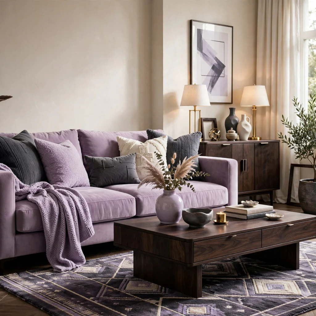
Lilac and charcoal pairs a soft pastel purple with a much deeper, near-black gray, using strong tonal contrast to keep the pastel from reading as too delicate on its own. Charcoal typically anchors larger surfaces like an accent wall or major furniture piece, while lilac appears through bedding, textiles, or smaller accents. This combination works particularly well in bedrooms, where the contrast adds a bit of drama without moving into fully saturated jewel tones.
10. Seafoam and Driftwood Beige
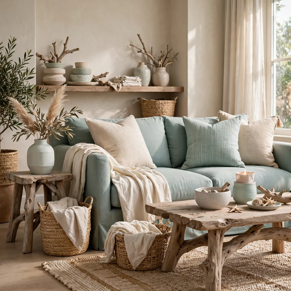
Seafoam and driftwood beige combines a pale, muted green-blue with a warm, light beige reminiscent of weathered wood, producing a soft, coastal-adjacent palette. Seafoam typically works on walls or larger textiles, while driftwood beige carries furniture and flooring-adjacent tones to keep the palette grounded rather than washed out. This combination suits rooms with ample natural light, since both tones can look flat in dim spaces.
11. Pastel Coral and Cream
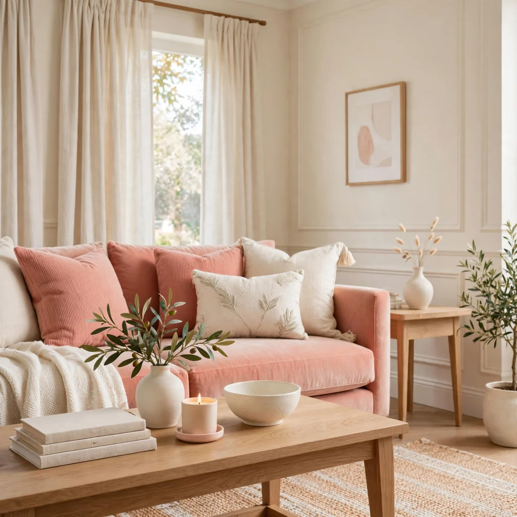
Pastel coral and cream pairs a soft, muted orange-pink with a warm off-white, creating a palette that feels cheerful without being as saturated as a full coral or hot pink. Coral typically appears through textiles, ceramics, or a single accent wall, while cream carries the majority of the room’s larger surfaces. This combination pairs well with brass or gold accents, which reinforce the palette’s warmth.
12. Powder Blue and Blush
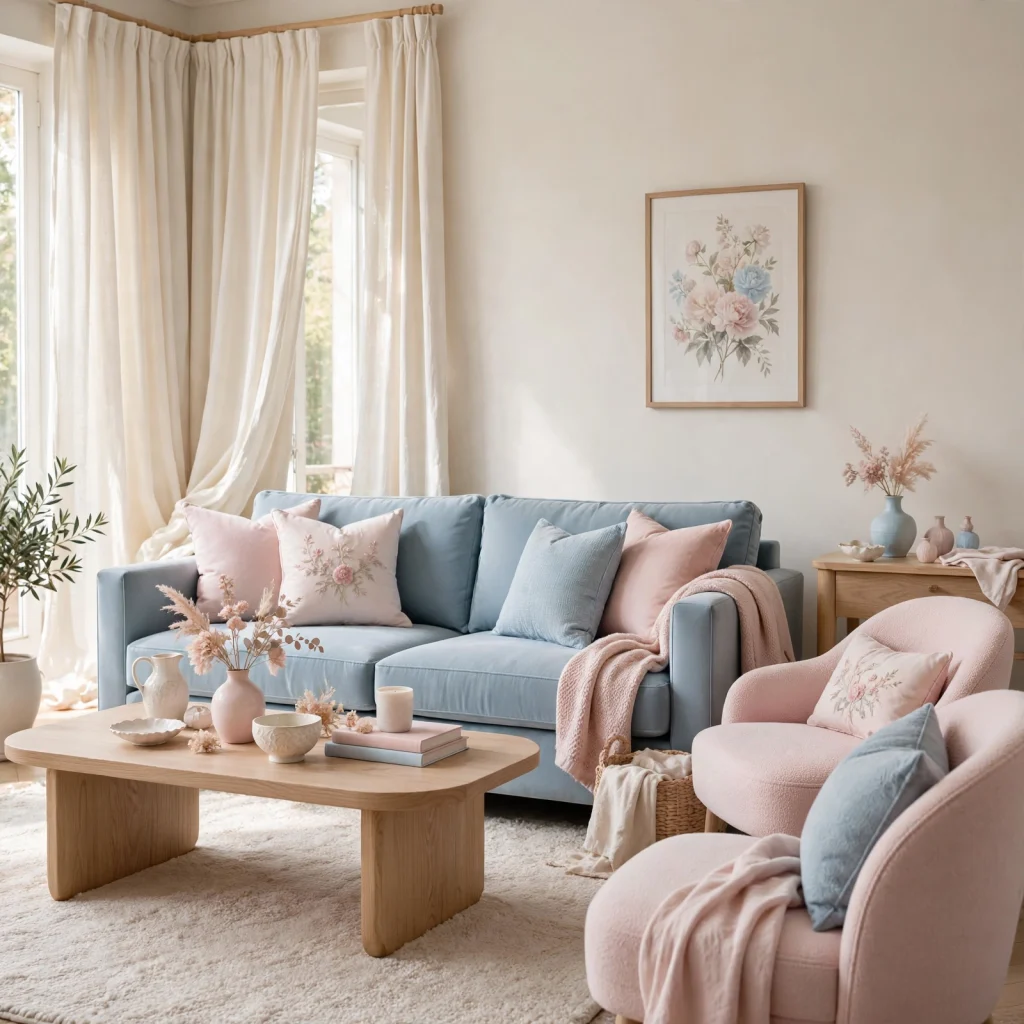
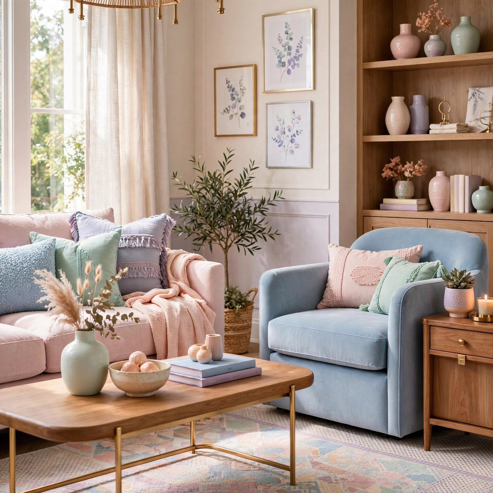
Powder blue and blush combines two classic pastel tones, a soft blue and a soft pink, in a combination that reads gentle and slightly nostalgic rather than dated when paired with more modern furniture shapes. Powder blue typically carries larger surfaces like walls or upholstery, while blush appears through smaller accents like pillows or ceramics. This palette suits nurseries, bedrooms, or reading nooks, and works best with matte rather than glossy finishes.
13. Sage and Mustard
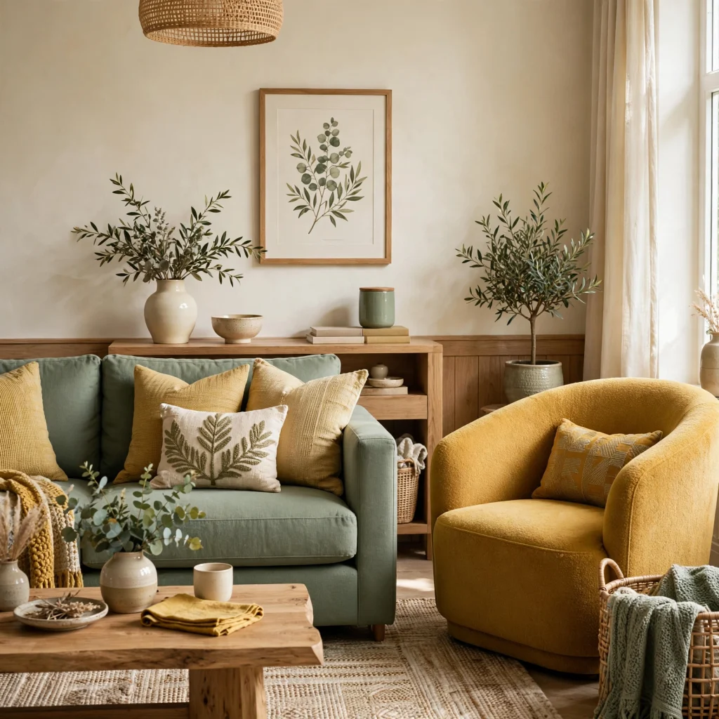
Sage and mustard pairs a muted pastel green with a deeper, warmer mustard yellow, giving the palette a stronger anchor tone than an all-pastel combination would provide on its own. Sage typically carries walls or cabinetry, while mustard appears through upholstery, textiles, or a single furniture piece for contrast. This combination pairs naturally with warm wood tones and works well in kitchens, dens, or home offices.
14. Dusty Rose and Navy
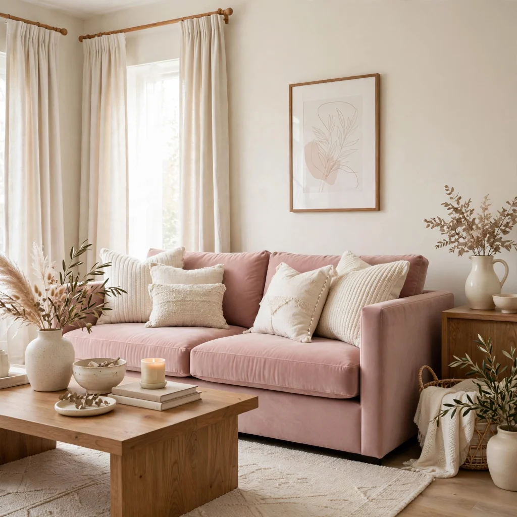
Dusty rose and navy pairs a soft, muted pink with a deep, near-black blue, creating strong contrast between a pastel and a saturated anchor tone that keeps the palette from feeling too soft overall. Dusty rose typically works on bedding, textiles, or a single wall, while navy carries larger furniture pieces or a contrasting accent wall. This combination tends to suit bedrooms where a slightly more grown-up, less overtly pastel feel is the goal.
15. Pale Peach and Sage
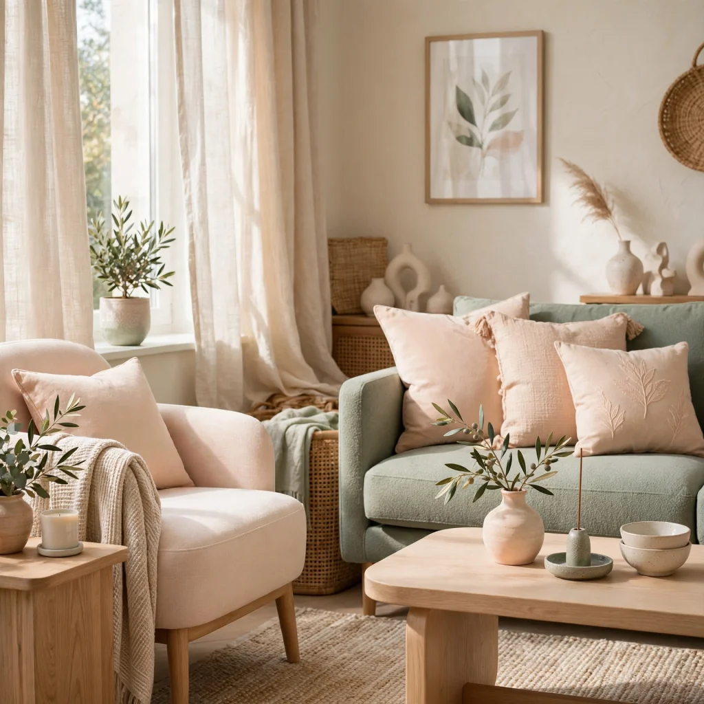
Pale peach and sage combines a very soft, warm peach with a muted green, producing a gentle, garden-inspired palette that leans slightly warmer than a straightforward sage and blush combination. Peach typically carries walls or bedding, while sage appears through textiles, cabinetry, or plant-adjacent accents. This palette works particularly well in nurseries or sunrooms, where the warmth of peach pairs naturally with abundant natural light.
16. Cotton Candy Blue and Pink
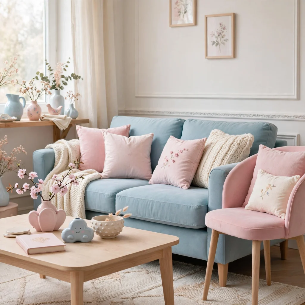
Cotton candy blue and pink pairs two brighter, more saturated pastel tones than most of the combinations on this list, leaning into a playful, slightly retro feel rather than a muted, grown-up palette. Blue and pink are typically balanced in roughly equal measure across walls, textiles, and furniture, rather than one dominating and the other serving as a small accent. This combination suits playrooms, kids’ bedrooms, or spaces where a more energetic pastel feel is specifically the goal.
| Palette | Undertone | Best Room Type |
| Dusty Pink and Cream | Warm | Bedroom, living room |
| Sage and Blush | Neutral-warm | Nursery, bedroom |
| Baby Blue and Warm White | Cool-warm mix | Nursery, bathroom |
| Lilac and Charcoal | Cool with dark anchor | Bedroom |
| Cotton Candy Blue and Pink | Cool-warm mix | Playroom, kids’ room |
Shop the Look
A few starting pieces depending on direction: a large paint sample in your top pastel choice, a linen or cotton throw pillow in a matching muted tone, a set of unlacquered brass hardware for warmer pastel pairings, a light wood picture frame to test against your base wall color, and a woven jute rug to ground a cooler pastel palette. Testing smaller items first helps confirm the undertones actually work together before committing to a full repaint.
Common Mistake to Avoid
A common mistake with pastel color palettes is using several soft tones together without any deeper anchor color, which often leaves a room feeling washed out or difficult to photograph well in changing light. Adding at least one deeper tone, whether through a piece of furniture, a set of hardware, or a single contrasting wall, gives the eye a resting point and keeps the softness of the pastels from blending into a flat, undefined space.
FAQs
How do I keep a pastel color palette from looking too juvenile?
Pairing pastels with a deeper anchor tone, matte rather than glossy finishes, and warm materials like wood or brass generally keeps a palette from reading as childish. Muted, dusty versions of pastel colors, rather than bright, candy-saturated ones, also read as more grown-up when used across an entire room. Limiting the number of pastel tones to two, with one carrying most of the room and the other used as an accent, further helps the palette feel intentional rather than playful by default.
Do pastel color palettes work in rooms with little natural light?
Pastels generally need more natural light than deeper, saturated colors to avoid looking flat or gray, so rooms with limited light often do better choosing warmer pastels, like a dusty peach or butter yellow, over cooler ones like pale blue or lavender. Testing a sample swatch at the darkest point of the day is especially important for pastels, since the softness that reads as calming in good light can look washed out or dull without it.
What metal finishes pair best with a pastel color palette?
Warm metals like brass, gold, and copper tend to pair more naturally with pastel palettes than cool-toned metals like chrome or stainless steel, since the warmth helps ground the softness of the colors. Cooler pastels, like powder blue or lavender, can still work with brushed nickel or chrome if the rest of the room leans more modern, but brass remains the more universally flattering choice across most pastel combinations. Testing hardware against a paint sample before purchasing helps confirm the pairing works in your specific light.
Can a pastel color palette work in a living room, or is it better for bedrooms?
Pastel palettes can absolutely work in living rooms, particularly when paired with a deeper anchor color and warmer materials like leather or wood to keep the space feeling grounded rather than delicate. Muted pastels like sage, dusty rose, or butter yellow tend to translate better to shared living spaces than brighter, more saturated pastels, which can feel more suited to a bedroom or nursery. The key difference is usually balancing the pastel with enough contrast and texture to hold up in a higher-traffic room.
How many pastel tones should be in one palette?
Most successful pastel palettes use two primary tones, often one warm and one cool, or one pastel paired with a single deeper anchor color, rather than three or more pastels combined at once. Using more than two pastel tones tends to require very careful balancing of saturation and placement to avoid the room feeling scattered, since pastels are close enough in weight that they can start to blend together visually rather than reading as distinct choices.
Conclusion
A well-planned pastel color palette can feel calm and grown-up rather than overly sweet, as long as it’s paired with a deeper anchor tone and tested against your room’s real lighting first. Pick one of these sixteen combinations that matches the mood you’re after, sample it before committing to paint, and ground it with warm materials like wood or brass. Save this post to Pinterest for later, or check out our related guide on choosing paint undertones for more direction.