16 Unique Fall Color Palette Ideas for a Warm, Layered Home
Picking the right fall color palette can turn a flat, forgettable room into one that feels grounded and intentional the moment the light shifts golden in October. This guide walks through sixteen distinct palette directions, from classic rust and cream combinations to deeper, moodier options like merlot and charcoal. Each idea includes the materials and finishes that make it work in a real home, not just a mood board, along with practical notes on where and how to apply it.
Trend & Background
Warm, earth driven color schemes have moved well beyond seasonal decor and into permanent interior choices, as homeowners lean toward palettes that feel collected rather than themed. Paint brands have responded with entire lines built around ochre, terracotta, and deep botanical greens, reflecting a broader shift away from cool gray interiors that dominated the last decade. This matters now because these tones read as timeless rather than trendy, meaning a well chosen fall inspired palette can anchor a room year round instead of being packed away every winter.
Key Takeaways
- A fall color palette works best when it pairs one deep anchor tone (rust, merlot, espresso) with a lighter neutral to keep rooms from feeling heavy.
- Texture (wool, linen, brushed brass, raw wood) carries seasonal color as much as paint does, so palettes should be planned across fabric and finish, not just walls.
- Budget friendly swaps like throw pillows, table linens, and ceramic vases let you test a palette before committing to paint or upholstery.
- The most durable fall palettes borrow from the landscape: dried leaves, harvest wheat, bark, and dusk skies, which age better than trend driven neons or pastels.
1. Burnt Sienna & Cream
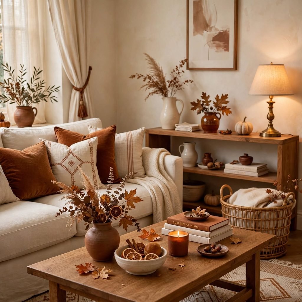
Burnt sienna paired with a soft cream base creates a palette that feels sun warmed without tipping into orange. Use the sienna on a single accent wall, a set of dining chairs, or ceramic pottery, while letting cream carry the bulk of the walls and larger upholstery. This combination photographs well in both natural and lamp light, which makes it a dependable choice for living rooms and entryways that see heavy daily use throughout the season.
| Element | Color/Finish | Suggested Placement |
| Anchor tone | Burnt Sienna | Accent wall, pottery |
| Base tone | Warm Cream | Walls, sofa upholstery |
| Metal accent | Aged Brass | Lighting, hardware |
| Wood tone | Natural Oak | Flooring, tabletops |
2. Terracotta and Olive
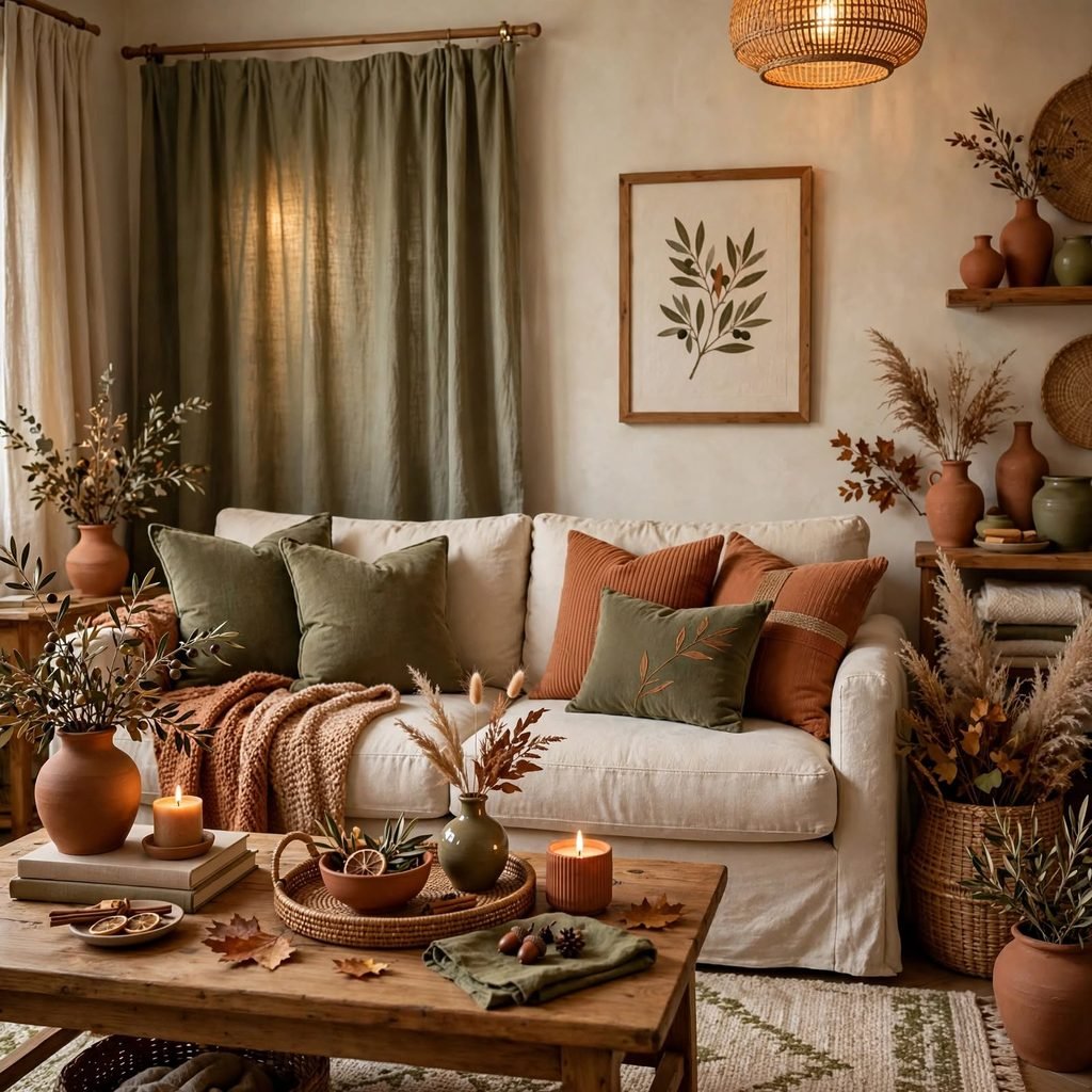
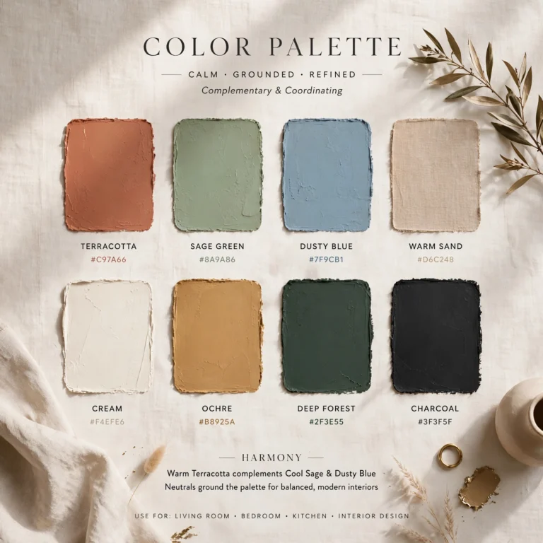
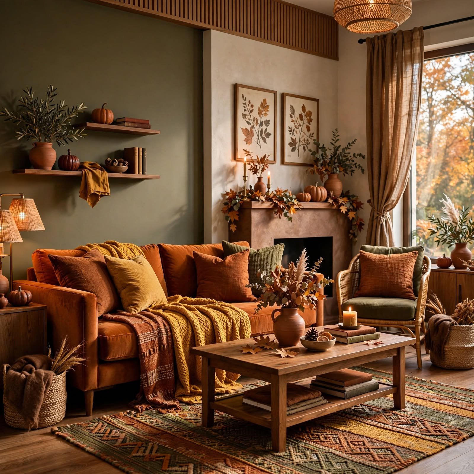
Terracotta and olive draw directly from Mediterranean pottery and orchard landscapes, giving a room an earthy, sun baked character. Bring terracotta in through planters, woven baskets, or a tiled backsplash, and let olive appear in linen curtains or a boucle armchair. The two tones share enough warmth that they never compete, making this pairing especially effective in kitchens and sunrooms where natural light shifts throughout the day.
3. Rust and Charcoal
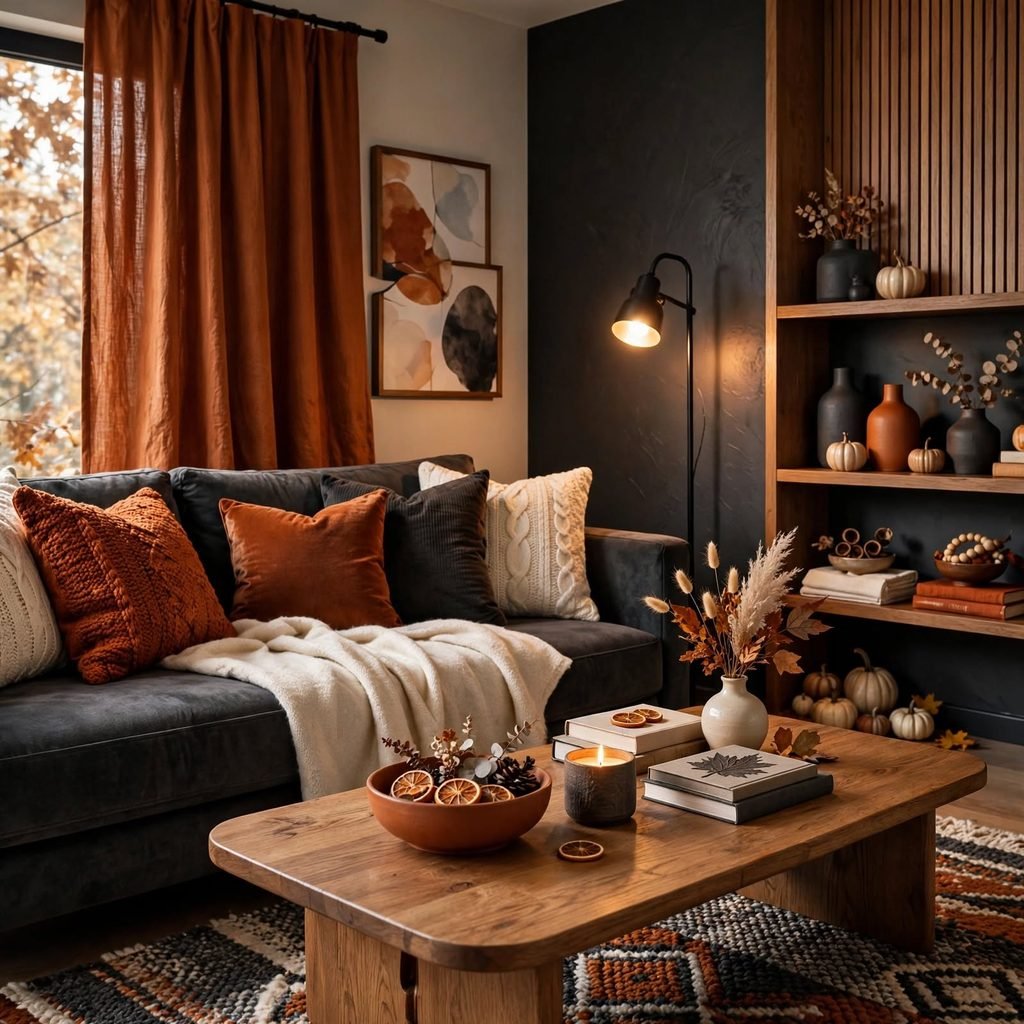
Rust and charcoal together create contrast without resorting to stark black and white, giving a space a masculine, grounded feel. Charcoal works best on a feature wall or a large sectional, while rust shows up in throw blankets, art frames, or a vintage rug. This palette suits studies, home offices, and dens where the goal is a cozy, slightly moody atmosphere rather than an airy one.
For more options winter color palette
4. Golden Ochre Accents
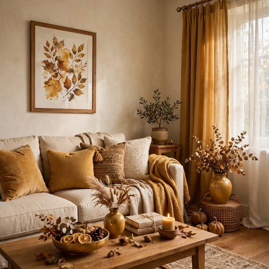
Golden ochre used sparingly as an accent injects warmth into an otherwise neutral room without overwhelming it. A single ochre lampshade, a set of velvet cushions, or a painted door frame is often enough to shift the entire mood of a space. Because ochre reads as both vintage and current, it pairs easily with existing furniture, making it one of the lowest commitment ways to bring a fall color palette into a rental or transitional home.
5. Deep Merlot Walls
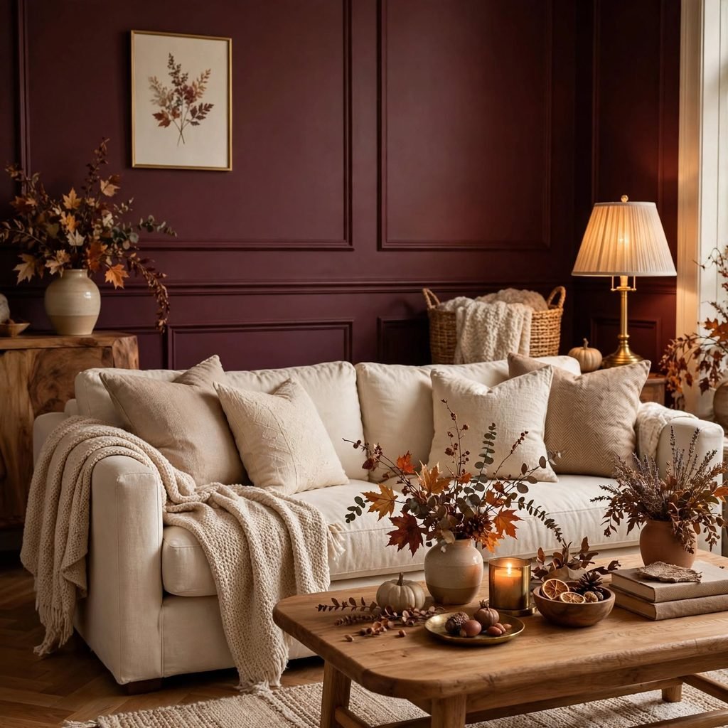
Deep merlot walls give a dining room or powder bath a dramatic, enveloping quality that reads as intentional rather than dated. Balance the intensity with brass or unlacquered fixtures and pale stone or marble surfaces so the room doesn’t feel closed in. Merlot performs particularly well in rooms lit primarily by candlelight or warm toned bulbs, where the color deepens into something closer to aged wine than straightforward red.
6. Cinnamon and Camel
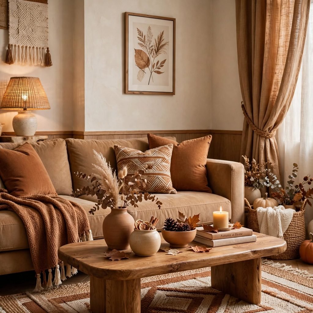
Cinnamon and camel form a soft, wearable palette that suits bedrooms and reading nooks where the goal is comfort over drama. Camel toned linen bedding paired with cinnamon throw pillows or a leather accent chair keeps the room feeling layered without much visual noise. This combination also transitions easily into winter, since both tones sit close enough on the color wheel to avoid a jarring seasonal reset.
7. Forest Green and Amber
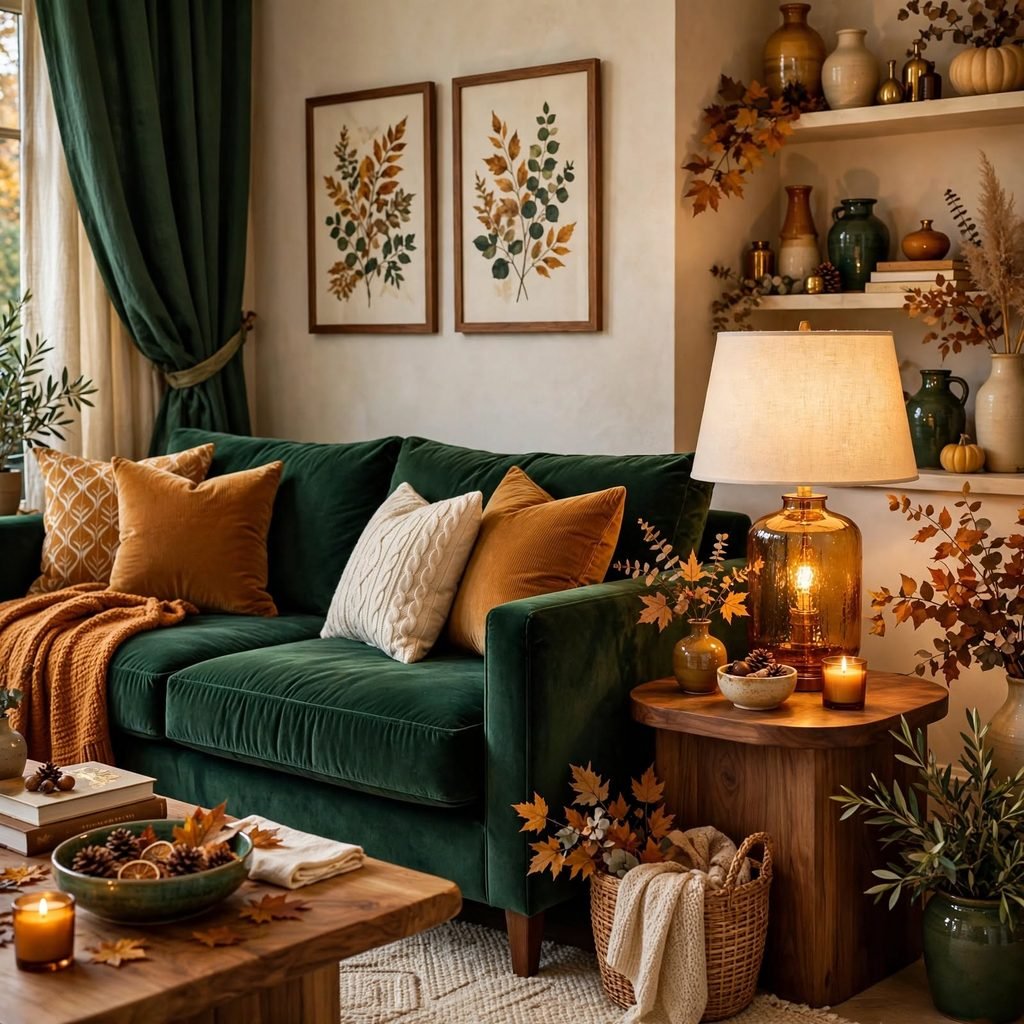
Forest green and amber borrow directly from turning leaves and evening light, giving a living room a woodland, cabin like quality. Use forest green on cabinetry, bookshelves, or a velvet sofa, and let amber glassware, candles, or wall sconces provide the warmth. This pairing tends to work especially well in homes with a lot of natural wood trim, since both colors sit comfortably against honey and walnut tones.
8. Mustard Yellow Highlights
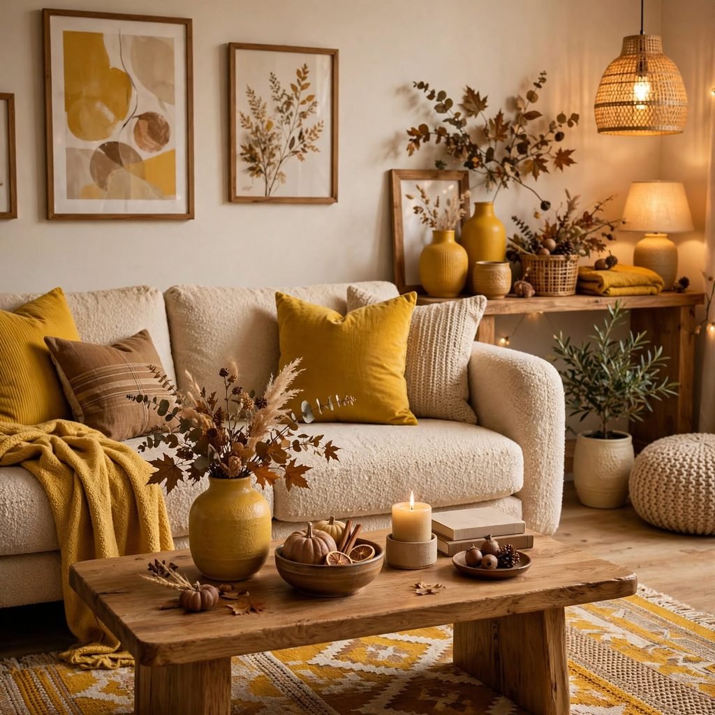
Mustard yellow used as a highlight color brings energy into a fall palette without pushing it toward Halloween orange. A mustard accent chair, a set of ceramic mugs, or a striped throw introduces the tone without requiring a full furniture overhaul. Because mustard can skew either warm or slightly muddy depending on lighting, it’s worth testing swatches under both daylight and evening bulbs before committing to a larger piece.
| Budget Tier | Suggested Item | Approx. Cost |
| Low | Mustard throw pillow covers | $20–$40 |
| Mid | Ceramic vase or lamp base | $60–$120 |
| High | Upholstered mustard accent chair | $400–$900 |
9. Chestnut Brown Palette
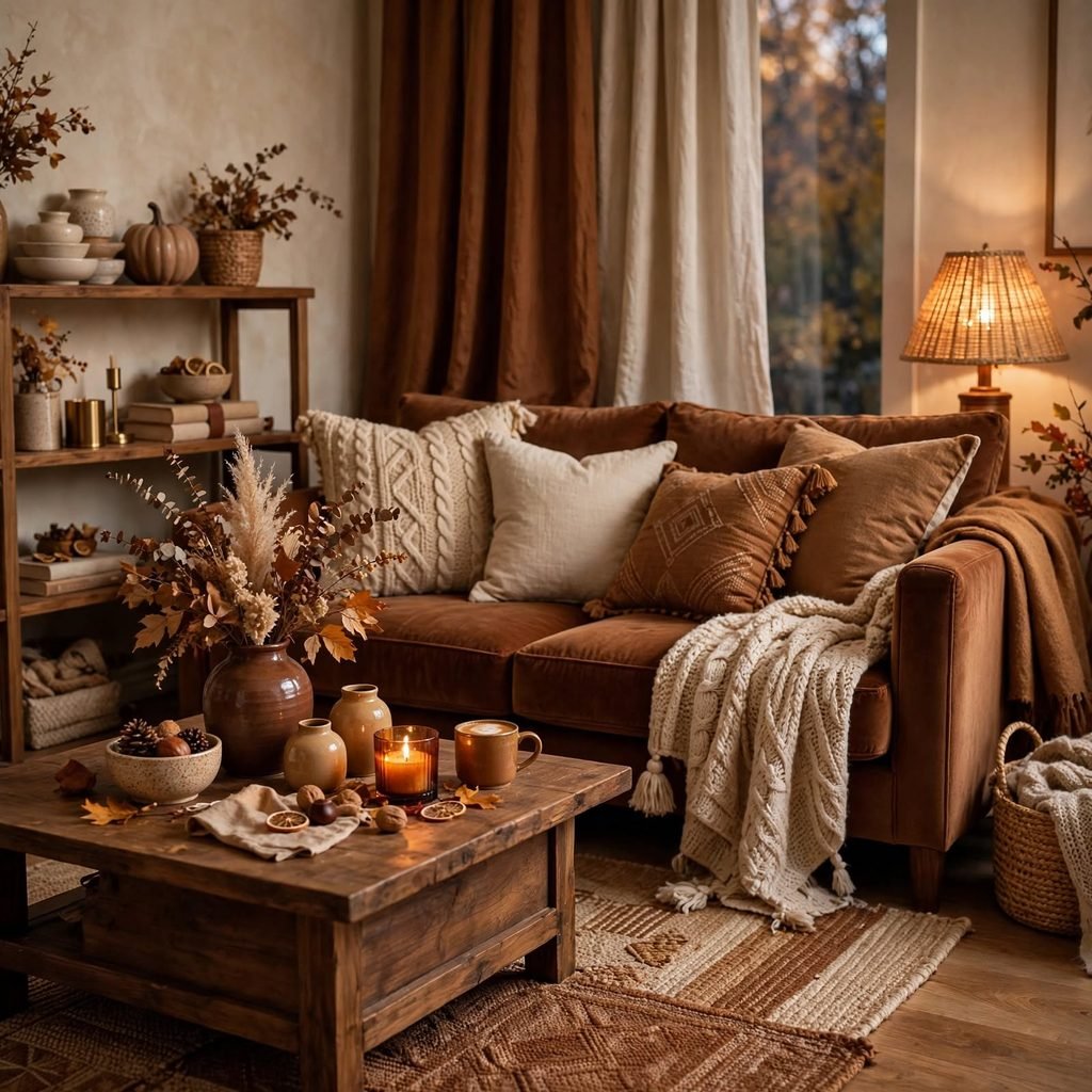
A chestnut brown palette leans into rich, saturated wood tones that feel substantial rather than dated. Chestnut works well as a kitchen cabinet color, a leather sofa, or a set of dining chairs, especially when balanced against lighter plaster or limewash walls. This palette rewards natural materials over synthetic ones, so pairing chestnut with linen, rattan, or raw wood tends to look more intentional than pairing it with high gloss finishes.
10. Burgundy and Navy
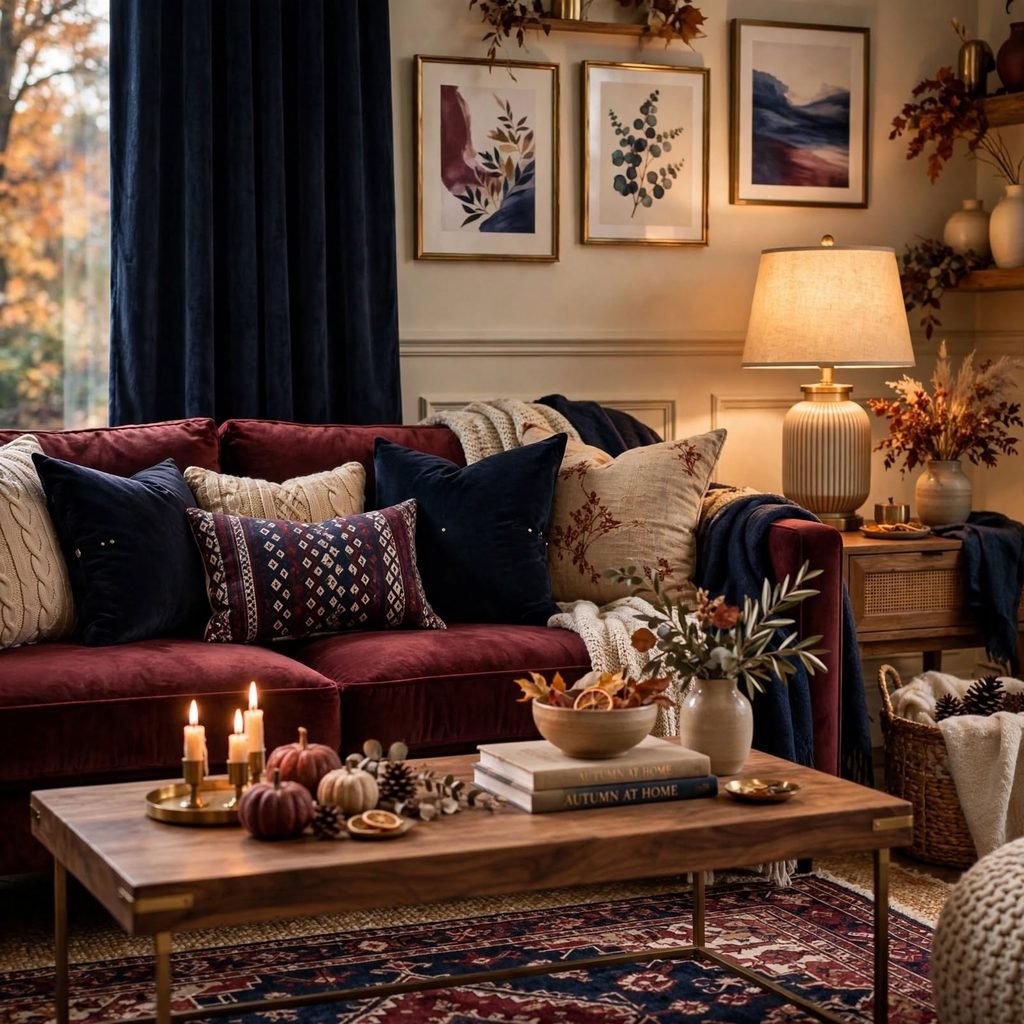
Burgundy and navy together create a rich, jewel toned palette that feels more formal than typical autumn combinations. Use navy as the dominant base on walls or an upholstered headboard, then bring in burgundy through velvet cushions, a runner rug, or drapery. This combination suits dining rooms and libraries especially well, where the goal is often a cozy, slightly clubby atmosphere rather than a bright, casual one.
11. Copper Metallic Accents
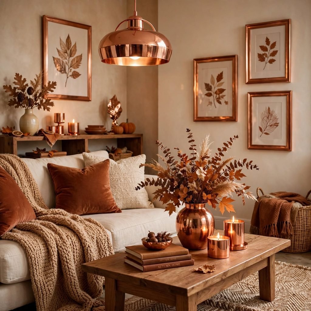
Copper metallic accents add warmth and shine to any fall color palette without requiring a change to existing wall colors. Copper pendant lights, cookware left on open shelving, or a mirrored frame catch and reflect warm light in a way that flat paint colors can’t replicate on their own. This works particularly well in kitchens and bathrooms, where metal fixtures already play a functional role and can simply be swapped for a warmer finish.
12. Pumpkin Spice Tones
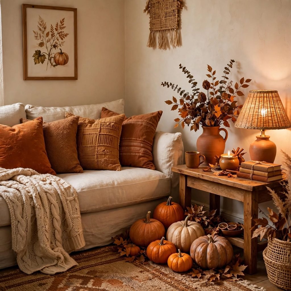
Pumpkin spice tones, a muted, dusty orange rather than a bright Halloween shade, bring seasonal warmth into a room without feeling like a costume display. This tone works best in small doses: a set of napkins, a stack of throw blankets, or a single upholstered ottoman. Because the color is inherently attention grabbing, keeping the surrounding palette neutral, in tones like oatmeal or bone, prevents the room from feeling overly themed.
13. Sage Green and Rust
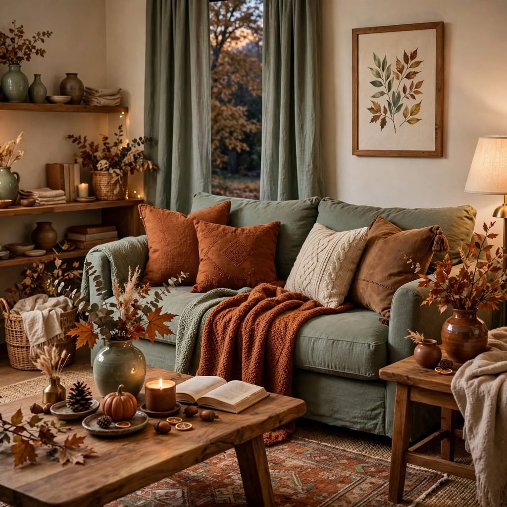
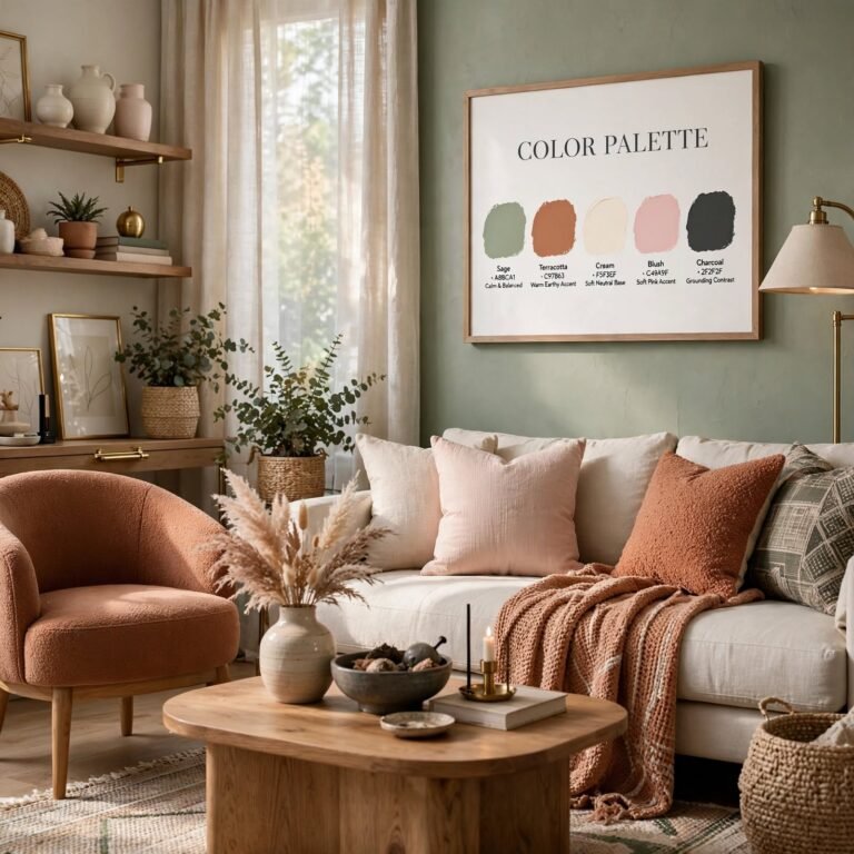
Sage green and rust pair a cool, muted green with a warm clay tone, giving a room balance between calm and energy. Sage works well as a wall color or kitchen cabinetry, while rust appears in pottery, woven textiles, or a leather bench. This palette has become a favorite in farmhouse and modern rustic interiors because it reads as grounded and natural rather than tied to a specific decade or trend.
14. Espresso and Marigold
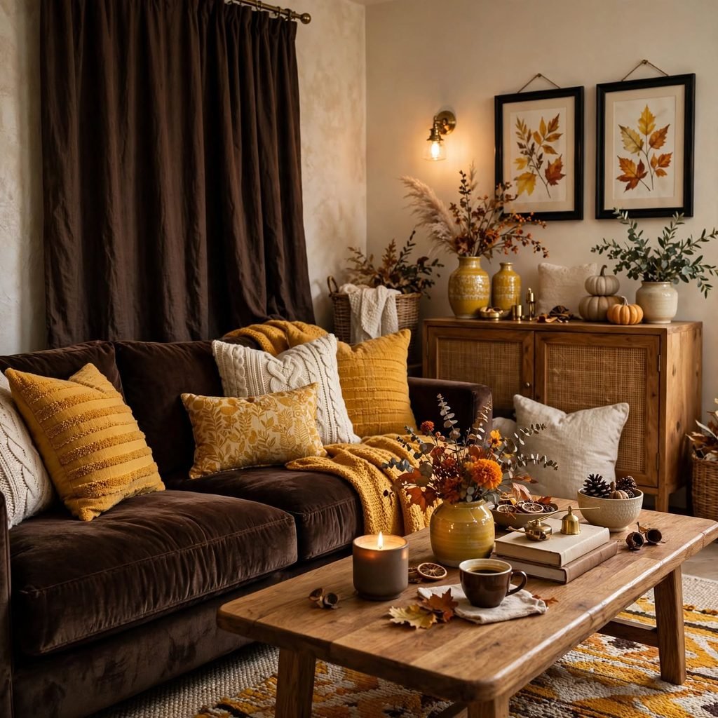
Espresso brown and marigold yellow create a bold, high contrast palette suited to spaces that can handle a strong visual statement, like a home bar or entryway. Espresso stained wood cabinetry or millwork anchors the space, while marigold appears in artwork, a single accent chair, or patterned wallpaper. This combination tends to photograph dramatically well, making it a strong choice for spaces meant to feel like a focal point of the home.
15. Plum and Mauve
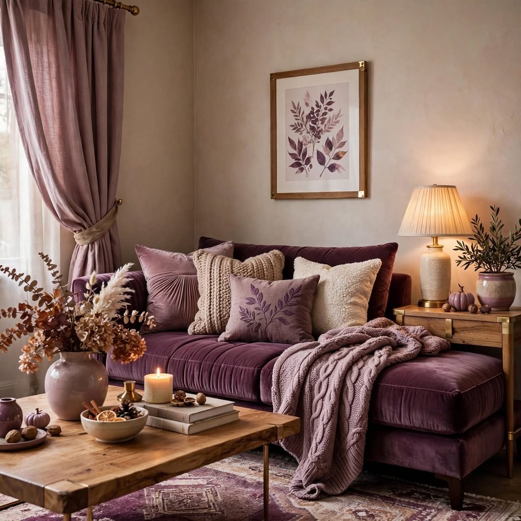
Plum and mauve soften the typical fall lineup with a slightly cooler, more romantic edge, working well in bedrooms and dressing rooms. Mauve can carry the walls or bedding, while deeper plum shows up in velvet drapery, a headboard, or accent trim. Because both tones share a similar undertone, this palette avoids the visual clash that can happen when purples are paired with straightforward orange based autumn colors.
16. Harvest Wheat Neutrals
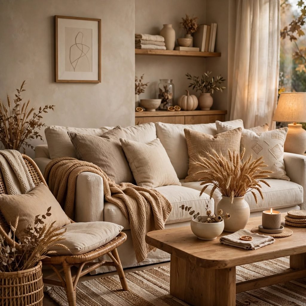
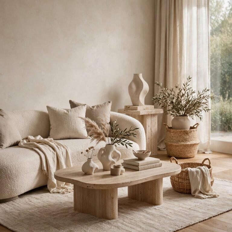
Harvest wheat neutrals, pale straw, bone, and unbleached linen, form the quiet backbone many fall palettes need to avoid feeling overwhelming. These tones work across walls, rugs, and large upholstery pieces, giving richer accent colors like rust or merlot somewhere calm to sit. This is often the first layer to choose in a fall color palette, since it determines how bold the accent colors can afford to be later.
Shop the Look
A few pieces make it easy to test these palettes before committing to paint. Look for a set of ribbed ceramic vases in ochre or rust for an entryway console, a boucle throw pillow in sage or olive for a neutral sofa, an unlacquered brass table lamp to warm up any of the darker wall colors, a chunky wool throw blanket in camel or chestnut for a reading chair, and a hand thrown stoneware dinnerware set in terracotta tones for the dining table.
Common Mistake to Avoid
The most common mistake with a fall color palette is applying every warm tone at once (rust walls, mustard curtains, and a burgundy rug in the same room), which flattens the palette instead of layering it. Strong autumn colors need visual rest in the form of neutrals like cream, bone, or oatmeal, and at least one cooler tone such as sage or navy to keep the space from reading as a single overwhelming block of orange and brown.
FAQs
What colors are considered a fall color palette?
A fall color palette typically includes warm, earthy tones like rust, terracotta, mustard, olive, and chestnut brown, often paired with a neutral base such as cream or oatmeal. These colors are drawn directly from the natural landscape of the season, turning leaves, harvest crops, and bark, which is why they tend to feel grounded rather than trend driven, and why they work well in both traditional and modern interiors.
How do I add fall colors without repainting?
The easiest way is through textiles and small decor: throw pillows, table linens, ceramic vases, and candles in tones like rust, ochre, or sage. Layering two or three of these accent colors against an existing neutral wall color gives the impression of a full seasonal refresh without any structural or paint changes, and everything can be swapped out again in a different season with minimal cost or effort.
Do fall colors work in a modern home?
Yes, especially when paired with clean lines and minimal patterning. Modern interiors tend to favor a restrained approach, so a single deep tone like merlot or espresso on cabinetry, combined with plain linen or boucle textiles in a lighter neutral, translates a fall color palette into a contemporary space without making it feel like a seasonal display or overly rustic.
What is the best neutral to pair with fall colors?
Warm neutrals like cream, bone, oatmeal, and unbleached linen tend to work best, since they share the same warm undertone as tones like rust and ochre rather than fighting against them. Cooler neutrals like true gray can also work as a contrast, but they require more careful balancing, since gray can make warm autumn tones look muddy rather than rich if used in equal proportion.
Can fall colors be used year round?
Many of them can, particularly muted or deep tones like chestnut, sage, and merlot, which don’t read as overtly seasonal the way bright pumpkin orange might. The key is choosing tones inspired by the season rather than tied to specific seasonal imagery, and keeping the palette anchored with neutrals so the room reads as a considered color scheme rather than a temporary autumn display.
Conclusion
A well planned fall color palette comes down to balance: one or two deep, earthy anchor tones, a warm neutral to let them breathe, and enough texture to carry the color through fabric and finish, not just paint. Save this guide to Pinterest for reference when you’re ready to test a palette, and check out our related post on layering textiles for a seasonal refresh for more room-by-room ideas.