18 Effective Color Palette Ideas for Every Room in Your Home
Choosing a color for a room is easy; choosing colors that work together across walls, furniture, and textiles is where most people get stuck. This guide walks through eighteen color palette ideas organized by mood and room type, from warm earth tones to high-contrast schemes and soft pastels. You’ll learn which combinations suit which spaces, how to test a palette before committing to paint, and the one mistake that causes even well-chosen colors to clash once they’re in the same room together.
Trend & Background
Interior color trends have moved away from single dominant colors, like the all-gray or all-white era, toward layered palettes that mix warm and cool tones with intention rather than accident. This shift matters now because paint brands and furniture retailers have expanded their color ranges significantly, giving homeowners more choice but also more room for undertone mismatches without a clear plan. Color palette ideas rooted in natural materials, like clay, sage, and walnut, have become especially popular as more people move away from trend-driven, short-lived color schemes toward tones that age well over time.
Key Takeaways
- The right color palette ideas depend on room function, natural light direction, and existing fixed materials like flooring or countertops.
- Earth tones, jewel tones, and soft pastels each suit different moods, from calm bedrooms to energetic kitchens.
- Undertone consistency matters more than matching exact shades a table inside this guide breaks down warm versus cool pairings by room type.
- Testing large swatches under real lighting conditions prevents the most common and costly color mistakes.
1. Warm Earth Tone Palette
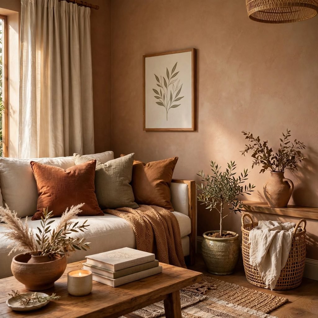
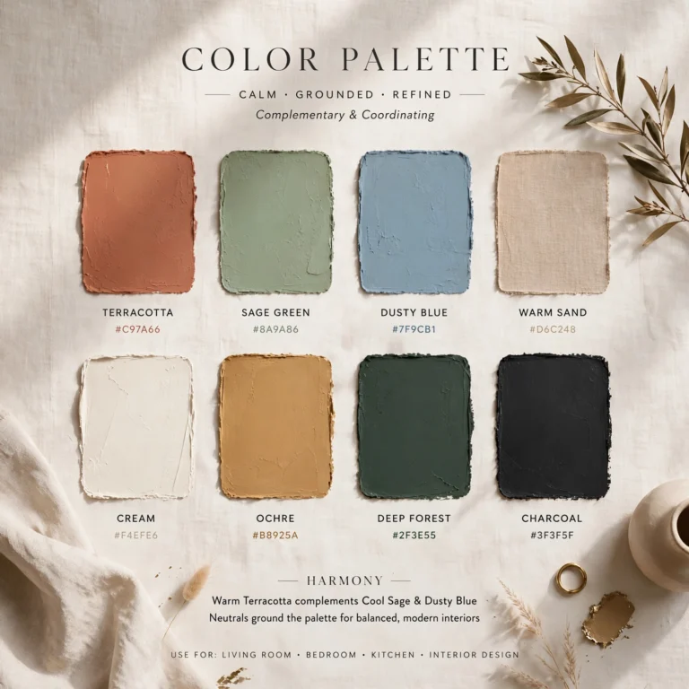
A warm earth tone palette built from terracotta, sand, and walnut brings a grounded, natural feel to a room and pairs easily with wood furniture and woven textiles already common in most homes. This palette works particularly well in living rooms and dining areas, where the warmth encourages a more relaxed, gathering-focused atmosphere throughout the day.
2. Cool Coastal Palette
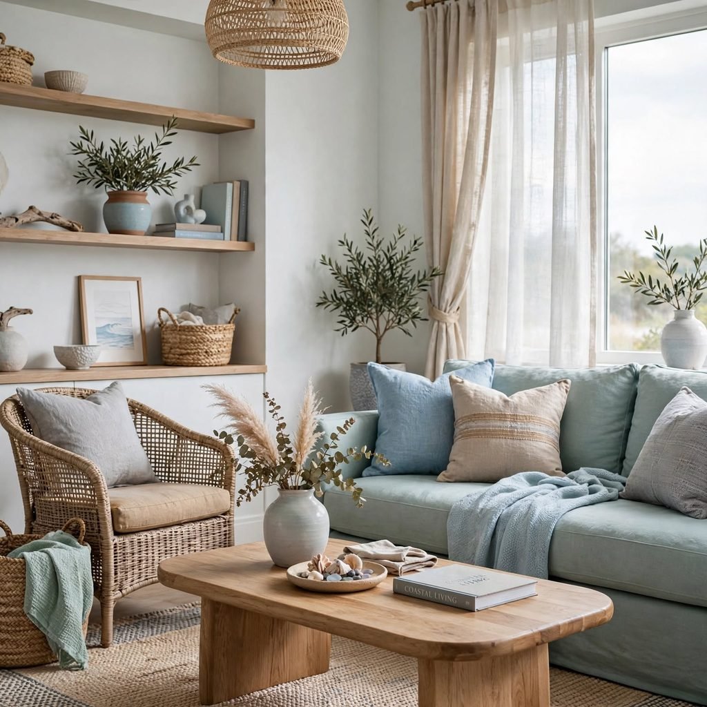
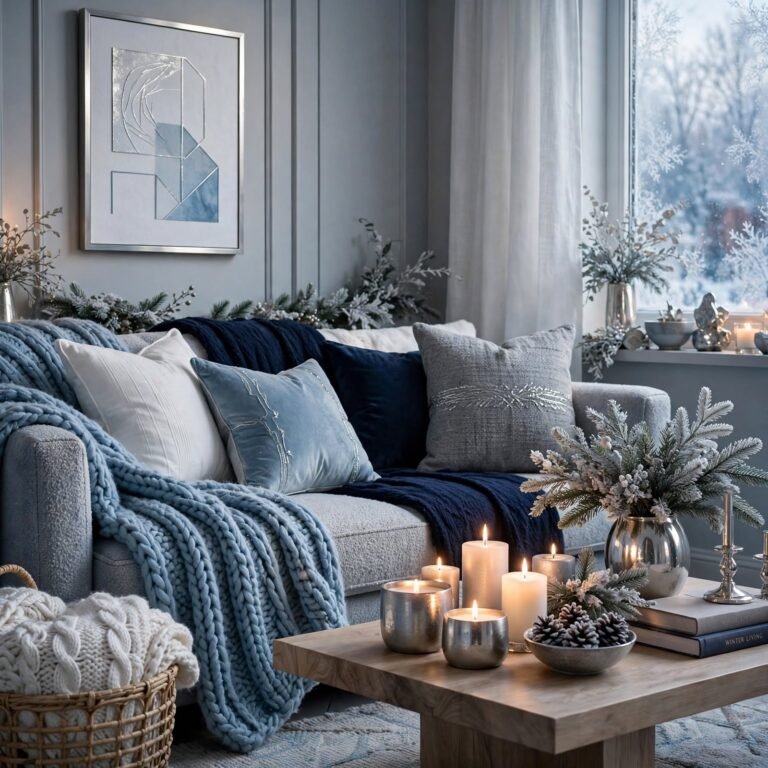
A cool coastal palette combining soft blues, sandy neutrals, and white creates an airy, light-filled feel that works especially well in rooms with strong natural light or ocean-adjacent views. Keeping the blues muted rather than saturated prevents the palette from reading as overly literal or themed, allowing it to work in inland homes just as well as beachfront ones.
For more fall color palette Click here
3. Moody Jewel Tone Palette
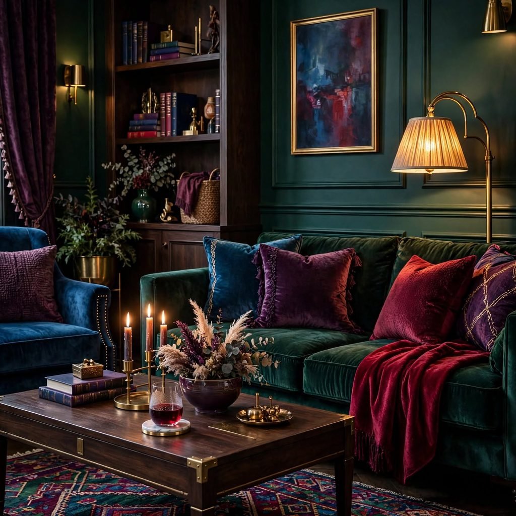
Jewel tones like emerald, sapphire, and deep burgundy create a rich, dramatic feel best suited to smaller rooms like a dining room or home office rather than large open-concept spaces where the saturation can feel overwhelming. Pairing jewel tones with black or dark wood trim intensifies the effect, while brass or gold accents add warmth and prevent the palette from feeling cold.
| Room Type | Best Jewel Tone | Recommended Trim |
| Dining room | Emerald | Black or dark walnut |
| Home office | Sapphire | Brass accents |
| Powder room | Burgundy | Gold fixtures |
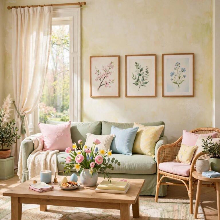
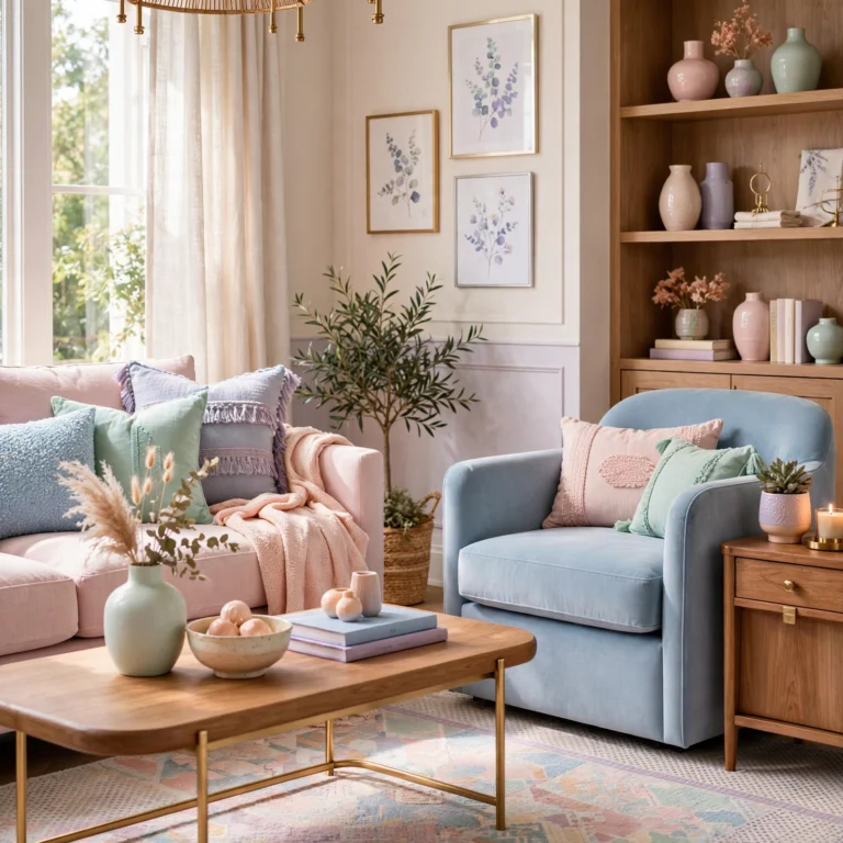
4. Soft Pastel Palette
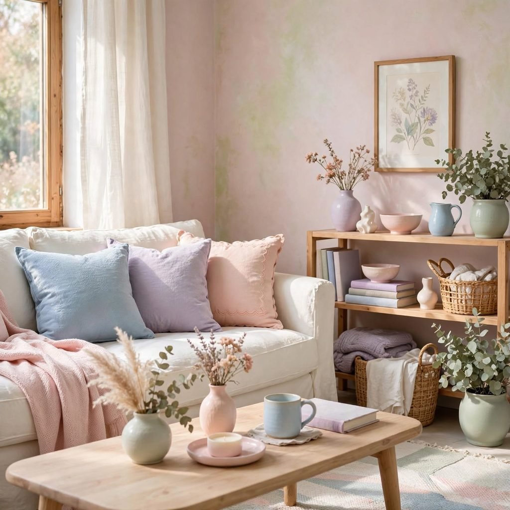
A soft pastel palette using muted pink, sage, and pale yellow suits a nursery, guest room, or reading nook where a gentle, calming mood is the priority. Keeping the pastels desaturated rather than bright is the key difference between a sophisticated pastel room and one that reads as overly juvenile or theme-park bright.
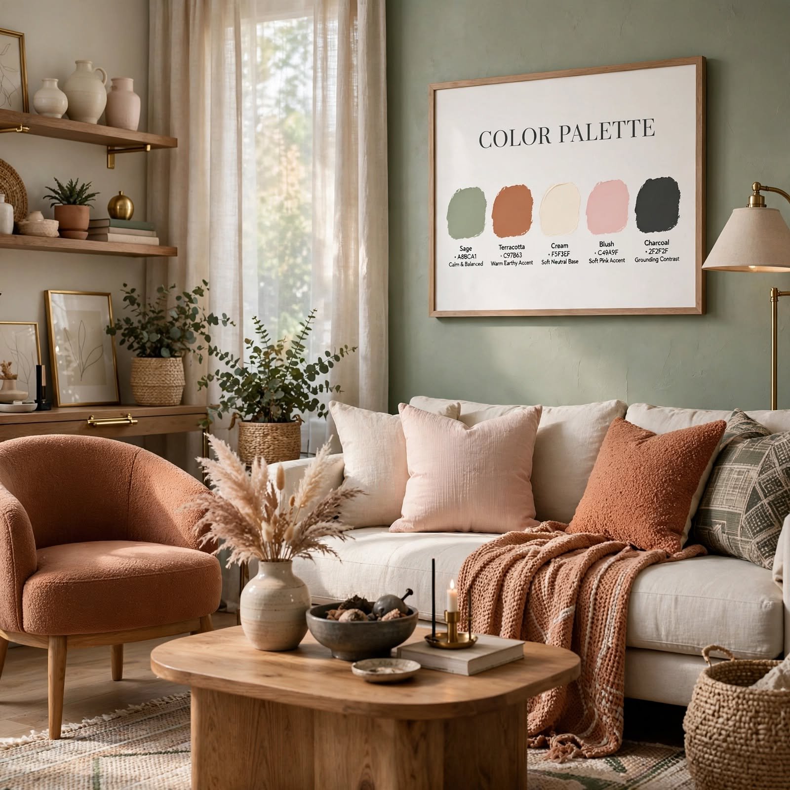
5. Color Palette Ideas Moodboard
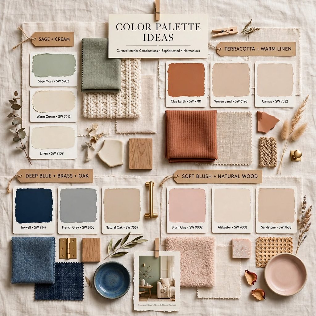
Building a moodboard before finalizing any color palette ideas lets you test how paint, fabric, and fixed materials interact in the same space before a purchase is made. Pull physical swatches instead of relying on a screen, since digital colors shift depending on device calibration, and view the board under the room’s actual lighting at different times of day. This step catches undertone mismatches early, which is the single most common reason a seemingly good palette falls apart once it’s on the wall.
6. High-Contrast Black and White
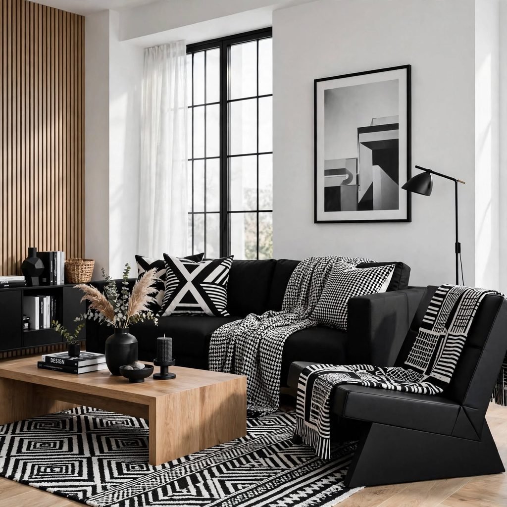
A black and white palette relies entirely on value contrast rather than hue, which gives a room a graphic, modern feel that works well in kitchens, bathrooms, and entryways. Introducing one warm material, like a wood floor or brass hardware, keeps the scheme from feeling sterile or overly clinical.
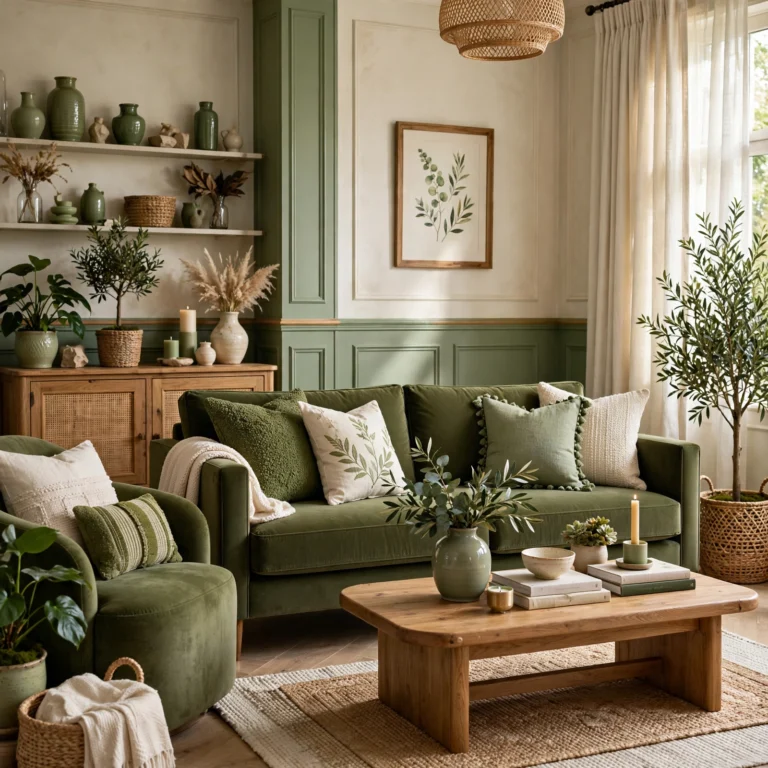
7. Sage and Cream Combination
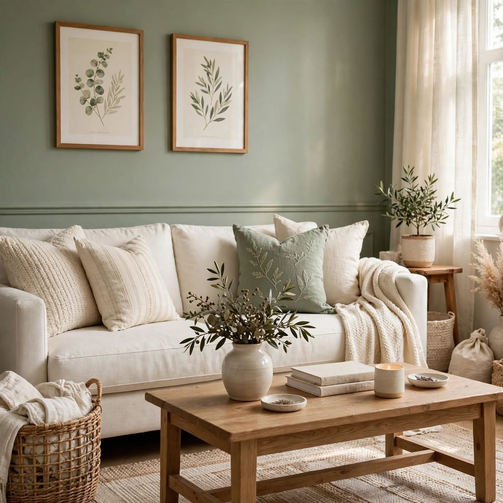
Sage green paired with a warm cream base creates a soft, garden-inspired palette that feels calm without leaning fully into pastel territory. This combination works especially well in bedrooms and living rooms, where sage acts as a secondary color against cream walls, with wood tones filling in as the connecting neutral.
8. Terracotta and Navy Pairing
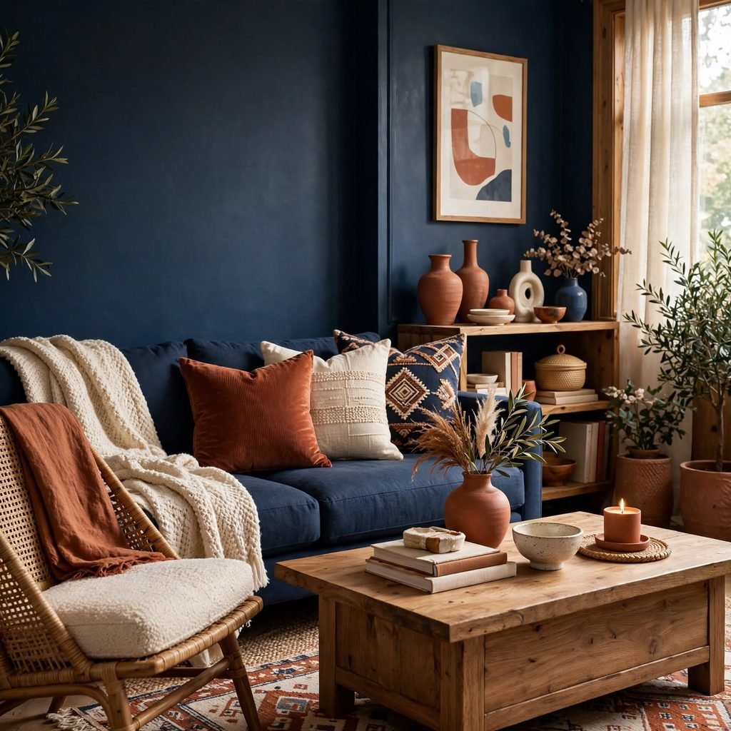
Terracotta and navy sit as an unexpected but effective pairing, since the warmth of the terracotta balances the depth of the navy, creating a palette that feels both grounded and a little bold. This combination works well in a home office or den, where navy can anchor a wall or large furniture piece while terracotta shows up in smaller accents like pillows or ceramics.
9. All-Neutral Layered Palette
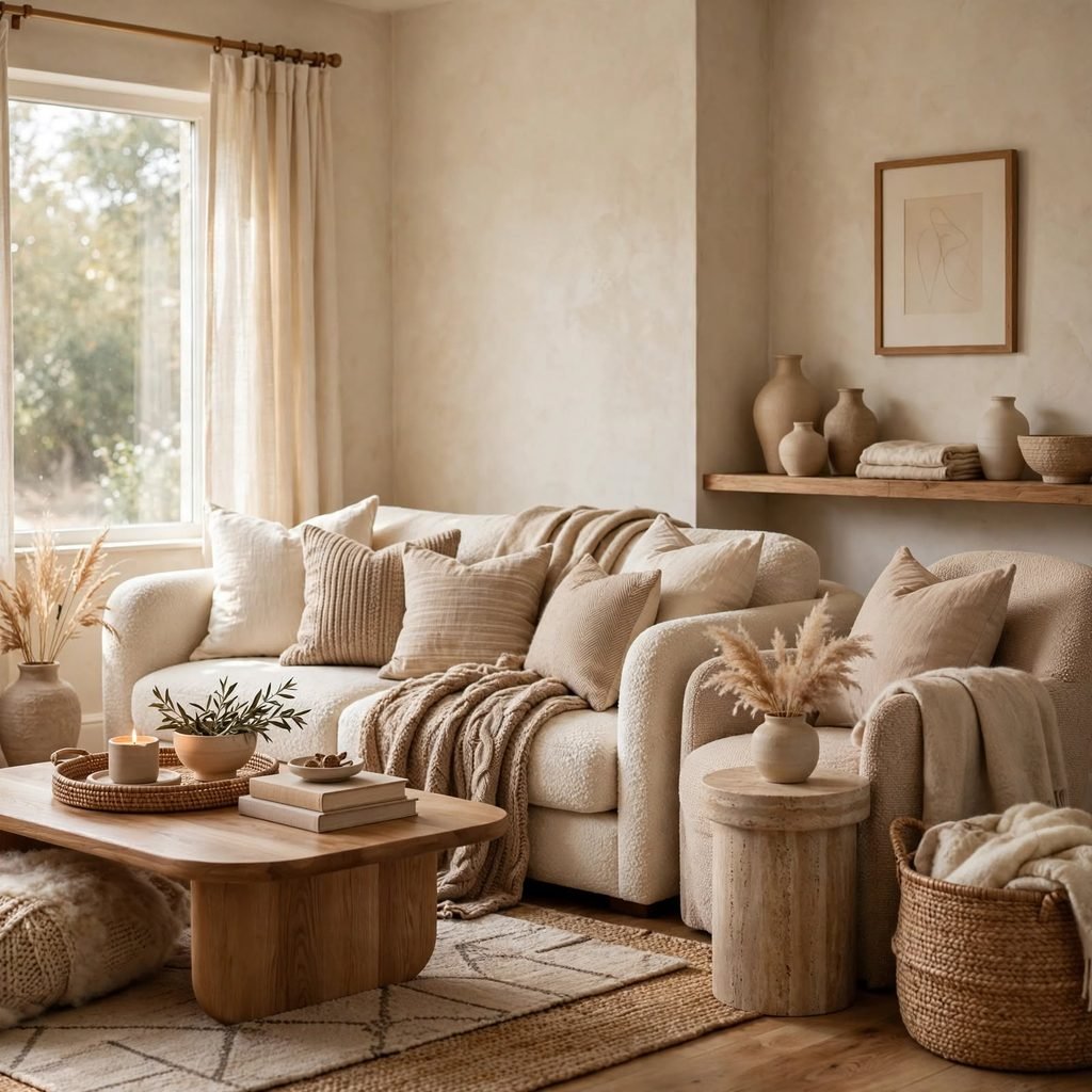
An all-neutral palette built from white, oatmeal, gray, and black relies on texture and material variation rather than color contrast to keep a room visually interesting. This approach is lower-risk than introducing a strong color and tends to age especially well, since neutrals rarely feel dated the way a specific trend color eventually does.
10. Warm vs Cool Palette Guide
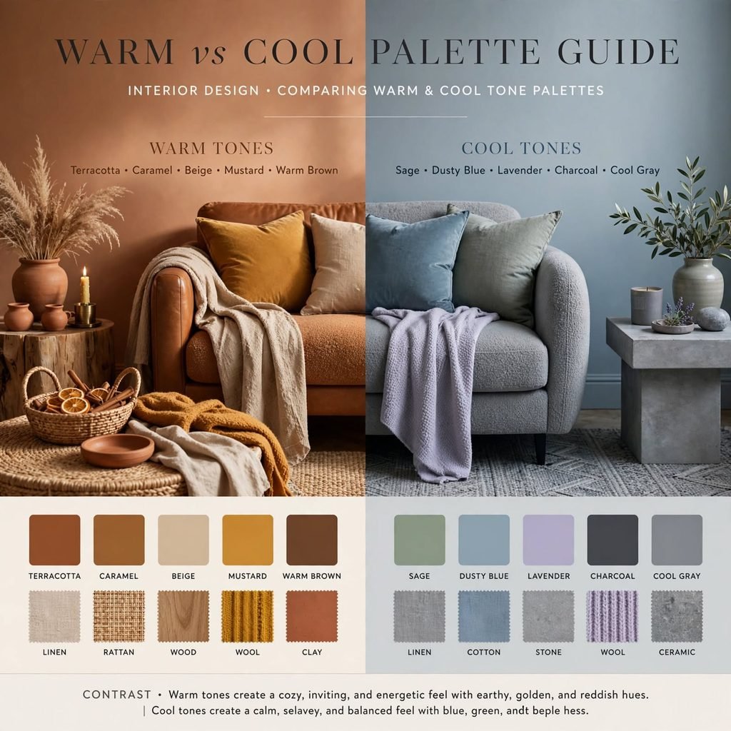
Every color palette ultimately leans warm or cool depending on its undertones, and mixing the two without a neutral buffer is the most common reason a seemingly coordinated room looks off. Warm palettes pair naturally with golden wood tones, brass, and terracotta, while cool palettes pair better with gray, chrome, and black metal finishes.
| Palette Type | Undertone | Best Paired Materials |
| Warm earth tone | Warm | Walnut, brass, terracotta |
| Cool coastal | Cool | White oak, chrome, linen |
| Moody jewel | Cool-warm mix | Black metal, brass, dark wood |
| All-neutral | Neutral | Any wood tone, black or white metal |
11. Olive and Rust Palette
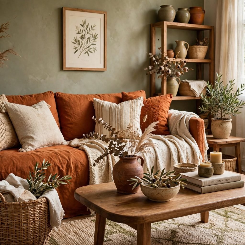
Olive green and rust orange share warm, muted undertones that make them easy to pair without a neutral buffer, and the combination reads as autumnal and cozy without requiring seasonal decor to reinforce it. This palette works well in living rooms and kitchens, especially when paired with brass hardware and natural wood cabinetry.
12. Monochrome Blue Palette
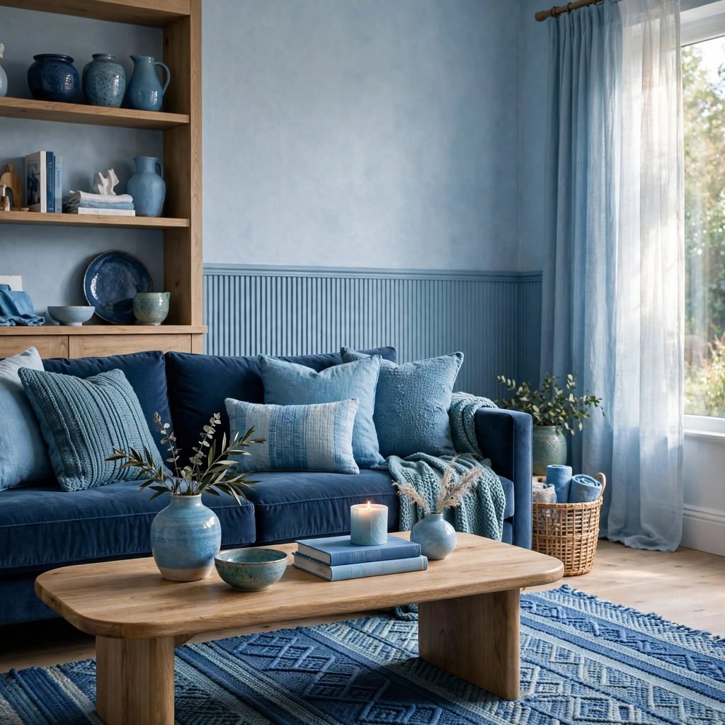
A monochrome blue palette uses several values of a single blue hue, from a pale powder blue to a deep navy, relying on that range rather than additional colors to create depth. This approach works particularly well in a bedroom, where the narrow color range supports a calm, restful mood without the visual complexity of a multi-hue scheme.
13. Blush and Charcoal Pairing
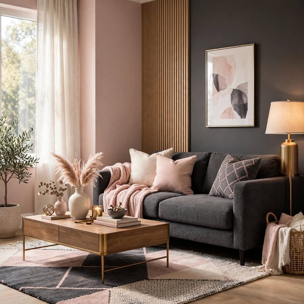
Blush pink paired with charcoal gray gives a soft color an edge, preventing the palette from reading as overly delicate while still keeping a warm, approachable feel. This combination works especially well in a bedroom or home office, where charcoal can anchor larger furniture pieces and blush shows up through textiles and smaller accessories.
14. Desert Sunset Palette
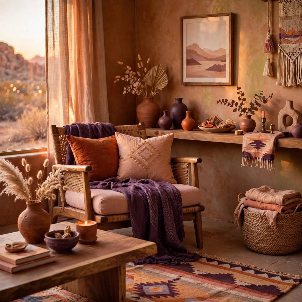
A desert sunset palette combining dusty rose, burnt orange, and warm sand draws directly from natural landscape colors and creates a warm, layered look without needing bold saturated hues. This palette suits a living room or bedroom that gets strong afternoon light, since the warm tones complement rather than compete with golden-hour sunlight.
15. Forest and Cream Palette
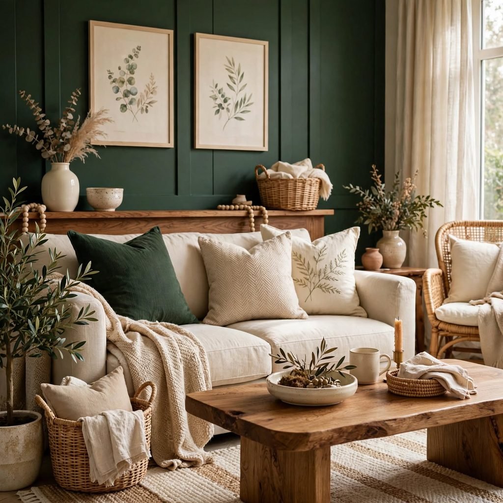
Deep forest green paired with a warm cream base creates a palette that feels both cozy and slightly formal, making it a strong choice for a dining room or library-style space. Adding brass or gold hardware brings warmth to the deep green, while cream keeps the overall room from feeling too dark or enclosed.
16. Two-Tone Kitchen Palette
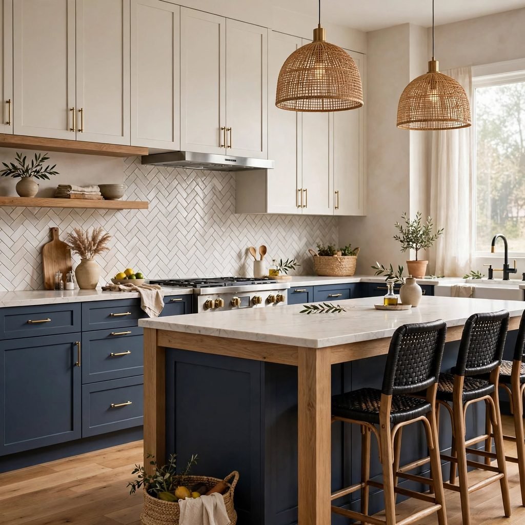
A two-tone kitchen palette pairs a darker lower cabinet color, like navy or forest green, with lighter upper cabinets or open shelving in white or oak, creating visual interest without committing to a single bold color across every surface. This approach also has a practical benefit, since darker lower cabinets tend to show less everyday wear than lighter ones positioned closer to counter-level messes.
17. Dopamine Color Palette
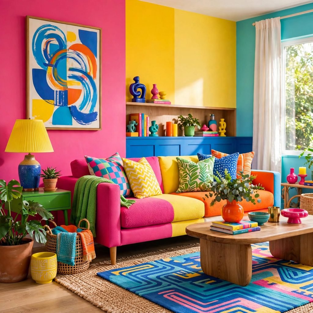
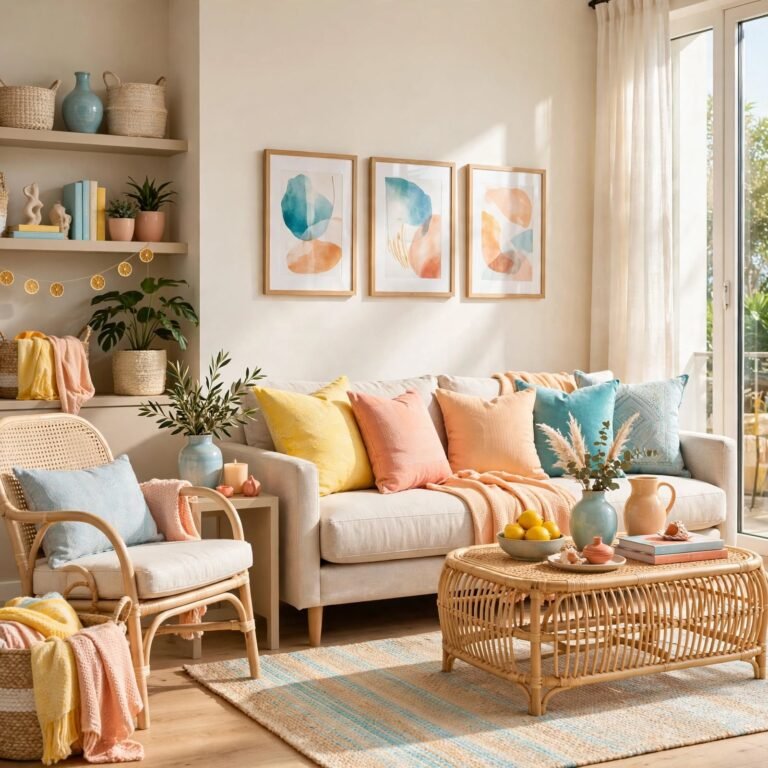
A dopamine palette leans into bold, saturated colors hot pink, cobalt blue, bright orange chosen specifically to feel energizing rather than calming, which works best in a creative studio, playroom, or powder room rather than a space meant for rest. Balancing at least one bold color with a neutral base, like white or black, keeps the palette from feeling overwhelming despite its saturation.
18. Lighting-Tested Final Palette
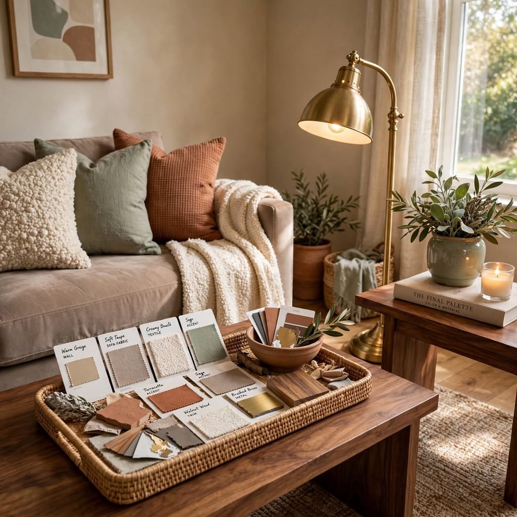
No color palette ideas should be finalized without testing large swatches directly on the wall across a full day, since natural light shifts a color’s appearance significantly between morning, afternoon, and evening. Rooms with north-facing windows tend to read cooler and often need warmer paint choices to compensate, while south-facing rooms can handle cooler tones since they already receive warm natural light throughout the day.
Shop the Look
A terracotta throw pillow set pairs well with a set of walnut picture frames and a woven jute rug for a warm earth tone palette starting point. Add a set of brass drawer pulls for an existing dresser, a sage green ceramic vase collection, and a charcoal gray throw blanket to introduce contrast across whichever palette direction fits the room best.
Common Mistake to Avoid
The most common mistake when working through color palette ideas is choosing every color in isolation rather than checking undertones against each other before committing to paint or furniture. A warm terracotta rug next to a cool-toned gray sofa is a frequent version of this error, and it’s rarely obvious until both pieces are actually in the room together. Testing swatches and fabric samples side by side under the room’s real lighting solves this problem before it becomes an expensive mistake.
FAQs
How do I choose a color palette for my home?
Start by identifying the room’s natural light direction and any fixed materials, like flooring or countertops, that can’t easily change, then build the palette’s undertone around those constraints. From there, apply a ratio like 60-30-10 to distribute a dominant, secondary, and accent color, and always test physical swatches in the room’s actual lighting before finalizing paint or large furniture purchases.
What are the most popular color palette ideas right now?
Warm earth tones built from terracotta, sand, and walnut remain among the most requested palettes, alongside layered neutral schemes and moody jewel tones used in smaller rooms like dining spaces and home offices. Soft, muted versions of pink and sage have also stayed popular, particularly when paired with natural materials like wood and unglazed ceramic rather than glossy finishes.
How many colors should be in a home’s color palette?
Most cohesive interior palettes use three to five colors total, including neutrals, since adding more than that tends to create competition rather than harmony across a room. A typical structure includes one dominant neutral, one secondary color for furniture or textiles, and one or two accent colors reserved for smaller details like pillows or artwork.
Do color palette ideas need to match throughout an entire house?
Not exactly most designers recommend a consistent undertone and a shared set of two or three anchor colors throughout a home, while allowing each room to have its own accent color suited to its function. This creates a sense of flow between rooms without forcing every space to look identical, which tends to feel repetitive rather than intentional.
What’s the easiest way to test a color palette before committing?
Painting large swatches, at least two feet by two feet, directly on the wall and observing them across a full day under natural and artificial light is the most reliable low-cost test available. Pairing those swatches with actual fabric samples and material finishes in the room, rather than judging colors in isolation, gives the clearest picture of how the final palette will actually look once assembled.
Conclusion
Strong color palette ideas come down to understanding undertones, applying a clear ratio, and testing real materials under real lighting before committing to paint or furniture. Start with one palette direction from this list, whether that’s a warm earth tone base or a cooler coastal scheme, and build outward from there. Save this guide to Pinterest for later, and check out our related post on color palette design frameworks for a deeper look at ratio-based planning.