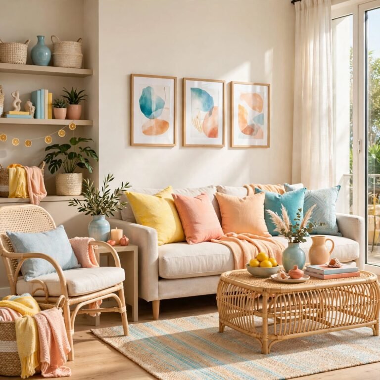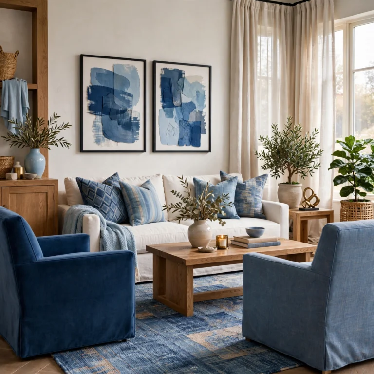
17 Genius Color Palette Ideas for a More Cohesive Home
Picking the right color palette is often the difference between a room that feels put together and one that feels randomly assembled, even when the individual pieces are nice on their own. This guide covers seventeen color palette ideas, from warm neutrals to bold jewel tones, with notes on undertone, lighting, and where each combination tends to work best. Whether you’re repainting a whole house or just want a more intentional plan for one room, there’s a palette here to build from.
Trend & Background
Color choices in home design have shifted away from stark, cool-toned neutrals toward warmer, more layered palettes, partly as a reaction to the all-gray interiors that dominated the last decade. Paint brands have responded by releasing more warm white and greige options, while saturated colors like terracotta, olive, and deep navy have moved from accent-only use into full-room applications. This shift also reflects a broader preference for rooms that feel warm and personal rather than showroom-neutral, making now a practical time to reconsider a palette that’s felt flat or dated.
Key Takeaways
- A strong color palette usually pairs one dominant neutral with one or two accent tones rather than several competing colors.
- Undertone matters more than the color name itself, since warm and cool versions of the same shade behave differently in a room.
- Natural light exposure should guide palette choice, since north-facing rooms read colors differently than south-facing ones.
- Testing a palette on a large sample swatch before committing prevents costly repainting later.
1. Warm Greige Neutral
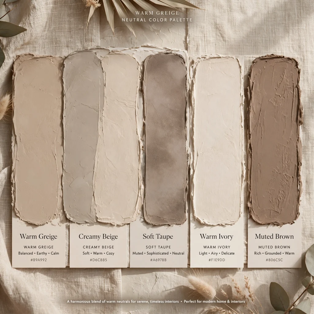
Warm greige neutral combines gray and beige into a single base tone that reads warmer than pure gray without leaning as yellow as traditional beige. It works well as a whole-house base color since it pairs easily with both warm woods and cooler metals like brushed nickel. This palette tends to look best in rooms with good natural light, since greige can read slightly flat or dull in spaces that stay dim most of the day.
2. Terracotta and Cream
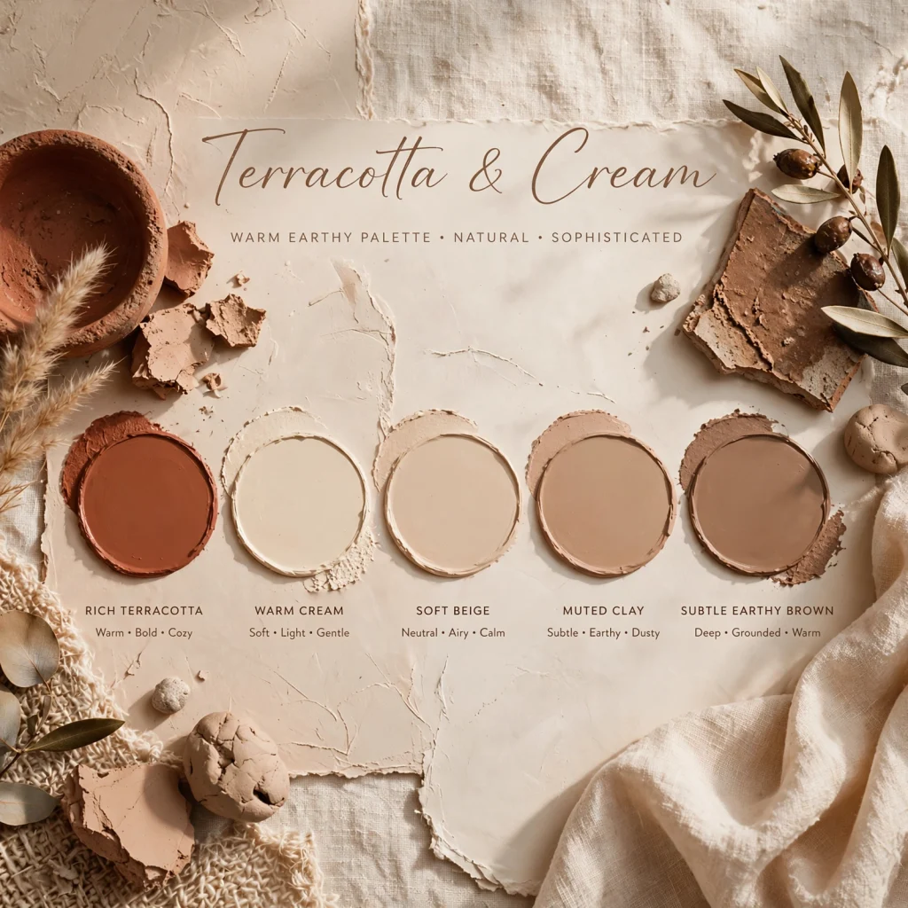
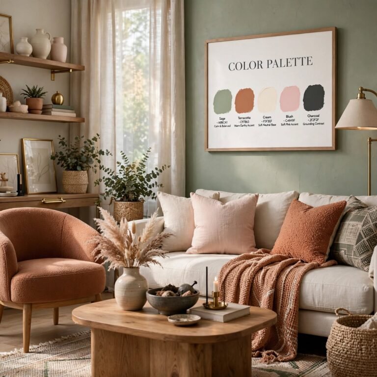
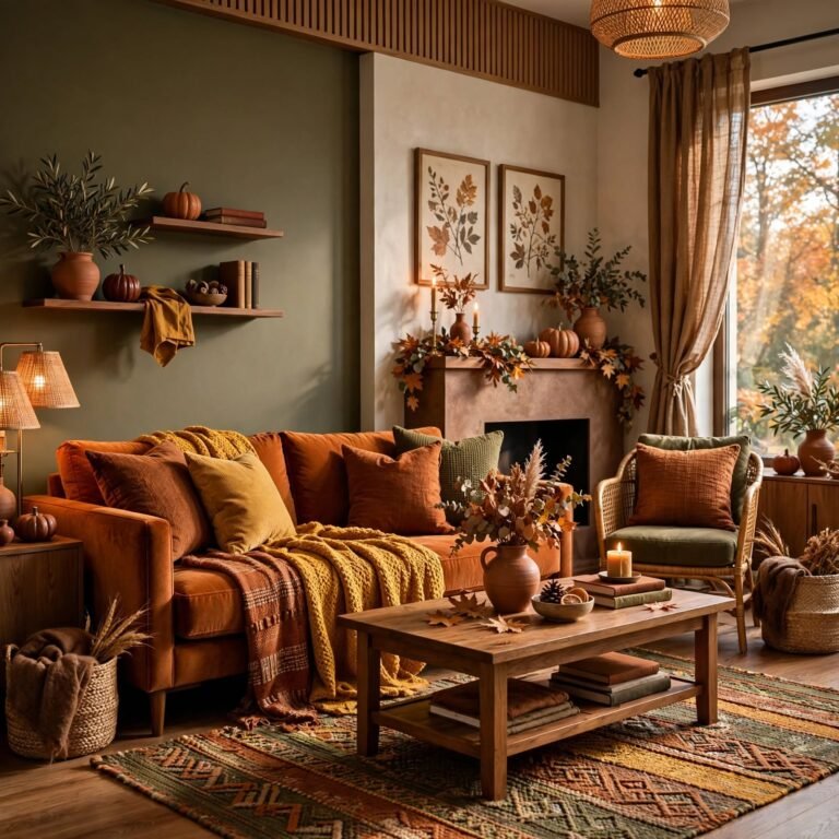
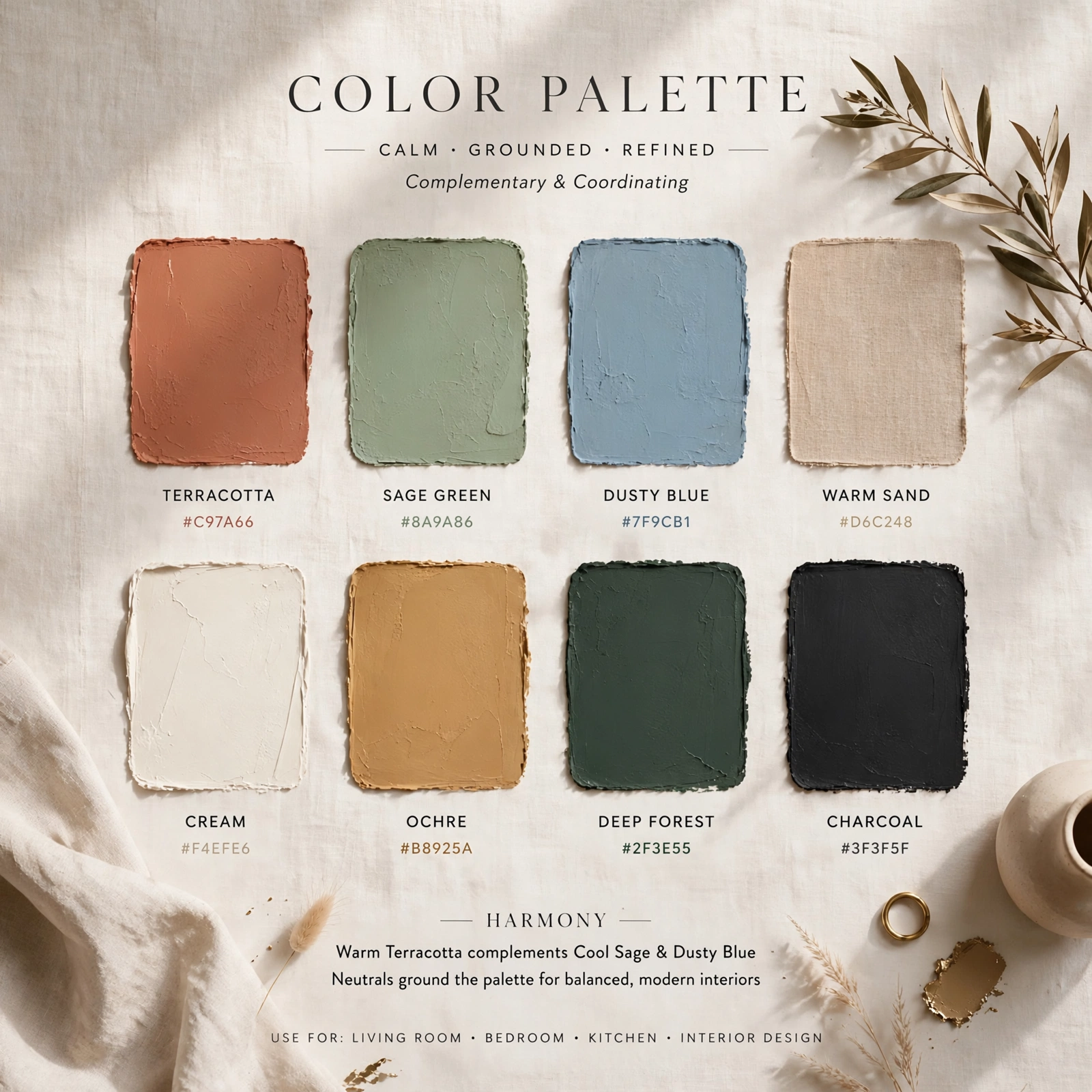
Terracotta and cream pairs a warm, earthy orange-red with a soft off-white base, creating a palette that feels grounded without being dark. Terracotta works well as an accent wall, textile, or ceramic color, while cream carries the majority of wall and furniture surfaces to keep the room from feeling too saturated. This combination suits rooms with warm wood tones and brass hardware, since cooler metals tend to clash with terracotta’s warmth.
To see more bathroom design
3. Sage Green and Oat
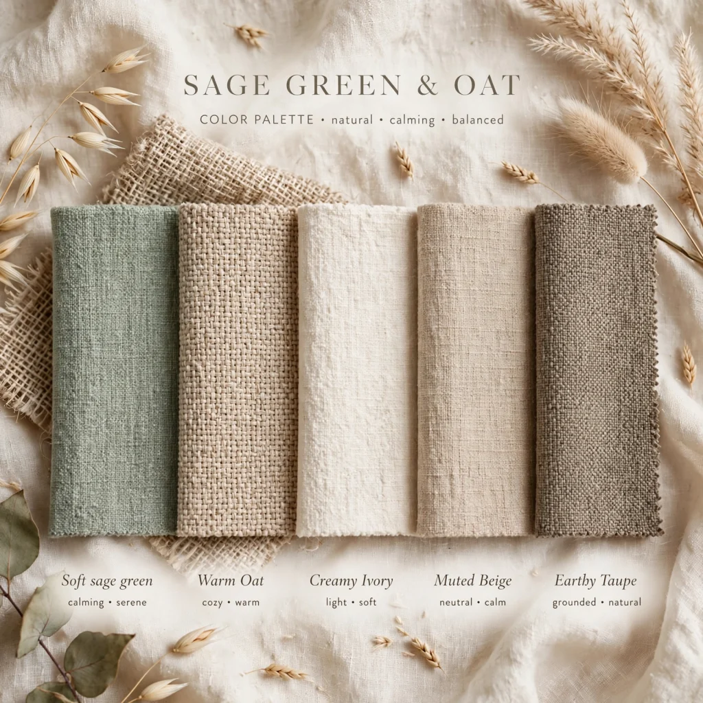
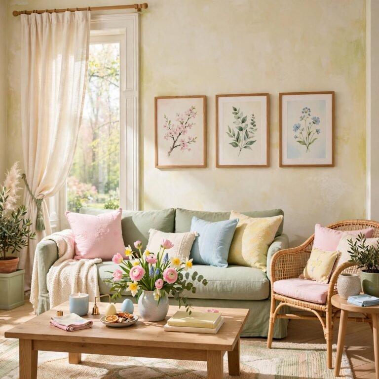
Sage green and oat combines a muted, grayed-out green with a warm, light tan, producing a calm palette that reads as both natural and understated. Sage works particularly well on cabinetry, an accent wall, or upholstery, while oat tones carry lighter surfaces like walls or bedding. This palette pairs naturally with unlacquered brass and light wood, and tends to hold up well across different lighting conditions compared to more saturated greens.
4. Navy and Brass
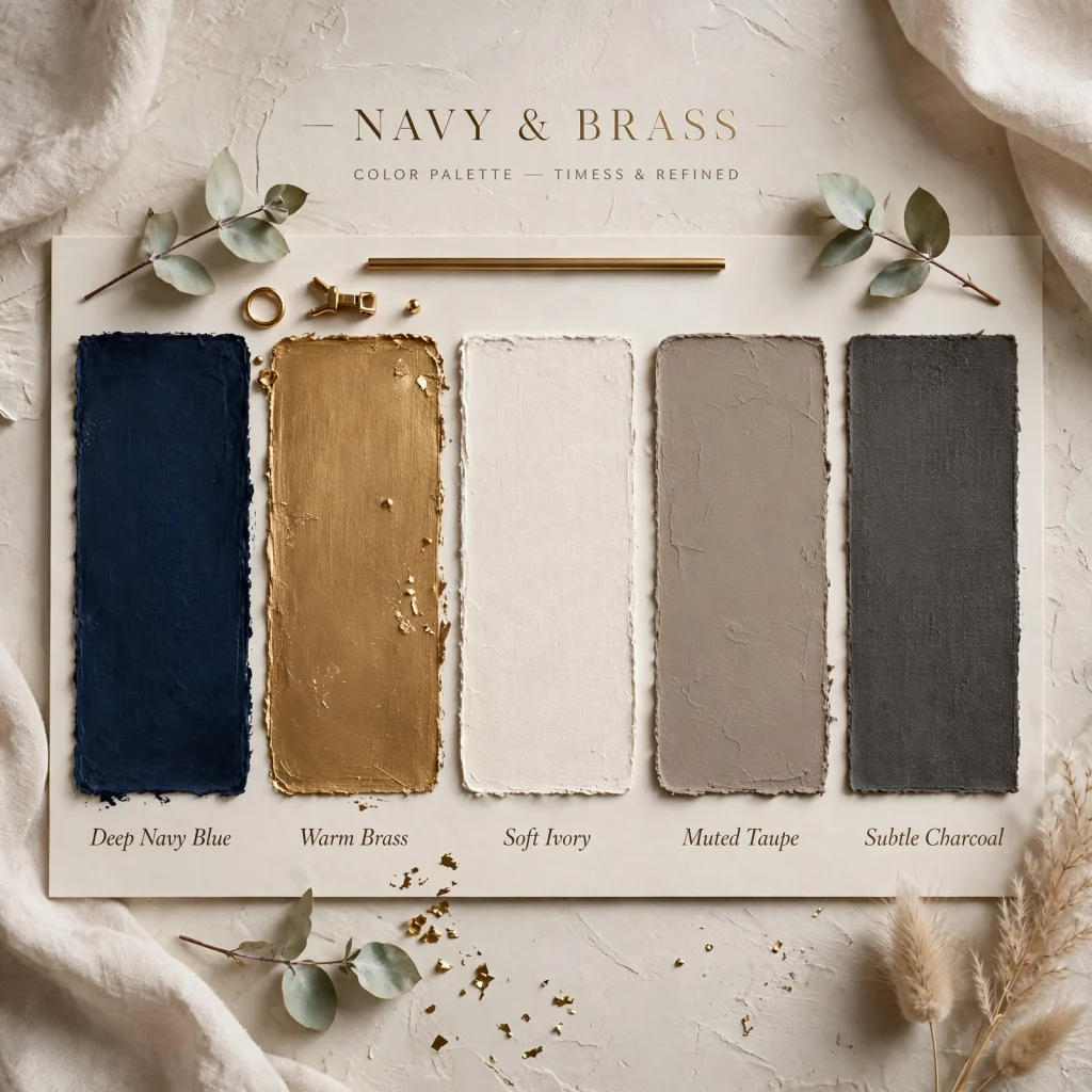
Navy and brass pairs a deep, near-black blue with warm metallic brass accents, creating a palette that reads as classic and slightly formal without feeling cold. Navy works well on a single accent wall, cabinetry, or upholstery, since using it across an entire room can feel heavy without enough contrast. Brass hardware, lighting, or picture frames keep the palette from reading flat, adding warmth against the cool base tone.
5. Color Palette Undertone Test
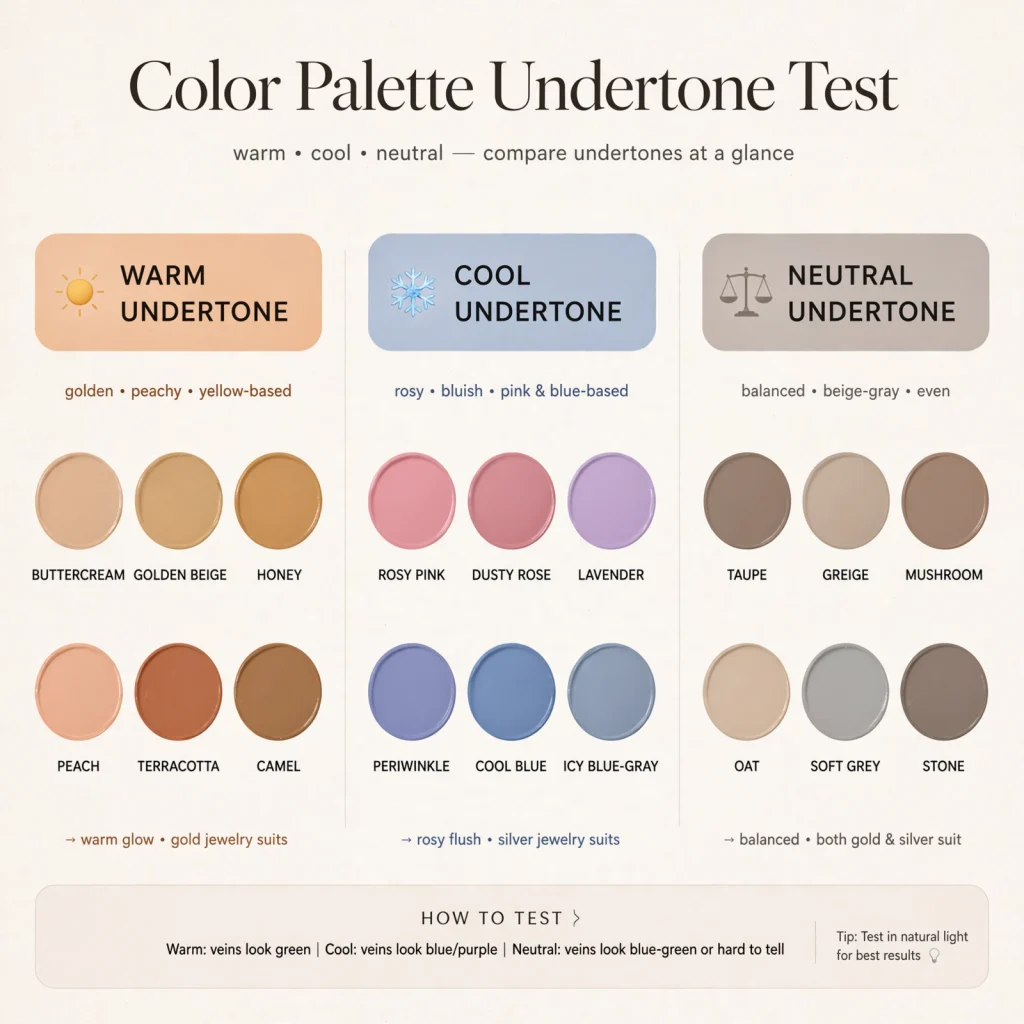
Before committing to any color palette, testing undertone against your room’s actual lighting prevents the common problem of paint looking different once it’s on the wall than it did on a small chip. Painting a two-foot sample swatch directly on the wall and observing it in morning, midday, and evening light reveals whether a chosen tone leans warmer or cooler than expected. This step matters most for grays, whites, and greens, since these colors shift the most dramatically depending on the light source and time of day.
6. Dusty Blue and White
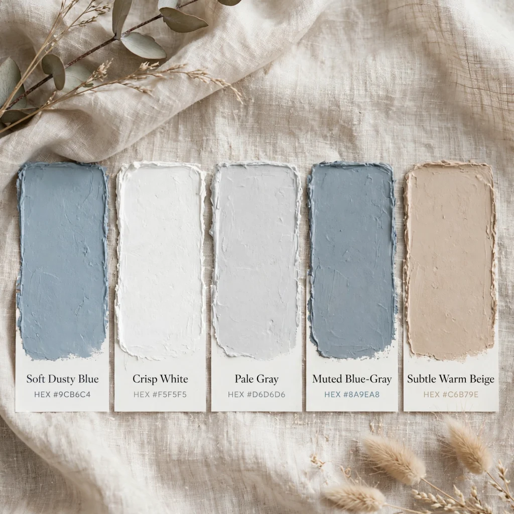
Dusty blue and white combines a soft, muted blue with a crisp or slightly warm white, creating a palette that feels airy without being sterile. Dusty blue works well on cabinetry, an accent wall, or bedding, while white carries trim, ceilings, and larger wall surfaces to keep the space feeling open. This palette tends to suit coastal-adjacent or Scandinavian-inspired rooms, and pairs naturally with light wood tones and woven natural textures.
7. Deep Olive and Camel
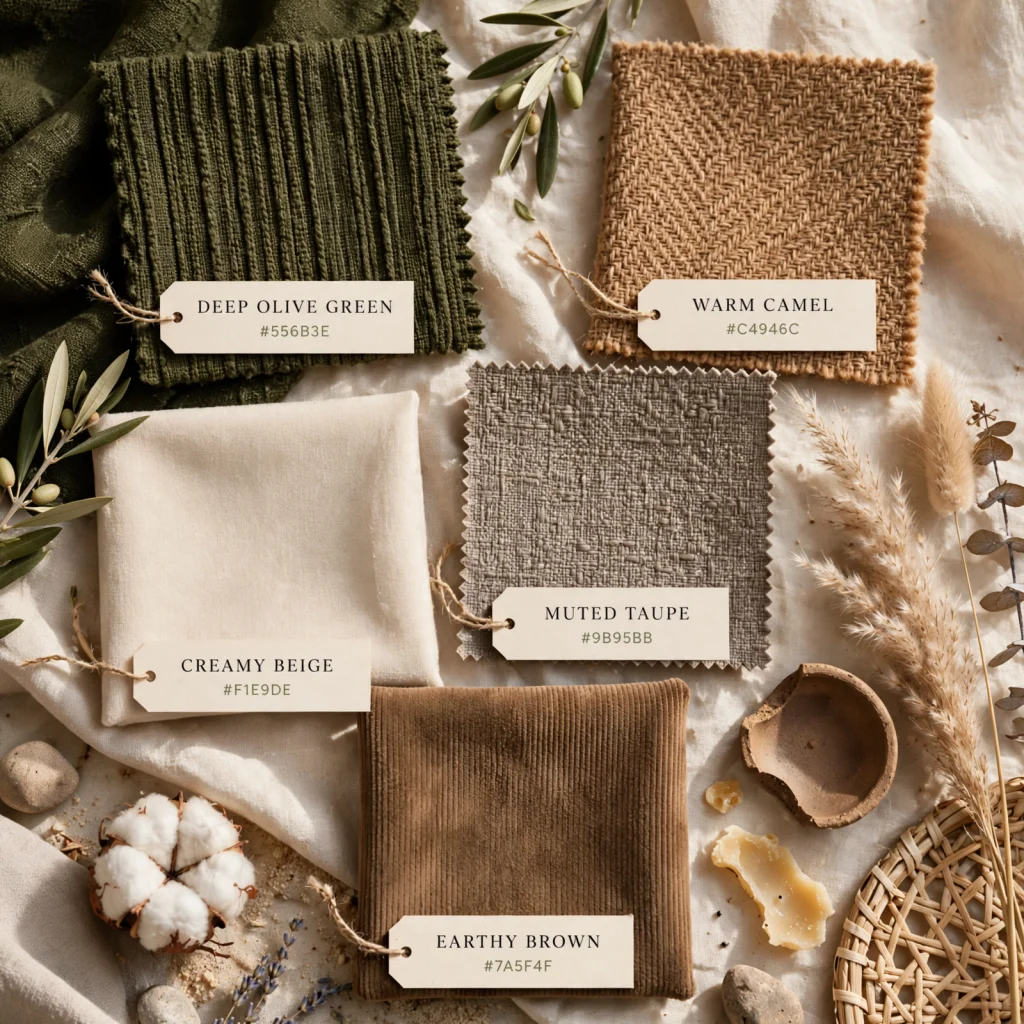
Deep olive and camel pairs a muted, dark yellow-green with a warm tan-brown, producing a rich but still earthy palette suited to rooms with a lot of natural wood or leather furniture. Olive works well as a wall color or large upholstered piece, while camel carries smaller accents like pillows, rugs, or leather seating. This combination tends to read more sophisticated than brighter greens, and holds up particularly well in rooms with warm, low evening light.
8. Blush and Charcoal
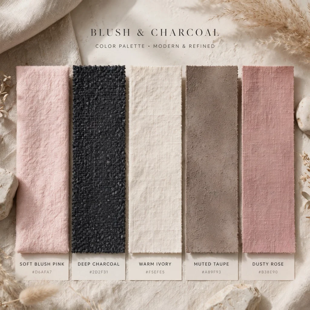
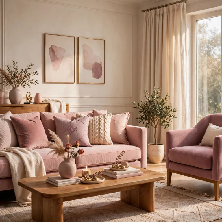
Blush and charcoal pairs a soft, muted pink with a near-black gray, creating contrast between something soft and something grounding rather than relying on two similarly weighted tones. Charcoal typically anchors larger surfaces like an accent wall or major furniture piece, while blush appears in smaller doses through textiles or accessories to keep the palette from feeling too soft overall. This combination works particularly well in bedrooms where a cozy, slightly moody feel is the goal.
9. Coastal Blue and Sand
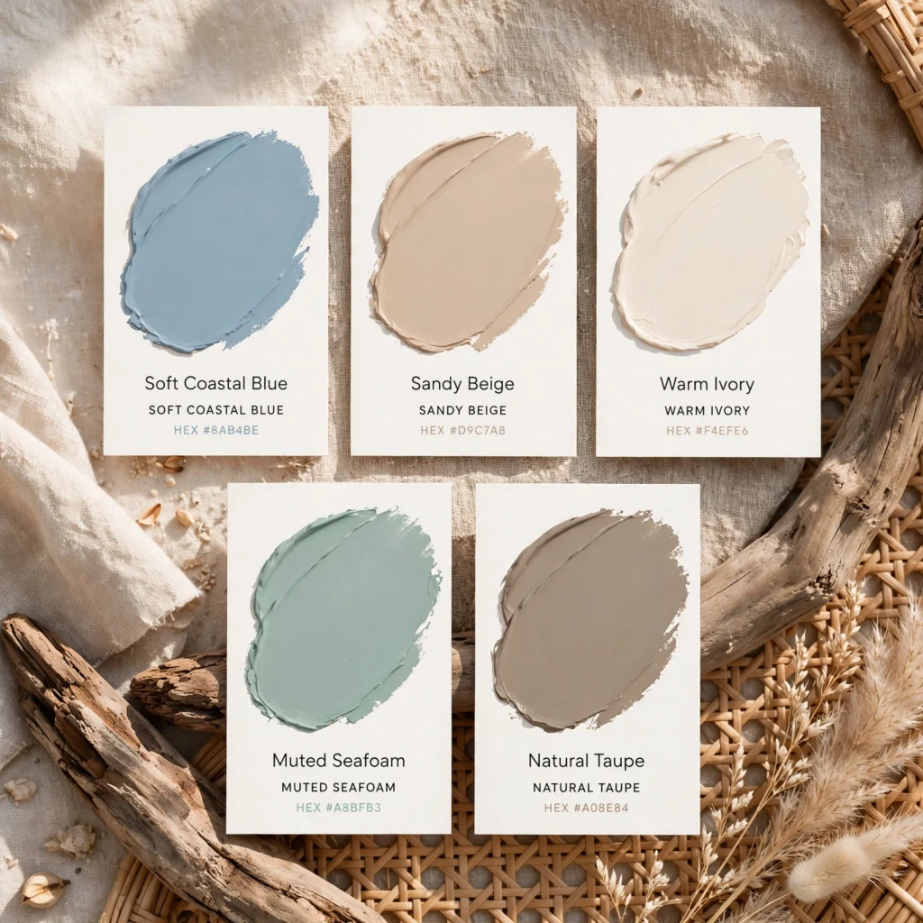
Coastal blue and sand combines a mid-tone, slightly gray blue with a warm, light sand tone, evoking a beach-adjacent feel without leaning into bright, saturated nautical colors. Blue typically appears on larger surfaces like walls or major upholstery, while sand carries trim, flooring-adjacent tones, or secondary furniture. This palette pairs well with natural fiber textures like jute, rattan, and linen, which reinforce the relaxed, coastal feel the colors are meant to evoke.
10. Burgundy and Forest Green
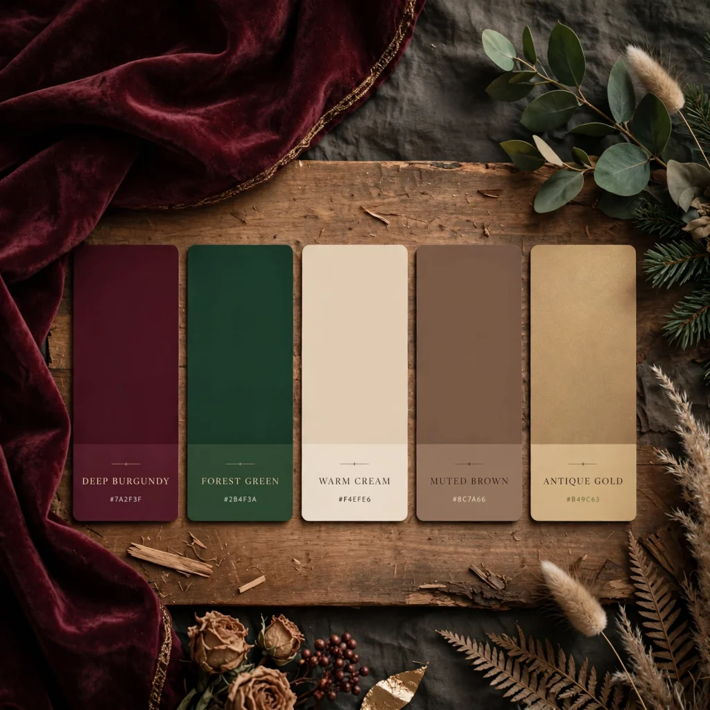
Burgundy and forest green pairs two deep, saturated tones from opposite ends of the color wheel, creating a rich, moody palette suited to rooms with limited natural light where darker colors won’t feel oppressive. Burgundy tends to work well on upholstery or an accent wall, while forest green carries drapery, bookshelves, or secondary furniture pieces. This combination pairs particularly well with brass or gold-toned hardware and warm wood tones like walnut or mahogany.
11. Soft Lavender and Gray
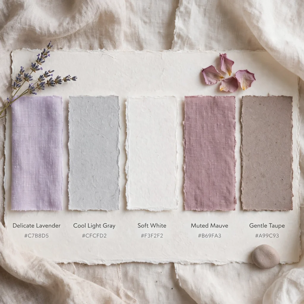
Soft lavender and gray combines a muted, low-saturation purple with a cool-toned gray, producing a quiet, slightly moody palette without leaning as dramatic as deeper jewel tones. Lavender typically works best in smaller doses, on textiles or a single wall, while gray carries the majority of the room to keep the purple from feeling overly sweet. This palette tends to suit bedrooms or reading nooks over high-traffic shared spaces, since it reads as more restful than energizing.
12. Mustard and Charcoal
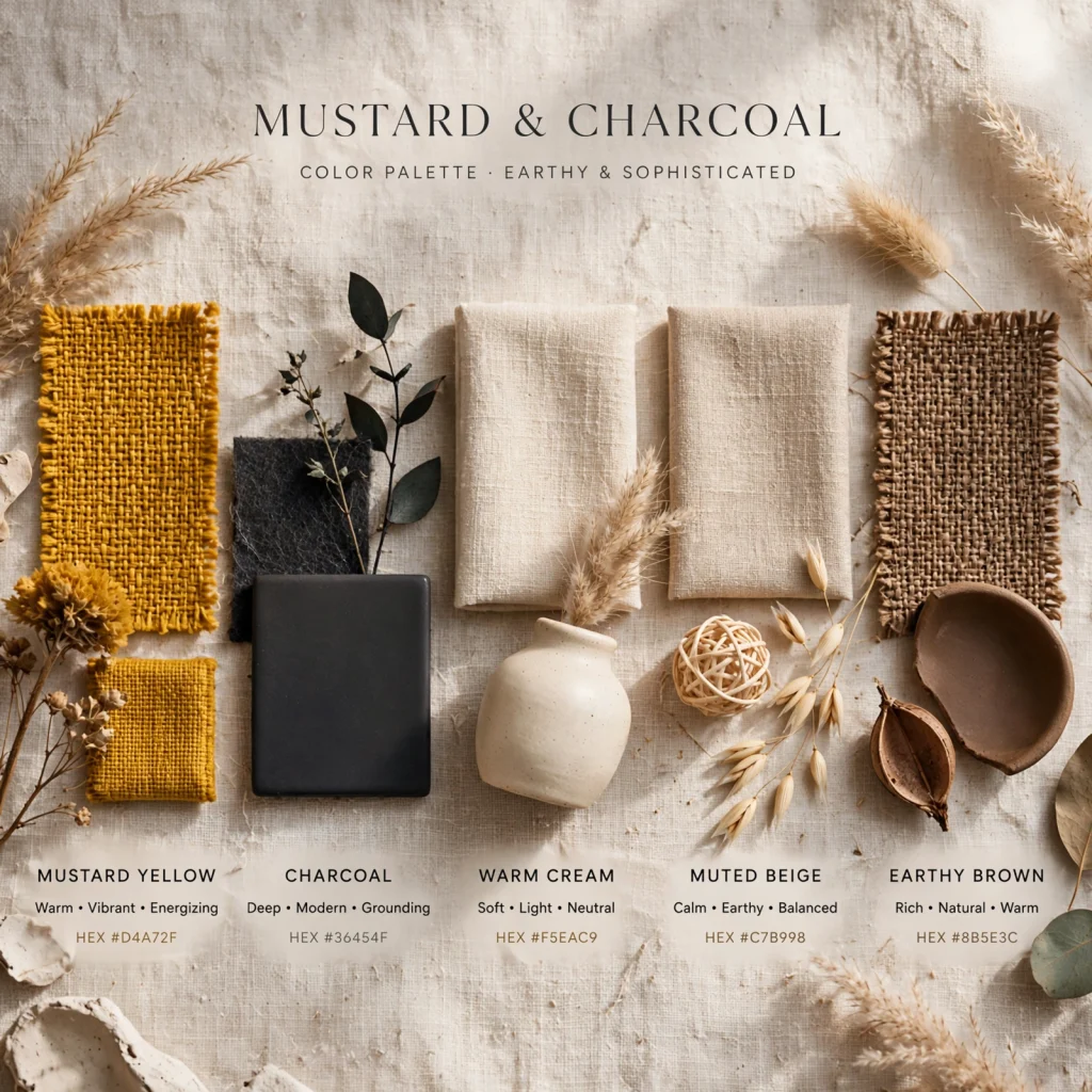
Mustard and charcoal pairs a warm, saturated yellow with a near-black gray, creating a mid-century-inspired palette built on strong contrast rather than blended, similar-toned colors. Mustard works well as an accent chair, throw pillow, or small furniture piece, while charcoal carries larger surfaces like walls or major upholstery to keep the yellow from overwhelming the room. This combination tends to pair naturally with warm wood tones and brass or copper accents.
13. Warm White and Walnut
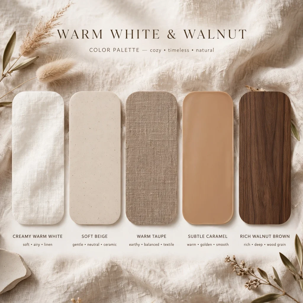
Warm white and walnut combines a soft, slightly creamy white with a rich, reddish-brown wood tone, producing a palette that feels clean without reading cold or clinical. White typically carries walls, trim, and larger upholstered pieces, while walnut appears through furniture, flooring, or wood accents to add warmth and contrast. This palette works well as a flexible base that can support a wide range of accent colors added later through textiles or art.
14. Rust and Denim Blue
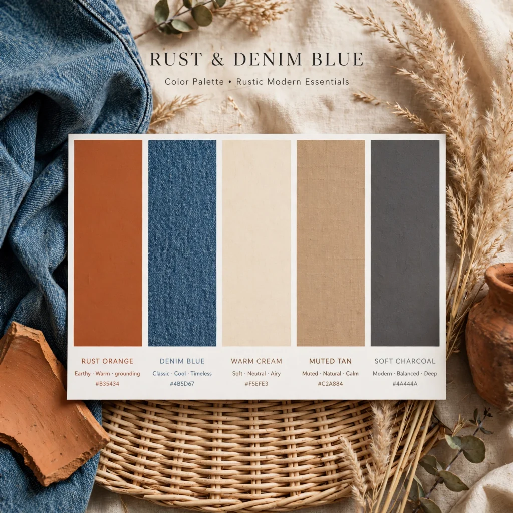
Rust and denim blue pairs a warm, saturated orange-red with a mid-tone, slightly faded blue, creating a palette with strong contrast that still feels casual rather than formal. Rust works well on upholstery, ceramics, or an accent wall, while denim blue carries secondary furniture, drapery, or bedding. This combination tends to suit more relaxed, lived-in rooms over formal spaces, since both colors read as warm and slightly worn rather than crisp.
15. Black and Warm Cream
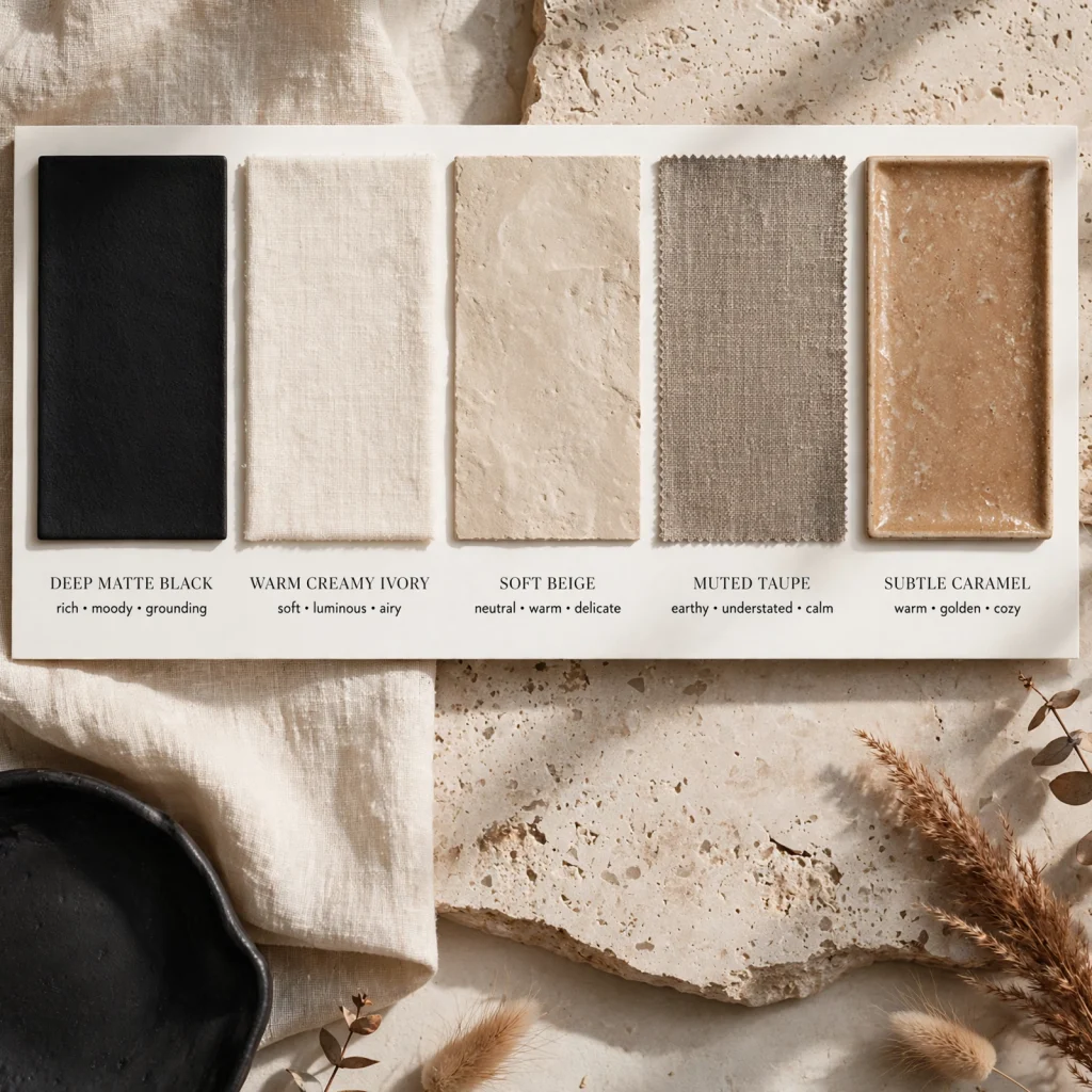
Black and warm cream pairs a true, saturated black with a soft, warm off-white, creating a high-contrast palette that reads as modern without feeling stark or cold. Black typically appears through window frames, hardware, or a single furniture piece rather than large wall surfaces, while cream carries the majority of the room. This palette pairs particularly well with natural wood tones and woven textures, which soften the contrast and keep the room from feeling too severe.
16. Seafoam and Driftwood
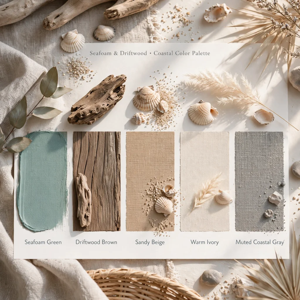
Seafoam and driftwood combines a pale, slightly gray-green with a light, weathered wood tone, producing a soft, coastal-adjacent palette that reads lighter than deeper blue-based coastal combinations. Seafoam typically works on walls or larger textiles, while driftwood tones appear through furniture and flooring to keep the palette grounded. This combination tends to suit rooms with a lot of natural light, since both tones can read washed out in dim spaces.
17. Plum and Gold
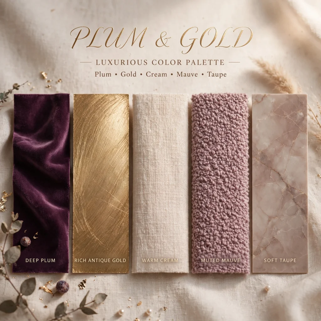
Plum and gold pairs a deep, saturated purple with warm metallic gold accents, creating a rich, slightly glamorous palette suited to rooms meant to feel a bit more formal or dramatic. Plum typically works on upholstery, drapery, or an accent wall, while gold appears through hardware, lighting, or small decorative objects to add contrast and warmth. This palette tends to work best in dining rooms or bedrooms rather than high-traffic casual spaces, since the saturation reads as more intentional in smaller doses.
| Palette | Dominant Tone | Best Room Type |
| Warm Greige Neutral | Neutral | Whole-house base |
| Navy and Brass | Cool with warm accent | Living room, office |
| Sage Green and Oat | Neutral-warm | Kitchen, bedroom |
| Burgundy and Forest Green | Deep, saturated | Dining room, den |
| Blush and Charcoal | Soft with dark anchor | Bedroom |
Shop the Look
A few places to start testing a palette: large paint sample swatches in your top two or three choices, a set of unlacquered brass hardware for warmer combinations, a linen or cotton throw pillow in your accent tone, a woven jute or seagrass rug to ground cooler palettes, and a warm wood picture frame to test against your base wall color. Testing these smaller, lower-cost items before repainting an entire room helps confirm a palette actually works together in your space.
Common Mistake to Avoid
A common mistake is choosing a color palette entirely from a screen or paint chip without testing it against the room’s actual lighting, since colors shift noticeably between north-facing rooms, south-facing rooms, and different times of day. A shade that looks warm and inviting on a paint chip under store lighting can read cold or muddy once it’s on a large wall at home. Painting a full sample swatch and viewing it over at least a full day prevents this kind of costly mismatch.
FAQs
How many colors should be in a good color palette?
Most cohesive palettes work with one dominant neutral, one secondary color, and one accent tone used sparingly, rather than four or five colors competing for attention. This structure gives a room enough variation to feel intentional without becoming visually busy or difficult to coordinate furniture and textiles around. Adding more colors is possible, but it generally requires more careful balancing of saturation and placement to keep the palette from feeling scattered.
What’s the difference between warm and cool undertones in a color palette?
Warm undertones lean toward yellow, orange, or red, making colors feel cozier and pairing naturally with wood tones and brass or gold metals, while cool undertones lean toward blue or green, reading as crisper and pairing better with chrome or nickel finishes. Mixing warm and cool undertones within the same palette without intention often creates a subtly clashing effect, even if the individual colors seem compatible at first glance. Identifying undertone before combining colors is one of the most useful steps in building a palette that actually works together.
Should ceiling and trim match the wall color palette?
Trim is traditionally painted a brighter white than the wall color to create definition and make architectural details stand out, though some modern palettes intentionally paint trim the same color as the walls for a more seamless, cocooning effect. Ceilings are usually kept white or a very light version of the wall color to avoid making a room feel shorter, unless a bolder, more dramatic look is specifically the goal. There’s no single correct answer here, and the right choice depends on the overall mood the palette is meant to create.
How do I choose a color palette for a room with little natural light?
Rooms with limited natural light generally do better with either very light, warm neutrals that maximize available brightness, or deliberately embracing darker, saturated tones like burgundy or forest green that don’t rely on bright light to look intentional. Attempting a mid-tone gray or a washed-out pastel in a dim room often backfires, since these colors can read flat or muddy without enough light to bring out their undertone. Testing any candidate color at the darkest point in the day is especially important for low-light rooms.
Can a color palette work across an entire open floor plan?
Yes, a single color palette can carry across an open floor plan by using the same base neutral throughout and varying which accent color takes the lead in each zone, such as sage green in the kitchen and navy in the adjoining living area. This keeps the overall space feeling connected while still giving each zone a bit of its own identity. Repeating at least one shared color or material, like the same wood tone or metal finish, across all zones helps reinforce that connection visually.
Conclusion
A strong color palette does more to unify a room than almost any single piece of furniture, and it’s worth the extra time spent testing swatches against real lighting before committing. Pick one of these seventeen combinations that matches the mood you’re after, test it on a large sample first, and build the rest of the room’s choices around it. Save this post to Pinterest for later, or check out our related guide on choosing paint finishes for more direction.