16 Elegant Neutral Color Palette Ideas for a Timeless, Layered Home
Choosing a neutral color palette sounds simple until you’re staring at forty shades of white paint chips wondering why your living room still looks flat. The truth is that neutral doesn’t mean boring it means intentional. This guide walks through seventeen practical ideas for layering warm creams, cool greiges, soft taupes, and deep charcoals so every room feels calm, cohesive, and anything but sterile, whether you’re repainting one wall or overhauling an entire floor plan.
Trend & Background
Neutral interiors have shifted noticeably over the past few years, moving away from the stark, cool-toned “greige everything” look of the 2010s toward warmer, richer combinations inspired by Scandinavian and Japandi design. Homeowners are now pairing oatmeal linens with walnut wood tones and warm white plaster instead of flat builder-grade beige. This matters now because resale-conscious buyers and renters alike want spaces that photograph well, adapt easily to changing decor trends, and don’t require repainting every time a trend cycle turns.
Key Takeaways
- A neutral color palette relies on tonal layering mixing warm and cool undertones rather than sticking to a single shade of white or beige.
- Texture (linen, boucle, oak, limewash) does the visual work that bold color usually does in a neutral scheme.
- Small doses of black, brass, or stone break up flatness and keep neutral rooms from feeling washed out.
- Lighting temperature and natural material choices matter as much as paint color when building a cohesive neutral scheme.
1. Warm White Walls
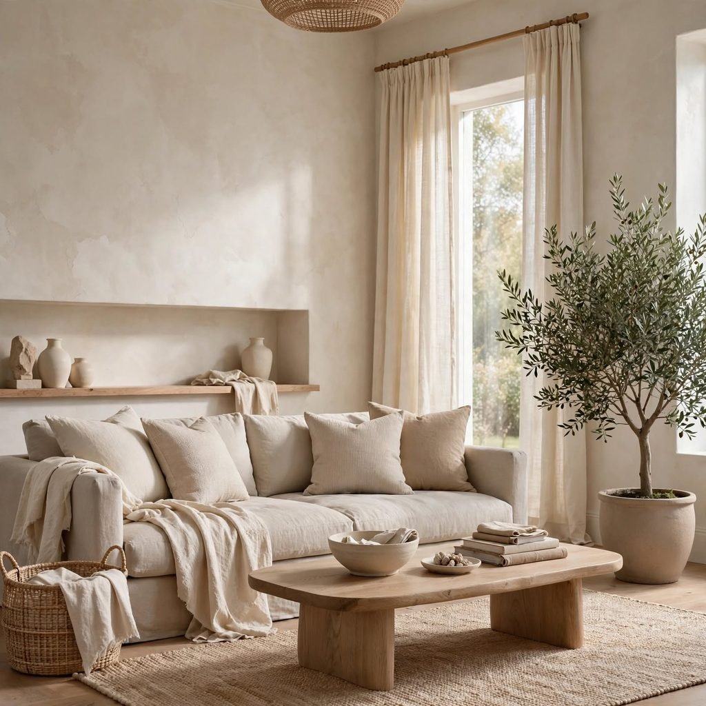
Warm white paint, rather than stark bright white, gives a room a soft glow instead of a clinical feel. Shades with subtle yellow, cream, or beige undertones read as fresh without turning cold under artificial light at night. This works especially well in rooms with limited natural light, since warm white avoids the gray, flat cast that cooler whites can take on. Pair it with natural wood trim or brass hardware to keep the warmth consistent throughout the space.
2. Layered Linen Textiles
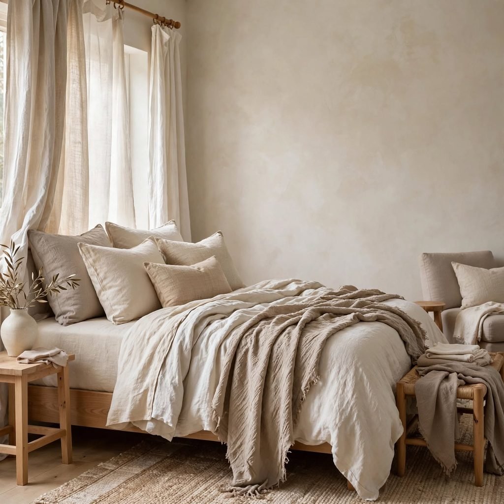
Building a neutral scheme through fabric rather than paint keeps a room from feeling one-dimensional. Mixing raw linen curtains, a boucle throw, and a nubby wool rug in slightly different shades of oatmeal and cream adds depth without introducing new colors. The key is variation in weave and texture, not pattern, since pattern can pull a neutral room off balance. This approach is especially useful in rental homes where painting walls isn’t an option.
3. Greige Accent Wall
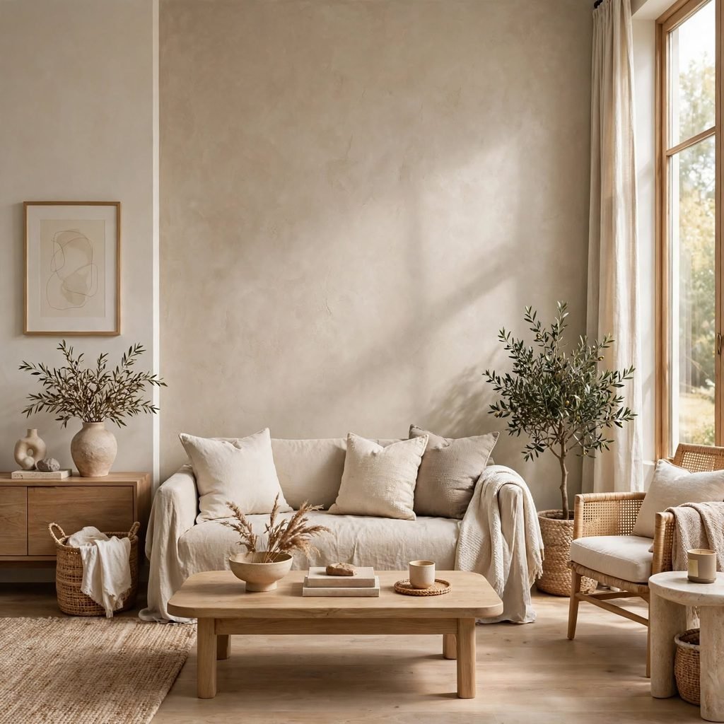
A greige accent wall a blend of gray and beige adds subtle depth behind a bed or sofa without committing to a bold color statement. Because greige sits between warm and cool, it pairs easily with both black metal fixtures and honey-toned wood furniture, making it one of the most flexible neutral choices available. Test swatches in the room at different times of day, since greige shifts noticeably between morning and evening light.
To see more wedding color palette
4. Natural Stone Countertops
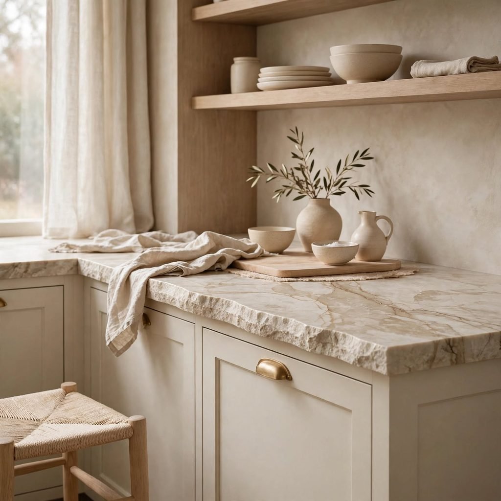
Stone surfaces like honed marble, soapstone, or quartzite bring organic variation into a neutral kitchen or bathroom that paint alone can’t replicate. The subtle veining and mineral flecks in natural stone give the eye something to rest on, preventing an all-neutral kitchen from feeling sterile. Choosing a stone with warm undertones, rather than stark white with gray veining, helps tie cabinetry, flooring, and countertops into one cohesive material story.
5. Whitewashed Oak Flooring
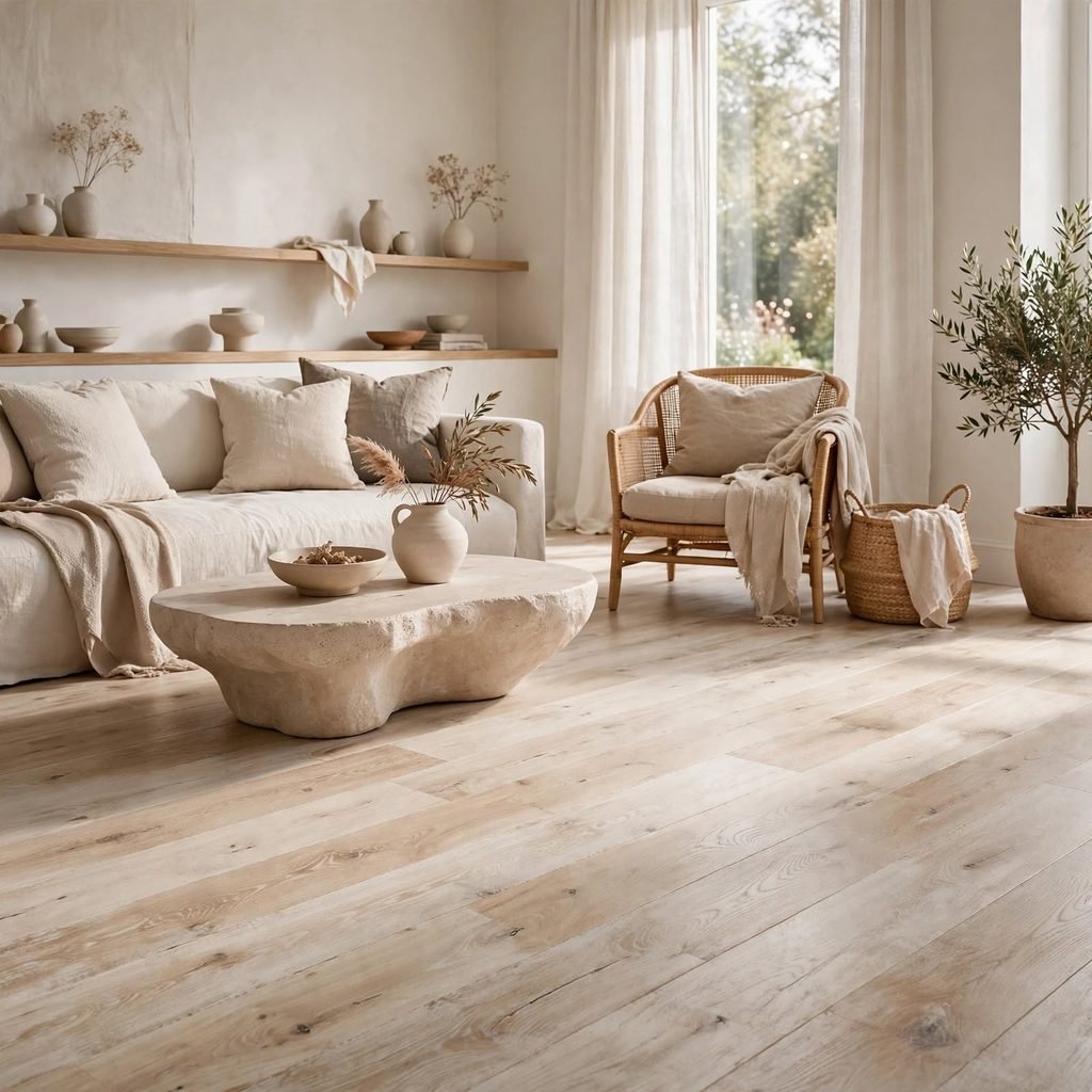
Whitewashed or limewashed oak flooring lightens a space while keeping the visible wood grain intact, which paint-grade white flooring can’t do. This treatment softens the contrast between dark furniture and pale walls, acting as a visual bridge in an otherwise neutral room. It performs especially well in open-concept homes, where flooring runs through multiple rooms and needs to unify different furniture tones without competing with any single piece.
6. Charcoal Window Frames
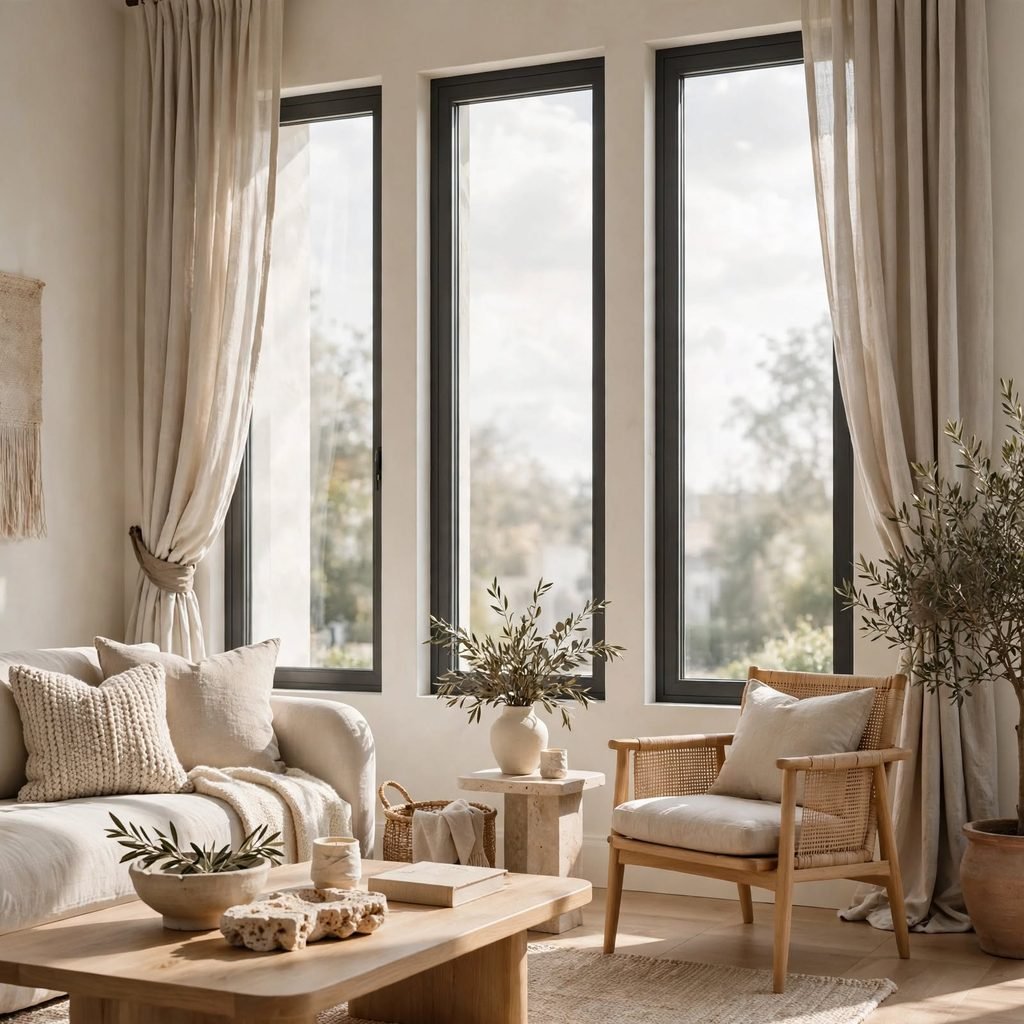
A single dose of charcoal or matte black on window frames or door trim gives a neutral room definition it would otherwise lack. Without this contrast, an all-cream or all-beige space can start to blur together at the edges. Charcoal frames act almost like punctuation, outlining architectural features such as windows, French doors, or a fireplace mantel so the eye has clear stopping points as it moves around the room.
7. Boucle Upholstery
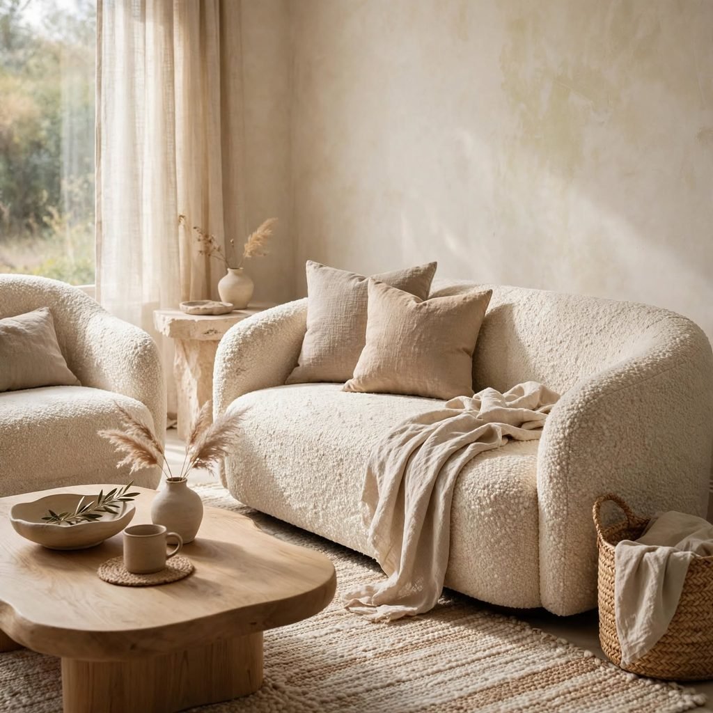
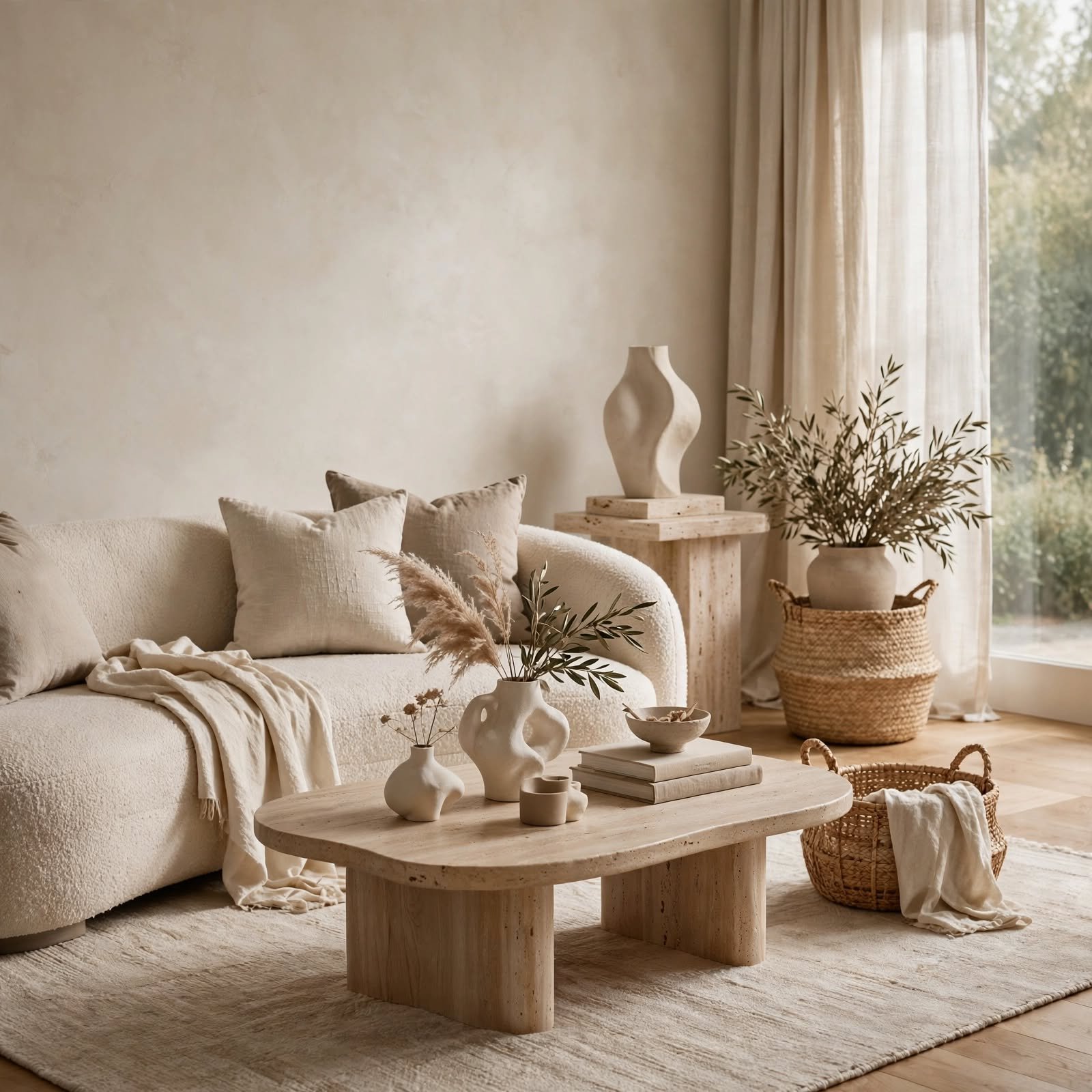
Boucle fabric, with its looped, nubby texture, has become a go-to for neutral sofas and accent chairs because it reads as soft and inviting rather than flat. Its texture catches light differently than smooth cotton or linen, creating subtle shadow variation across a single piece of furniture. Choosing boucle in oatmeal or bone rather than pure white keeps the fabric looking intentional rather than sterile, and it hides everyday wear better than flat weaves.
8. Plaster-Finish Walls
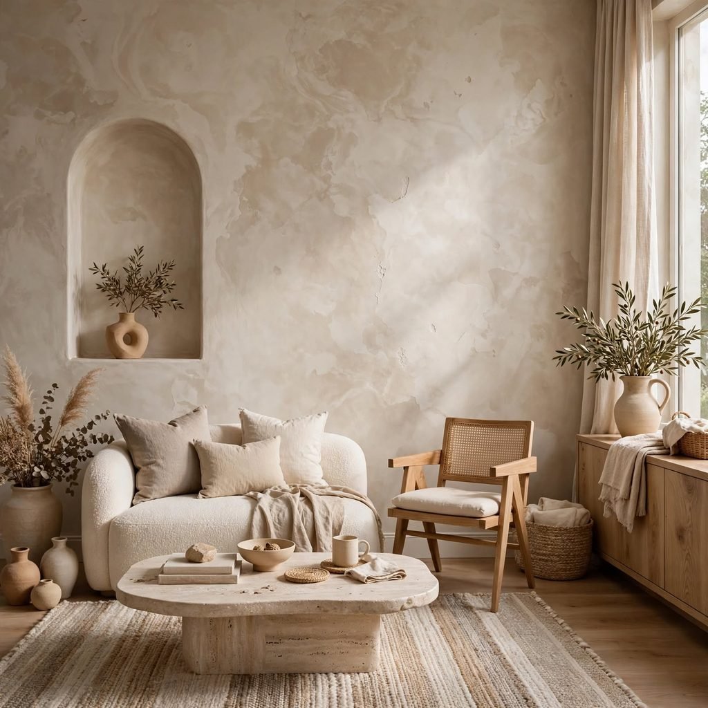
Limewash or Venetian plaster wall finishes introduce handmade texture and subtle tonal variation that flat paint can’t achieve. Because plaster absorbs and reflects light unevenly, walls appear to shift in tone throughout the day, giving a neutral room a sense of depth and movement. This finish works particularly well in entryways, powder rooms, or feature walls where you want a tactile, artisanal quality without adding any actual color.
9. Brass and Unlacquered Brass Fixtures
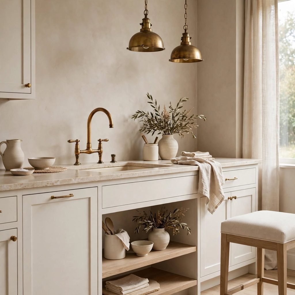
Warm metal fixtures, especially unlacquered brass that develops a living patina over time, add richness to a neutral palette that chrome or matte black can’t replicate. Brass hardware on cabinets, faucets, and lighting introduces a warm glow that pairs naturally with cream walls and honey-toned wood. Because unlacquered brass ages and tarnishes gradually, it also gives a neutral room a sense of history rather than a showroom-fresh look.
10. Natural Woven Baskets
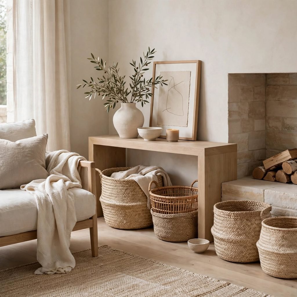
Woven storage baskets in seagrass, jute, or rattan add organic texture to a neutral room while doubling as functional storage. Their irregular, handwoven texture contrasts nicely with smoother surfaces like painted walls or upholstered furniture, preventing the room from feeling too uniform. Stacking two or three baskets of varying sizes near a reading chair or under a console table is an easy, low-cost way to add warmth without introducing color.
11. Cream Boucle Rug
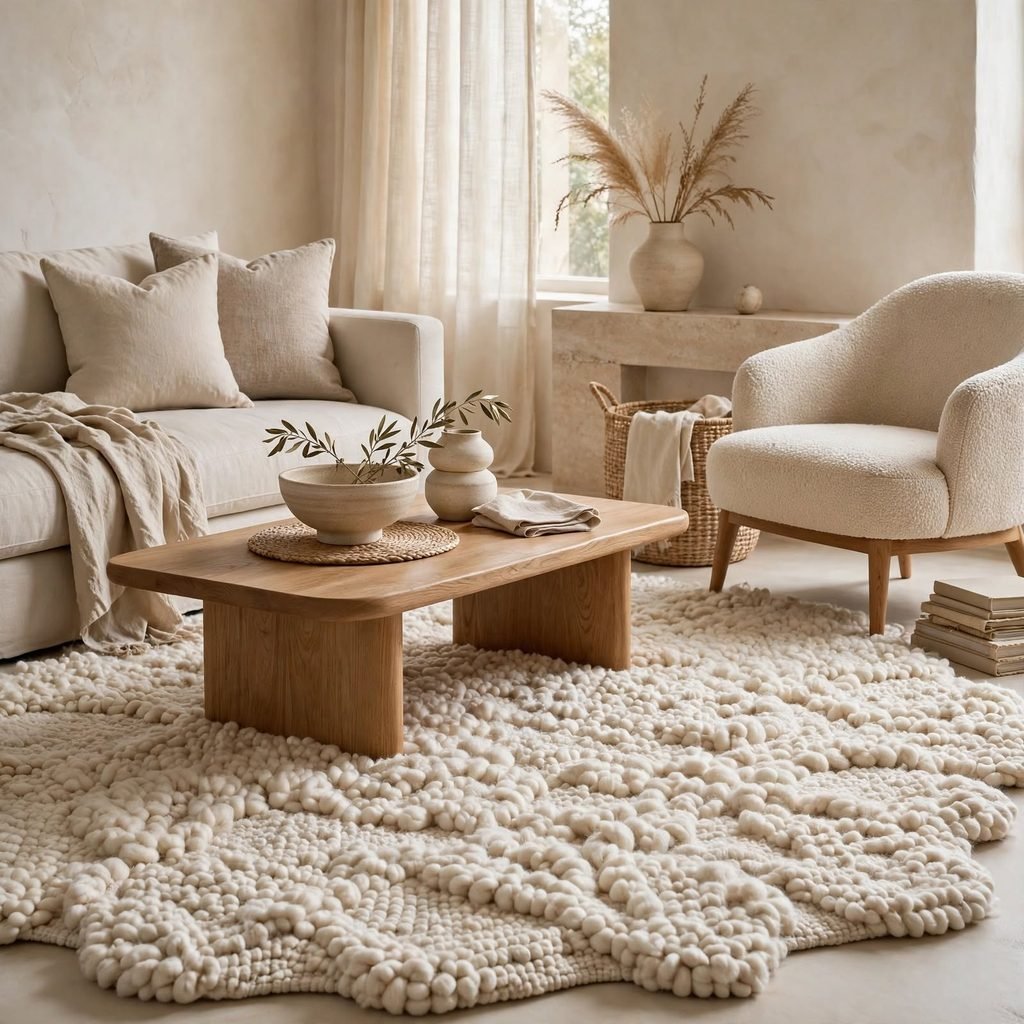
A cream or oatmeal boucle rug grounds a neutral living room while adding a soft, textured focal point underfoot. Unlike a flat-weave neutral rug, boucle’s looped pile catches shadows and creates visual interest even without pattern or color. This works especially well layered over a natural jute rug, combining two textures in complementary neutral tones for a grounded, collected look that still reads as calm and cohesive.
12. Matte Black Lighting Fixtures
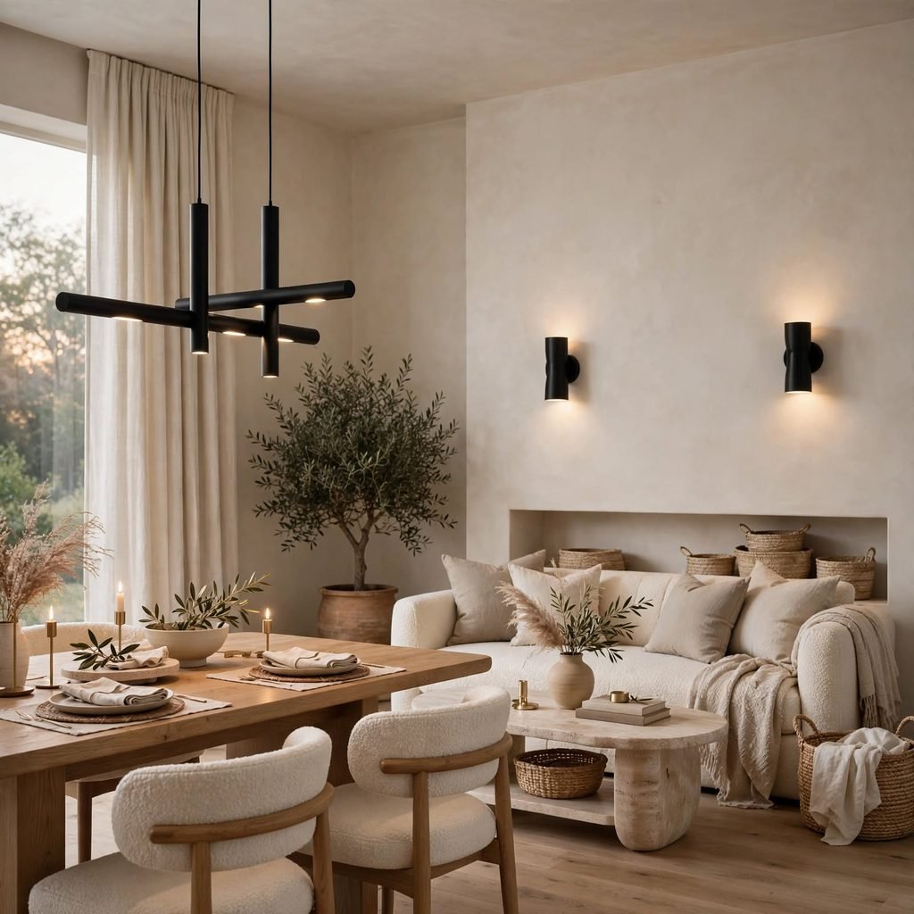
Matte black pendant lights or sconces provide the same grounding effect as charcoal trim but at eye level, where lighting fixtures naturally draw attention. Because matte black absorbs light rather than reflecting it, fixtures read as sculptural silhouettes against a pale wall or ceiling. This idea works particularly well over a kitchen island or dining table, where the fixture becomes the room’s single strongest visual anchor.
13. Taupe and Bone Color Blocking
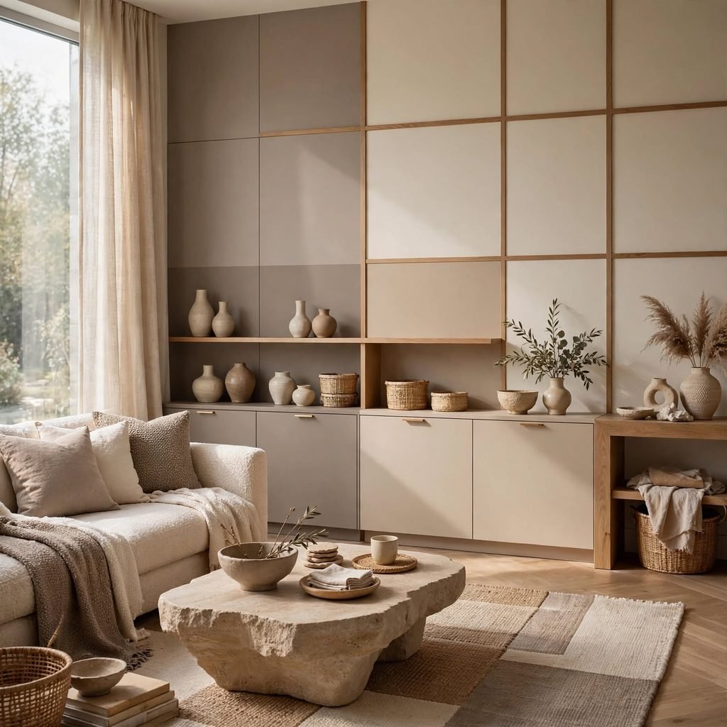
Painting adjacent walls or a lower half-wall in slightly different neutral tones taupe below, bone above creates subtle architectural interest without needing a chair rail or wallpaper. This technique works because taupe and bone share the same undertone family, so the transition feels intentional rather than jarring. It’s an especially good option in hallways, stairwells, or dining rooms where a single flat wall of color can otherwise feel underwhelming.
14. Raw Wood Furniture Legs
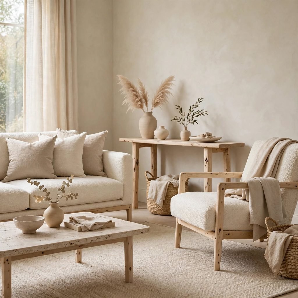
Furniture with visible raw or lightly oiled wood legs think a sofa, console, or dining chair adds warmth to a neutral room without introducing pattern or color. The grain and knots in raw wood provide natural variation that painted or upholstered legs can’t match. This detail works especially well when the wood tone is repeated at least twice in a room, such as on a coffee table and a set of shelves.
15. Sculptural Ceramic Vases
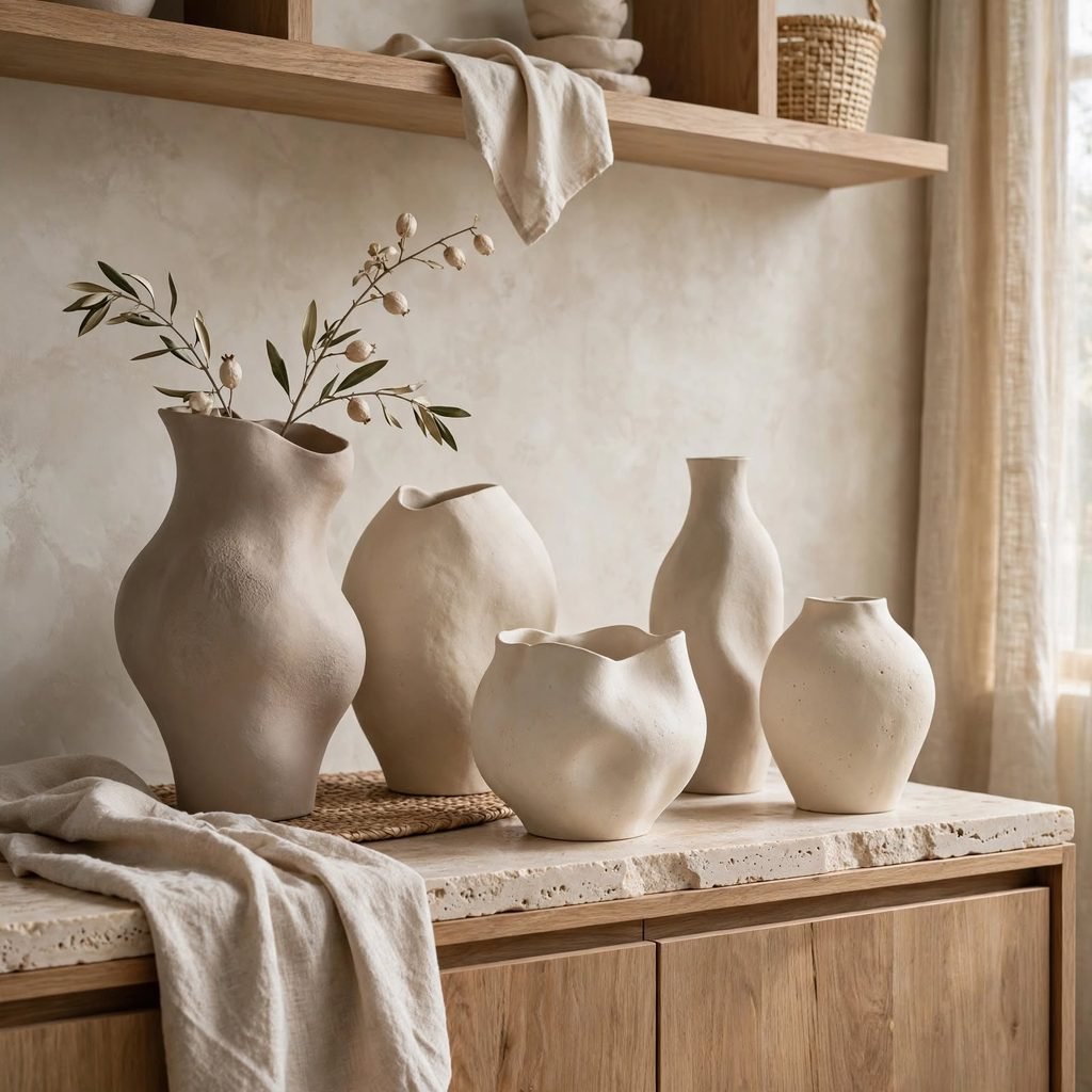
Unglazed or matte ceramic vases in bone, sand, or clay tones serve as sculptural accents on a shelf or console without breaking a neutral scheme. Their varied, often irregular shapes add visual interest that a symmetrical decor object can’t provide. Grouping two or three vases of different heights and slightly different neutral shades creates a still-life effect that feels curated rather than staged.
16. Wool Throw Blankets
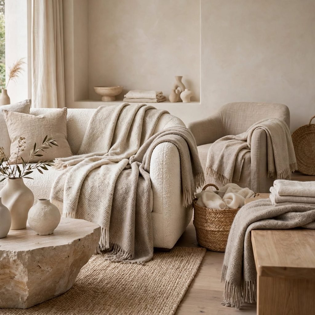
A chunky wool throw in oatmeal, ivory, or camel adds tactile warmth to a sofa or bed while reinforcing the room’s neutral color story. Wool’s natural texture and slight sheen variation give it more visual weight than a flat cotton blanket, so it reads as a deliberate styling choice rather than an afterthought. Draping it asymmetrically, rather than folding it flat, also adds a relaxed, lived-in quality to the space.
Neutral Tone Comparison
| Neutral Type | Undertone | Best Paired With | Ideal Room |
| Warm White | Yellow/Cream | Brass, light oak | Bedrooms, nurseries |
| Greige | Balanced gray-beige | Black metal, walnut | Living rooms |
| Taupe | Warm gray-brown | Bone, camel textiles | Dining rooms, hallways |
| Charcoal | Cool, deep gray | White trim, brass | Window frames, doors |
| Bone | Soft off-white | Rattan, linen | Bathrooms, entryways |
Shop the Look
A few pieces make it easy to build this palette without a full renovation: an oatmeal boucle accent chair for texture, an unlacquered brass floor lamp for warm ambient light, a chunky wool throw in ivory for the sofa, a set of matte ceramic vases in varying sand tones for the console table, and a seagrass storage basket duo for functional texture near the entryway.
Common Mistake to Avoid
The most common mistake is choosing every neutral element in the exact same shade and finish, which flattens a room instead of layering it. A space built entirely from matching beige walls, beige furniture, and beige flooring loses depth and starts to look washed out under both natural and artificial light. The fix is intentional contrast: pair warm tones with cool ones, matte finishes with slight sheen, and smooth textures with nubby or woven ones so the eye has variation to follow.
FAQs
What is considered a true neutral color palette?
A true neutral color palette is built from colors without a strong hue bias whites, beiges, grays, taupes, and browns though most neutrals still carry a subtle warm or cool undertone. Designers typically layer three to five neutral tones within a room rather than relying on just one, since a single flat shade tends to read as unfinished. The goal is tonal variation, not the complete absence of color.
How do I keep a neutral room from looking boring?
Texture is the main tool for keeping a neutral room visually interesting. Mixing materials like linen, boucle, raw wood, woven rattan, and matte ceramic gives the eye variation to focus on even without introducing bold color. Adding at least one dark accent, such as charcoal window trim or matte black lighting, also helps define the room’s edges and prevents everything from blending into a single flat plane.
Should neutral walls be warm or cool toned?
The right undertone depends on your room’s natural light and fixed finishes like flooring or countertops. North-facing rooms with limited direct sun generally look better with warm white or cream walls, since cool tones can read as gray and flat in low light. South-facing rooms with abundant sunlight can handle cooler grays or greige without looking cold, since the natural light balances out the undertone.
Can a neutral color palette work in a small space?
Yes, and it’s often one of the best strategies for small rooms, since consistent neutral tones on walls, trim, and larger furniture pieces avoid visually chopping up the space. Layering in different textures, rather than different colors, keeps a small room feeling calm and cohesive instead of cluttered. Mirrors and matte metallic accents like brass also help bounce light around without disrupting the neutral scheme.
What colors pair well with a neutral palette for accents?
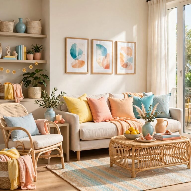
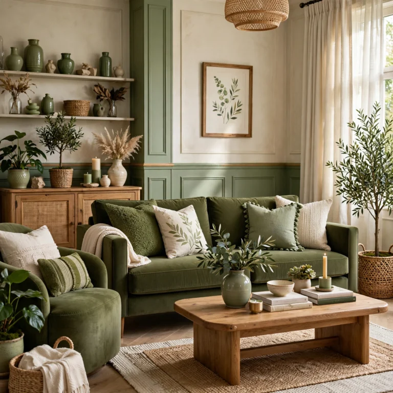
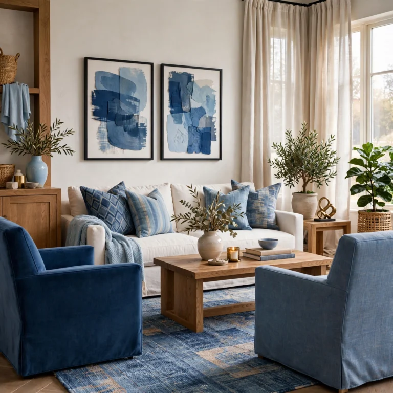
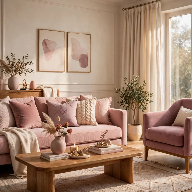
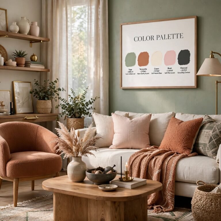
Sage green, dusty terracotta, and deep navy are popular accent choices because they read as muted rather than bright, which keeps them from clashing with a neutral base. These colors work best in small doses a throw pillow, a piece of art, or a single upholstered chair rather than as a dominant wall color, since too much saturated color can overwhelm a carefully layered neutral scheme.
Conclusion
Building a neutral color palette that actually feels warm and finished comes down to layering tone, texture, and material rather than picking one shade and repeating it everywhere. From whitewashed oak floors to unlacquered brass fixtures, these seventeen ideas offer plenty of starting points for any room in the house. Save this guide to Pinterest for your next redesign, and check out our related post on choosing the right paint sheen for every room.