14 Amazing Brown Color Palette Ideas for a Warmer Home
A brown color palette has moved firmly away from the dated, monochrome brown interiors of decades past and into a warmer, more layered approach that mixes several shades and materials in a single room. This guide covers fourteen practical ways to bring brown into a space, from full accent walls to smaller textile choices, so you can find an approach that matches your room’s existing furniture and your comfort with color. Each idea focuses on a specific shade, material, or pairing that keeps the palette feeling current rather than heavy.
Trend & Background
Brown has re-emerged as one of the most requested neutral palettes in home design after years of grey and white dominance, driven largely by a broader shift toward warmer, more textural interiors following the pandemic-era emphasis on cozy, lived-in spaces. Paint companies have responded with several brown and brown-adjacent shades named color of the year in recent seasons, reflecting growing demand for tones like mocha, cocoa, and chocolate across both walls and furniture. At the same time, natural materials like walnut wood, leather, and boucle fabric have grown in popularity alongside the color itself, since brown reads as more current when paired with texture rather than applied as a flat, single-material finish.
Key Takeaways
- A brown color palette works across nearly every room when paired with the right undertone, from warm camel to cool espresso.
- Layering multiple brown shades, rather than one flat tone, gives a room depth that a single-color scheme can’t achieve.
- Brown pairs naturally with cream, rust, and bronze, which keeps the palette from feeling heavy or dated.
- Material choice, like leather, boucle, or walnut wood, matters as much as the shade itself for how current the palette feels.
1. Chocolate Brown Accent Wall
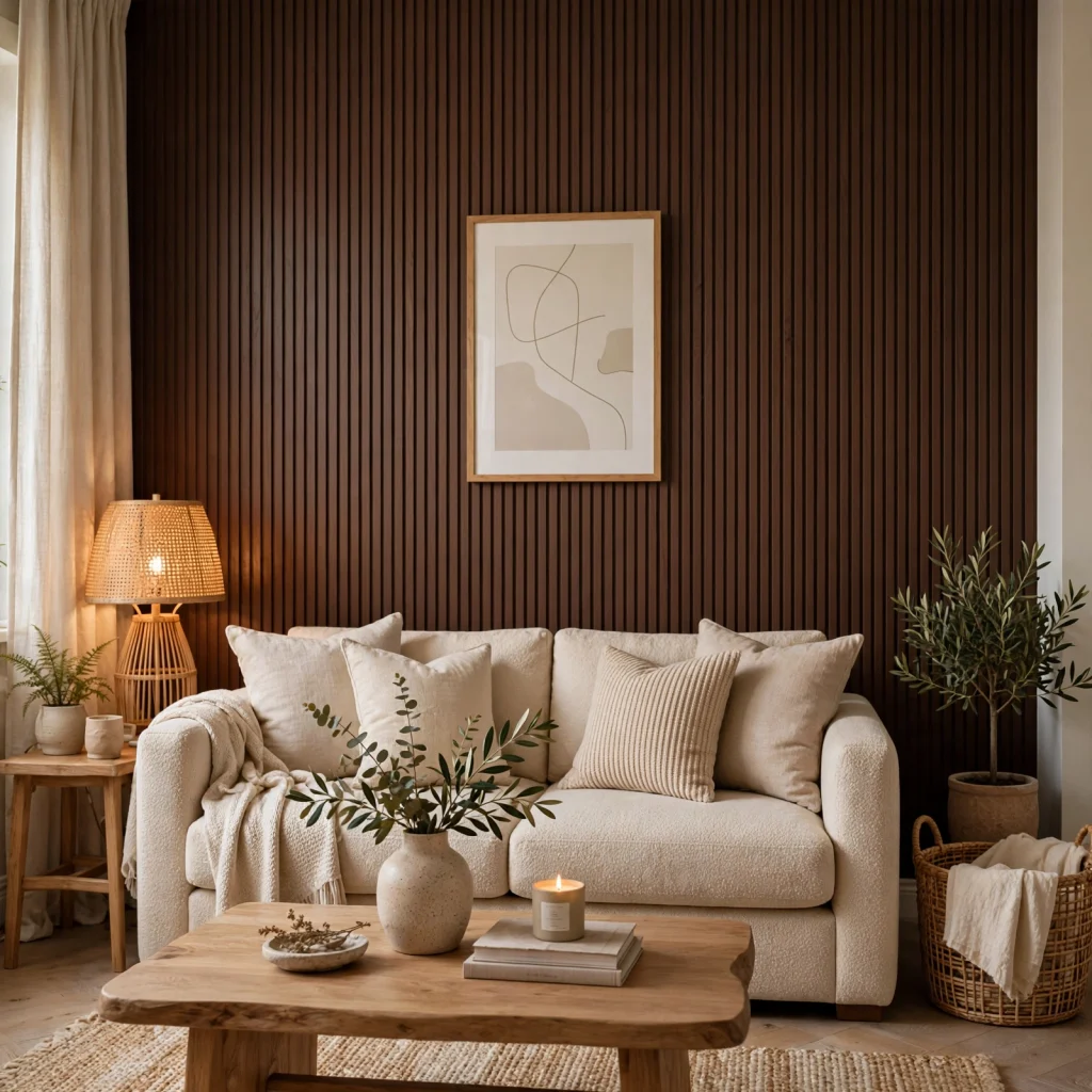
A single wall painted in a deep chocolate brown adds drama and warmth to a room without the commitment of covering every surface, and it works especially well in a space with good natural light to balance the darker tone. Choose a matte or eggshell finish over high-gloss, since a matte surface absorbs light in a way that reads as richer and more intentional. Pair the wall with lighter furniture and textiles nearby so the room doesn’t feel overly enclosed by the darker color.
2. Camel Leather Accent Chair
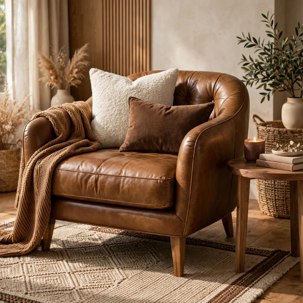
A camel leather chair introduces a warm, mid-tone brown through furniture rather than paint, which makes it easier to swap out or reposition if your overall palette changes later. Choose a full-grain or top-grain leather for the most durable finish, since leather quality varies significantly and affects how the material ages over years of use. This piece works well as a focal point in a room with otherwise neutral walls and flooring.
For more options pink color palette SEE MORE
3. Walnut Wood Furniture Pairing
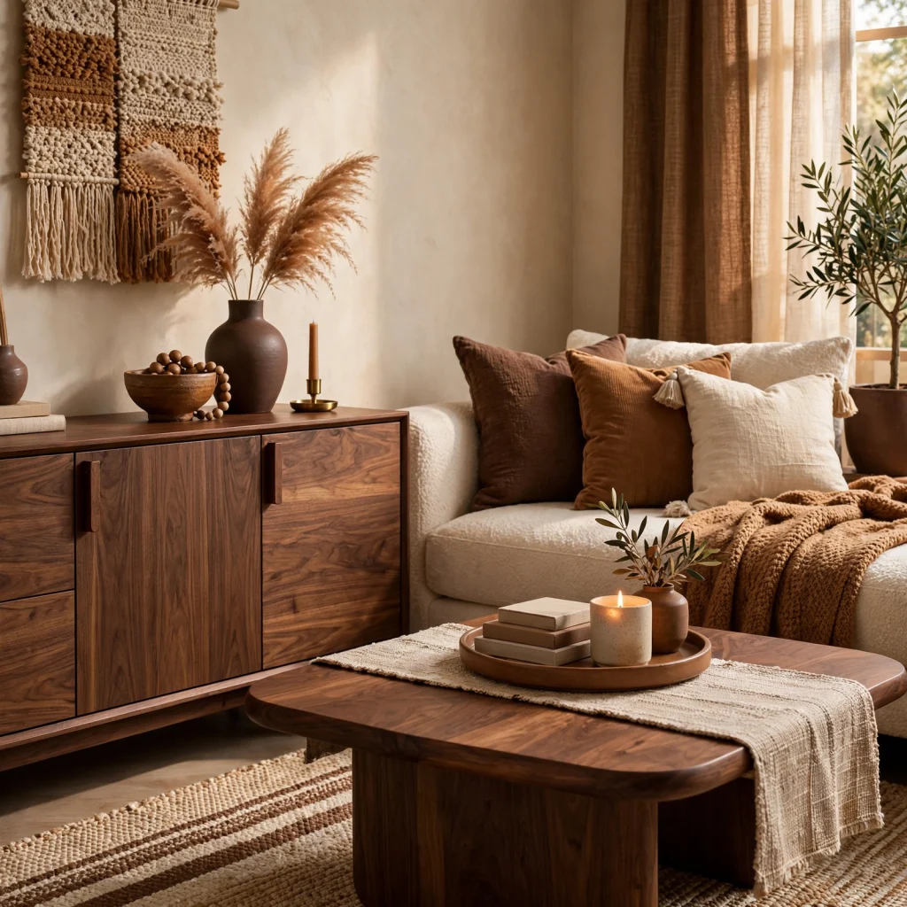
Walnut furniture, with its rich, reddish-brown grain, adds warmth and material depth to a room in a way that painted or laminate furniture can’t replicate. Pair walnut pieces with lighter wall colors, like warm white or soft grey, so the wood tone stays the visual focal point rather than competing with a similarly dark wall. Mixing walnut with a lighter wood, such as oak or ash, in the same room adds contrast without clashing, since both fall within the same warm undertone family.
| Wood Tone | Undertone | Best Paired With |
| Walnut | Reddish-brown | Warm white, sage green |
| Oak | Golden-brown | Cream, terracotta |
| Espresso | Near-black brown | White, brass metal |
4. Terracotta and Brown Layering

Layering terracotta accents, such as pillows, ceramics, or a rug, against a brown base palette adds warmth and a slightly more playful tone without introducing a fully separate color scheme. Choose terracotta pieces with a matte, slightly textured finish to match the grounded, earthy feel of a brown-based room. This combination works particularly well in a living room or dining space where a few accent pieces can carry the terracotta tone without overwhelming the brown foundation.
5. Espresso Cabinet Finish
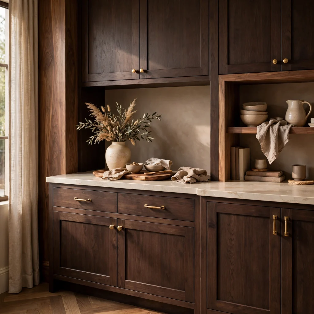
Espresso-stained cabinetry, whether in a kitchen or bathroom, gives a room a deep, near-black brown finish that reads as more sophisticated than a flat black cabinet while still offering strong visual contrast against lighter countertops. Choose a satin or matte stain over high-gloss lacquer for a more current, less formal look. Pair espresso cabinets with brass or unlacquered brass hardware to keep the finish from feeling too cold or severe.
6. Mocha Mousse Paint
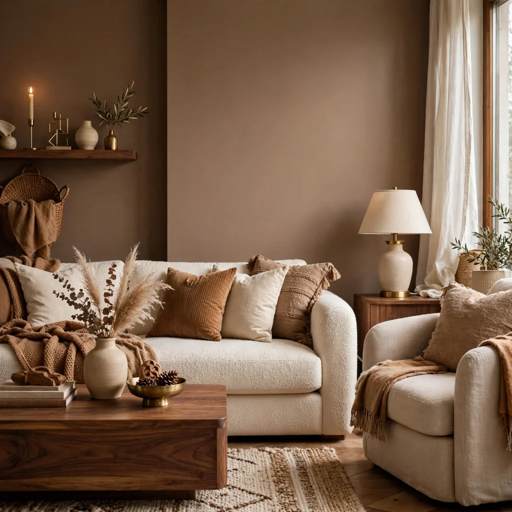
A mocha-toned paint, sitting between a warm grey and a soft brown, works as a more approachable alternative to a deeper chocolate wall color for anyone hesitant to commit to a bolder shade. This tone reads differently depending on lighting, appearing warmer under incandescent bulbs and cooler under daylight-balanced LED lighting, so it’s worth testing a sample patch at different times of day before committing to a full room. Mocha pairs particularly well with cream trim and warm wood flooring.
7. Tan Linen Upholstery
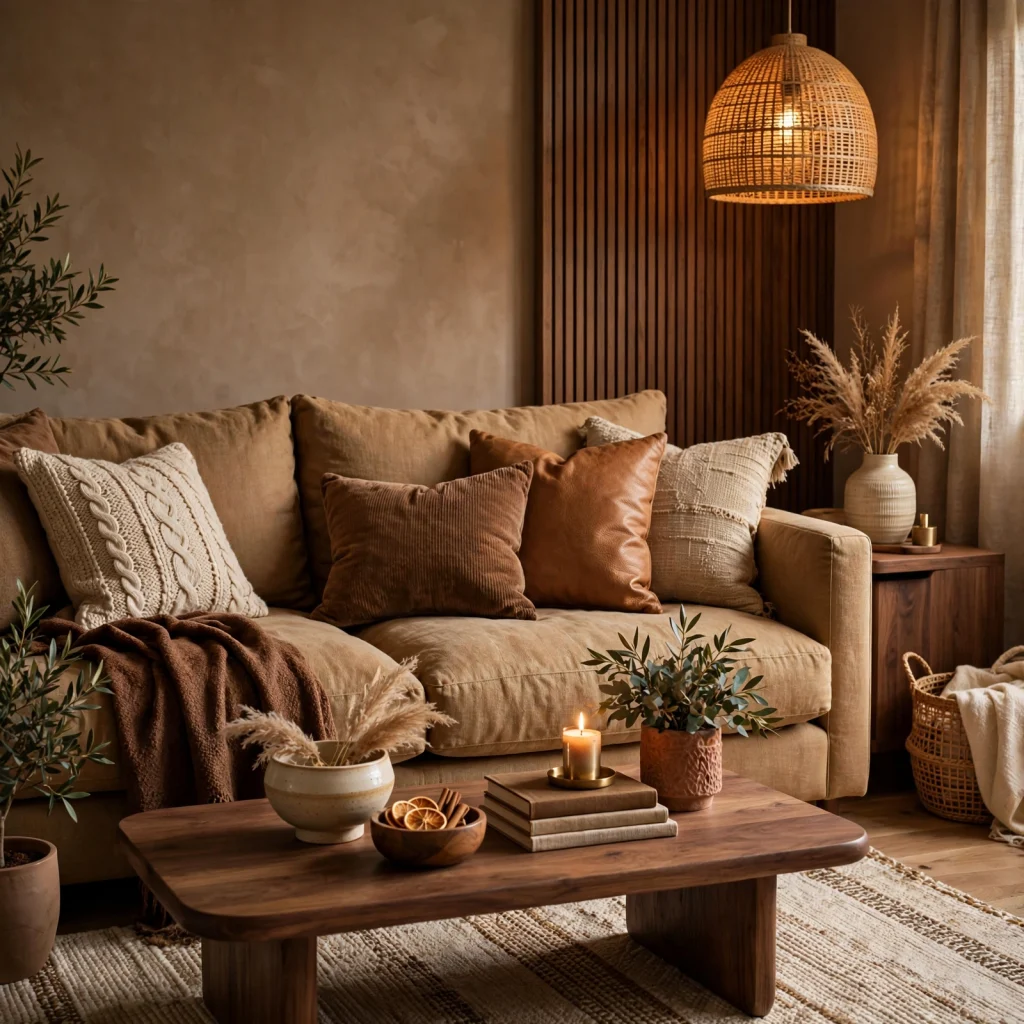
Tan linen upholstery on a sofa or accent chair introduces a lighter, more casual brown tone through texture rather than a saturated color choice, which keeps a room feeling relaxed rather than formal. Choose a linen blend with some synthetic fiber content for better durability and wrinkle resistance than pure linen alone. This material pairs especially well with a brown color palette built around natural, textural elements like wood, leather, and woven baskets.
8. Brown and Cream Color Blocking
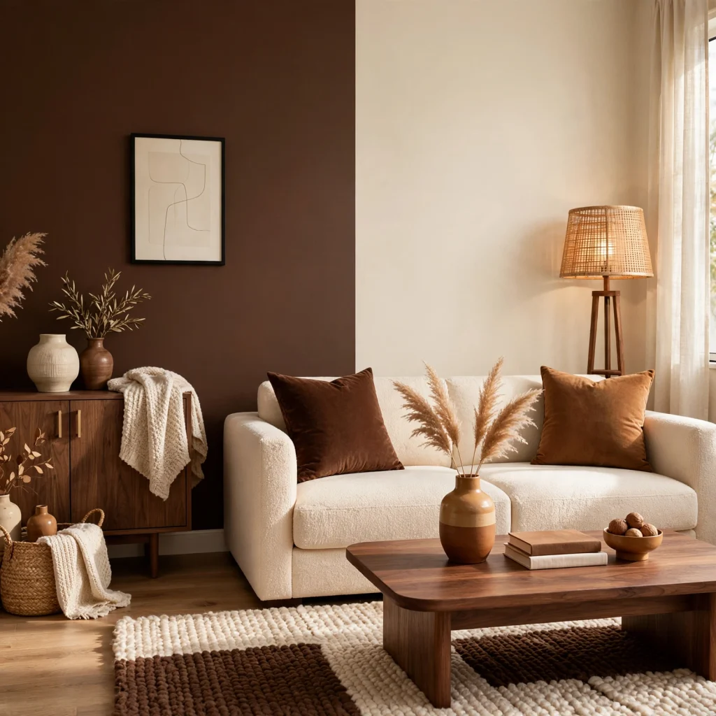
Pairing solid blocks of brown and cream, whether through paint, bedding, or upholstery, creates a graphic, high-contrast look that reads as more intentional than blending the two tones together gradually. This approach works well in a bedroom, where a cream-toned bed paired with a brown accent wall or headboard creates immediate visual structure. Keep the color blocking simple, limiting the palette to just these two tones plus one metal accent, to avoid the look becoming visually busy.
9. Rust and Brown Combination
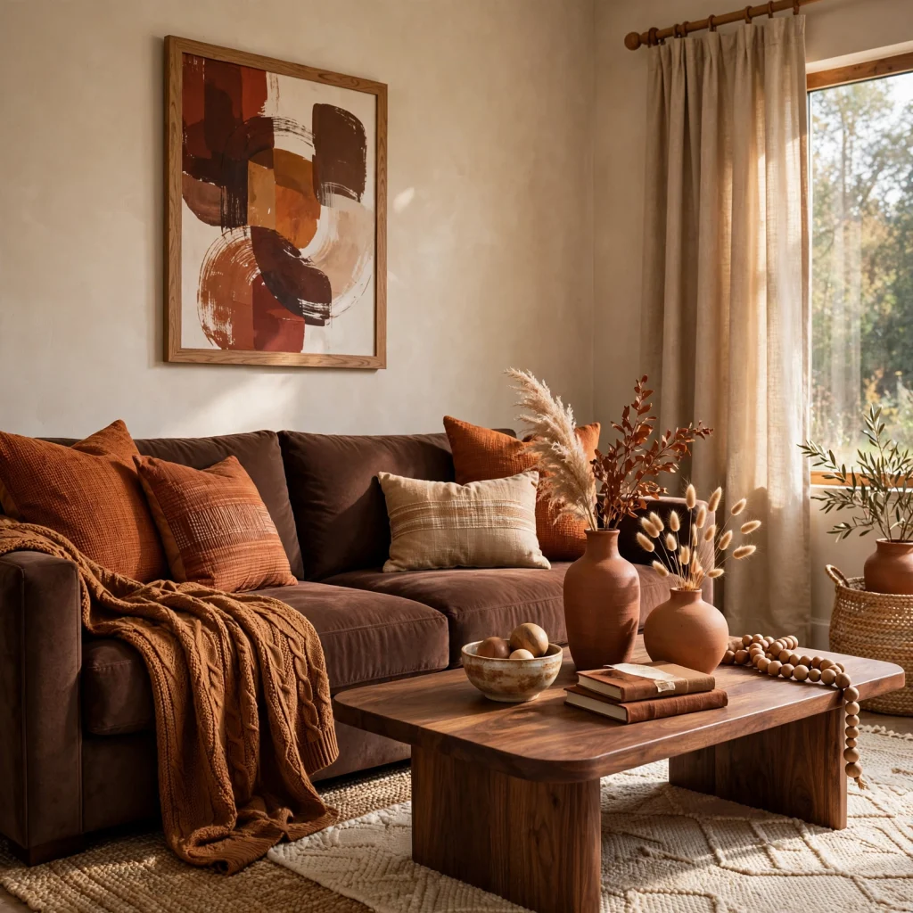
Rust, a warmer, more saturated cousin of brown, adds energy to a brown-based palette when used in smaller doses, such as a single accent chair, a set of pillows, or a piece of art. This combination works particularly well in a living or dining room, where the rust tone can serve as a focal point against a more neutral brown wall or furniture base. Keep rust to no more than one or two pieces in the room so it reads as an intentional accent rather than a second competing color scheme.
10. Bronze Metallic Accents
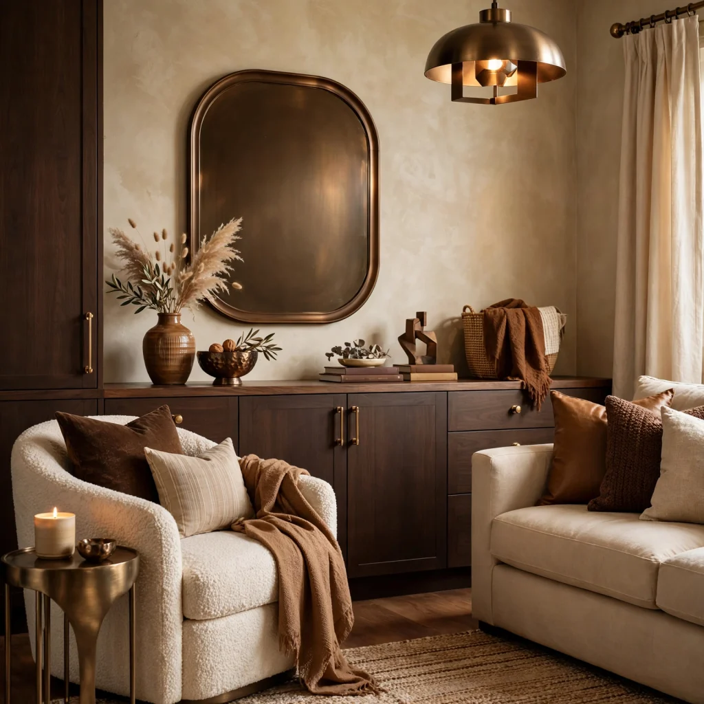
Bronze hardware, light fixtures, and small decorative objects tie a brown color palette together through metal rather than paint or textiles, adding warmth without introducing an entirely new color. Choose an aged or unlacquered bronze finish over a bright, polished version for a look that complements the muted, earthy quality of most brown palettes. This works especially well in a bathroom or kitchen, where hardware and fixtures already need a metal finish decision regardless of the wall color chosen.
11. Brown Boucle Textile
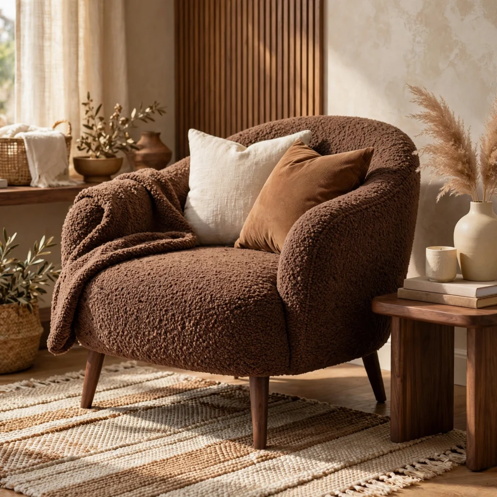
Boucle fabric in a warm brown tone adds texture and a slightly more contemporary feel to a brown color palette, since the looped, nubby weave reads as more current than a flat woven or velvet fabric in the same shade. Use it on an accent chair, ottoman, or a set of pillows rather than a full sofa if you’re testing the texture before a larger investment. This material pairs particularly well with walnut wood furniture, since both bring warmth and texture without relying on pattern.
12. Taupe Wall Paint
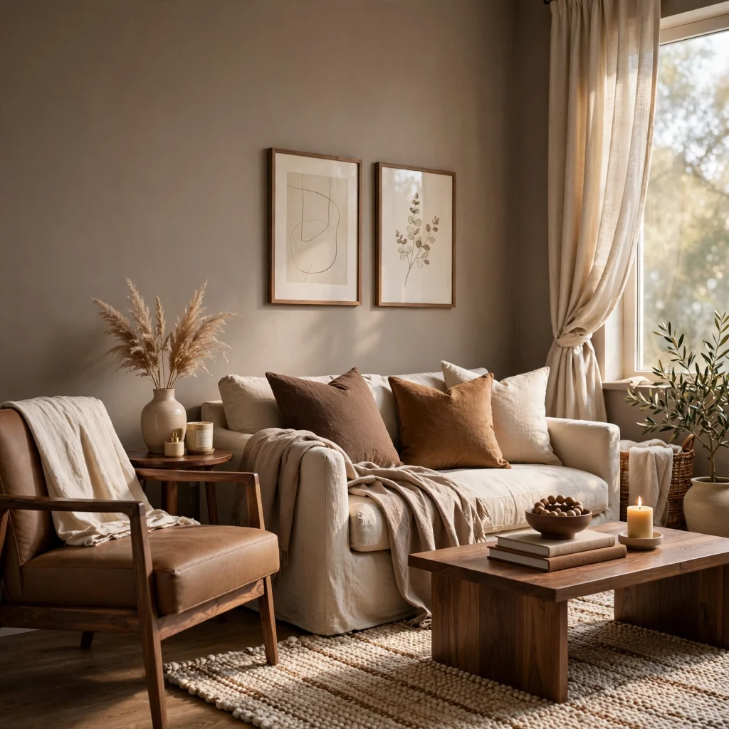
Taupe, a brown-grey blend, works as one of the most versatile entry points into a brown color palette, since it reads as a neutral in most lighting conditions while still carrying enough warmth to avoid feeling cold or clinical. Choose a warmer taupe with visible brown undertones over a cooler, greyer version if the goal is leaning further into the brown palette rather than staying closer to a true grey. This shade works in almost any room and pairs easily with both warm woods and cooler metal finishes.
| Shade | Undertone Strength | Best Room |
| Light Taupe | Subtle brown-grey | Living room, hallway |
| Mocha | Moderate warm brown | Bedroom, dining room |
| Chocolate | Strong deep brown | Accent wall, powder room |
13. Coffee Brown Kitchen Island
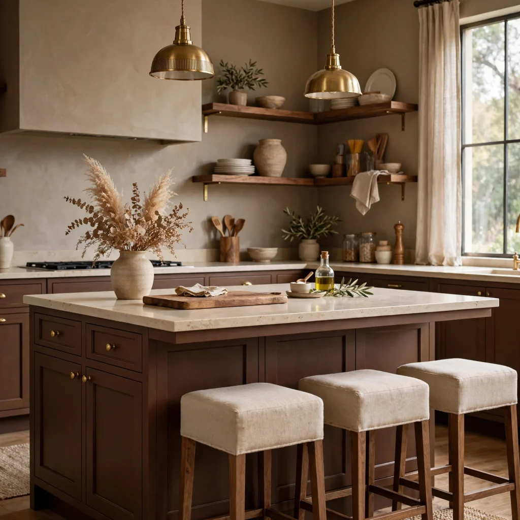
A kitchen island finished in a deep coffee brown, whether through paint or a wood stain, gives an otherwise white or neutral kitchen a grounding focal point without requiring a full cabinetry overhaul. Choose a durable enamel or lacquer finish given how much daily wear an island surface receives from both cooking and casual seating use. Pair the island with a lighter countertop material, like white quartz or a pale butcher block, to keep the contrast crisp rather than heavy.
14. Brown Tonal Bedding Layers
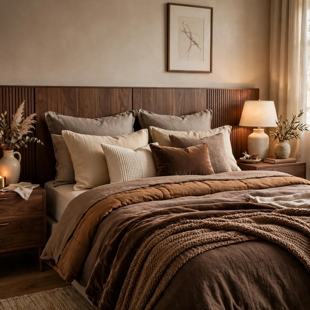
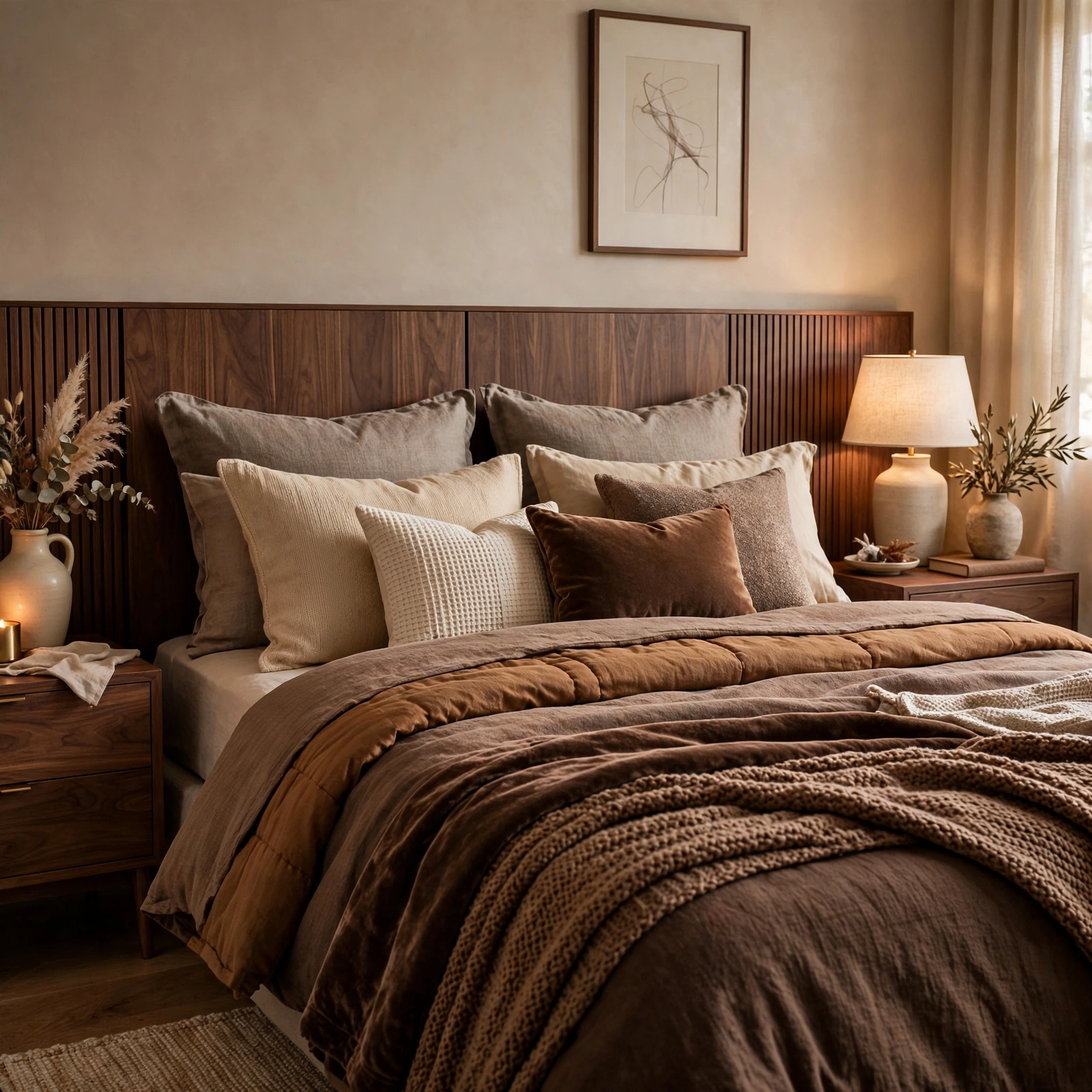
Layering two or three brown tones across a duvet, throw blanket, and pillows, rather than matching everything to a single shade, gives a bed visual depth similar to how tonal layering works in fashion. Choose fabrics with slightly different textures, such as a smooth cotton sheet paired with a knit throw and a velvet lumbar pillow, so the tonal variation reads as intentional rather than mismatched. This approach works well as a lower-commitment way to test a brown color palette before extending it to walls or larger furniture.
Shop the Look
Look for a camel leather accent chair to anchor a living room’s brown color palette, paired with a set of bronze picture frames and a small bronze table lamp. A walnut wood side table adds material warmth, while a boucle throw pillow in a warm brown tone layers in texture. Round out the room with a taupe area rug to tie the wall color and furniture together without introducing a competing shade.
Common Mistake to Avoid
The most common mistake with a brown color palette is relying on a single flat shade across walls, furniture, and textiles, which can make a room feel heavy or dated rather than warm and layered. Mixing at least two or three brown tones, along with a lighter neutral like cream or white, keeps the palette from feeling monochrome in a way that reads as unfinished rather than intentional. Skipping texture entirely, by choosing only smooth, flat-finish materials, is a similar issue, since texture is what keeps a brown-heavy room from looking flat under most lighting conditions.
FAQs
Does a brown color palette make a room feel smaller or darker?
Lighter brown tones like tan or taupe generally don’t shrink a room’s perceived size, since they reflect light in a way similar to other soft neutrals, while deeper shades like chocolate or espresso can make a room feel more enclosed if used across every surface. Limiting darker brown tones to one accent wall or a piece of furniture, rather than the whole room, balances the warmth of the color against the room’s actual light levels. Good lighting, including layered lamps and overhead fixtures, matters more to a room’s perceived size than the specific brown shade chosen.
What colors pair best with a brown color palette?
Cream and white are the most reliable neutral partners for brown, since they lighten the overall palette and prevent the room from feeling too enclosed by warm, dark tones. Sage green, terracotta, and rust all work well as secondary accent colors, adding a bit of contrast without clashing with brown’s naturally warm undertone. Cooler colors like true blue or lavender require more careful balancing, since they can fight against brown’s warmth if not paired thoughtfully.
Is a brown color palette currently in style or already dated?
Brown has returned strongly to current design trends after years of grey and white dominance, though today’s version relies more on layered shades, natural materials, and texture than the flatter, more uniform brown interiors common decades ago. Several paint brands have named brown-adjacent shades as color of the year in recent seasons, which reflects sustained demand rather than a short-lived trend cycle. Choosing natural materials like leather, walnut wood, and linen over synthetic finishes helps a brown palette feel current rather than retro.
How do you introduce brown into a room without committing to a full renovation?
Textiles, like a throw blanket, accent pillows, or a small area rug, are the easiest ways to test a brown color palette without touching walls or furniture at all. A single piece of furniture, such as a leather chair or a walnut side table, is the next lowest-commitment option, since it can be repositioned or replaced later if the palette doesn’t feel right. Paint and larger furniture investments are worth saving until you’ve lived with smaller brown accents for a few weeks and confirmed the shade works in your space’s specific lighting.
What material works best for a brown accent piece?
Leather, walnut wood, and boucle fabric are three of the most reliable materials for a brown accent piece, since each brings natural texture that keeps the color from reading as flat or one-dimensional. Leather works particularly well for furniture meant to age and develop character over time, while boucle suits smaller accent pieces like pillows or an ottoman. Walnut wood is the most versatile of the three, working equally well as a small side table or a larger furniture investment like a dining table.
Conclusion
A brown color palette works best when it’s layered across two or three shades and materials, from a chocolate accent wall to a camel leather chair, rather than relying on a single flat tone throughout the room. Pairing brown with cream, texture, and warm metal accents keeps the palette feeling current and grounded instead of heavy or dated. Save this guide to Pinterest for your next room refresh, and check out our related post on cute room decor ideas for more inspiration.