17 Innovative Spring Color Palette Ideas for a Fresher Home
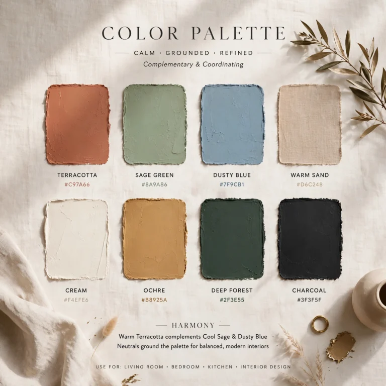
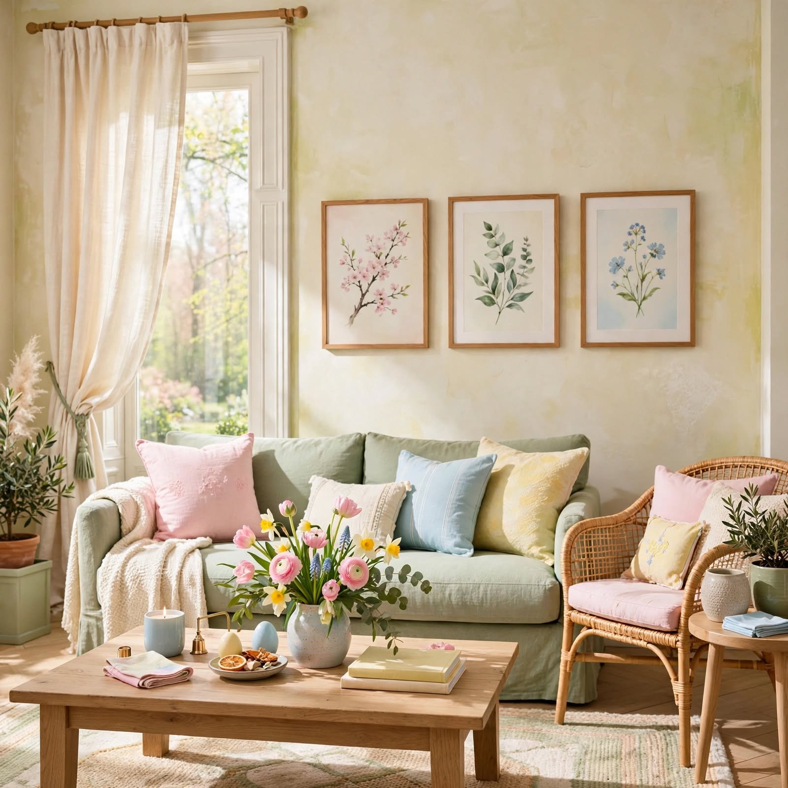
A spring color palette works best when it favors soft, muted versions of pastel shades rather than the brighter, more saturated tones often associated with the season, since muted pastels read as more sophisticated and last longer in a room’s overall design than a trend-driven bright palette. This guide covers seventeen practical ways to bring spring colors into a home, from full accent walls to smaller textile swaps, so you can find an approach that suits your comfort level with color and your room’s existing furniture. Each idea focuses on a specific shade or pairing that keeps the palette feeling fresh without tipping into overly saccharine territory.
Trend & Background
Spring color palettes have shifted over the past several years away from the bright, candy-colored pastels once associated with the season and toward softer, more muted tones like sage, butter yellow, and dusty lavender that work year-round rather than feeling seasonal or temporary. This shift tracks a broader move in home design toward warmer, more livable neutrals paired with restrained pops of color, rather than full rooms built around a single saturated hue. Paint and textile brands have responded by naming several of these muted spring tones as color of the year in recent seasons, which has made softer, more grounded pastels far more visible in home decor content than the brighter Easter-adjacent palettes common a decade ago.
Key Takeaways
- A spring color palette leans on soft, muted pastels rather than the bright, saturated versions of the same colors.
- Pairing two or three spring shades with a neutral like cream or white keeps a room from feeling overly sweet.
- Textiles and small accents are the easiest way to test a spring palette before committing to paint or furniture.
- Natural materials like linen and light wood keep pastel colors from reading as artificial or overly playful.
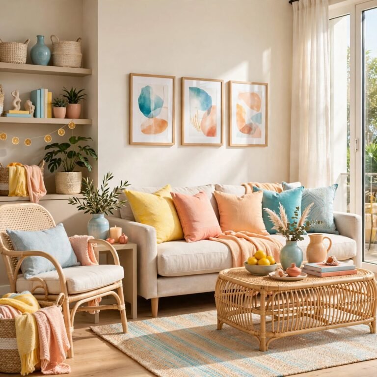
1. Butter Yellow Accent Wall
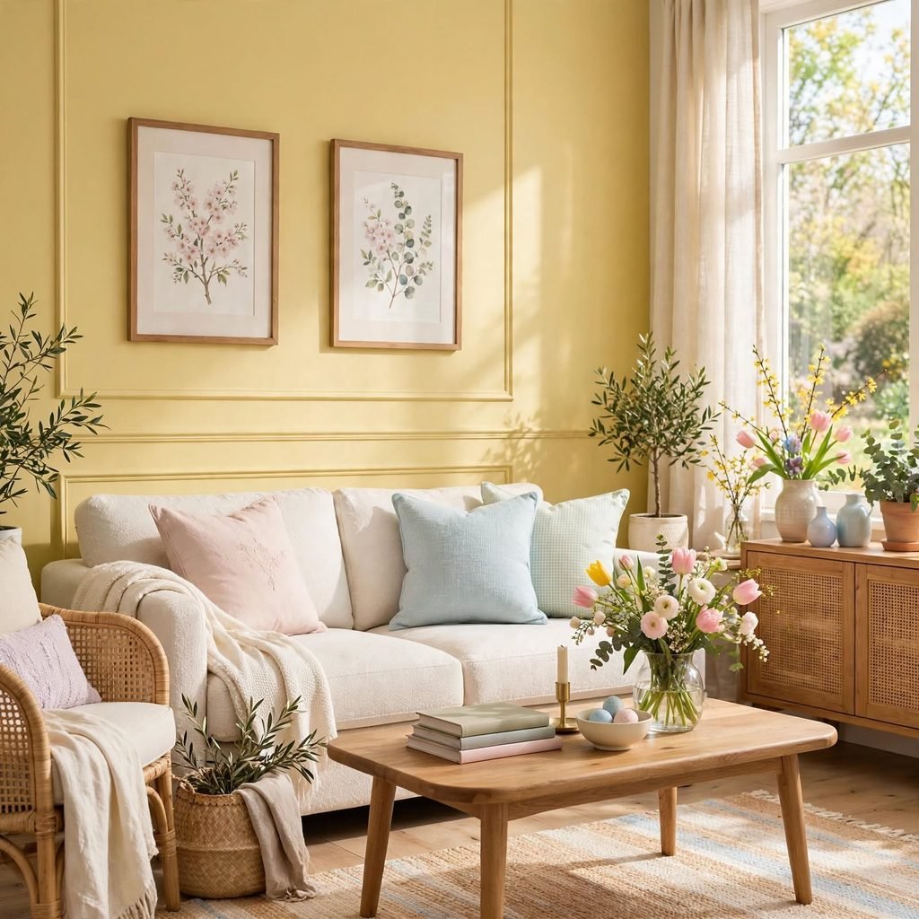
A wall painted in a soft, warm butter yellow adds brightness to a room without the intensity of a fully saturated yellow, and it works particularly well in a kitchen or breakfast nook where morning light amplifies the warmth of the tone. Choose a matte or eggshell finish to keep the color feeling soft rather than glossy, and pair it with white trim to keep the wall from feeling too enclosed. This shade tends to photograph and read differently depending on the room’s natural light, so testing a sample patch at different times of day is worth the extra step.
2. Sage Green Living Room
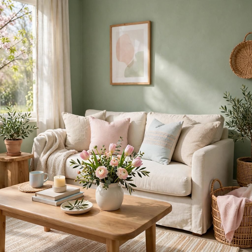
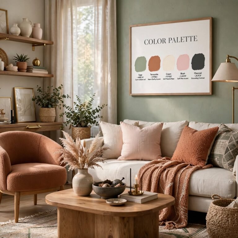
Sage green has become one of the most requested spring-adjacent neutrals for living rooms, since its muted, grey-green undertone pairs easily with both warm and cool furniture finishes. Use it on a large piece of upholstered furniture, like a sofa or accent chair, if you’re not ready to commit to a full wall, since the color works nearly as well in smaller doses. Pair sage with warm wood tones and cream textiles to keep the room feeling grounded rather than overly pastel.
For more color palette design
3. Blush Pink and Cream Pairing
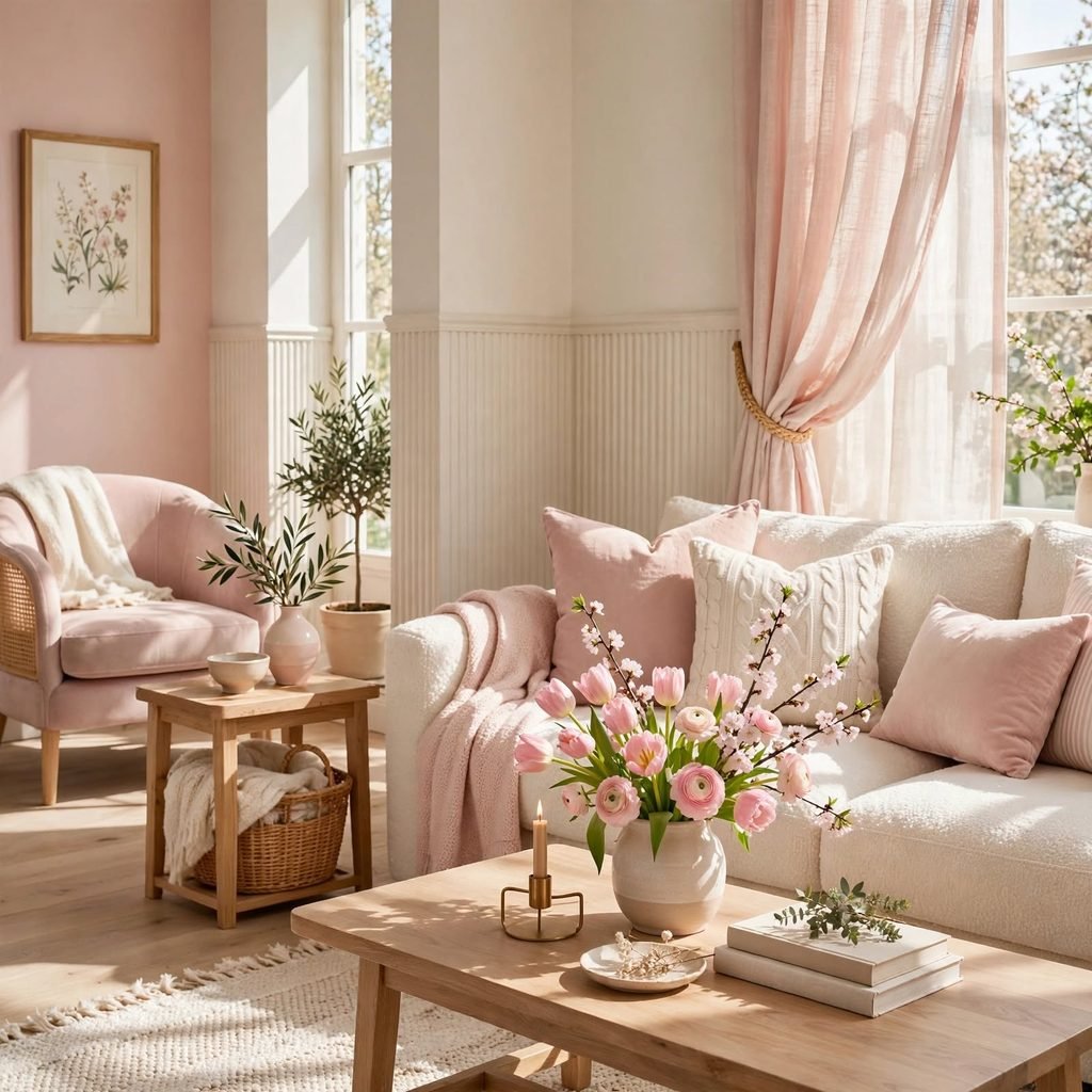
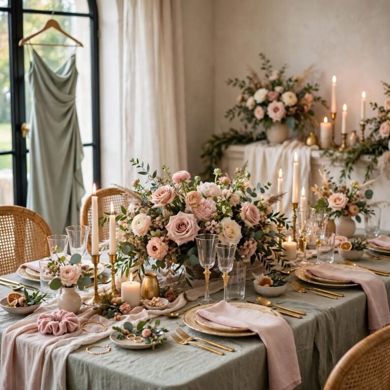
Pairing a soft blush pink with a warm cream base creates a gentle, low-contrast palette that reads as calm rather than overtly themed to any single season. This combination works especially well in a bedroom, where blush can appear on bedding or a headboard while cream carries the walls and larger furniture. Keep any additional accent colors minimal, since this pairing relies on its softness rather than contrast for visual interest.
4. Lavender Bedroom Palette
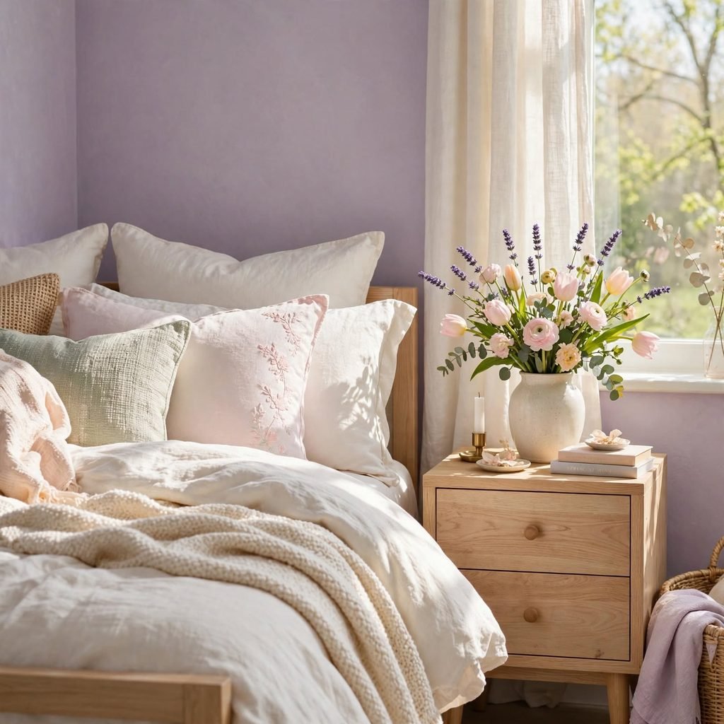
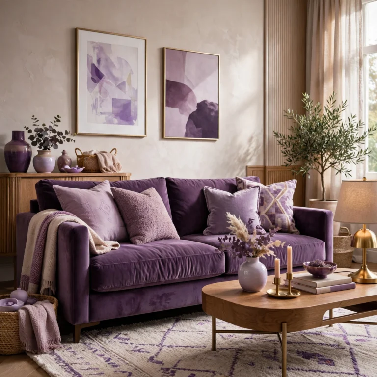
A muted lavender, closer to a dusty grey-purple than a bright violet, brings a calming quality to a bedroom that’s well suited to the color’s association with rest and relaxation. Choose lavender for bedding, a headboard, or a single accent wall rather than covering every surface, since the color can feel cool and flat if overused without warmer accents to balance it. Pair lavender with warm wood furniture and brass hardware to keep the room from feeling too cold.
| Lavender Shade | Undertone | Best Use |
| Dusty Lilac | Grey-purple | Bedding, accent wall |
| Soft Lavender | True pastel purple | Small accents, pillows |
| Wisteria | Blue-purple | Statement furniture piece |
5. Sky Blue Kitchen Accents
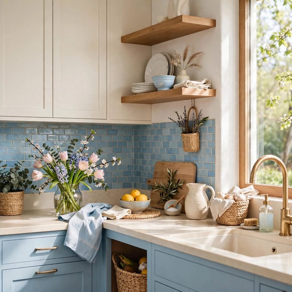
A soft sky blue introduced through kitchen accents, like a runner rug, dish towels, or a set of ceramic canisters, adds a light, airy quality without requiring any change to cabinets or countertops. This shade pairs particularly well with white or cream cabinetry and brass hardware, keeping the overall kitchen palette light and fresh. Because it’s introduced through smaller, swappable items, this idea is one of the easiest on this list to update seasonally if your taste shifts.
6. Coral Pink Textiles
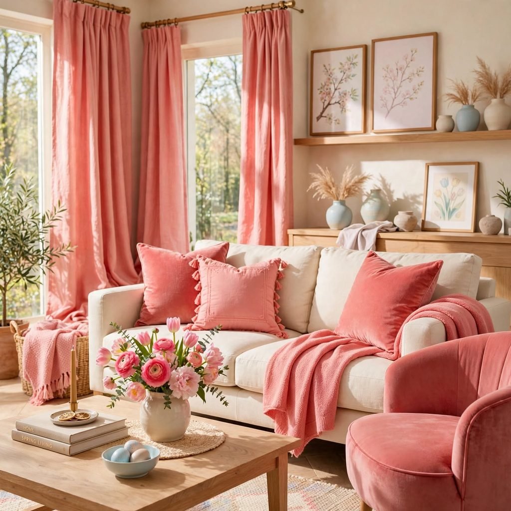
Coral pink, warmer and slightly more saturated than blush, adds energy to a spring palette through pillows, a throw blanket, or a piece of art rather than a full wall or furniture commitment. This shade works well as an accent against a more neutral base, such as white bedding or a beige sofa, where it can stand out without overwhelming the room. Limit coral to one or two pieces so it reads as an intentional pop of color rather than a competing second palette.
7. Mint Green Bathroom Tile
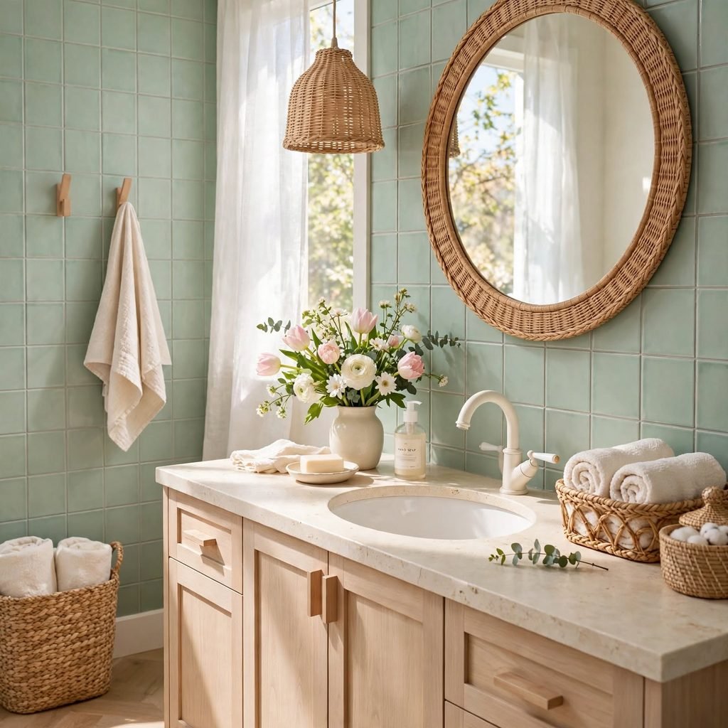
A soft mint green tile, whether on a full shower surround or a smaller accent area like a backsplash, brings a fresh, spring-adjacent color into a bathroom in a way that tends to age better than a brighter, more saturated green. Choose a matte or honed finish over high-gloss for a more current, less clinical look. Pair mint with white fixtures and brass or unlacquered brass hardware to keep the palette feeling elevated rather than overly playful.
8. Peach Fuzz Paint
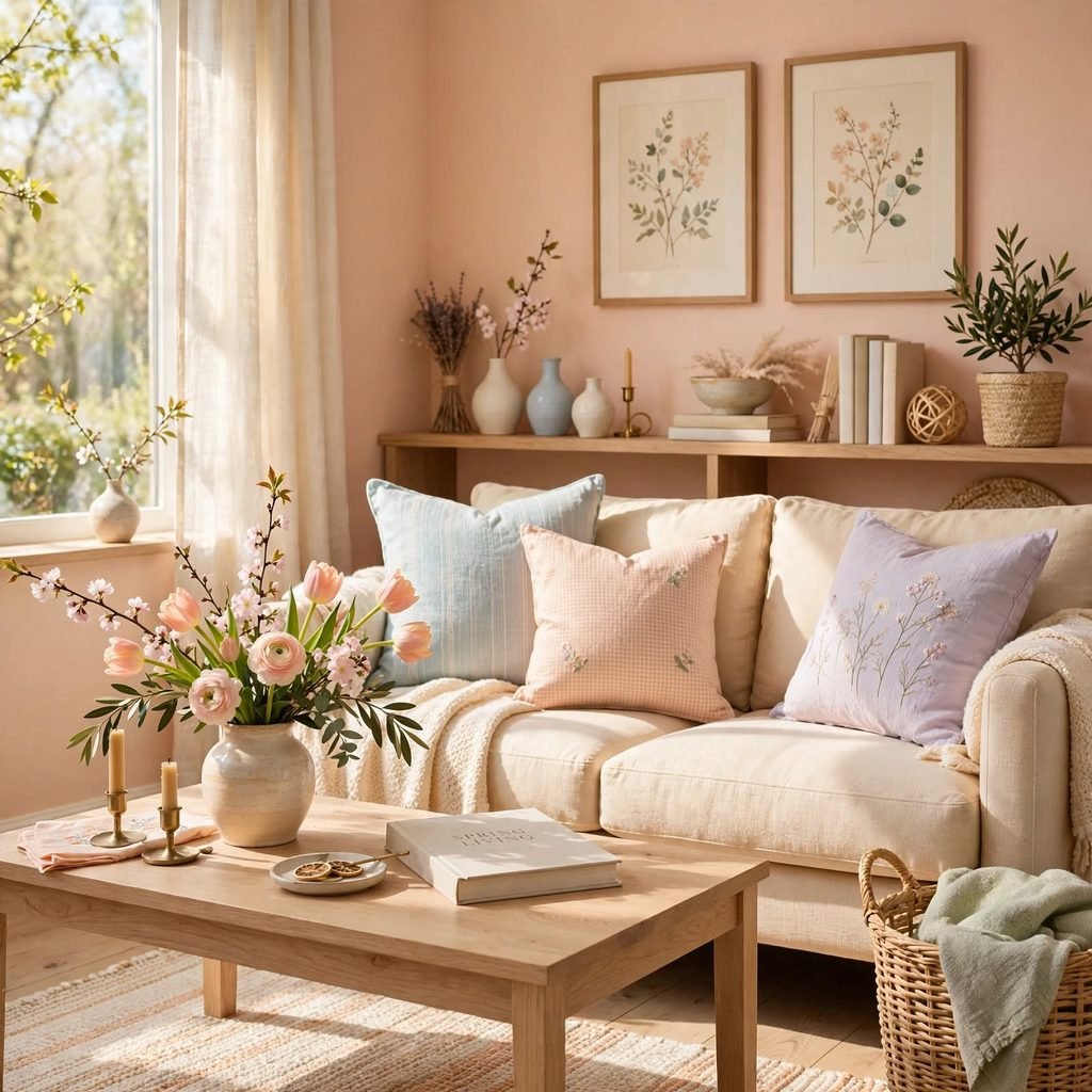
A soft peach tone, warmer and more muted than a traditional coral, works well as a wall color in rooms that get good natural light, since the warmth of the shade is most flattering under daylight rather than artificial lighting. This color has grown in popularity following several recent color-of-the-year announcements built around similar warm, peachy neutrals. Pair peach walls with cream or white trim and warm wood furniture to keep the room feeling cohesive rather than overly saturated.
9. Pastel Rainbow Layering
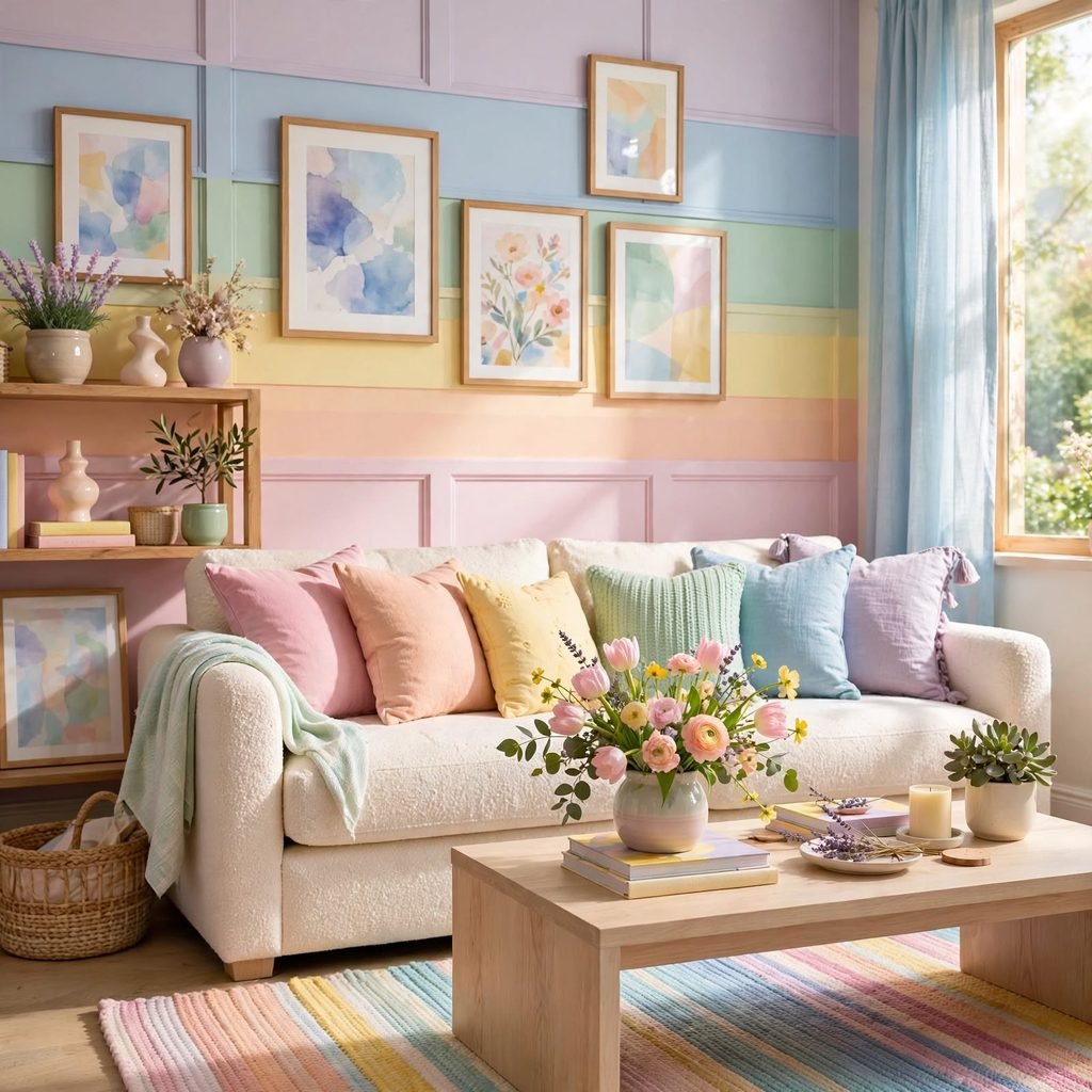
Layering several muted pastel tones together, such as sage, blush, and butter yellow, across different textiles and small accents creates a softer version of a rainbow palette without relying on bright, saturated versions of each color. This approach works best when one shade dominates as the primary color while the others appear only in smaller doses, like pillows or artwork, rather than giving each color equal visual weight. Keeping all the chosen pastels within a similarly muted saturation level prevents the combination from looking mismatched.
10. Daffodil Yellow Florals
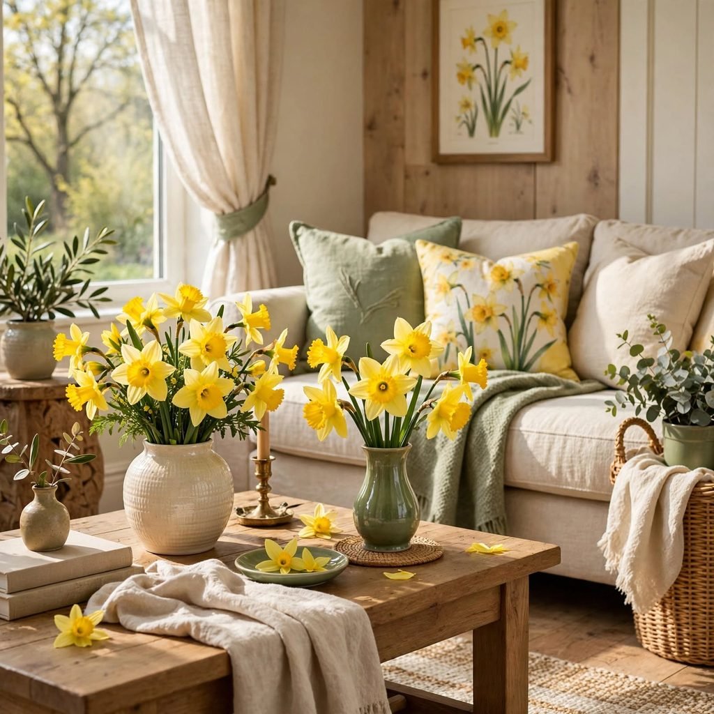
Incorporating daffodil yellow through fresh or faux florals, rather than paint or large furniture, brings a direct seasonal reference into a room without any lasting commitment to the color. This approach works well on a dining table, entryway console, or mantel, where florals can rotate easily with the actual season rather than staying fixed year-round like a painted wall would. Pair yellow florals with a simple white or clear vase to keep the color itself as the focal point.
11. Soft Lilac Wallpaper
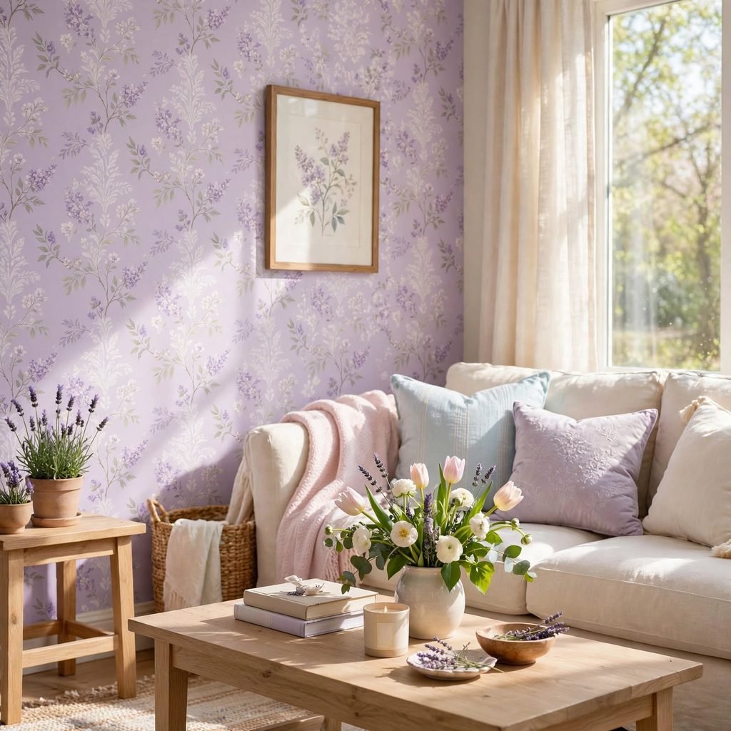
A soft lilac wallpaper, whether in a subtle stripe, floral, or solid textured pattern, adds pattern and color to a smaller space like a powder room or accent wall without the visual weight of a fully saturated purple. Choose a paper with a matte or subtly textured finish rather than a glossy vinyl for a more sophisticated, less overtly pastel look. This works especially well combined with white trim and brass fixtures for contrast.
12. Seafoam Green Furniture
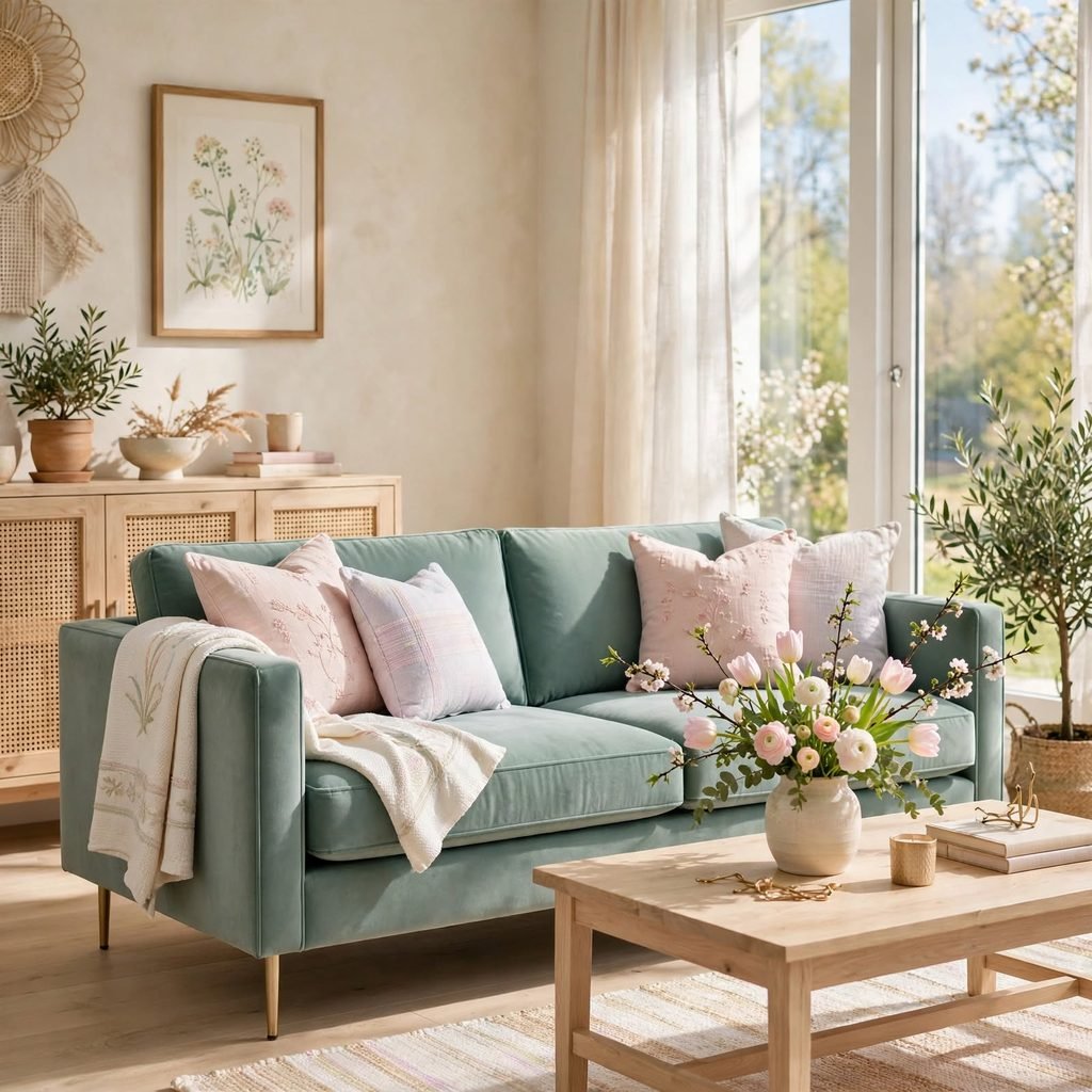
A seafoam green sofa, chair, or cabinet introduces a cooler, blue-leaning green into a room through furniture rather than paint, which makes the color easier to reposition or replace if your palette changes over time. This shade pairs particularly well with warm wood tones and brass accents, since the coolness of seafoam benefits from a warmer counterpart nearby. Choose a durable, easy-to-clean upholstery fabric if the piece will see daily use, since lighter colors show wear more readily than darker tones.
13. Cream and Sage Color Blocking
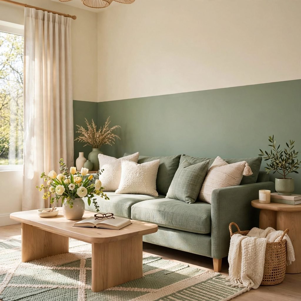
Pairing solid blocks of cream and sage green, whether through paint, bedding, or upholstery, creates a graphic, high-contrast look that feels more structured than blending the two tones together gradually. This approach works particularly well in a bedroom, where a cream-toned bed paired with a sage green headboard or accent wall creates immediate visual definition. Keep the palette simple, limiting it to these two tones plus one metal accent, to avoid the combination feeling visually busy.
14. Dusty Rose Bedding
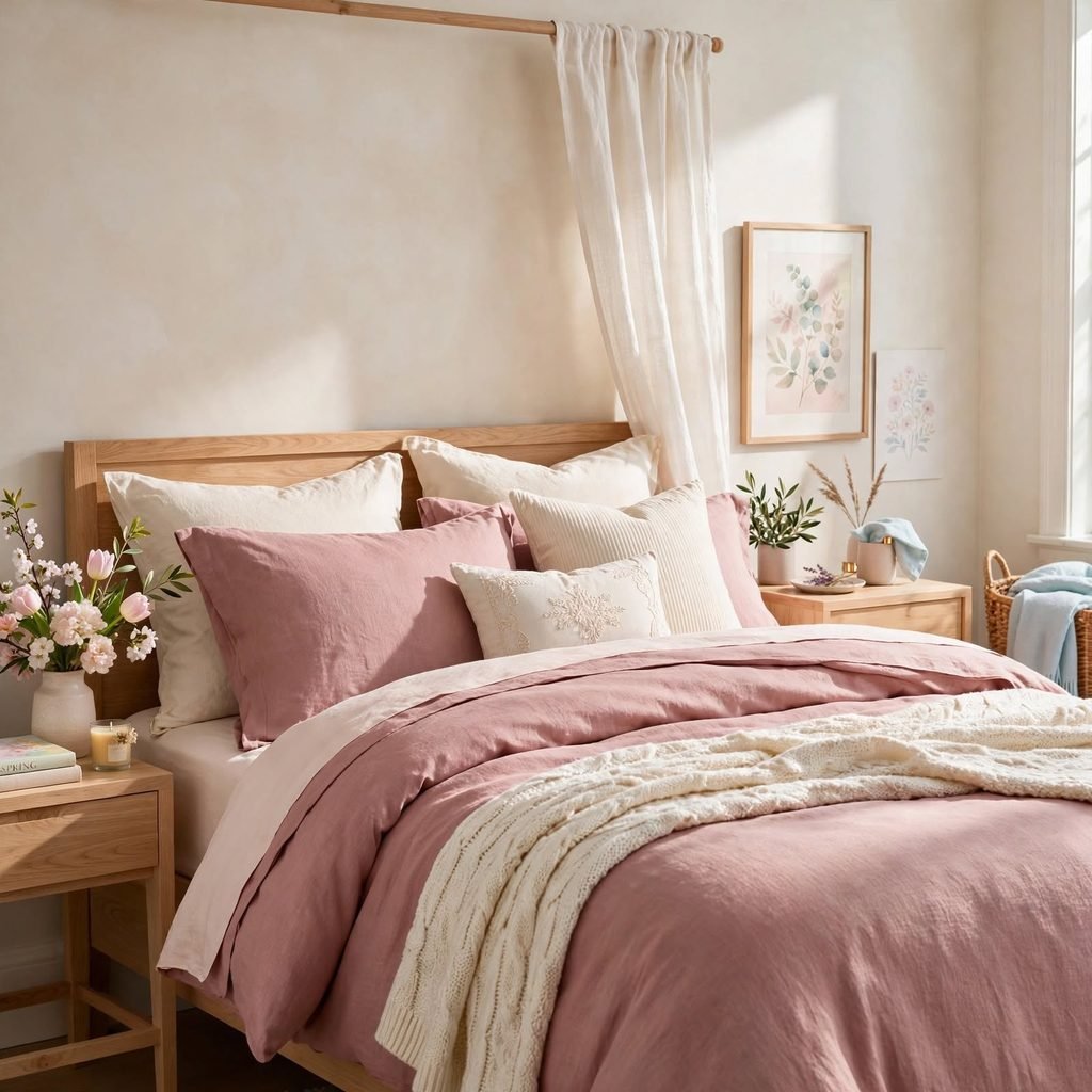
Dusty rose bedding, layered with a cream or white base sheet, brings a muted, grown-up version of pink into the bedroom without requiring any wall or furniture commitment. Choose a matte cotton or linen blend over a shiny satin finish for a look that reads as more current and less overtly themed. This is one of the lowest-commitment ways to test a spring palette in the bedroom before extending the color to a larger surface.
| Fabric | Feel | Best Season Use |
| Cotton | Crisp, breathable | Year-round base layer |
| Linen | Relaxed, textured | Spring and summer |
| Velvet | Soft, warm | Accent pillow or throw |
15. Buttercream Kitchen Cabinets
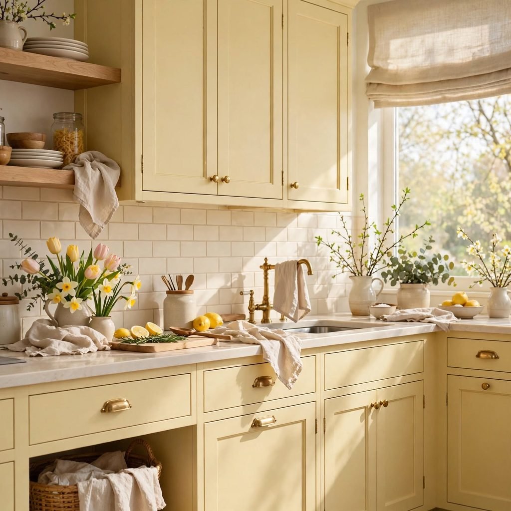
Cabinets painted in a soft buttercream, warmer and more muted than a stark white, give a kitchen a gentle spring-adjacent glow without the boldness of a full butter yellow commitment. Choose a durable enamel finish given how much daily wear kitchen cabinets receive, and pair the color with brass or unlacquered brass hardware for warmth. This shade works particularly well in kitchens with limited natural light, since the warm undertone helps compensate for a room that might otherwise feel dim or cold.
16. Periwinkle Blue Accents
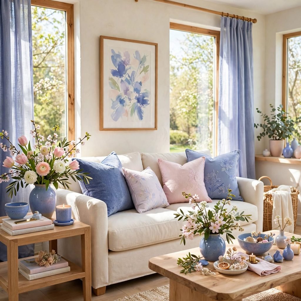
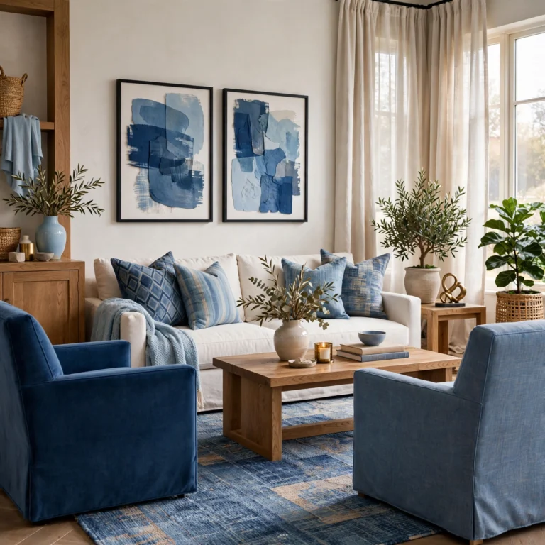
Periwinkle, a blue with a noticeable purple undertone, adds a slightly more unexpected color choice to a spring palette than the more commonly used sage or blush, and it works well introduced through smaller accents like a lamp, vase, or set of pillows. This shade pairs particularly well with white and warm wood tones, since its cool undertone benefits from warmer materials nearby to balance it. Limit periwinkle to one or two pieces initially to gauge how the color reads in your specific room’s lighting before expanding it further.
17. Spring Green Outdoor Cushions
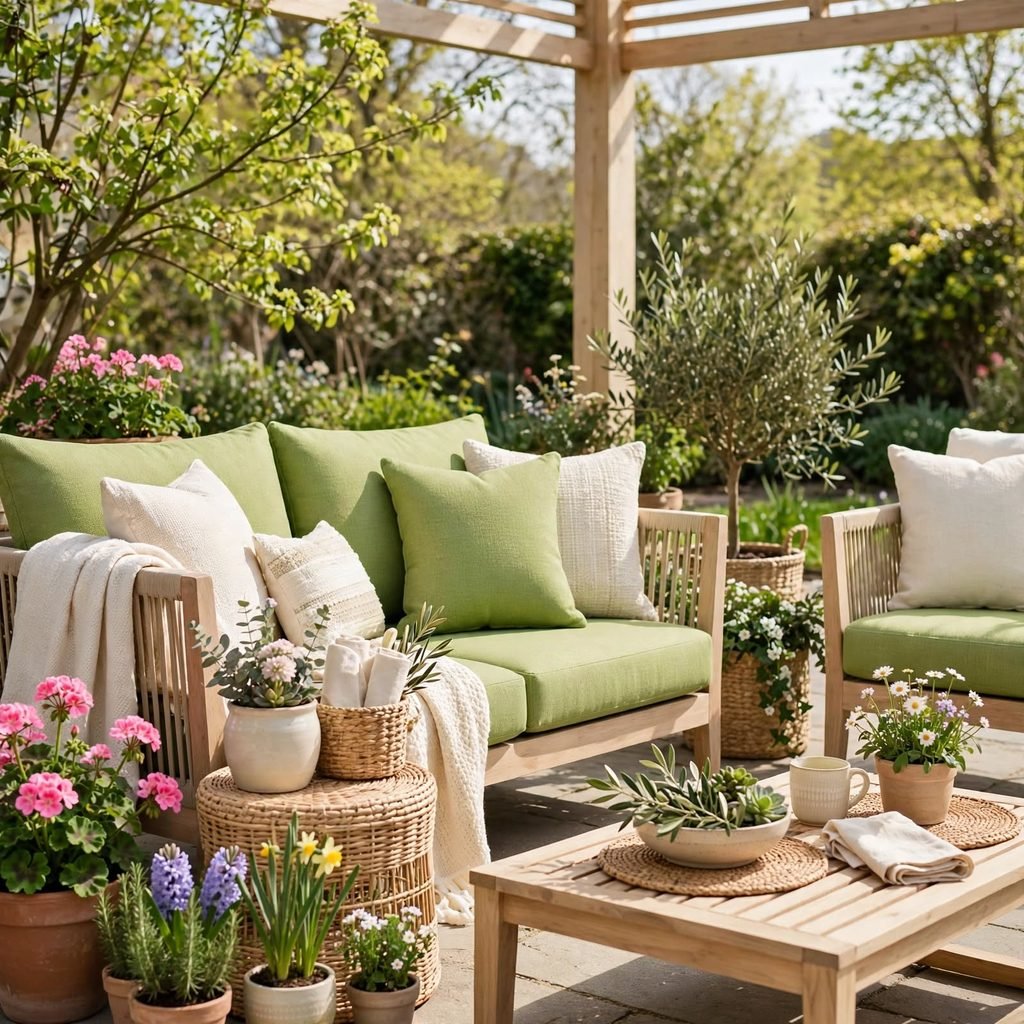
A fresh, muted spring green on outdoor cushions and textiles brings the season’s palette to a patio or balcony space, where it can pair naturally with actual greenery and plants nearby. Choose fade-resistant, weather-treated fabric given the sun and moisture exposure outdoor textiles face throughout the season. This is one of the easiest and lowest-risk ways to test a bolder spring green, since outdoor cushions are typically swapped more frequently than indoor furniture and textiles.
Shop the Look
Look for a sage green throw pillow set to layer onto a neutral sofa, paired with a set of butter yellow ceramic vases for the dining table or console. A soft lavender bedding set brings the palette into the bedroom, while a set of brass picture frames ties the metal finishes together across rooms. Round out the palette with a cream linen table runner and a small cluster of faux daffodils for an easy seasonal refresh.
Common Mistake to Avoid
The most common mistake with a spring color palette is reaching for bright, fully saturated pastels across too many surfaces at once, which can make a room feel more like a seasonal display than a considered, lasting design choice. Choosing muted, softer versions of spring colors, and layering them against a neutral base like cream or white, keeps the palette feeling current well beyond the season itself. It’s also worth limiting the palette to two or three core colors rather than incorporating every spring shade at once, since too many pastels together tend to compete rather than complement each other.
FAQs
How do you make a spring color palette feel less seasonal and more permanent?
Choosing muted, softer versions of spring colors, like sage instead of bright green or dusty lavender instead of true violet, is the most effective way to keep the palette feeling current year-round rather than tied to a single season. Pairing these colors with warm neutrals and natural materials, like linen and light wood, also grounds the palette so it doesn’t read as overtly themed. Introducing the colors through swappable textiles rather than permanent paint or large furniture gives you the flexibility to adjust the intensity later if needed.
What’s the easiest way to test a spring color palette before committing to paint?
Textiles, such as pillows, a throw blanket, or a table runner, are the lowest-commitment way to test how a spring palette feels in your space, since they can be swapped out easily if the colors don’t work as expected. Small decorative accents, like vases or picture frames, are a similar low-risk entry point that let you gauge the palette’s overall effect before a larger investment. Paint and furniture are worth saving until you’ve lived with the smaller textile version of the palette for a few weeks.
Which spring colors pair best together?
Sage green, butter yellow, and blush pink form one of the most reliable spring color combinations, since all three sit within a similarly muted saturation level and share warm undertones that keep them from clashing. Lavender and periwinkle pair well together as a cooler alternative combination, particularly when balanced with a warm neutral like cream. Limiting any combination to two or three core colors, rather than incorporating every spring shade at once, generally produces a more cohesive result.
Does a spring color palette work in a room with limited natural light?
Warmer spring tones, like butter yellow, peach, and buttercream, tend to perform better in rooms with limited natural light than cooler shades like sky blue or seafoam green, since the warmth helps compensate for a lack of daylight. Testing a paint sample at different times of day, including in the evening under artificial lighting, is especially important for spring palettes given how much these softer tones can shift depending on the light source. Adding warm-toned lighting fixtures can also help a cooler spring color read as intended in a dimmer room.
How long do spring color trends typically stay relevant in home design?
Muted, grounded versions of spring colors, like sage green or dusty lavender, have shown staying power over multiple years rather than cycling out after a single season, since they function more as extended neutrals than trend-driven statement colors. Brighter, more saturated spring shades tend to have a shorter relevance window and are better suited to swappable accents rather than permanent investments like paint or large furniture. Choosing the muted version of any spring color is generally the safer long-term choice if longevity matters more than following the most current trend cycle exactly.
Conclusion
A spring color palette works best when it leans on soft, muted shades like sage, butter yellow, and dusty lavender, layered against a warm neutral base rather than applied in full saturation across every surface. Testing the palette first through textiles and small accents lets you find the right balance before committing to paint or furniture. Save this guide to Pinterest for your next seasonal refresh, and check out our related post on brown color palette ideas for more inspiration.