17 Inspiring Pink Color Palette Ideas for a Warm, Curated Space
Pink has moved past its reputation as a purely playful or feminine color and is now one of the most requested palettes in adult living rooms, bedrooms, and home offices. This guide covers seventeen ways to build a pink color palette into a room using paint, textiles, and accent pieces, without the space tipping into a nursery look. You’ll learn which pink undertones pair well with which materials, how to balance pink against a grounding neutral, and the one mistake that makes a pink room feel cheap instead of considered.
Trend & Background
Muted, dusty pinks terracotta-adjacent blush, dried rose, faded mauve have replaced the cooler, brighter pinks that dominated design a decade ago, largely because they pair more easily with the warm woods and natural materials currently popular in interiors. This matters now because pink is no longer treated as a single accent wall color; it’s being used across full rooms, kitchens, and even exteriors as designers lean into warmer, more saturated palettes overall. The shift also reflects a broader move away from all-white and all-gray interiors toward rooms with more personality and color confidence.
Key Takeaways
- A pink color palette works best when paired with a grounding neutral like clay, walnut, or charcoal rather than left to stand alone.
- Dusty and muted pink tones read as sophisticated, while bright or bubblegum pink tones work best as small accents.
- Undertone matters more than shade name a table inside this guide breaks down warm versus cool pink pairings.
- Texture and material variation keep a pink-heavy room from feeling flat or overly themed.
1. Dusty Rose Wall Paint
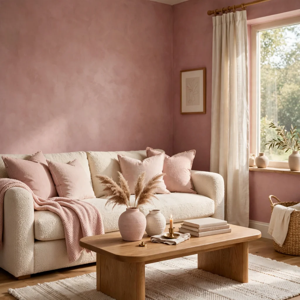
Dusty rose reads as warm and grounded rather than sweet, which is why it works as a full-wall color in a way that brighter pinks usually can’t. Test the color at different times of day before committing, since dusty rose can shift noticeably cooler under blue-toned evening light and warmer under direct afternoon sun. Pairing it with white trim keeps the color from feeling heavy, while black trim gives it a more dramatic, saturated edge.
2. Terracotta and Blush Pairing
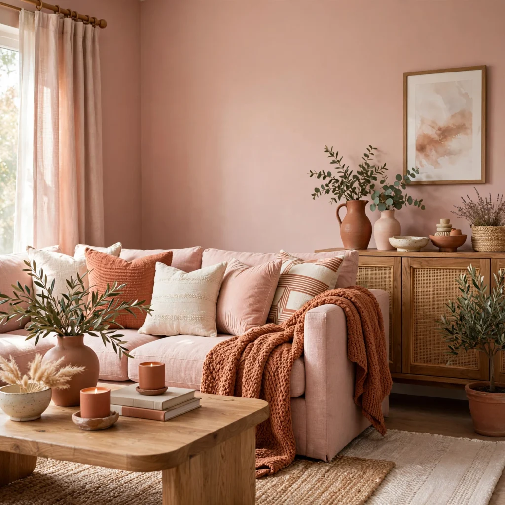
Terracotta and blush sit close enough on the color wheel to layer without clashing, and the combination reads as earthy rather than overtly pink once other neutrals are introduced. Use terracotta for larger anchor pieces like a rug or an accent chair, and reserve blush for smaller items like throw pillows or ceramics, so the terracotta grounds the lighter tone rather than competing with it for attention.
| Element | Terracotta Use | Blush Use |
| Large furniture | Accent chair, sofa | Avoid too dominant |
| Textiles | Rug, curtains | Throw pillows, throws |
| Accessories | Planters | Vases, ceramics |
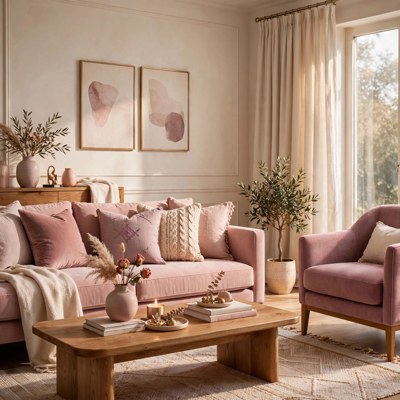
3. Mauve Velvet Upholstery
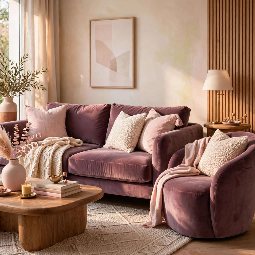
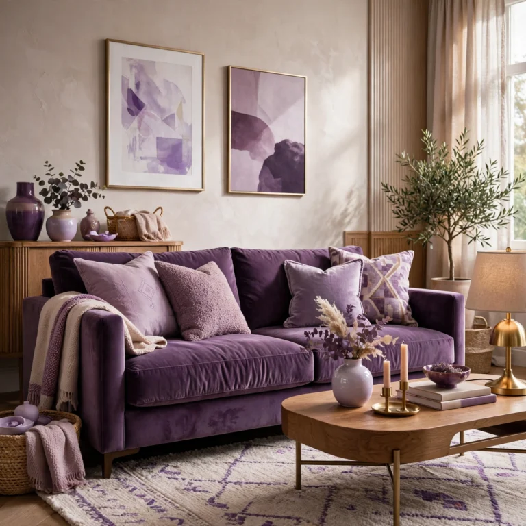
Mauve velvet on a single accent chair or headboard introduces both color and texture in one piece, and the slight gray undertone in mauve keeps it from reading as overtly sweet. Velvet also catches light differently depending on the angle, which adds visual depth to a solid-color piece that a flat cotton or linen upholstery wouldn’t provide.
4. Pink Color Palette Moodboard
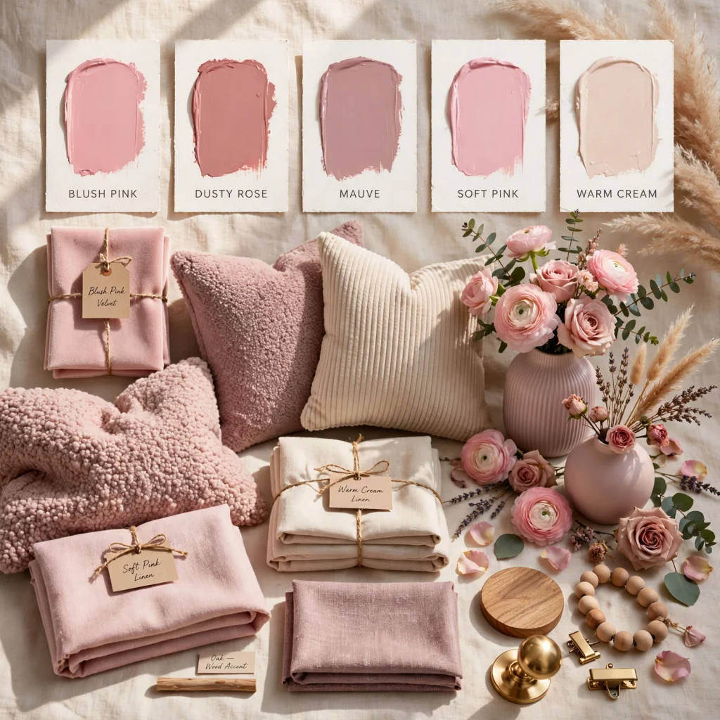
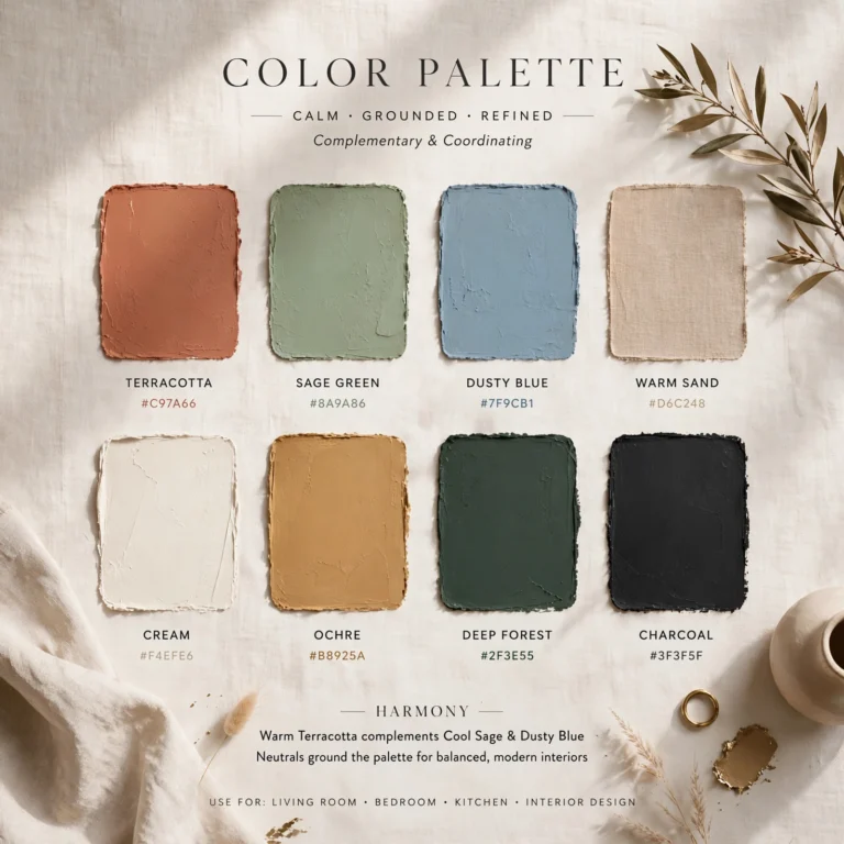
Building a moodboard before committing to paint or large furniture is especially important with a pink color palette, since undertones are easy to misjudge from a small paint chip or a screen. Pull physical swatches of every pink under consideration and view them together in the actual room’s lighting at different times of day. This step catches mismatched undertones early a cool-toned pink next to a warm wood floor, for example before a full wall or a large upholstered piece is committed to the wrong shade.
5. Blush Linen Bedding
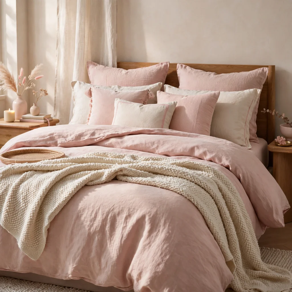
Blush linen sheets and a duvet cover add color at the room’s largest surface without requiring paint, which makes bedding one of the lowest-commitment ways to test a pink palette before going further. Pair blush linen with white or oatmeal pillowcases rather than matching everything to the same shade, since a small contrast keeps the bed from looking like a single flat block of color.
6. Rose Quartz Accent Tile
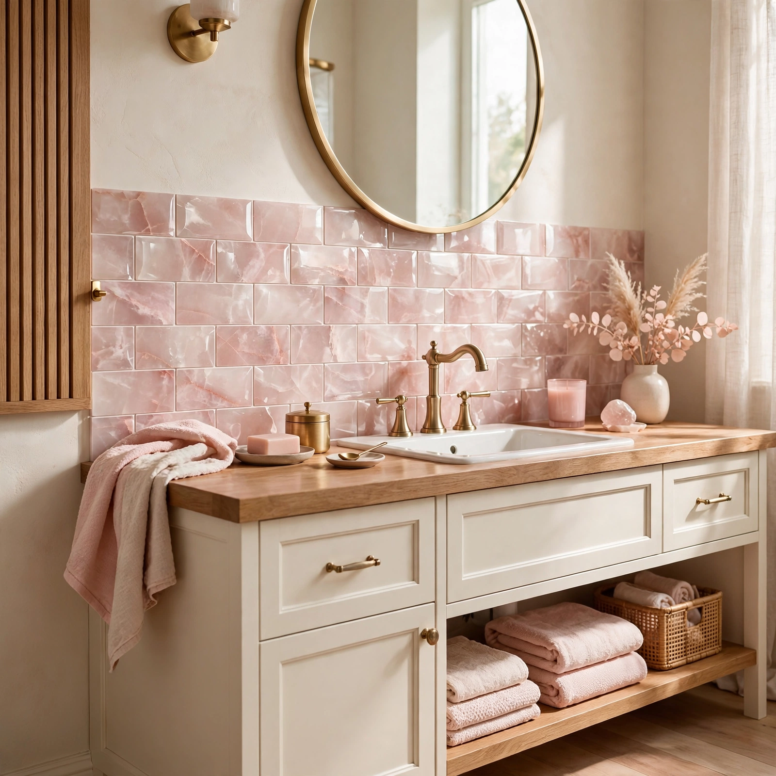
A small run of rose-toned tile as a kitchen backsplash, a bathroom accent wall, or a fireplace surround introduces pink in a permanent material that reads as intentional rather than trend-driven. Keep the surrounding surfaces, like countertops and cabinetry, in a neutral tone so the tile stays the clear focal point rather than competing with other colored surfaces in the same space.
In order to see more options for green color palette CLICK HERE
7. Dried Floral Arrangements
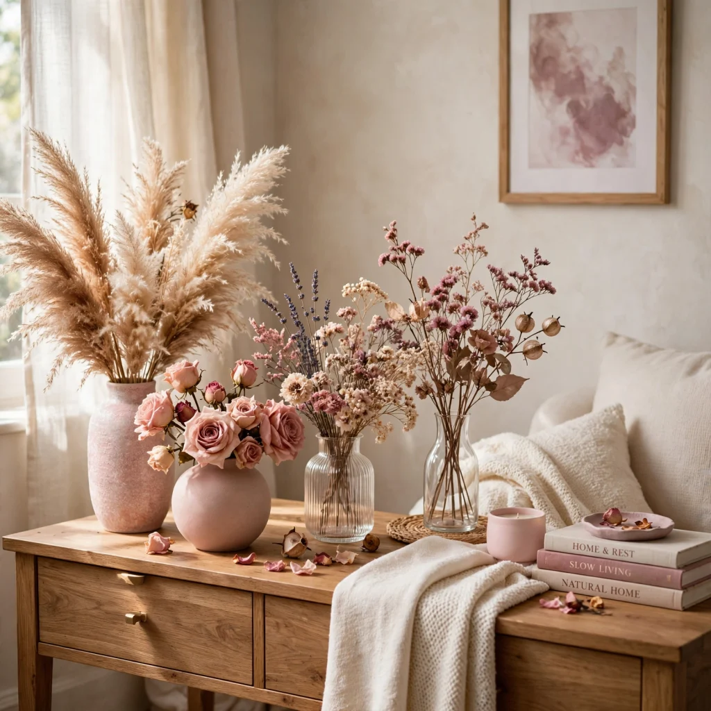
Dried pampas grass, bunny tail, or preserved roses in muted pink and mauve tones bring the palette into a room organically without paint or fabric, and they last for months without maintenance. Arrange them in a plain ceramic or glass vase rather than a patterned one, so the dried stems’ natural color variation stays the visual focus.
8. Warm vs Cool Pink Pairing Guide
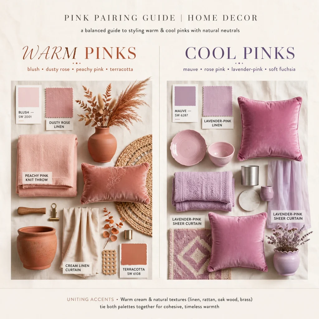
Every pink shade leans either warm, with an orange or peach undertone, or cool, with a blue or purple undertone, and mixing the two without a neutral buffer usually looks unintentional rather than layered. Warm pinks pair naturally with terracotta, rust, and golden wood tones, while cool pinks pair better with gray, black, and cooler-toned metals like chrome or brushed nickel.
| Pink Type | Undertone | Best Paired Materials |
| Dusty Rose | Warm | Walnut, terracotta, brass |
| Mauve | Cool | Charcoal, chrome, black metal |
| Blush | Neutral-warm | Oak, oatmeal linen, gold |
| Bubblegum | Cool-bright | White, chrome, glass (accent only) |
9. Pink Marble Side Table
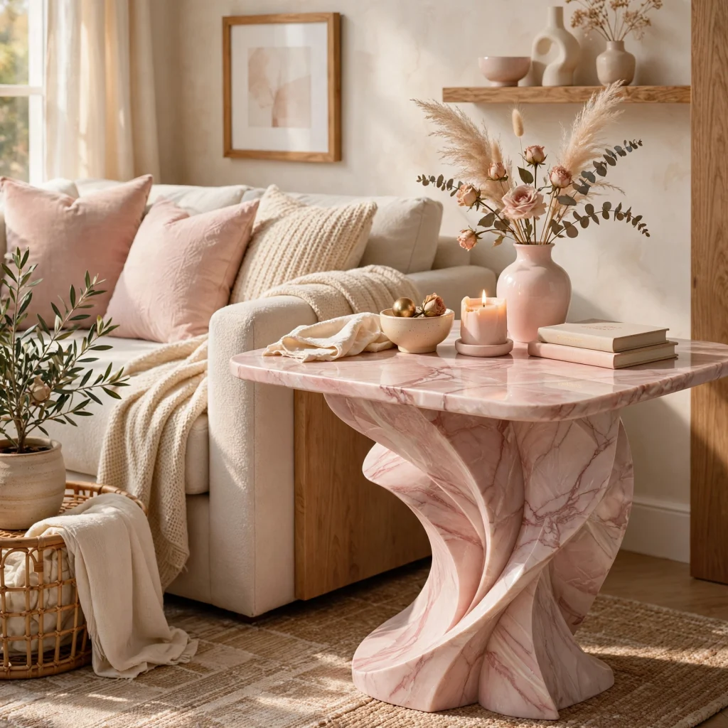
A small pink-veined marble side table adds a hard, cool surface that balances out the soft textiles typically associated with a pink palette, like velvet or linen. Because the pink in the marble is subtle and naturally variegated, it works as a neutral-adjacent piece even in rooms where the rest of the palette leans more heavily toward gray or white.
10. Muted Pink Kitchen Cabinetry
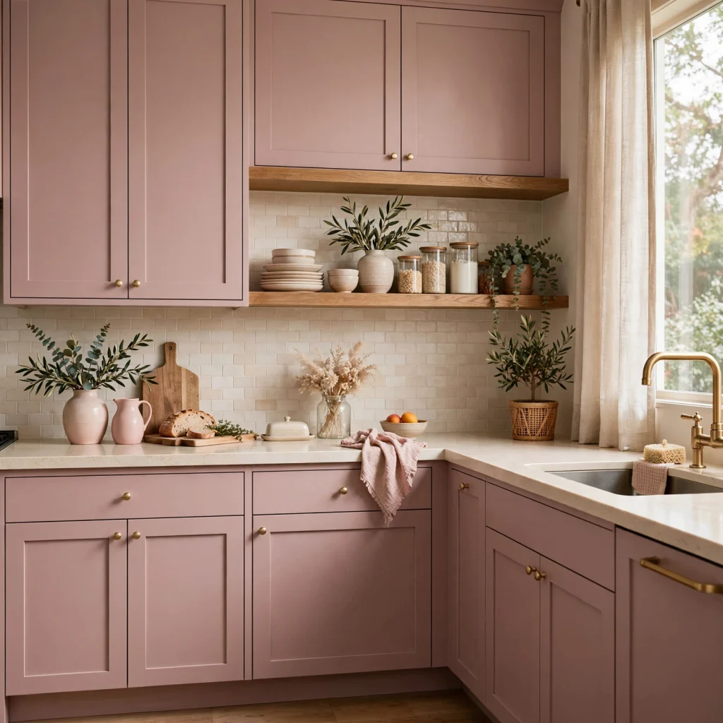
Lower cabinets or a kitchen island painted in a muted, dusty pink read as sophisticated rather than novelty when paired with warm wood open shelving and brushed brass hardware. Keep upper cabinets or walls in white or a light neutral so the pink stays contained to a defined area rather than overwhelming the entire kitchen at eye level.
11. Pink and Sage Green Combination
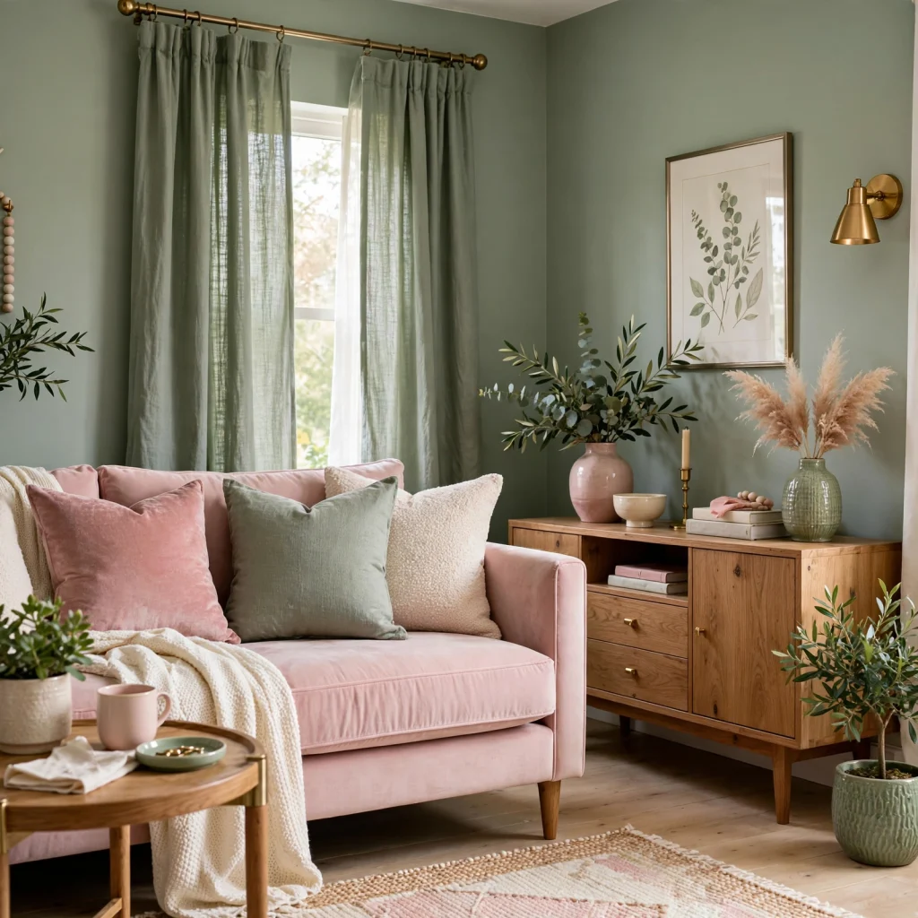
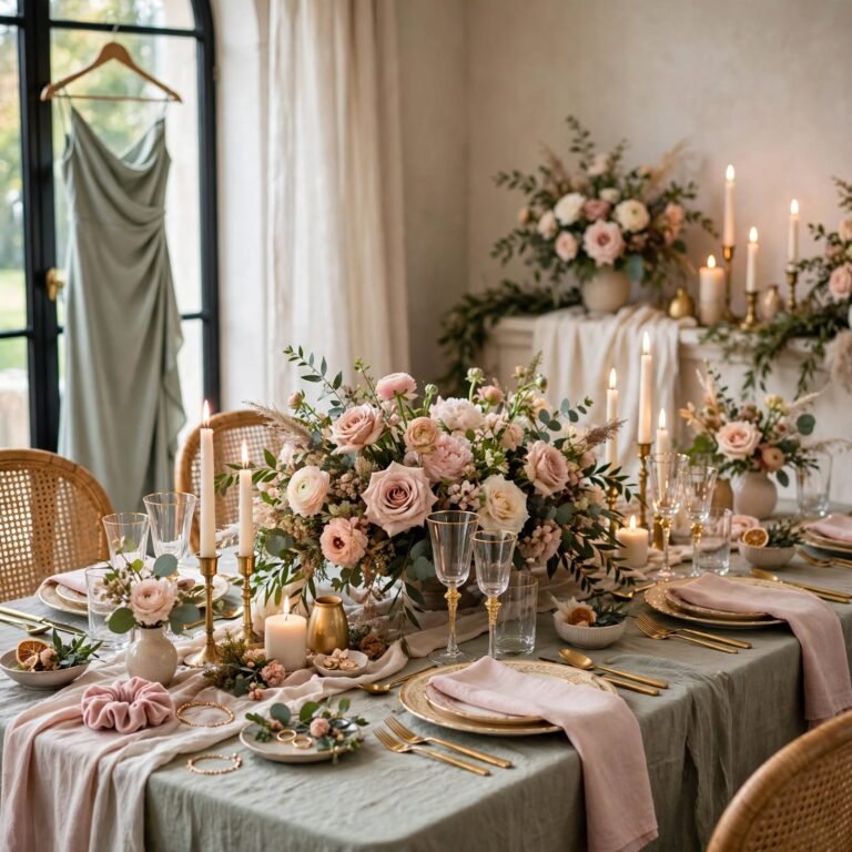
Pink and sage green sit as near-complementary tones on the color wheel, and the pairing reads as fresh and garden-inspired rather than clashing, particularly when both colors are kept in muted, dusty versions rather than saturated ones. Use sage as the larger surface, like a wall or sofa, and bring in pink through smaller accents like pillows, ceramics, or a single accent chair.
12. Rose Gold Hardware Accents
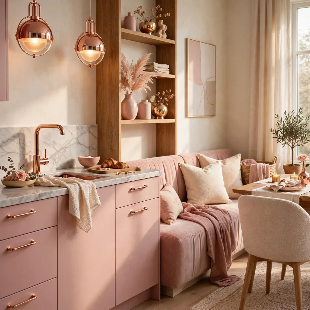
Rose gold drawer pulls, faucet fixtures, or lighting fixtures introduce a warm pink-adjacent metal tone that ties a broader pink palette together without adding another fabric or paint color. Because rose gold is a finish rather than a saturated color, it works even in rooms where the rest of the palette is fairly neutral, giving a subtle nod to the pink theme through metal alone.
13. Dusty Pink Curtain Panels
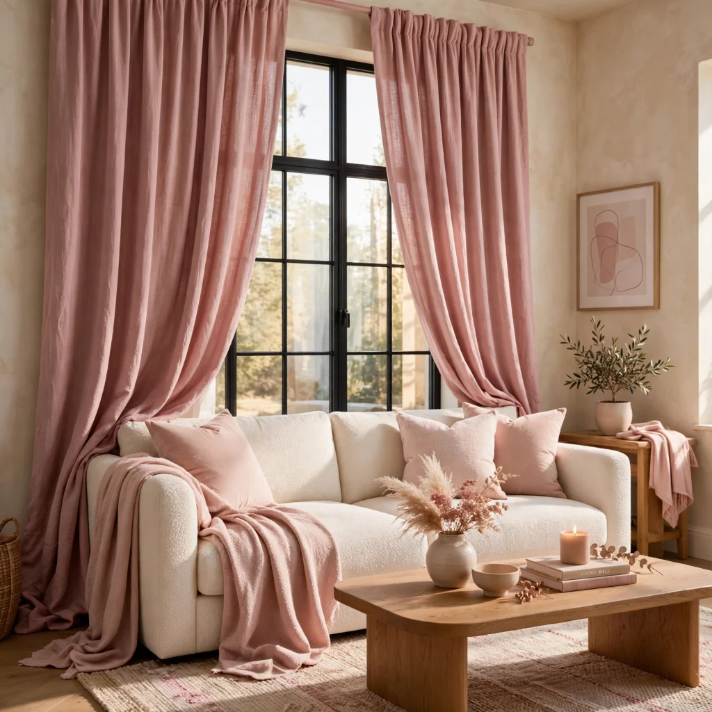
Curtains in a dusty or muted pink linen filter daylight with a warm, slightly rosy cast across the room, which is a softer effect than the color would have on a solid wall. Hang them at ceiling height in a room where pink is otherwise used sparingly, since curtains are large enough to establish the palette on their own without needing a painted wall to back them up.
14. Clay and Blush Ceramic Set
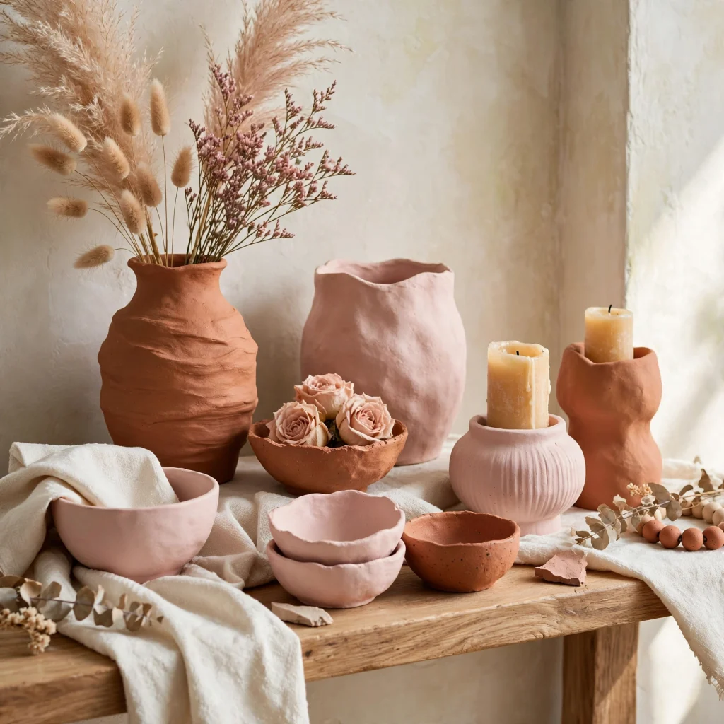
A set of clay-toned and blush ceramic vases or bowls displayed together on a shelf or console introduces pink through a warm, matte material that photographs and ages better than glossy ceramics. Vary the heights and exact shades within the set so the grouping reads as collected over time rather than purchased as a single matching set.
15. Pink Statement Sofa
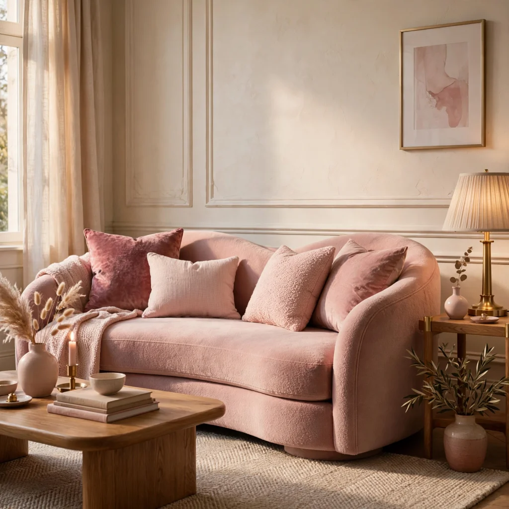
A sofa in a saturated but not neon pink works as the room’s single boldest move, and it functions best when everything else in the room, including the walls, stays in a quiet neutral like white, oatmeal, or light gray. This approach avoids the most common pink-room mistake of matching pink furniture to pink walls to pink textiles, which quickly starts to feel like a themed room rather than a styled one.
16. Blush and Black Contrast
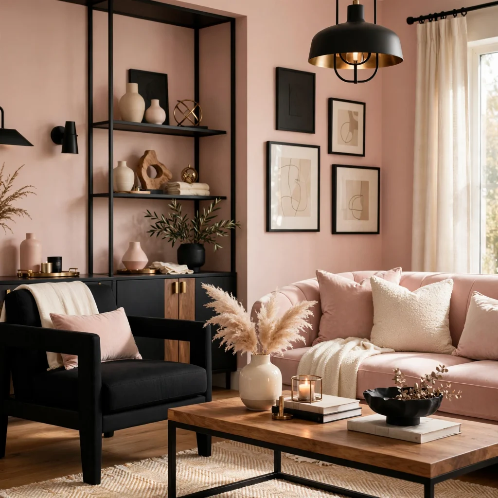
Pairing blush pink with black in a black-framed mirror, black metal shelving, or black-painted trim gives the palette an edge that keeps it from reading as overly soft or sweet. This combination works particularly well in a home office or living room, where a fully soft pink palette might otherwise feel mismatched to the room’s function.
17. Layered Pink Textile Mix
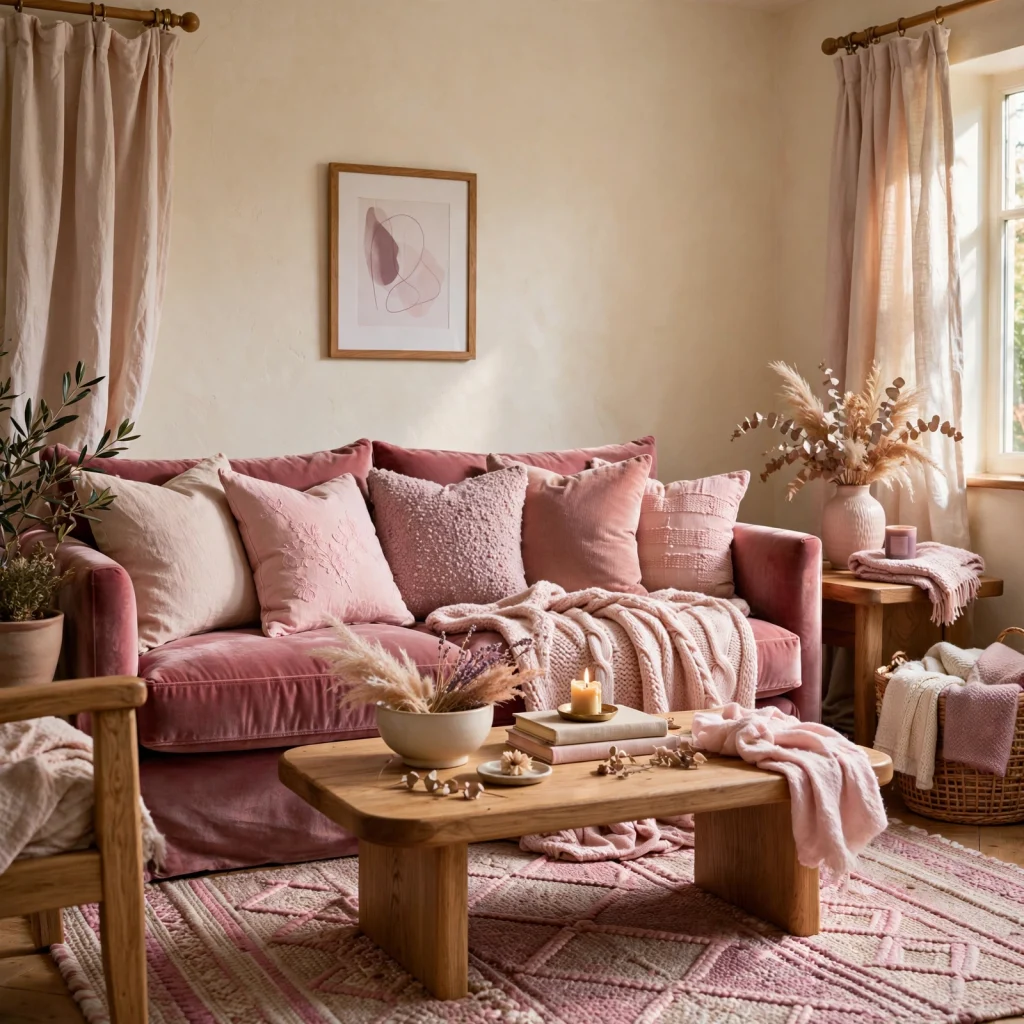
Mixing two or three different pink tones across a room’s textiles a mauve throw, a blush pillow, a dusty rose rug creates depth in a way that a single matching pink across every textile doesn’t. Keep the tones within the same undertone family, either all warm or all cool, so the layering looks deliberate rather than like mismatched leftover fabric.
Shop the Look
A dusty rose linen curtain panel pairs well with a mauve velvet accent chair and a set of clay-toned ceramic vases in graduated sizes for the console or shelf. Add a small pink-veined marble side table, a set of rose gold drawer pulls for an existing dresser, and a blush linen bedding set to tie the bedroom or living room palette together across multiple surfaces and materials.
Common Mistake to Avoid
The most common mistake with a pink color palette is mixing warm and cool pink undertones without a neutral buffer between them, which tends to make the room look unintentional rather than layered. A cool mauve pillow next to a warm terracotta wall, for example, will visually clash even though both are technically pink. Sticking to one undertone family per room, or separating warm and cool pinks with white, black, or wood-toned neutrals, solves this almost every time.
FAQs
What colors go best with a pink color palette?
Warm woods like walnut and oak, terracotta, sage green, and black metal all pair well with pink, depending on whether the specific pink leans warm or cool. Warm pinks like dusty rose and terracotta-adjacent blush pair naturally with golden wood tones and brass, while cooler pinks like mauve pair better with charcoal, chrome, and black. White and oatmeal work as a neutral base for almost any pink undertone.
Is a pink color palette too feminine for a living room?
Not when it’s built around muted, dusty tones rather than bright or bubblegum pink, and paired with grounding materials like black metal, dark wood, or leather. The combination of a soft color with harder, more neutral materials is what keeps a pink living room from reading as overtly feminine or themed. Limiting pink to one or two large surfaces, rather than every textile and wall, also keeps the room feeling balanced.
What is the most popular pink shade for interiors right now?
Dusty rose and muted blush tones are currently the most requested pink shades for interiors, largely because their warm, slightly faded quality pairs easily with the natural wood and clay tones already popular in home decor. Bright or cool-toned pinks like bubblegum or fuchsia are still used, but almost exclusively as small accents rather than full-room colors, since they read as more novelty and less timeless.
How do I keep a pink room from looking like a nursery?
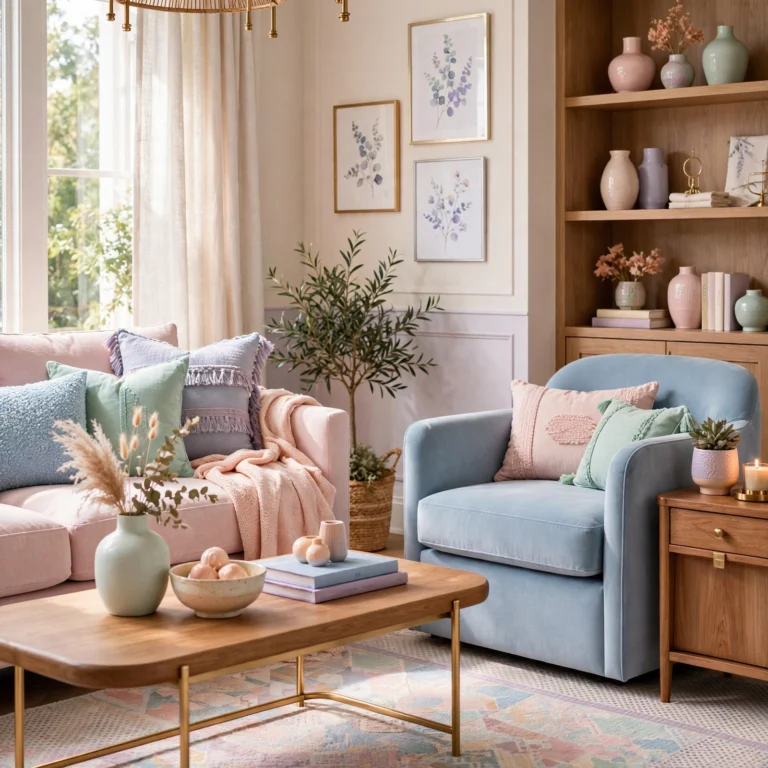
Avoid pairing pink with pastel blue, yellow, or mint, which are the color combinations most associated with nursery design, and instead pair pink with black, charcoal, dark wood, or terracotta for a more adult palette. Using textured, matte materials like linen, boucle, and unglazed ceramic instead of glossy or plastic finishes also shifts the look toward sophisticated rather than playful.
Can I use a pink color palette in a small room?
Yes, and a muted pink can actually help a small room feel warm and intentional rather than cold or clinical, as long as the pink is balanced with enough white or light neutral space to keep the room from feeling closed in. Using pink on a single wall, in textiles, or through accessories, rather than covering every surface, is usually the better approach for a smaller space.
Conclusion
A pink color palette works best as a considered mix of warm and cool decisions, grounded by neutrals like wood, black metal, or white, rather than a single shade applied everywhere at once. Start with one lower-commitment idea from this list, like blush bedding or a dried floral arrangement, before moving to paint or large furniture. Save this guide to Pinterest for later, and check out our related post on choosing paint undertones for more color-planning tips.