17 Stylish Summer Color Palette Ideas for a Warm, Sun-Filled Home
Summer color choices tend to favor light, warm, and sun-reflective tones that suit longer days and brighter natural light. This post covers seventeen summer color palette ideas spanning coastal blues, citrus brights, desert neutrals, and garden-inspired greens, with practical notes on where each palette works best and how to bring it into a room. Each idea explains the specific color combination involved, so the list is useful whether the goal is a full seasonal refresh or a few smaller accent changes.
Trend & Background
Summer color trends have shifted toward warmer, more saturated palettes in recent seasons, moving away from the cooler, washed-out coastal blues that dominated summer design for years. Citrus tones lemon, tangerine, coral have grown significantly in popularity as accent colors, paired more often with warm neutrals than with the crisp white backgrounds common in earlier coastal trends. Desert and terracotta-inspired palettes have also expanded well beyond Southwestern-specific design, reflecting a broader interest in warm, sun-baked tones that read as intentionally summery without relying on the traditional nautical color story.
Key Takeaways
- A summer color palette works best when it leans into warmth and light reflection rather than deep, heavy tones better suited to colder months.
- Coastal, citrus, and desert-inspired palettes each offer a distinct take on summer color without relying on the same handful of overused shades.
- Textiles and small accents are often the easiest way to bring a summer palette into a room without committing to a full repaint.
- Pairing a summer palette with natural materials like rattan, linen, and light wood reinforces the seasonal feel beyond color alone.
1. Classic Coastal Blue and White
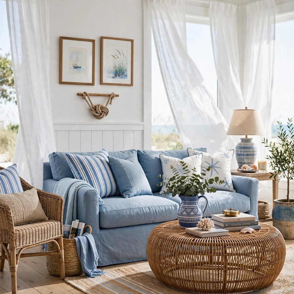
A coastal blue and white palette remains one of the most enduring summer color choices, evoking ocean and sky through a simple, high-contrast combination. This palette works particularly well in a sunroom or beach house setting, where the bright white keeps the space feeling airy and the blue accents add just enough color without overwhelming the room. Choosing a mid-tone blue, rather than navy or pale pastel, keeps this classic pairing from feeling either too heavy or too washed out.
| Blue Shade | Undertone | Best Application |
| Cornflower | Slightly warm | Textiles, accent walls |
| Cerulean | Cool, bright | Kitchen tile, ceramics |
| Navy | Deep, cool | Accent trim, furniture |
2. Citrus Yellow and Orange Accent Palette
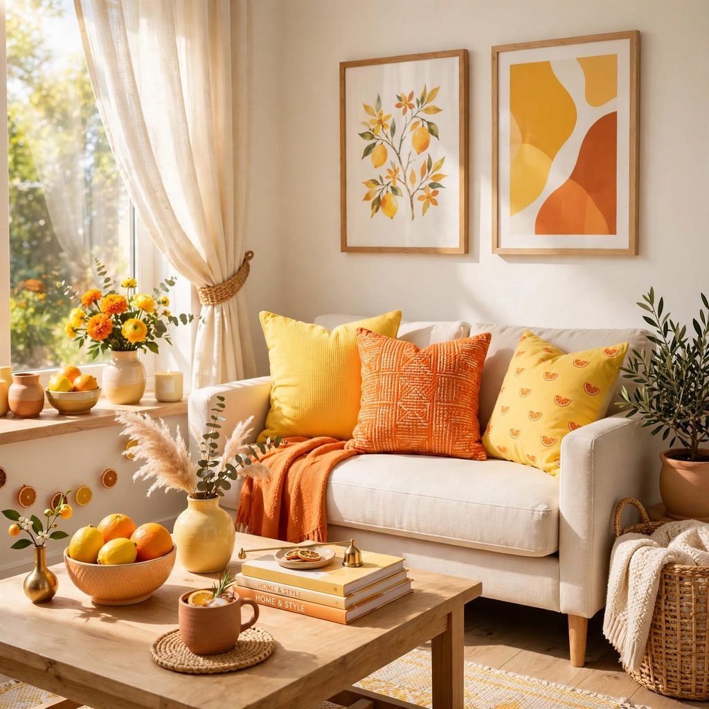
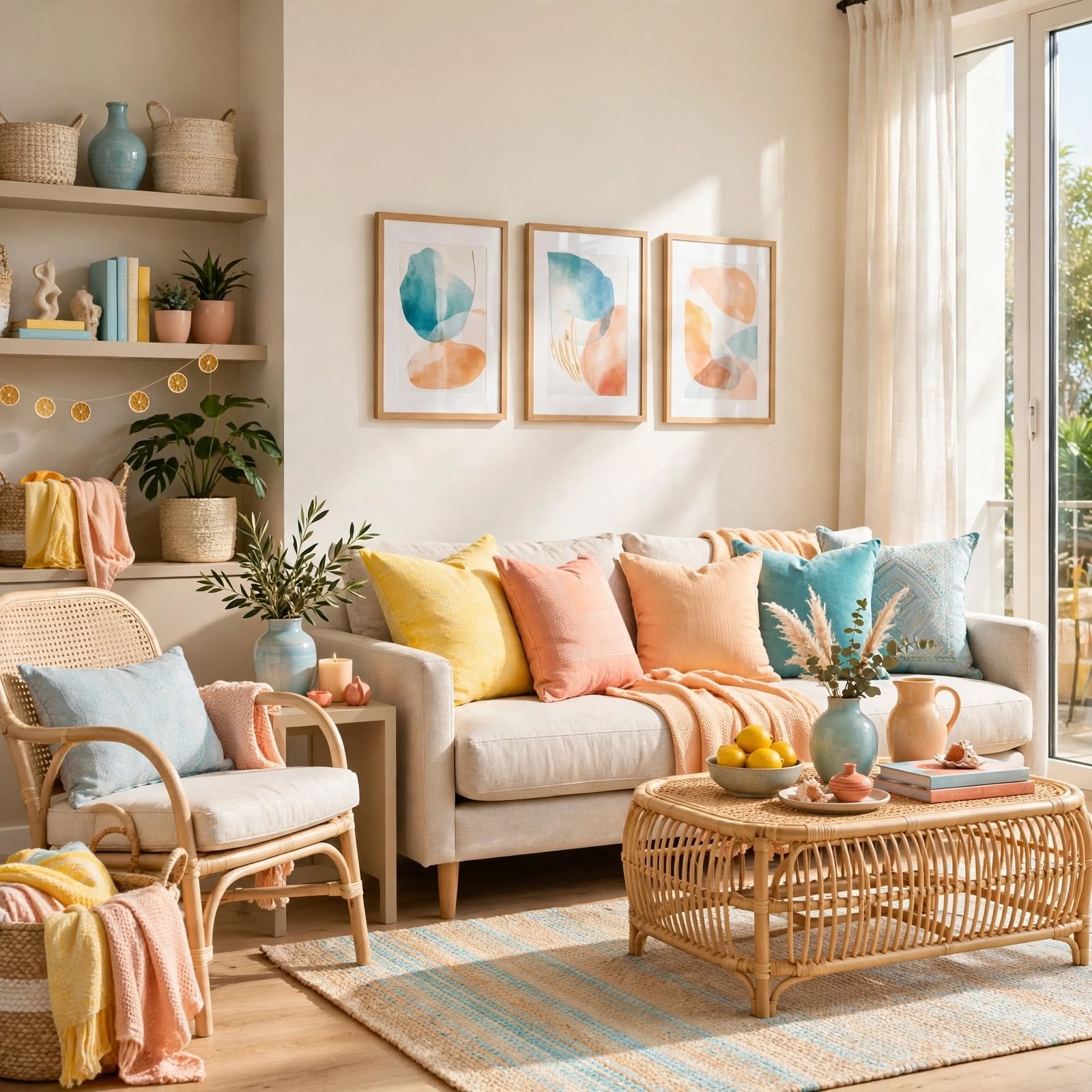
Pairing a bright citrus yellow with a warm orange creates an energetic, sun-drenched palette well suited to a kitchen or breakfast nook rather than a full living room commitment. This combination works best in smaller doses, through textiles, ceramics, or a single accent wall, rather than covering an entire room. Balancing citrus brights with a neutral base, like cream or white walls, keeps the palette feeling fresh rather than overwhelming.
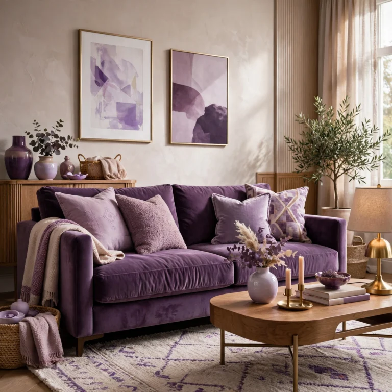
To see more options for purple color palette CLICK HERE
3. Terracotta and Sand Desert Palette
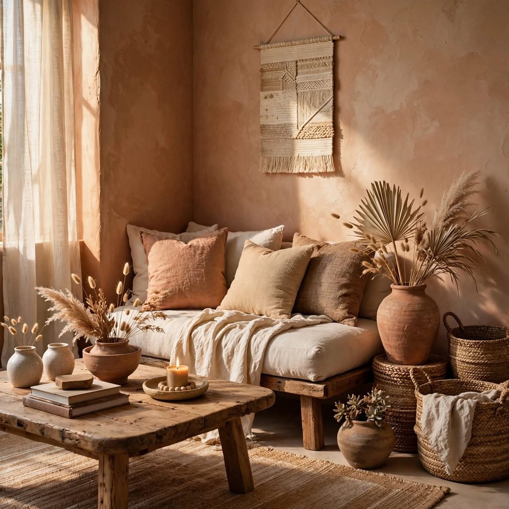
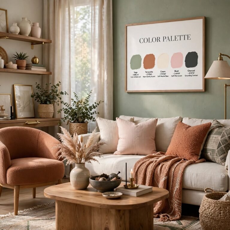
A terracotta and sand palette draws on warm, sun-baked earth tones rather than the cooler coastal blues typically associated with summer, offering an alternative rooted in desert and Mediterranean landscapes instead. This combination pairs particularly well with natural materials like rattan and unfinished wood, reinforcing the palette’s organic, warm character. Terracotta works especially well as a textile or ceramic accent color against a sand-toned wall base.
4. Watermelon Pink and Green
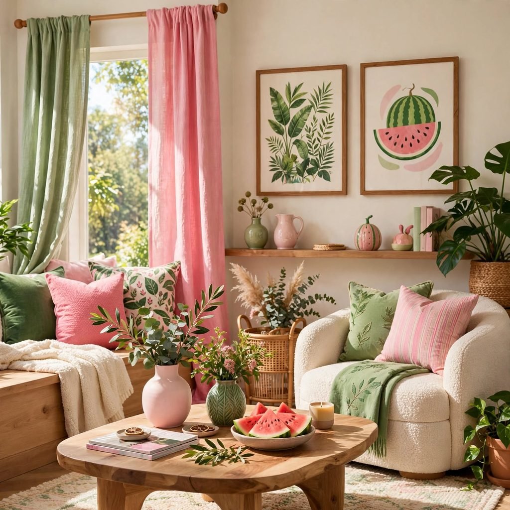
Pairing a bright watermelon pink with a fresh green creates a playful, high-energy summer palette well suited to a kids’ room, a pool house, or a small accent area rather than a full formal living space. This combination reads as distinctly summery and fun without leaning into a more muted, sophisticated palette direction. Using pink as the dominant color and green as a supporting accent, rather than an equal split, keeps the combination from feeling too busy.
5. Summer Color Palette Lavender and Sage
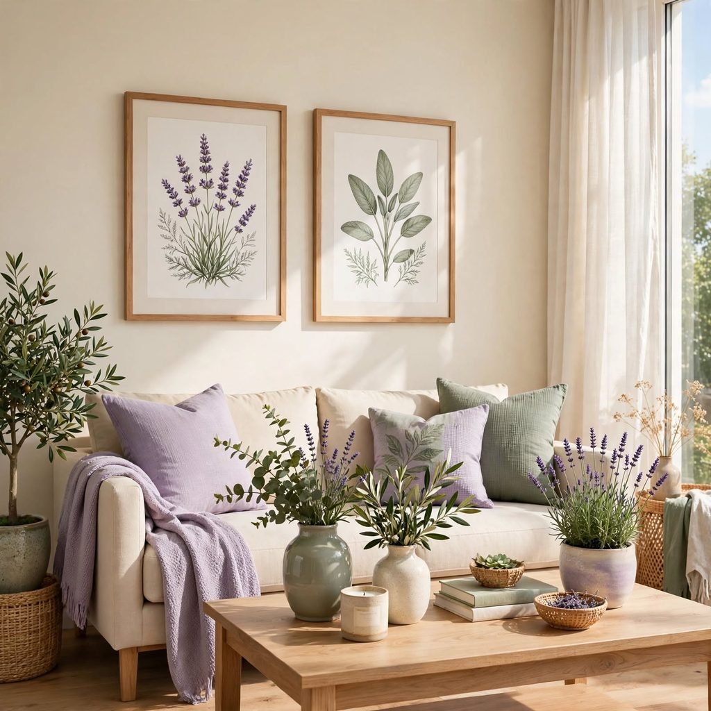
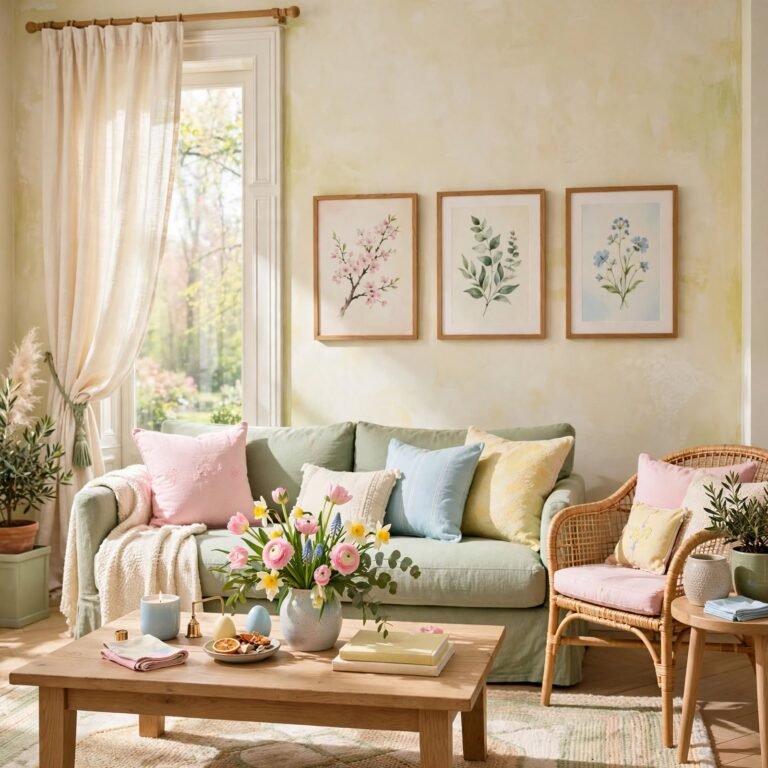
Combining a soft lavender with muted sage green creates a gentler, garden-inspired summer palette that reads as calming rather than bold or high-energy. This pairing works particularly well in a bedroom or reading nook, where a more relaxed summer palette suits the room’s function better than a brighter, more saturated combination. Among summer color palette choices built around softer tones, this pairing photographs especially well in natural, indirect light.
6. Aqua and Coral Reef Palette
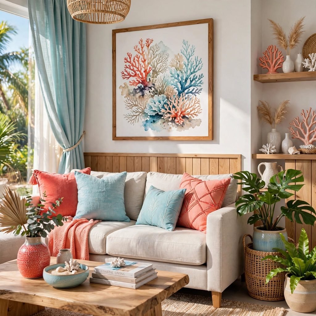
Aqua paired with coral creates a bright, tropical-leaning palette that references reef and ocean colors more directly than a traditional navy-and-white coastal scheme. This combination works well in a bathroom or sunroom, where the bright, saturated colors suit a space intended to feel energetic and fun. Balancing the two bright colors with plenty of white space, rather than covering every surface, keeps the palette from feeling overwhelming.
7. Warm Cream and Butter Yellow
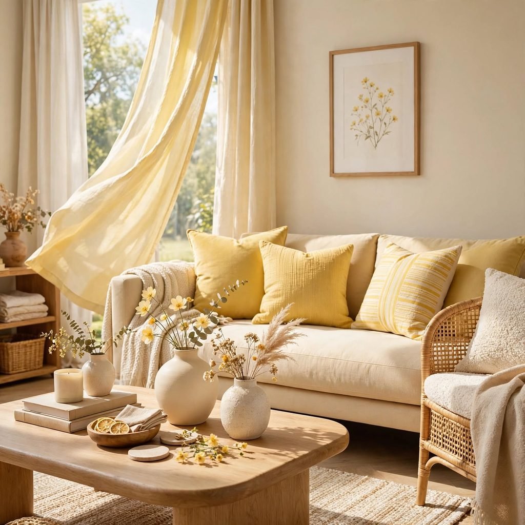
A softer, more muted pairing of warm cream and pale butter yellow creates a gentle summer palette without the intensity of a full citrus brights combination. This palette works particularly well throughout an entire room, including walls, since both tones are light enough to avoid feeling heavy or oversaturated at a larger scale. Adding a single bolder accent color, like a small citrus or coral detail, prevents this softer palette from reading as flat.
8. Olive and Cream Mediterranean Palette
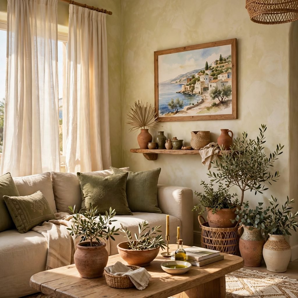
Pairing olive green with warm cream draws on a Mediterranean color story, evoking olive groves and sun-bleached stone rather than a more traditional beach palette. This combination works especially well paired with natural materials like linen and unfinished wood, reinforcing the palette’s rustic, sun-washed character. Olive works well as either a wall color or a textile accent, depending on how bold a commitment the room calls for.
9. Bright Coral and White
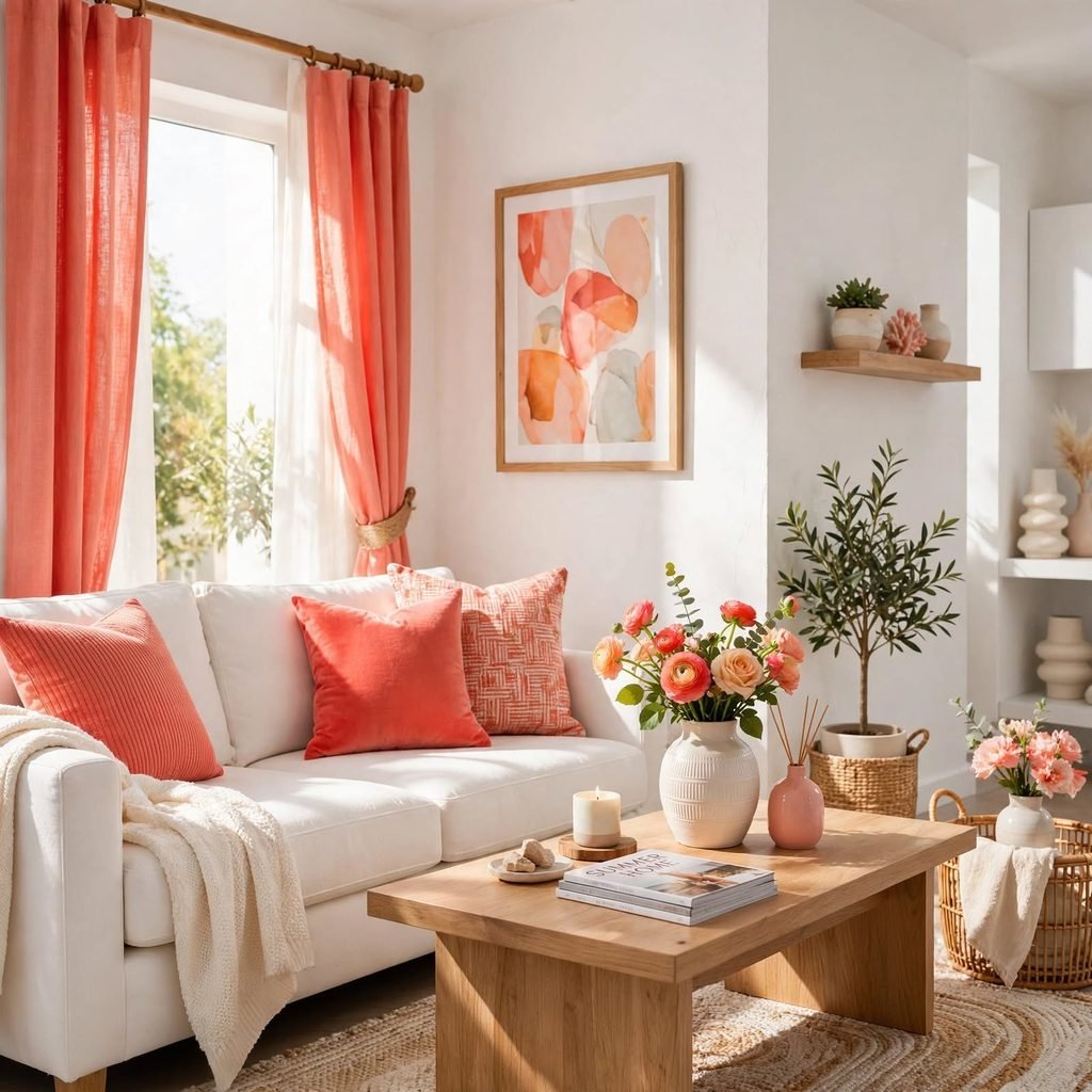
A high-contrast pairing of bright coral against crisp white creates a bold, graphic summer statement well suited to a single accent wall, a set of outdoor cushions, or a smaller powder room rather than a full-room commitment. This combination reads as confidently summery without needing additional supporting colors. Choosing a true coral, rather than a more muted salmon or peach, keeps the contrast against white feeling sharp and intentional.
| Application | Coral Saturation | Best Room Type |
| Full accent wall | High | Powder room, entryway |
| Textile accents | Medium | Living room, bedroom |
| Small ceramic details | High | Kitchen, dining room |
10. Turquoise and Warm Wood Tones
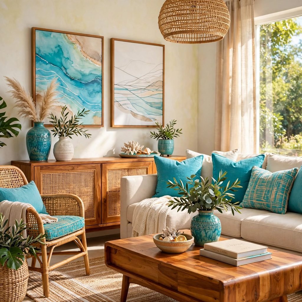
Pairing a saturated turquoise with warm wood furniture balances a cool, vibrant color with grounding natural material, preventing the turquoise from feeling too cold or clinical on its own. This combination works particularly well in a kitchen or dining room, where turquoise cabinetry or tile paired with a wood table creates genuine visual warmth despite the cool primary color. Choosing a honey or amber-toned wood, rather than a gray-washed finish, strengthens the warm contrast against the turquoise.
11. Summer Color Palette Peach and Sage
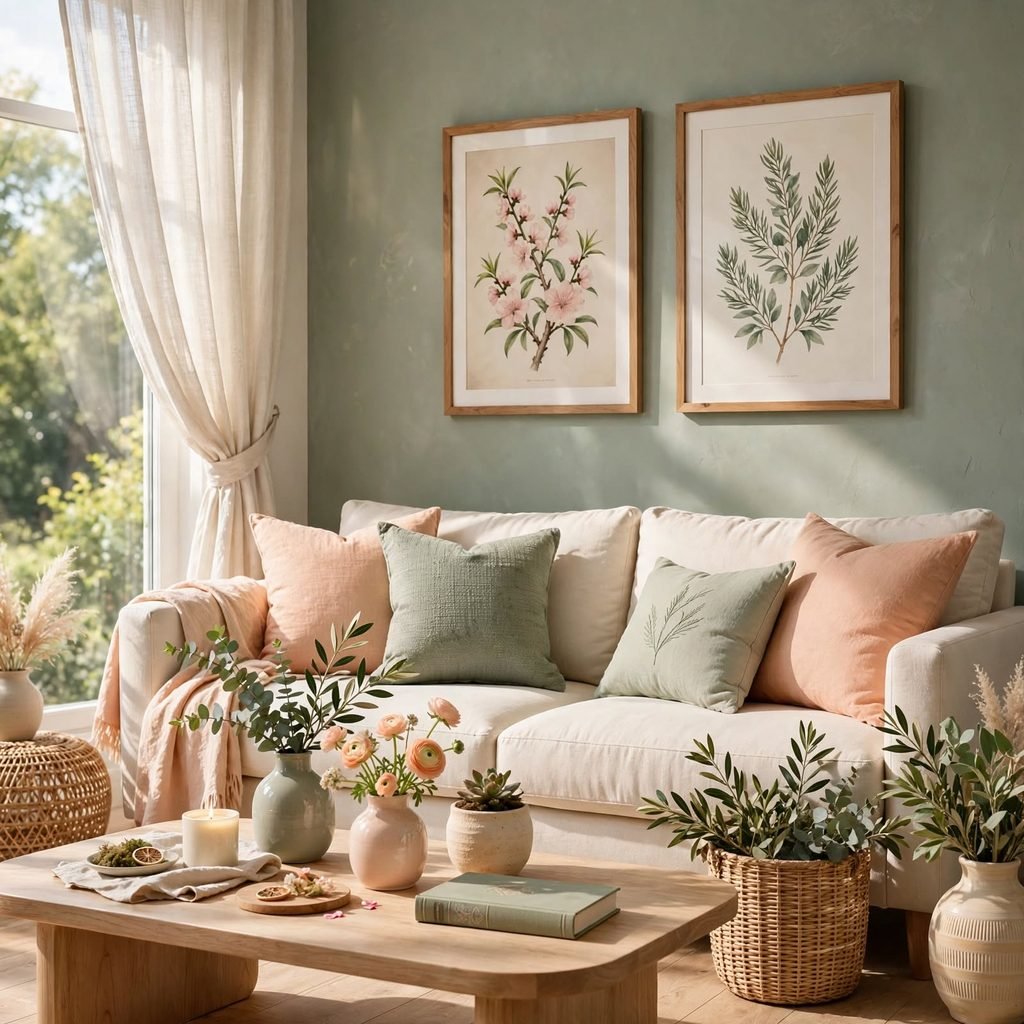
Combining a soft peach with muted sage creates a gentle, slightly retro-inspired summer palette that reads as both warm and calming at once. This pairing works well in a nursery, bedroom, or sunroom, where the combination of a warm and cool tone at similar saturation levels keeps the room feeling balanced rather than leaning too far in either direction. Among summer color palette pairings that suit a softer, more nostalgic aesthetic, peach and sage has grown notably in recent seasons.
12. Golden Hour Amber and Rust
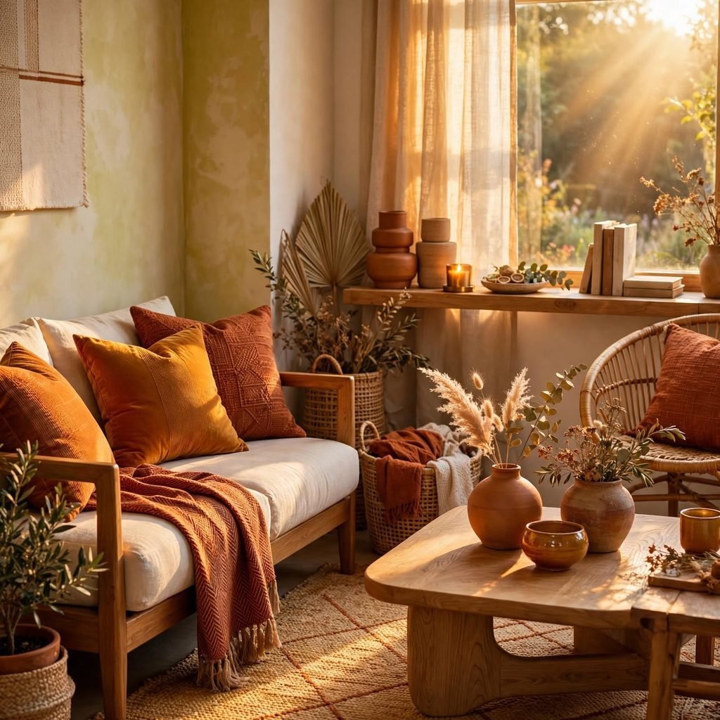
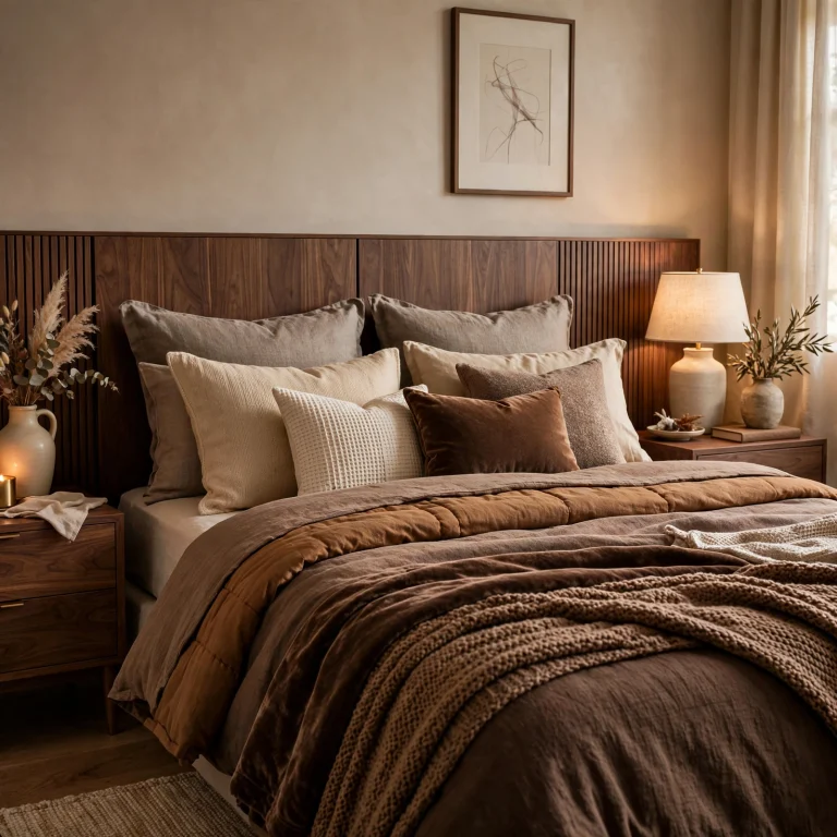
An amber and rust palette evokes the warm, low light of a summer evening rather than the brighter midday tones many summer palettes lean toward, offering a cozier, more atmospheric alternative. This combination works particularly well in a living room or dining room used primarily in the evening, where the warmer tones suit the room’s typical lighting conditions. Pairing amber and rust with brass or copper metallic accents reinforces the palette’s warm, glowing character.
13. Seafoam Green and Driftwood
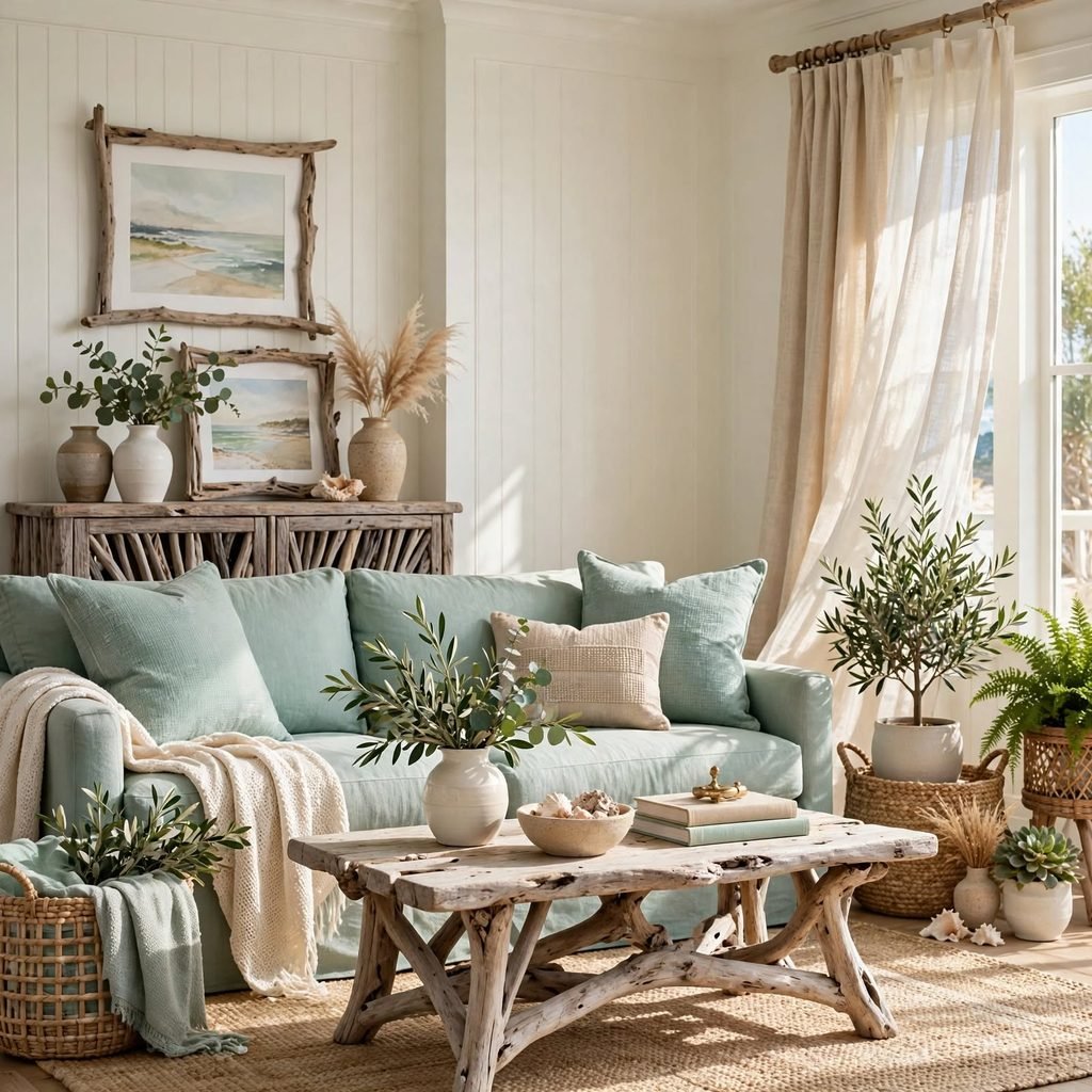
Pairing a pale seafoam green with driftwood-toned wood furniture creates a softer, more weathered coastal palette than the higher-contrast blue-and-white classic pairing. This combination suits a beach house or coastal-adjacent home aiming for a more relaxed, lived-in feel rather than a crisp, formal coastal look. Choosing furniture with a genuinely weathered or whitewashed finish, rather than a stained wood, strengthens the driftwood association within the palette.
14. Hot Pink and Orange Sunset Palette
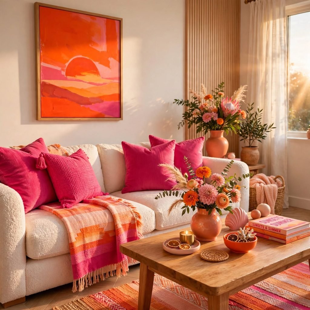
A bold combination of hot pink and orange references a summer sunset more directly than a softer palette would, working particularly well in a space intended to feel playful and energetic, like a home bar, pool house, or teen bedroom. This pairing requires confidence to execute well, since both colors are highly saturated and compete for visual attention if not balanced carefully. Using one color as the dominant tone and the other strictly as an accent keeps this bold combination from feeling chaotic.
15. Summer Color Palette Sky Blue and White Linen
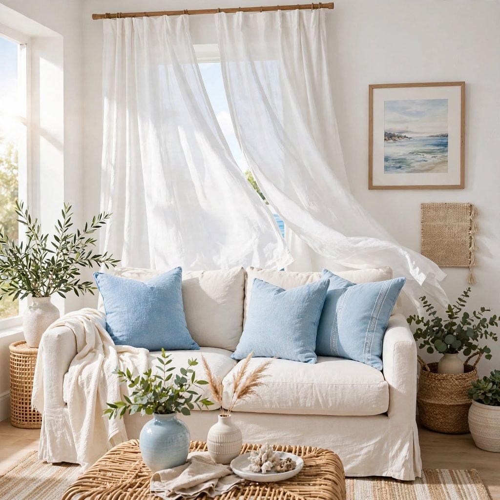
Pairing a soft sky blue with white linen textiles creates an airy, breezy palette that leans lighter and softer than a bolder cerulean or navy coastal combination. This pairing works particularly well in a bedroom, where the soft blue promotes a calming atmosphere well suited to a summer sleeping environment. Among summer color palette ideas built specifically around a restful mood, this combination pairs especially well with sheer curtains that let light filter through softly.
16. Marigold and Deep Green
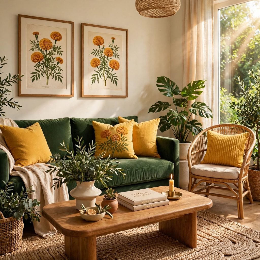
Combining a rich marigold orange-yellow with a deep, saturated green creates a bolder, more garden-inspired summer palette than a paler citrus or pastel combination. This pairing works particularly well in a dining room or kitchen, where the warm marigold tone complements natural wood and the deep green adds visual weight and grounding. Choosing marigold as an accent color, through textiles or ceramics, while keeping the deep green as the dominant wall or cabinet color, balances the two saturated tones effectively.
17. White and Natural Rattan Neutral Base
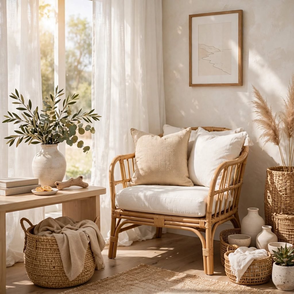
A neutral base of white walls paired with natural, unstained rattan furniture creates a versatile summer foundation that any of the bolder color pairings on this list can be layered over through textiles and accents. This approach works particularly well for anyone wanting a summer refresh without committing to a full wall repaint. Swapping throw pillows, a rug, or a few ceramic accents seasonally allows this neutral base to shift between different summer color directions without any structural changes.
Shop the Look
A coastal blue and white base pairs well with woven rattan furniture and a set of coral throw pillows for a bright, textural accent. Add citrus yellow ceramics on an open shelf, a terracotta table runner for the dining table, and sheer white curtains to keep the room feeling airy. Finish with a few sage green potted plants and warm brass hardware throughout to tie the natural materials and metallics together.
Common Mistake to Avoid
The most common mistake with a summer color palette is committing to a fully saturated, high-energy combination across an entire room, which can feel overwhelming once the season shifts and the same bold colors no longer suit a cooler, darker time of year. Concentrating bolder summer colors in easily swapped elements, like textiles, ceramics, or a single accent wall, rather than in fixed materials like cabinetry or flooring, keeps the palette adaptable as seasons change. This approach also makes the summer refresh far less costly to update or reverse later.
FAQs
What colors are trending for summer this year?
Citrus tones like lemon and tangerine, along with terracotta and desert-inspired neutrals, have grown significantly in popularity relative to the cooler, more traditional coastal blues that dominated summer palettes in past years. Warmer, sun-baked color combinations overall have become more common than the crisp, high-contrast blue-and-white pairing associated with classic coastal design. Pairing any of these warmer palettes with natural materials like rattan and linen reinforces the current summer design direction.
How do I add a summer color palette without repainting?
Textiles, ceramics, and small accent pieces are the easiest way to bring a summer palette into a room without committing to a full repaint, since throw pillows, rugs, and table linens can be swapped seasonally with minimal cost or effort. Adding a few potted plants or fresh flowers in a coordinating color also reinforces the palette without any permanent changes. Concentrating the seasonal color in a single accent wall, if a wall change is desired, keeps the commitment more contained than repainting an entire room.
What summer color palette works best for a small room?
Lighter, softer combinations like cream and butter yellow, or sky blue and white linen, tend to work best in a small room since they reflect more light and avoid the visual weight of a more saturated, high-contrast palette. Concentrating bolder summer colors, like coral or citrus brights, in small accent doses rather than across the full room also helps a small space avoid feeling overwhelmed. Choosing a neutral base with a few swappable accent colors offers the most flexibility for a small room’s summer refresh.
Can a summer color palette work year-round?
Softer, more muted summer palettes, like sage and peach or olive and cream, tend to transition reasonably well into other seasons since they’re not as tied to a specific bright, high-energy summer mood. Bolder combinations, like hot pink and orange or bright coral and white, generally read as more distinctly seasonal and benefit from being concentrated in easily swapped elements rather than permanent fixtures. Choosing a neutral base paired with rotating seasonal accents is the most practical way to enjoy a summer palette without a full seasonal overhaul each time.
What materials pair well with a summer color palette?
Natural materials like rattan, linen, and light wood consistently reinforce a summer color palette’s warm, organic character better than glossier, more formal materials would. Woven textures in particular echo the relaxed, breezy feeling most summer palettes are aiming for, regardless of whether the specific color direction is coastal, citrus, or desert-inspired. Choosing warm metallic accents, like brass, over cooler silver tones also supports most summer palette directions more effectively.
Conclusion
A summer color palette offers real range, from a classic coastal blue-and-white pairing to a bolder citrus or desert-inspired combination, all united by a shared emphasis on warmth and light. Whether the starting point is a full room repaint or a simple textile swap, the goal is a space that feels genuinely seasonal without requiring a permanent commitment. Save this list to Pinterest for later, and check out our related post on green color palette for another versatile, natural color direction.