16 Sophisticated Winter Color Palette Ideas to Warm Up Any Room
Cold months change how light moves through a room, which is exactly why a winter color palette needs different rules than the one you used in June. Deep hues that felt heavy in summer suddenly read as rich and grounding once the days shorten. This guide walks through sixteen tested combinations from frosted blues to espresso browns along with the finishes, pairings, and small mistakes to watch for as you plan your next seasonal update.
Trend & Background
Interior color trends have shifted noticeably toward saturated, moody tones over the past few winter seasons, replacing the all-white minimalism that dominated the 2010s. Paint brands like Benjamin Moore and Sherwin-Williams have both leaned into deep greens, inky blues, and warm neutrals in their recent seasonal collections, reflecting a broader desire for spaces that feel enclosed and restful during darker months. This matters now because more people are decorating with intention rather than trend-chasing, and a well-planned winter color palette extends a room’s usefulness rather than requiring a full redo every few months.
Key Takeaways
- A well-chosen winter color palette balances cool undertones with warm accents so rooms feel cozy instead of cold.
- Deep jewel tones, charcoal neutrals, and metallic accents are the most reliable building blocks for a seasonal refresh.
- Texture and lighting matter as much as hue matte finishes and warm-toned bulbs soften dark winter shades.
- These 16 combinations work across paint, textiles, and decor, so you can commit fully or test with small accents first.
1. Frosted Blue Winter Color Palette
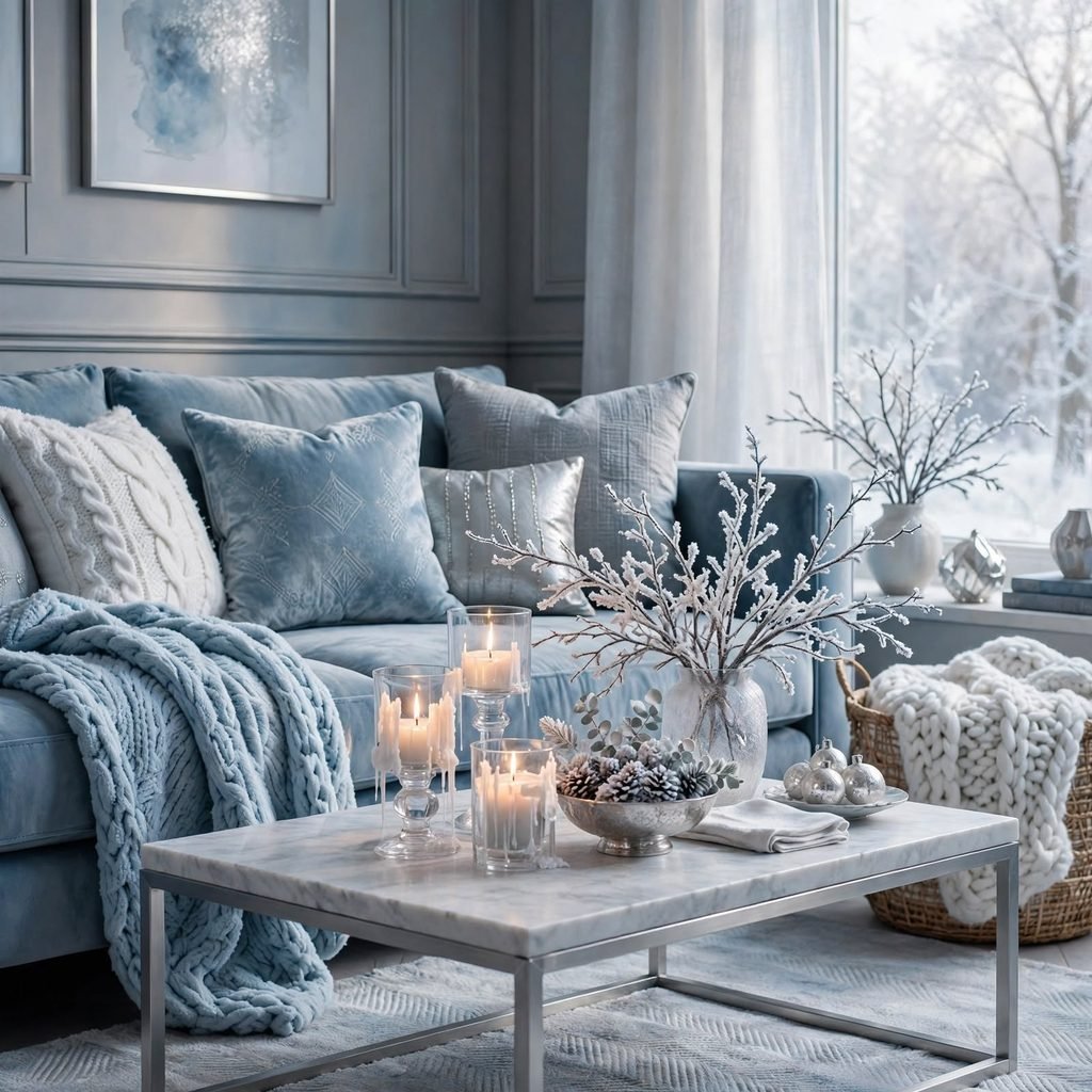
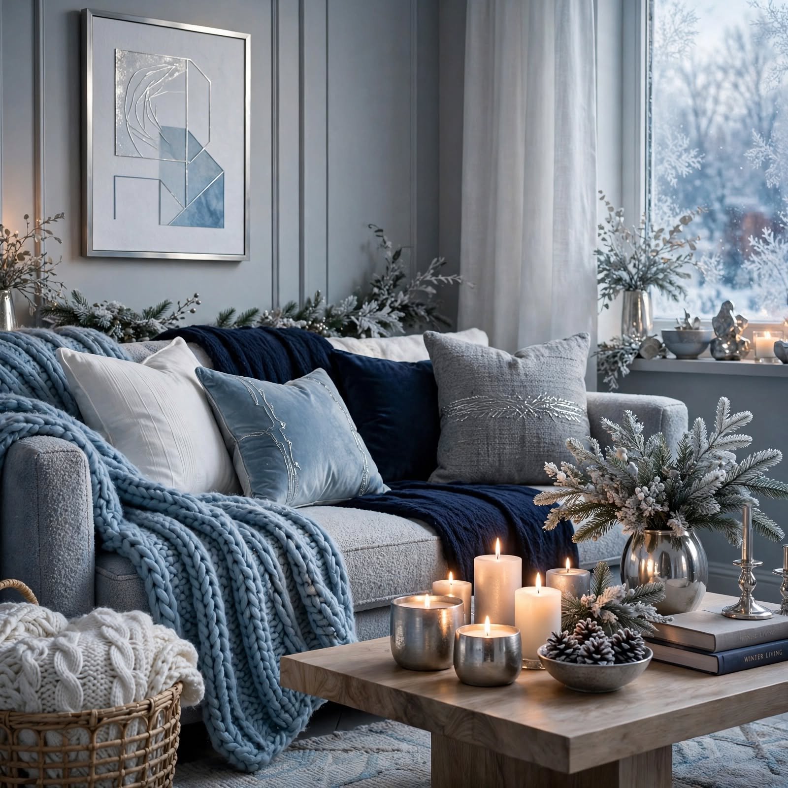
This combination pairs a pale, slightly gray-toned blue with crisp white trim and brushed nickel hardware, evoking frost on a windowpane without feeling clinical. It reads best in bedrooms and bathrooms where natural light is limited, since the cool base won’t compete with warm-toned wood floors. Balance the palette with a wool throw or linen curtains in the same family to avoid a sterile look, and keep metal finishes matte rather than polished for a softer overall effect.
| Undertone | Best Paired With | Ideal Room |
| Blue-gray | White oak, brushed nickel | Bedroom |
| Powder blue | Cream linen, matte black | Bathroom |
| Steel blue | Walnut, brass | Home office |
2. Charcoal and Cream
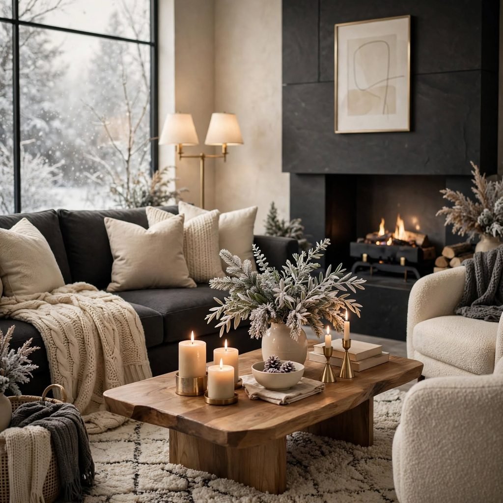
Charcoal walls anchored by cream trim and upholstery create contrast without the starkness of pure black and white. This works particularly well in living rooms with large windows, since the deep charcoal absorbs light rather than reflecting glare, while cream keeps the space from feeling closed in. Use charcoal on a single accent wall or built-in cabinetry first if you’re hesitant to commit to a full room, then layer in cream boucle or mohair textiles to soften the hard edges of the darker tone.
3. Deep Emerald and Gold
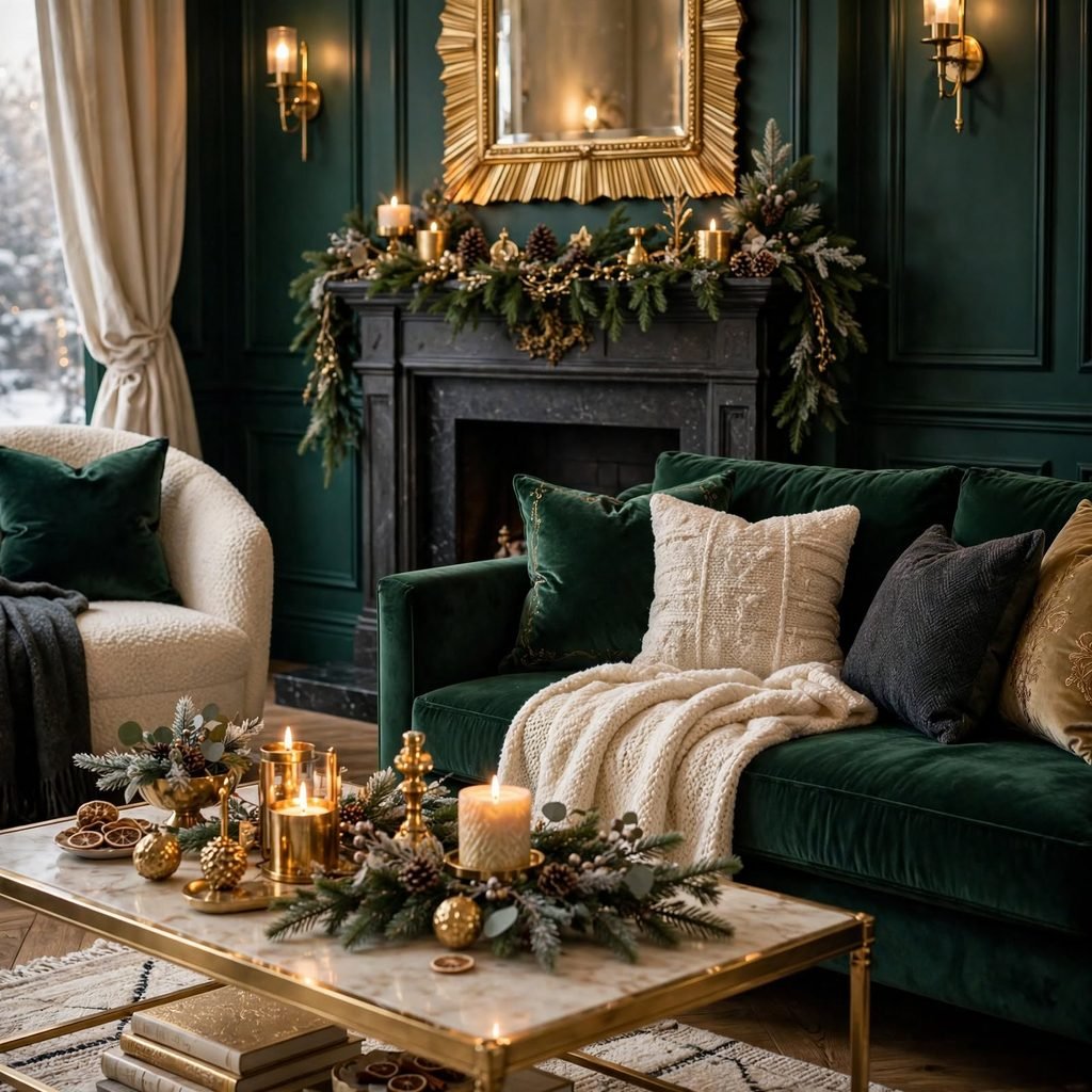
Emerald green paired with brass or gold accents brings a jewel-box feeling that reads as intentional rather than trendy when used with restraint. This pairing suits dining rooms and studies, where a smaller footprint means the saturated green won’t overwhelm daily living spaces. Introduce the gold through picture frames, lamp bases, or drawer pulls rather than large furniture pieces, since a little metallic goes a long way against a color this rich, and too much can tip the room toward costume rather than classic.
For more options neutral color palette CLICK HERE
4. Burgundy and Ivory
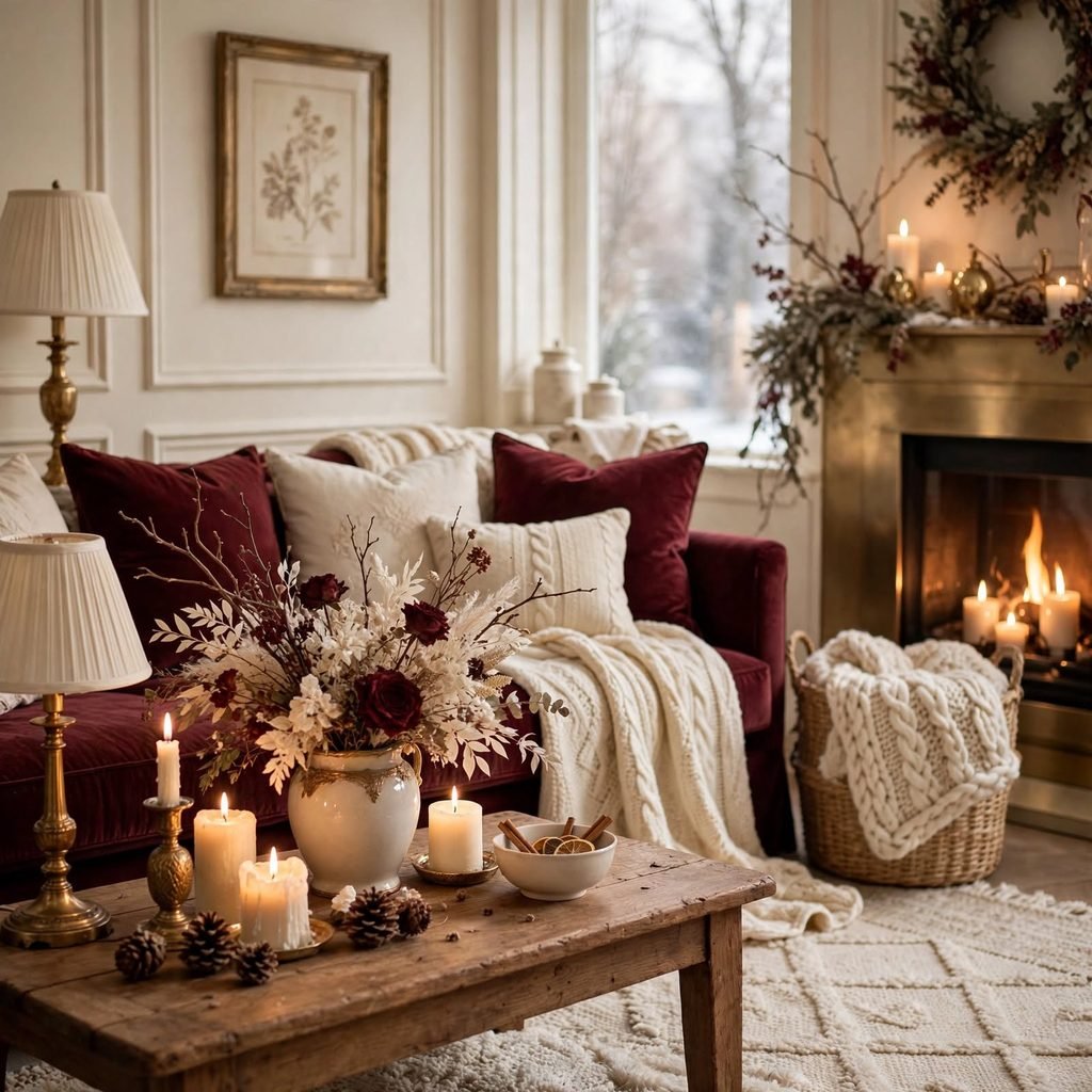
Burgundy walls or upholstery against ivory linens and trim create a palette that feels formal without being fussy, borrowing from traditional English interiors but reading as fresh when paired with simpler, unfussy furniture lines. This combination performs well in dining rooms and libraries where evening lighting is common, since burgundy deepens beautifully under warm bulbs. Keep hardware and lighting fixtures in aged brass or bronze rather than chrome, which can feel too cold against a wine-toned wall.
5. Slate Gray and Silver
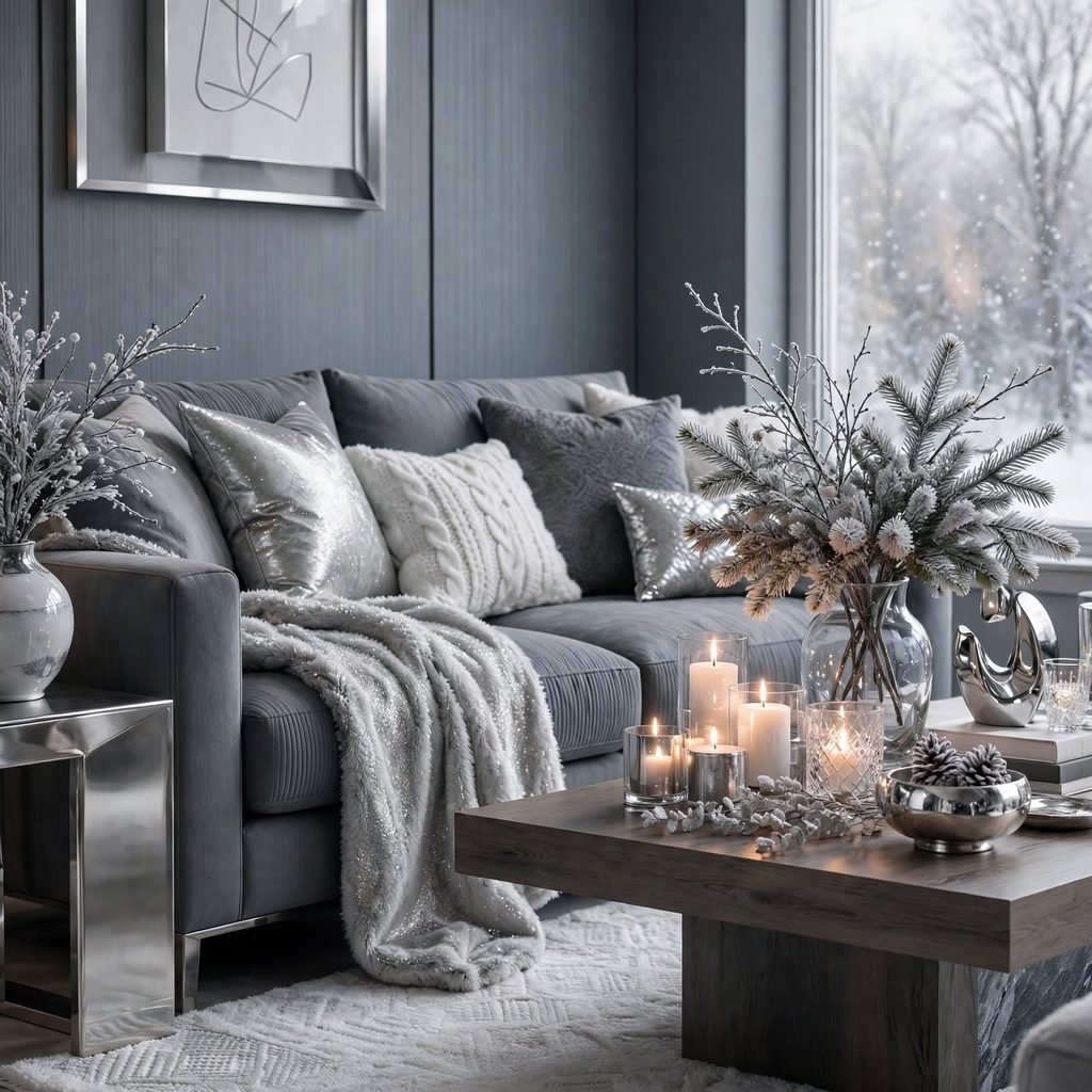
Slate gray offers a cooler, more industrial alternative to charcoal, especially when paired with silver or pewter hardware and glass accents. It suits modern kitchens and bathrooms where a crisp, updated look is the goal, and it photographs well under both natural and artificial light without shifting too warm or too blue. Add texture through a ribbed glass pendant or a brushed steel faucet to keep the palette from feeling flat, since slate on its own can read a bit sterile without contrast.
6. Navy and Blush
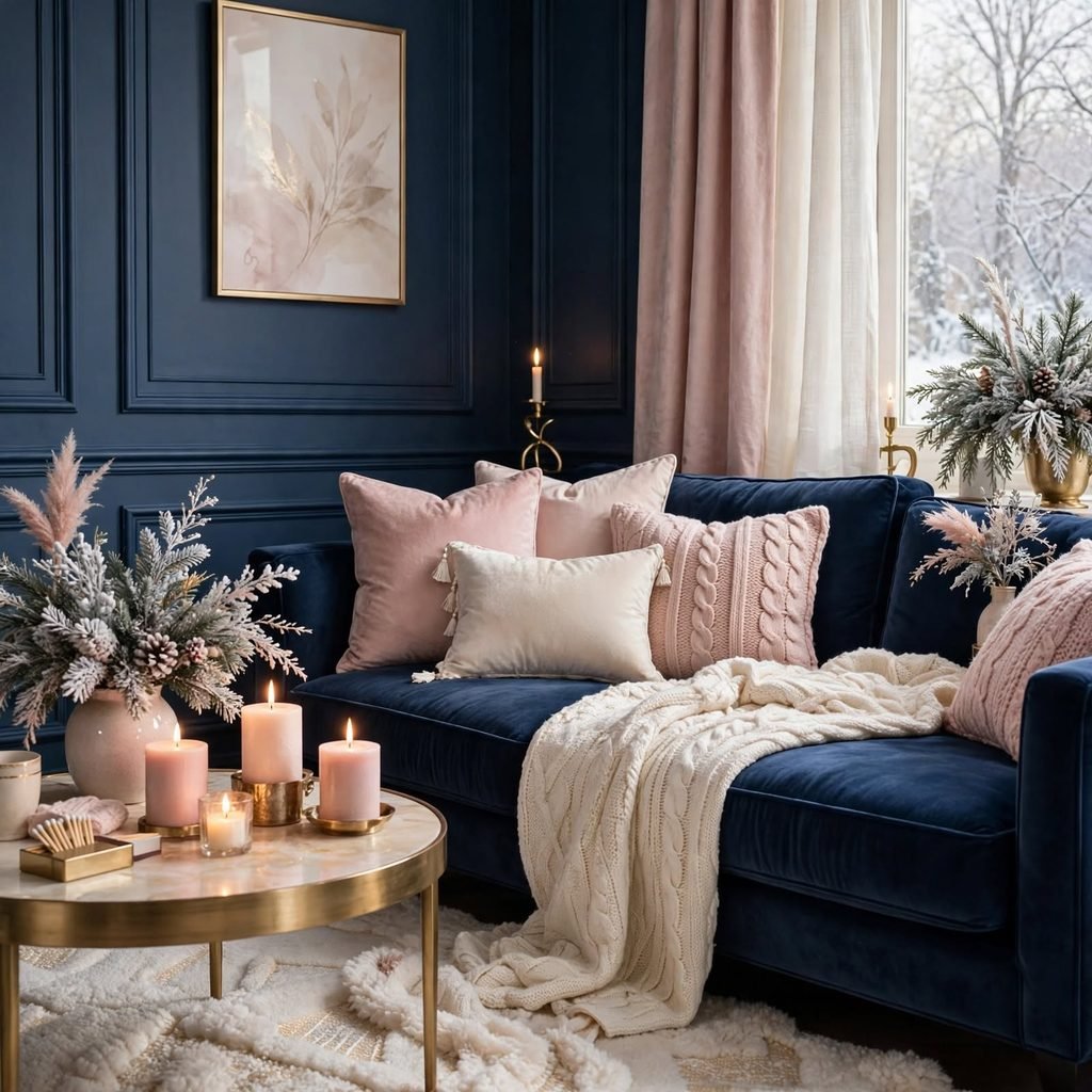
Navy blue paired with a soft, dusty blush creates a combination that feels grown-up rather than nursery-adjacent, particularly when the blush is muted rather than bright pink. This works in bedrooms and powder rooms, where a smaller dose of blush through pillows or a vanity stool keeps navy as the dominant, grounding tone. Gold or brushed brass fixtures tie the two together nicely, and a cream area rug prevents the pairing from feeling overly saturated in a smaller room.
7. Plum and Champagne
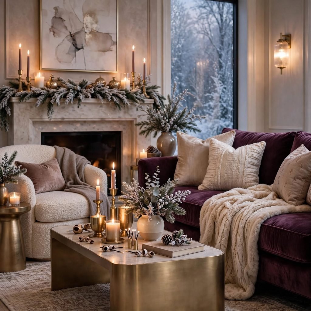
Plum has more warmth than a true purple, making it easier to live with year-round while still reading as distinctly wintery when paired with champagne-toned metallics and fabrics. This combination suits bedrooms and dressing areas, where a velvet headboard or upholstered bench in plum adds depth against pale walls. Champagne hardware, rather than stark silver or gold, keeps the palette cohesive, and a faux fur throw in a neutral tone adds the textural warmth this pairing benefits from.
8. Forest Green and Copper
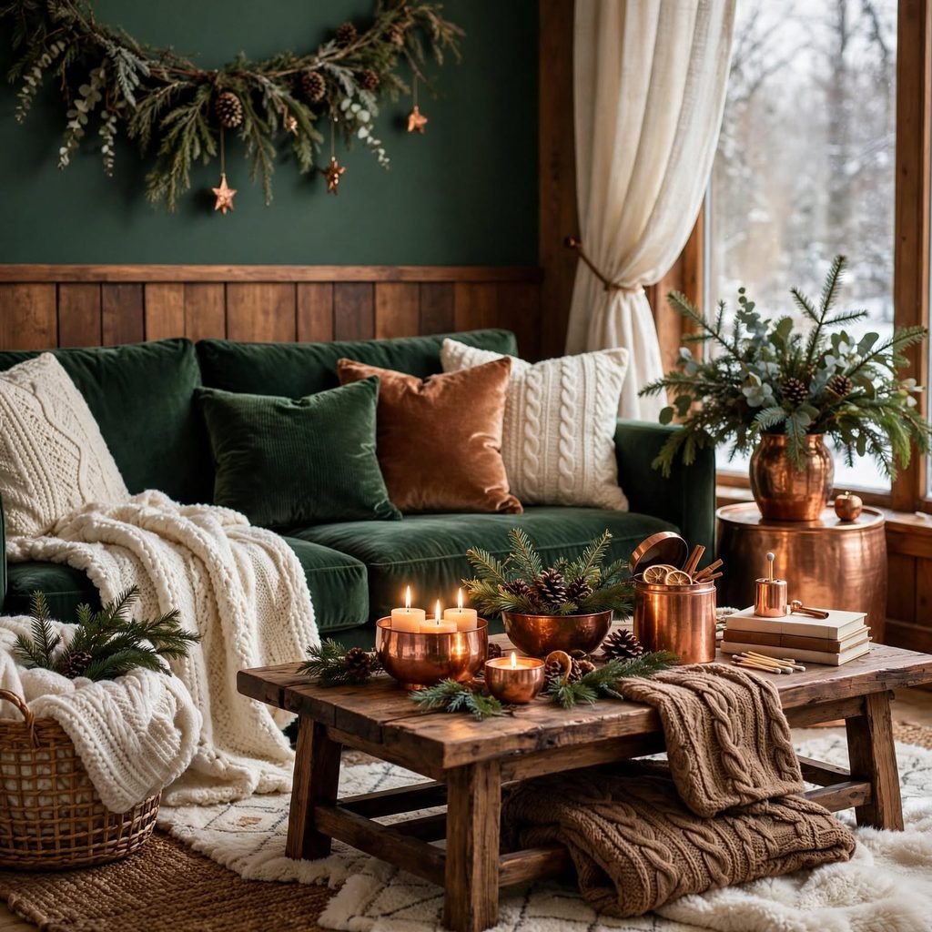
Forest green brings an outdoorsy, cabin-inspired warmth that pairs naturally with copper cookware, light fixtures, or hardware in kitchens and mudrooms. The combination holds up well in high-traffic spaces since forest green hides scuffs better than lighter tones, and copper’s warm glow keeps the overall look from feeling too rustic or dated. Introduce the copper through smaller fixtures first, such as cabinet pulls or a single pendant light, before committing to larger pieces like a range hood.
| Finish | Effect | Where to Use |
| Polished copper | Bright, reflective | Pendant lights |
| Aged copper | Muted, rustic | Cabinet hardware |
| Brushed copper | Soft glow, low glare | Faucets |
9. Black and Snow White
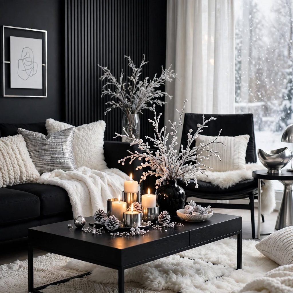
A near-monochrome pairing of matte black and snow white delivers a graphic, high-contrast winter look that suits entryways and modern kitchens especially well. Because the palette relies entirely on contrast rather than hue variation, execution matters more than color selection keep black to trim, window frames, or a single wall, and let white dominate the remaining square footage. Adding one warm wood tone, like a walnut console table, prevents the space from feeling like a black-and-white photograph.
10. Icy Lavender and Gray
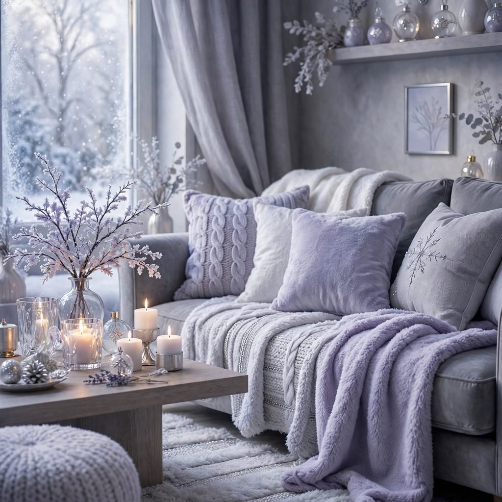
Icy lavender is a cool, almost silvery purple that pairs naturally with warm and cool grays alike, making it a flexible choice for bedrooms and bathrooms. It carries less commitment than a true purple while still reading as distinctly seasonal, particularly in northern light where blue and violet undertones read clearly. Pair it with brushed nickel or unlacquered brass depending on whether you want the room to lean cooler or warmer, and use gray as the larger surface to keep lavender in a supporting role.
11. Rust and Stone
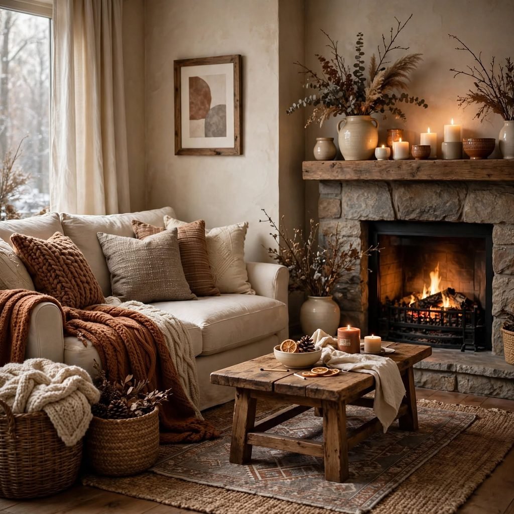
Rust brings unexpected warmth to a winter palette without tipping into full autumn territory, especially when balanced against a cool, pale stone gray. This pairing works well in living rooms and entryways, where a rust-toned accent chair or ceramic vase against stone-colored walls creates depth without overwhelming the space. Keep the stone tone as your base and use rust sparingly through textiles or ceramics, since too much of a saturated warm color can shift the palette away from its wintery balance.
12. Midnight Blue and Pewter
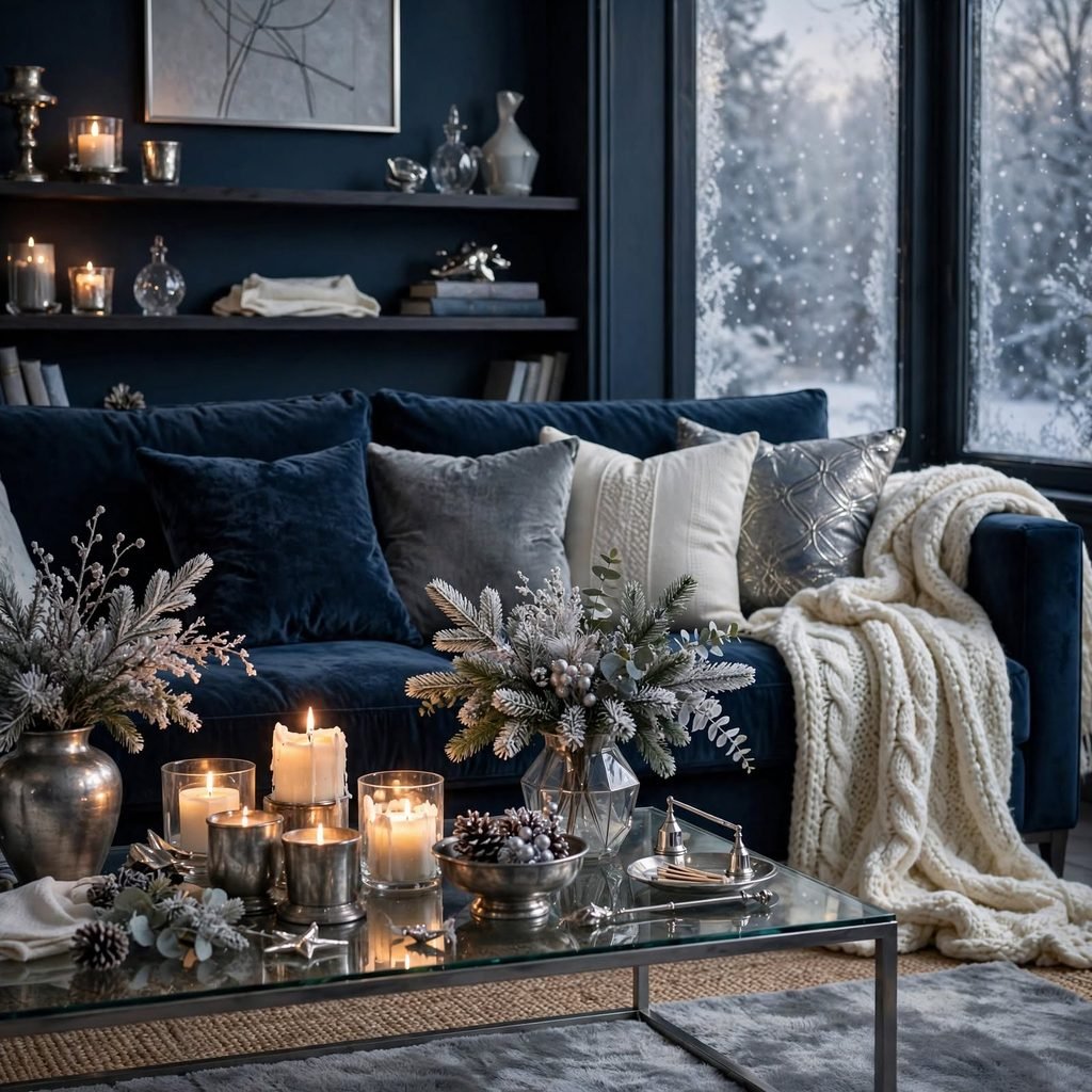
Midnight blue reads almost black in low light but reveals its true color under daylight, giving rooms a shifting, atmospheric quality that suits studies and primary bedrooms. Pewter hardware and light fixtures complement the blue without competing for attention, unlike brighter silver or gold finishes. This combination benefits from layered lighting a mix of table lamps and sconces since midnight blue can feel overly dark under a single overhead source, flattening the depth that makes this palette work.
13. Cranberry and Sage
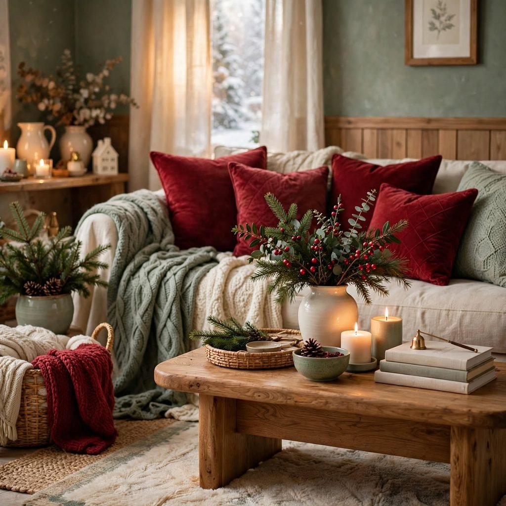
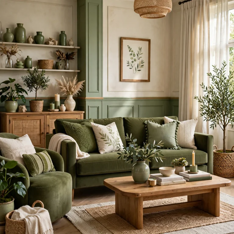
Cranberry and sage borrow directly from holiday color traditions but avoid feeling seasonal-only when the cranberry is muted toward a deeper wine tone and the sage stays grayed rather than bright. This combination suits kitchens and dining rooms, where cranberry cabinetry or a sage backsplash can anchor the space year-round. Cream countertops or trim keep the two saturated tones from competing, and brass fixtures add just enough warmth to bridge the cooler sage with the richer cranberry.
14. Taupe and Frost White
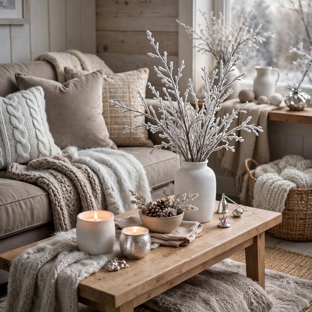
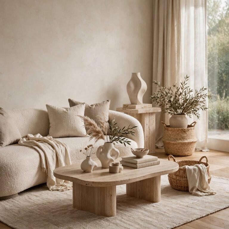
Taupe and frost white create one of the most versatile combinations on this list, working equally well as a full-room palette or a neutral base for bolder accent colors introduced through pillows or art. This pairing suits open-concept living spaces where continuity between rooms matters, since taupe reads warm enough to avoid feeling cold while frost white keeps ceilings and trim from disappearing into the walls. Layer in varied textures linen, boucle, rattan to keep an otherwise quiet palette visually interesting.
15. Espresso Brown and Cream
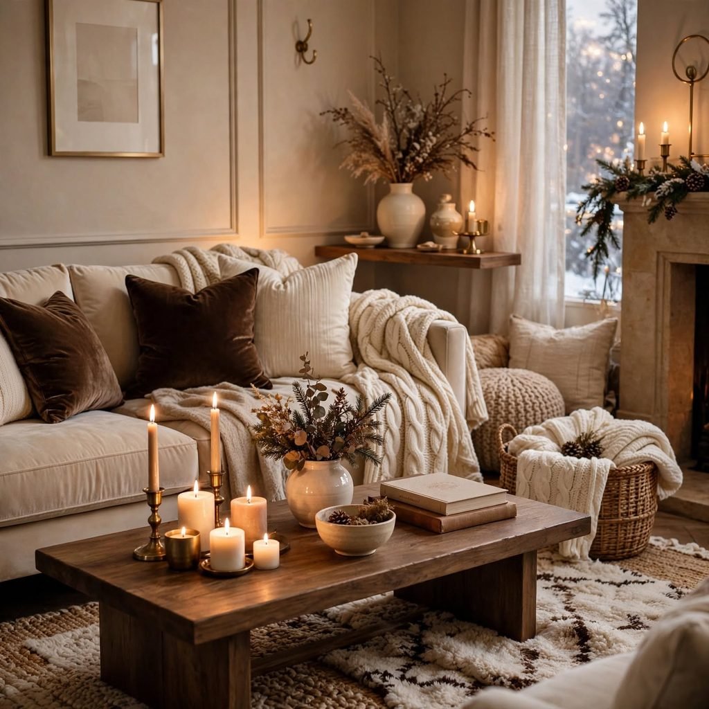
Espresso brown cabinetry, furniture, or flooring paired with cream walls and textiles creates a grounded, café-inspired warmth that works particularly well in kitchens and home offices. This combination has resurfaced strongly as a counterpoint to years of all-white kitchens, offering more visual weight without the starkness of black. Keep hardware in warm brass or bronze rather than chrome, and introduce texture through woven baskets or a jute rug to keep the deep brown from feeling too heavy against the lighter cream.
16. Arctic Teal and Charcoal
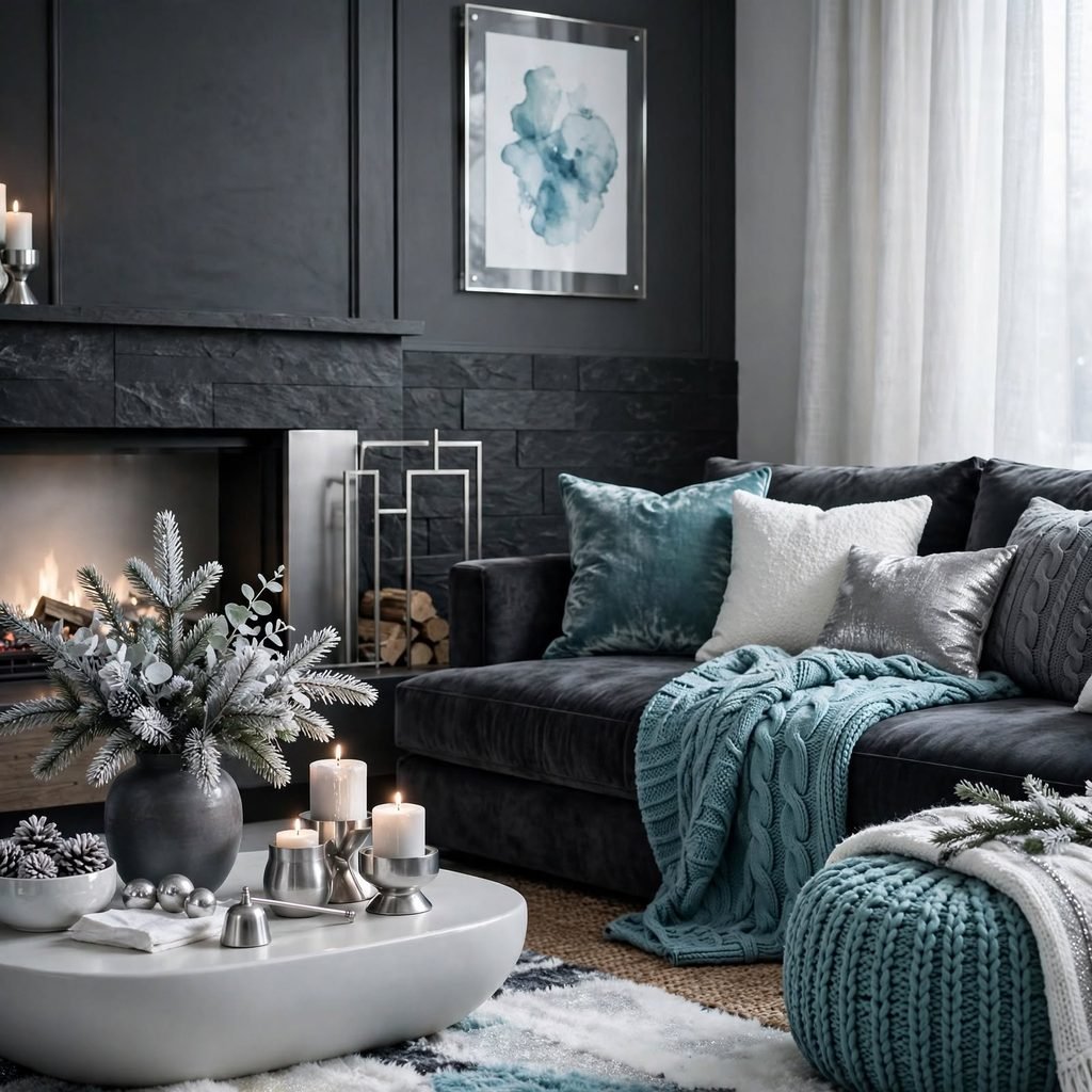
Arctic teal is cooler and more muted than a traditional teal, closer to a blue-green frost than a tropical hue, which is what makes it work in a winter palette rather than a summer one. Paired with charcoal trim or furniture, it suits bathrooms and bedrooms where a saturated but calm accent color is welcome. Use arctic teal on cabinetry or an accent wall while keeping charcoal to smaller elements like window frames, so the cooler tone doesn’t overwhelm an already dim winter room.
Shop the Look
A brushed nickel pendant light works well anchoring the Frosted Blue or Slate Gray palettes, while an aged brass picture light suits the Emerald and Gold or Burgundy and Ivory combinations. A mohair or boucle throw pillow in cream adds texture to any of the darker palettes, from Charcoal and Cream to Midnight Blue and Pewter. For kitchens leaning into Forest Green and Copper or Espresso Brown and Cream, a set of unlacquered brass cabinet pulls ties hardware and wall color together without looking matched-to-a-kit.
Common Mistake to Avoid
The most common mistake is choosing a deep winter color purely from a small paint chip under store lighting, then finding it reads far darker or bluer once applied across an entire wall at home. Undertones shift dramatically depending on natural light exposure, bulb temperature, and adjacent finishes like flooring or cabinetry. Always test a large swatch at least two feet square on the actual wall, and view it morning, afternoon, and evening before committing, since a color that looks perfect at noon can feel completely different by 7 p.m.
FAQs
What is the best winter color palette for a small room?
Lighter, cooler tones like Frosted Blue, Icy Lavender, or Taupe and Frost White tend to work best in small rooms, since they reflect more light without feeling as flat as pure white. If you want a deeper color in a small space, limit it to one wall or a piece of furniture rather than covering every surface, and keep trim and ceilings in a lighter shade to preserve a sense of height and openness.
Are dark colors a bad idea for winter rooms with little natural light?
Not necessarily dark colors can actually work well in low-light rooms because they stop reflecting the gray, flat quality of weak daylight and instead create an intentionally moody, cocoon-like feel. The key is compensating with warm artificial lighting, such as table lamps with warm-toned bulbs, rather than relying on a single overhead fixture, which can make deep colors like charcoal or midnight blue feel dull instead of rich.
How do I make a cool winter palette feel warmer?
Introduce warmth through material choices rather than changing the base color itself think brass or bronze hardware, wood tones like walnut or oak, and textiles such as wool, mohair, or boucle. Warm-toned lighting also makes a significant difference, since a 2700K bulb will soften even a cool blue or gray wall considerably compared to a bright white 4000K bulb, which tends to exaggerate any cool undertone in the paint.
Can I mix two different winter palettes in the same home?
Yes, as long as there’s a connecting thread, such as a shared metal finish or a repeated neutral like cream or charcoal running through both spaces. For example, Navy and Blush in a bedroom can coexist with Forest Green and Copper in a kitchen if both rooms use the same brass hardware and similar wood tones, which keeps the transition between spaces feeling deliberate rather than disjointed.
What finish works best for dark winter paint colors?
Matte or eggshell finishes generally work better than satin or semi-gloss for deep winter colors, since higher-sheen finishes tend to highlight wall imperfections and can make an already dark color feel flat or plasticky under artificial light. Matte finishes absorb light more evenly, which is part of what gives colors like charcoal, midnight blue, and espresso brown their rich, enveloping quality in person.
Conclusion
A thoughtful winter color palette doesn’t require repainting every room even one or two well-chosen combinations, applied through paint, textiles, or hardware, can shift how a space feels for the coldest months of the year. Save this list to Pinterest for reference when you’re ready to plan your next update, and check out our related post on seasonal lighting temperature for tips on making any of these palettes feel warmer after dark.